Nonprofit Digital Presence Comparison Website Template
Cause is a glassmorphic nonprofit landing page template built for cause-driven online stores. It combines a void-black aesthetic with frosted product cards, live impact data, and side-by-side comparison panels that turn skeptical visitors into confident buyers. Every scroll builds a transparent case for purchasing, replacing passive donation fatigue with proof-backed shopping.
by Rocket studio
Quick summary
Cause is a single-page nonprofit storefront template that sells mission-driven merchandise through data transparency. It uses a Tech Glass visual system, animated impact tickers, and modular product card grids to convert millennial donors, corporate gift buyers, and nonprofit supporters into customers who shop with confidence.
Who this template is for
This template is built for nonprofit teams and cause-driven brands that sell physical products to fund verified missions. It speaks directly to audiences who need proof before they buy.
- Millennial donors who want measurable impact, not vague promises
- Corporate gift buyers sourcing ethical merchandise for company events
- Nonprofit board members and supporters who want merch that advocates on their behalf
What problem this template solves
Most nonprofit storefronts look like afterthoughts. They list products without context, leaving buyers wondering whether their money actually matters. Cause fixes this by weaving transparency directly into the shopping experience.
- Visitors arrive skeptical and leave without proof of impact under standard store designs
- Corporate buyers have no quick way to compare ethical swag against conventional gift alternatives
- Passive donation fatigue causes millennial audiences to disengage before reaching a call to action
What you get with this template
You get a fully structured, single-page storefront layout that doubles as a transparency report. Every section is built to address a specific buyer objection before it becomes a reason to leave.
- A cinematic hero section with a typewriter headline, live impact ticker, and floating stats strip
- A modular card grid with built-in bar chart visuals, monospace impact ratios, and geographic dot maps
- Two full-width comparison panels and a conversion-focused call to action with an email capture field
Feature list
This template includes six core feature areas drawn directly from the design brief.
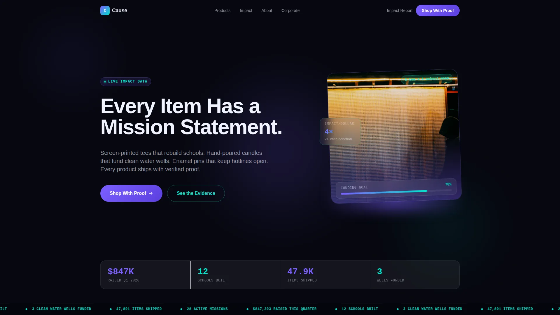
Animated Hero with Live Impact Ticker
The hero section opens on a void-black background with a single product lit from below by a violet glow. A typewriter effect types the headline in real time. A cyan ticker scrolls live impact data across the screen, such as funds raised and schools built, giving visitors an immediate sense of scale before they scroll.
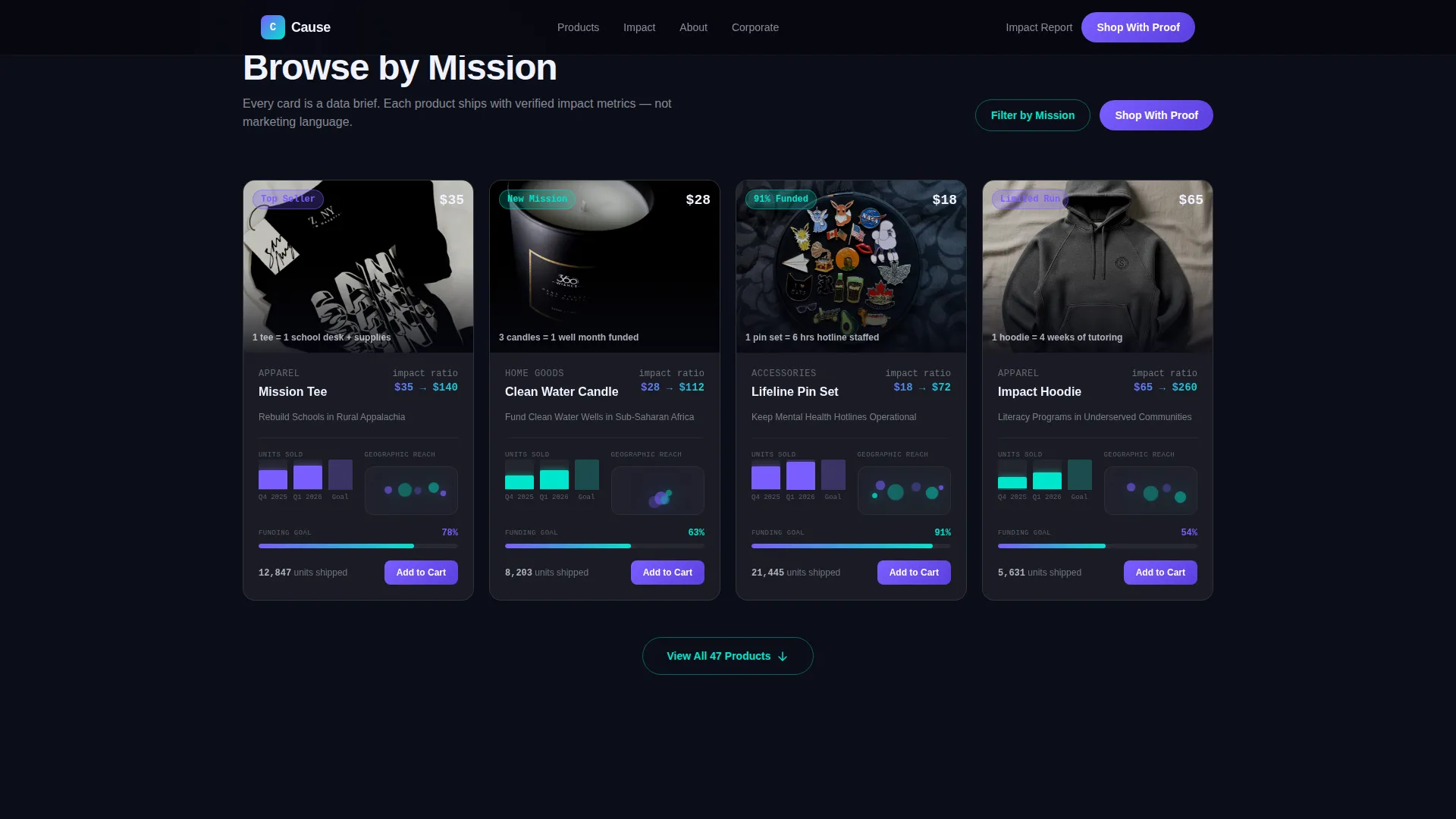
Modular Bento-Style Product Card Grid
Each product card presents its category as a data brief rather than a simple listing. Cards include rising bar chart animations showing unit sales, monospace dollar-per-impact figures, and geographic dot cluster maps. The staggered card entrance animation is handled through scroll-triggered reveals.
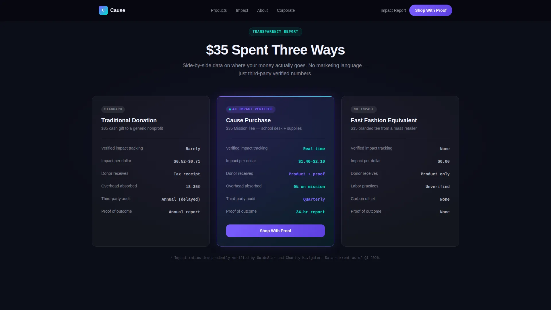
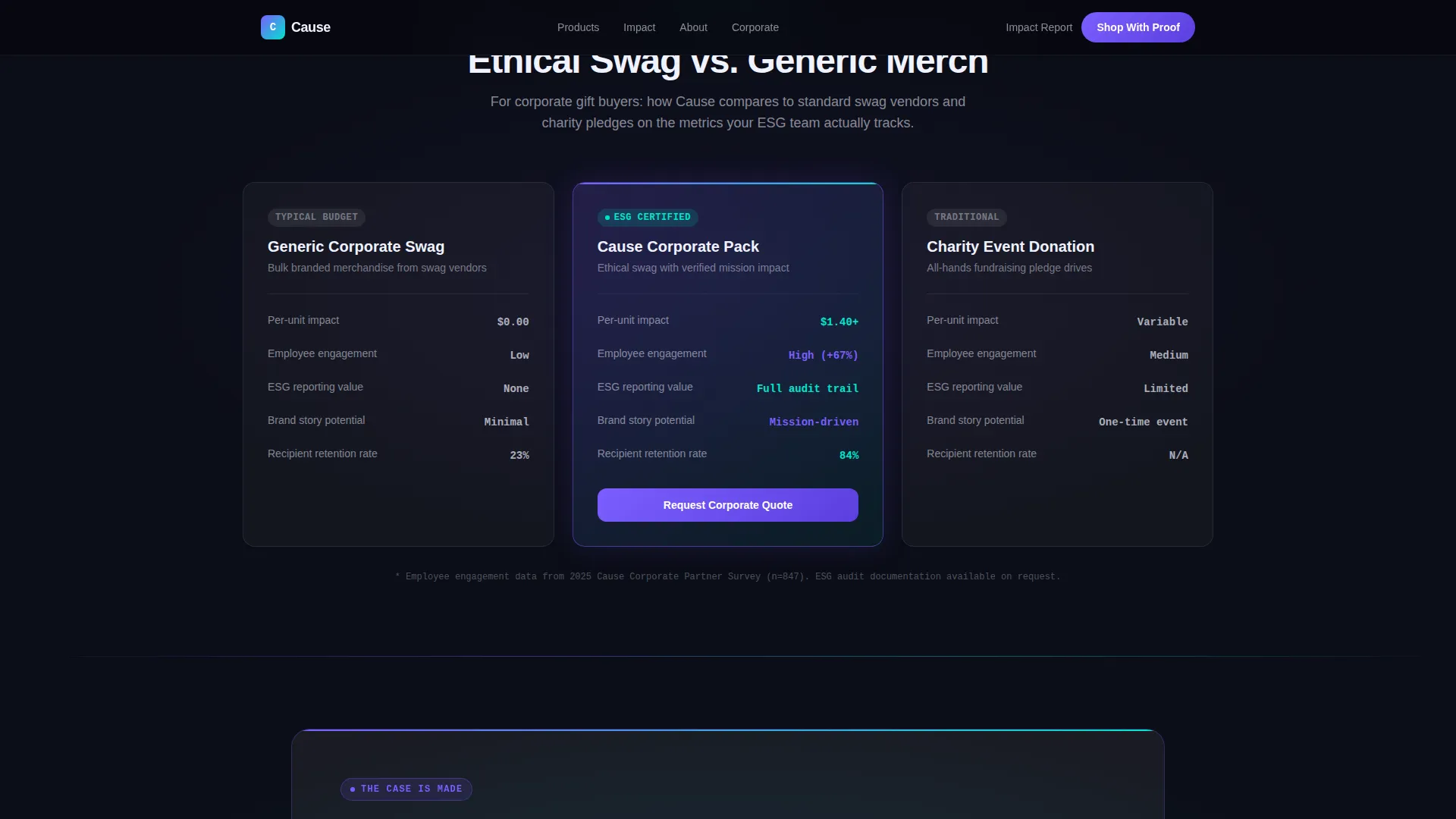
Full-Width Comparison Panels
Every third content row breaks the grid with a full-width versus panel. These panels stack this store's impact-per-dollar against traditional donations, corporate gift alternatives, and fast-fashion equivalents. The comparison framing dissolves price objections before the primary call to action appears.
Glassmorphic Card Design System
Product cards float as frosted glass panels over a void-black depth. Each card uses 8% white opacity with backdrop blur and a 1-pixel luminous border. Hover states deepen the glass effect and trigger signal cyan accent transitions, reinforcing the Tech Glass visual identity throughout the grid.
Conversion-Focused Call to Action Block
The primary call to action, labeled "Shop With Proof," appears after the first comparison panel and links to the filtered product grid. A secondary path offers a downloadable impact report behind a single-field email capture input that glows on focus, giving visitors two clear next steps.
High-Fidelity Animation Layer
The template uses GSAP scroll reveals, pulsing violet glow effects, animated progress bars showing funding goals, a marquee ticker, and magnetic call to action button behavior. These interactions are organized into Server Components for static sections and Client Components for all animated elements.
Page sections overview
| Section | Purpose |
|---|---|
| Hero + Ticker | Cinematic product shot with typewriter headline and live impact stats |
| Comparison Panel One | Purchase versus donation versus fast fashion, full-width layout |
| Product Card Grid | Modular bento cards with bar charts, impact ratios, and geo maps |
| Comparison Panel Two | Ethical swag versus corporate gift alternatives, side-by-side |
| Call to Action + Email | "Shop With Proof" primary button and glowing impact report capture |
| Footer | Linear single-row footer with essential links |
Design & branding system
The visual identity follows a Tech Glass theme built on a Glassmorphic color system. The palette feels precise and purposeful, combining deep digital blacks with translucent layering and electric accent colors.
- Core colors: void black (#0B0D17) for backgrounds, cause-electric violet (#7B5EFF) as the primary accent, and signal cyan (#00E5CC) for hover states and data highlights
- Frosted glass panels use white at 8% opacity with backdrop blur and 1-pixel luminous borders throughout the card grid
- Typography pairs DM Sans for body copy and interface labels with JetBrains Mono for all impact figures, ratios, and data points
Mobile & speed optimization
The template is designed desktop-first to serve corporate buyers reviewing options on larger screens, with full mobile responsiveness carried through every section.
- Static sections use Server Components to reduce client-side load during initial render
- Client Components handle all animated interactions, keeping animation-heavy elements isolated from the static content layer
- The card grid and comparison panels reflow cleanly for mobile viewports without losing the glassmorphic visual depth
How this template helps you convert
The page is structured as a Comparison/Versus conversion flow. Every section earns the next click before asking for one.
- The hero ticker establishes credibility instantly with live impact figures, reducing the first barrier of skepticism before the visitor even scrolls
- The three comparison panels build a cumulative data case, showing that a $35 purchase here delivers four times the measurable impact of a $35 donation elsewhere, making price objections dissolve inside evidence
- The dual call to action block captures both ready buyers through "Shop With Proof" and research-mode visitors through the email-gated impact report, serving two distinct decision stages in one section
Other information about this template
This template is part of a broader category of cause-driven digital storefronts designed for nonprofit organizations that operate at the intersection of e-commerce and advocacy.
- The template is localized in English, priced in USD, and uses US-centric impact data references out of the box
- Animation intensity is high by design; teams with simpler needs can scale back GSAP interactions without restructuring the layout
- The linear single-row footer follows a clean Pattern 1 layout, keeping the page exit lightweight and uncluttered
- This template suits nonprofit organizations exploring modern nonprofit website builder approaches or teams transitioning from a basic donation page to a full cause-driven retail experience
Theme
Tech Glass
Creative direction
Industry Report
Color system
Glassmorphic
Style
Card Grid (Modular)
Direction
Comparison/Versus
Page Sections
Animated Hero with Live Impact Ticker
Modular Bento-style Product Card Grid
Full-width Comparison Panels
Glassmorphic Card Design System
Dual Call to Action with Email Capture
High-fidelity GSAP Animation Layer
Related questions
Can this template be used for a nonprofit that sells both physical products and digital downloads?
Does the template include the actual impact data shown in the demo?
How does the comparison panel work for corporate buyers?
Can the glassmorphic card grid be customized with different brand colors?
Is the email capture field connected to a mailing list service?


