Smart Donor Engagement Landing Page Template
The Gratitude template is a bento grid landing page built for nonprofit email platforms that turn generic donation receipts into personalized thank you stories. It features an interactive email preview toggle, scroll-animated stat tiles, a problem-to-solution arc, and a dual call to action path, all styled in a Tech Glass visual identity with deep teal, frosted white, and coral accents.
by Rocket studio
Quick Summary
The Gratitude template is a single-page bento grid landing page designed to help nonprofit email platforms show, not just tell, why donor retention depends on a better thank you message. Visitors toggle between a generic receipt and a personalized impact email, watch scroll-animated stats reveal the cost of poor thank you practices, and reach a clear call to action backed by real proof.
Who This Template Is For
Every fundraising professional who has watched a donor give once and disappear knows the pain this template addresses. The Gratitude landing page speaks directly to the people responsible for fixing that problem.
- Development Directors at mid-size nonprofits who are tired of sending the same flat, auto-generated thank you email and need a tool that makes donors feel appreciated from the moment a donor completes a gift.
- Annual Fund Coordinators tracking second-gift conversion rates and looking for ways to increase donor retention without rebuilding their entire email workflow from scratch.
- Capital Campaign Managers who understand that the thank you message sent right after a generous donation is the first step toward recurring giving and long term relationships with new supporters.
What Problem This Template Solves
Many nonprofits send a thank you email that reads like a tax document. The subject lines are generic. The body copy ignores the donation amount, skips personal details, and gives donors no reason to stay connected. First time donors slip away quietly, and one time gifts stay one time gifts.
- Poor donor thank you practices leave new donors cold. When donors do not feel appreciated, they are far less likely to give again, volunteer, or share the organization on social media.
- No visible impact story means donors understand their money was received but not what it actually did. Without personal stories and a clear fundraising goal update, there is no emotional reason to return.
- Weak subject lines and no personalization drag down open rates across all email campaigns, reducing ongoing engagement with both recurring donors and potential donors who are still deciding whether to commit.
What You Get With This Template
This template gives you a fully structured, ready-to-customize bento grid landing page that demonstrates the value of a thoughtful thank you email system at every scroll. The layout is organized to guide a skeptical development director from curiosity to conviction.
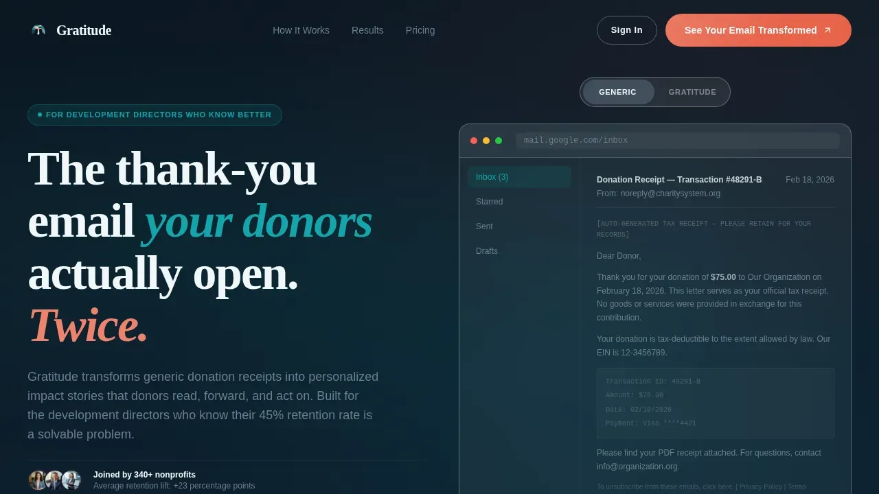
- An interactive hero section with a glass-morphic inbox frame where visitors toggle between a generic receipt and a Gratitude-powered thank you email, seeing the difference before reading a single headline.
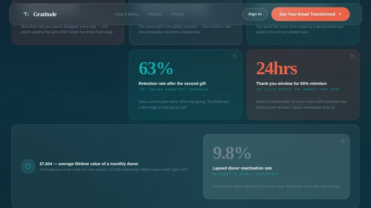
- A problem-to-solution bento arc with scroll-animated stat tiles showing donor retention numbers, second-gift conversion cliffs, and the cost gap between acquiring new donors versus keeping existing ones, each paired with a matching feature solution tile.
- Two distinct conversion paths built into the layout: a primary call to action ("See Your Email Transformed") with a lightweight intake form, and a secondary call to action ("Send Me the Retention Report") for visitors who need more time and only want to share an email address.
Feature List
This template is built around functional design decisions that serve a specific audience with a specific problem. Each feature exists because a fundraising professional reading this page needs to feel understood before they will click anything.
Interactive Email Preview Toggle
The header section renders a live-feeling email comparison inside a glassmorphic inbox frame. Visitors switch between a pale, text-heavy generic receipt and a rich, warm, personalized thank you email complete with an impact story, a campaign progress bar, and a program photo tied to the donor's specific donation amount. The glass-slide toggle animation makes the contrast visceral and immediate.
Scroll-Animated Stat Bento Grid
Each glass tile in the stats row holds a single donor retention number, open rate figure, or acquisition cost comparison. The numbers animate on scroll, giving each stat its own moment of weight. A secondary call to action pill sits beneath each tile for visitors in research mode, asking only for an email to send them the retention report.
Problem-to-Solution Arc Layout
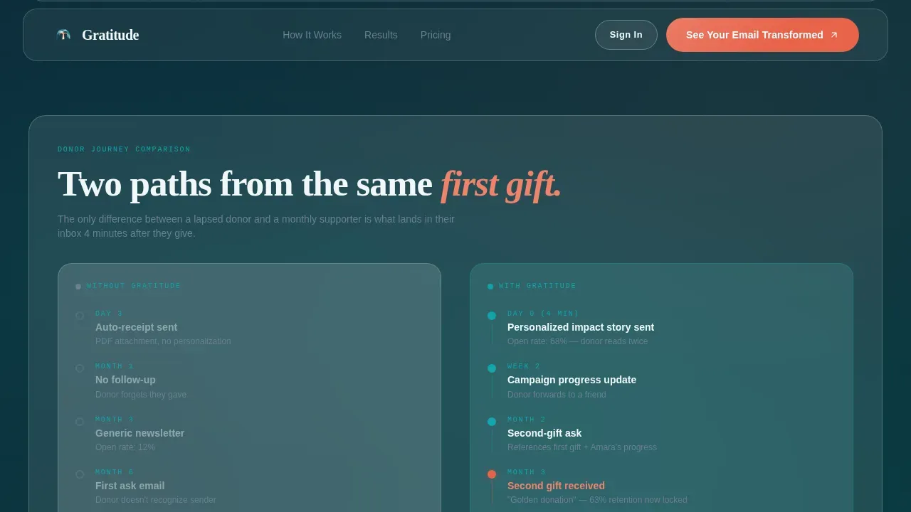
The template's mid-section maps each problem tile directly to a solution tile. Features like dynamic impact inserts, personalization layers, send-time optimization, and subject line testing each appear beside the specific donor retention wound they address. A full-width donor journey timeline then shows two paths side by side: one trailing off into lapsed silence, one building toward a monthly recurring gift.
Social Proof Ticker and Metrics Section
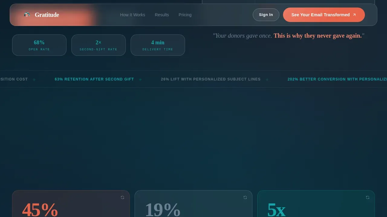
A scrolling marquee ticker displays nonprofit names already using the platform. Alongside it, retention lift percentages and real open-rate comparisons give new supporters and skeptical visitors the social proof they need to trust the offer. This section makes the case without asking visitors to take anything on faith.
Dual Conversion Path Design
The primary call to action collects organization name, current email platform, average monthly donation volume, and one email address. The secondary call to action sits in a smaller glass pill beneath each stat tile and requires only an email. Both paths respect where each visitor is in their decision process, and the layout places the primary call to action in the hero, at the grid midpoint, and in the final row.
Bento Grid with Staggered Reveal Animations
The layout uses a structured bento grid where each cell feels like a translucent tile floating above a teal-to-ink gradient. Staggered bento reveals animate cells into view as visitors scroll, keeping the page feel dynamic without overwhelming the content. Every cell has an active hover state, reinforcing interactivity throughout.
Page Sections Overview
| Section | Purpose |
|---|---|
| Hero Preview Toggle | Show the email gap instantly with an interactive before-and-after inbox frame |
| Stats Bento Row | Display scroll-animated donor retention and acquisition cost figures |
| Problem Solution Arc | Map each donor pain point to a specific platform feature tile |
| Donor Journey Timeline | Compare lapsed-donor path versus recurring-gift path side by side |
| Social Proof Ticker | Build trust with retention lift metrics and a scrolling nonprofit list |
| Primary Call to Action | Collect organization details and email via the main conversion form |
| Secondary Report Path | Offer the retention report download to research-mode visitors |
| Footer Arc Split | Logo and tagline left, navigation links right, clean closing structure |
Design & Branding System
The visual identity is built on a Tech Glass theme that feels like a modern museum lobby: cool glass surfaces catching one warm beam of afternoon light. The palette is deliberate and restrained, letting teal carry the structure while coral marks every moment that asks for a click.
- Color system: Deep ocean teal (#0D7377) anchors all structural grid lines and section dividers. Frosted glass white (#F0F7F8) fills every bento card background. Catalyst coral (#E8634A) appears on all interactive elements, buttons, and hover states. Near-black ink (#1A2332) handles all body text, reading like a fountain pen on linen.
- Typography pairing: Plus Jakarta Sans handles all body text and interface labels for clean modern readability. Fraunces, a display serif, carries headline warmth and gives the page its handwritten-note quality at large sizes.
- Glassmorphism treatment: Every bento card floats above a subtle teal-to-ink gradient with a blur effect that makes each cell feel like a translucent tile you could lift off the screen.
Mobile & Speed Optimization
The template is built desktop-first, which makes sense for development directors and annual fund coordinators who review tools at their desks. The layout remains fully responsive and readable at every screen size.
- Desktop-first bento grid designed for the full visual impact of the interactive preview toggle, stat animations, and side-by-side donor journey timeline, with a responsive reflow that preserves readability on tablet and mobile screens.
- Performance-split component architecture: Static sections use server-rendered components for fast initial load. Interactive elements like the email preview toggle, scroll-triggered number counters, and marquee ticker run as client-side components, keeping animation smooth without slowing the page.
How This Template Helps You Convert
The Gratitude landing page is built around a single insight: a development director will not click a call to action until they have already seen their own broken thank you email reflected back at them. Every design decision earns the click before asking for it.
- The toggle does the selling first. Visitors see the generic receipt and the Gratitude-powered thank you email side by side before any copy asks them to believe anything. The difference in warmth, personal touch, and relevant content is immediate and self-explanatory. By the time the headline fades in, the case is already made.
- The stat arc creates urgency without pressure. Each animated stat tile makes donors understand the real cost of sending a weak thank you message. Seeing donor retention numbers, second-gift drop-off rates, and acquisition cost comparisons in their own glass tiles gives visitors a clear reason to act now rather than later. The secondary call to action beneath each tile catches visitors who are not yet ready for the main form, keeping them in the funnel.
- The dual path respects the buyer's timeline. Not everyone is ready to share organization details on a first visit. The secondary "Send Me the Retention Report" path, requiring only one email address, keeps new supporters and curious board members engaged without friction, turning a browse into a lead.
Other Information About This Template
The Gratitude template is built for one niche and does it fully: nonprofit thank you email platform marketing. It does not try to serve every B2B use case. That focus is intentional and visible in every design choice.
- The you page structure is designed to make donors feel the warmth of genuine appreciation before any text explains it. The you letter concept runs through the entire donor experience the template showcases, from the personalized subject lines in the preview to the impact story body copy.
- The you page layout treats the thank you message not as a receipt acknowledgment but as the opening move in a long term relationship. A thoughtful thank you letter template built on this platform can support ongoing engagement across social media platforms, volunteer sign ups, event registrations, and future fundraising campaign announcements.
- The template supports showing how a donor thank you email can include relevant content like volunteer opportunities, upcoming event invitations, and links to a fundraising page, giving donors reasons to stay informed and stay connected well beyond their initial gift.
- A well-designed thank you letter template built on this platform helps community members and first time donors alike feel the positive impact of their generous gift. It creates a lasting impression that supports further support and future support from donors who might otherwise give only once.
- The you page is also useful for showing how different email campaigns can address specific groups, whether recurring donors, monthly donors, or new donors, each receiving a thank you message that reflects their donation amount and engagement patterns appropriately.
- This gratitude donor retention nonprofit email landing page template is the starting point for any fundraising professional who wants to demonstrate, clearly and visually, why showing appreciation through a personalized donor thank you email is the most cost-effective way to build lasting support.
- The template can also be used to show how a small gift deserves the same genuine appreciation and personal touch as a large one. When a donor completes a gift of any size, the thank you message they receive shapes whether they become recurring donors or lapse entirely.
- Volunteer opportunities, upcoming event details, and donation forms can all appear as natural next steps within the email experience the template showcases, giving donors multiple ways to stay connected and offer consistent support beyond their most recent gift.
- The page is built around making exciting news feel personal. When a nonprofit hits a fundraising goal or launches a new program for future generations, the thank you email is the right place to share that news with donors who made it possible.
- Staff members and board members reviewing this template will find a layout that reflects the professionalism their organization needs while making donors understand, instantly, that their support makes a real and visible difference.
Theme
Tech Glass
Creative direction
Problem→Solution Arc
Color system
Teal Catalyst
Direction
Comparison/Versus
Page Sections
Interactive Email Preview Toggle
Scroll-animated Stat Bento Grid
Problem-to-solution Arc Layout
Social Proof Ticker and Metrics Section
Dual Conversion Path Design
Staggered Bento Grid with Hover States
Related questions
Who is this landing page template designed for?
Can I customize the color palette and typography?
How does the interactive email preview toggle work?
Does this template include live email sending functionality?
What conversion paths does the template include?



