Celestia - Immersive Astronomy Landing Page Template
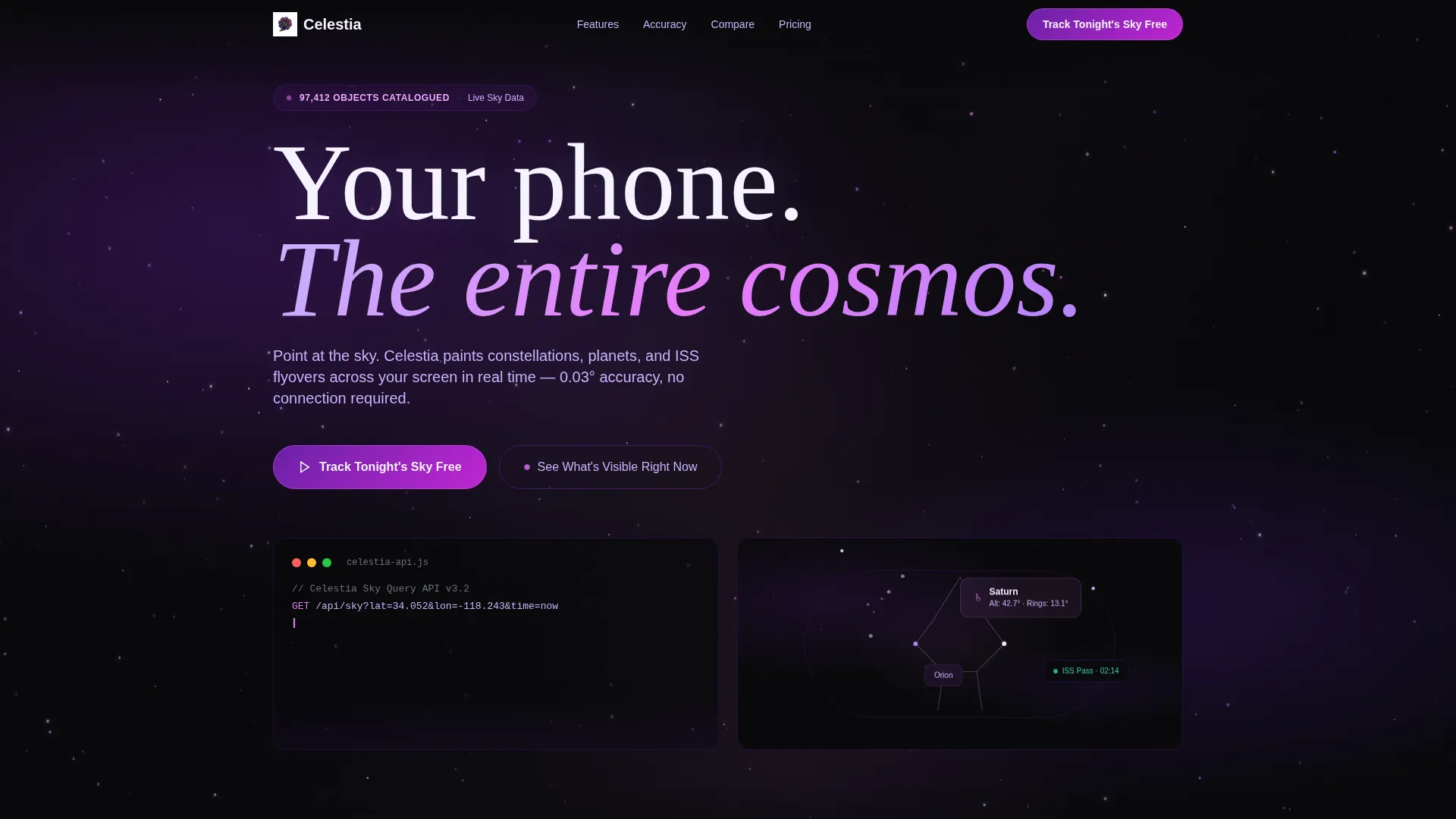
Celestia is an immersive astronomy landing page template built for star-gazing and sky-tracking apps. It opens with a live-typed API code snippet that transforms into a full 3D sky map, combines stats-first data cards with a competitor comparison table, and uses a void black and violet color system to create a night-sky atmosphere that feels as dramatic as it looks.
by Rocket studio
Quick summary
Celestia is a single-page, dashboard-style landing page template designed for astronomy and star-gazing apps. It leads with a live-typed code snippet that animates into a sky map, delivers oversized data stats on scroll, and anchors the middle of the page with a head-to-head competitor comparison grid. The visual identity draws entirely from deep space photography.
Who this template is for
This template is built for teams and founders who need to launch an astronomy or sky-tracking app with visual authority. It speaks directly to technically curious audiences while staying approachable for casual users.
- App developers and product marketers launching a star-gazing or astronomy mobile app
- Consumer tech startups that need a data-rich, visually dramatic single-page presence
- Astronomy educators or platform teams promoting a sky-charting tool to a broad audience
What problem this template solves
Most app landing pages either oversimplify the product or bury its best features in dense copy. For an astronomy app packed with real data, that is a missed opportunity. Celestia solves the trust and comprehension gap that sits between a curious visitor and an actual download.
- Visitors need to feel the app's depth before they commit to installing it
- Generic landing page templates cannot convey the technical precision that astronomy users expect
- Competitors are often left unnamed, making it hard for visitors to see why this app wins
What you get with this template
You get a fully structured, single-page layout that guides visitors from first impression to conversion without losing them in between. Every section is purposeful, motion-driven, and tuned for an audience that values accuracy as much as aesthetics.
- A live-typed API code snippet header that transitions into a 3D sky map viewport fill
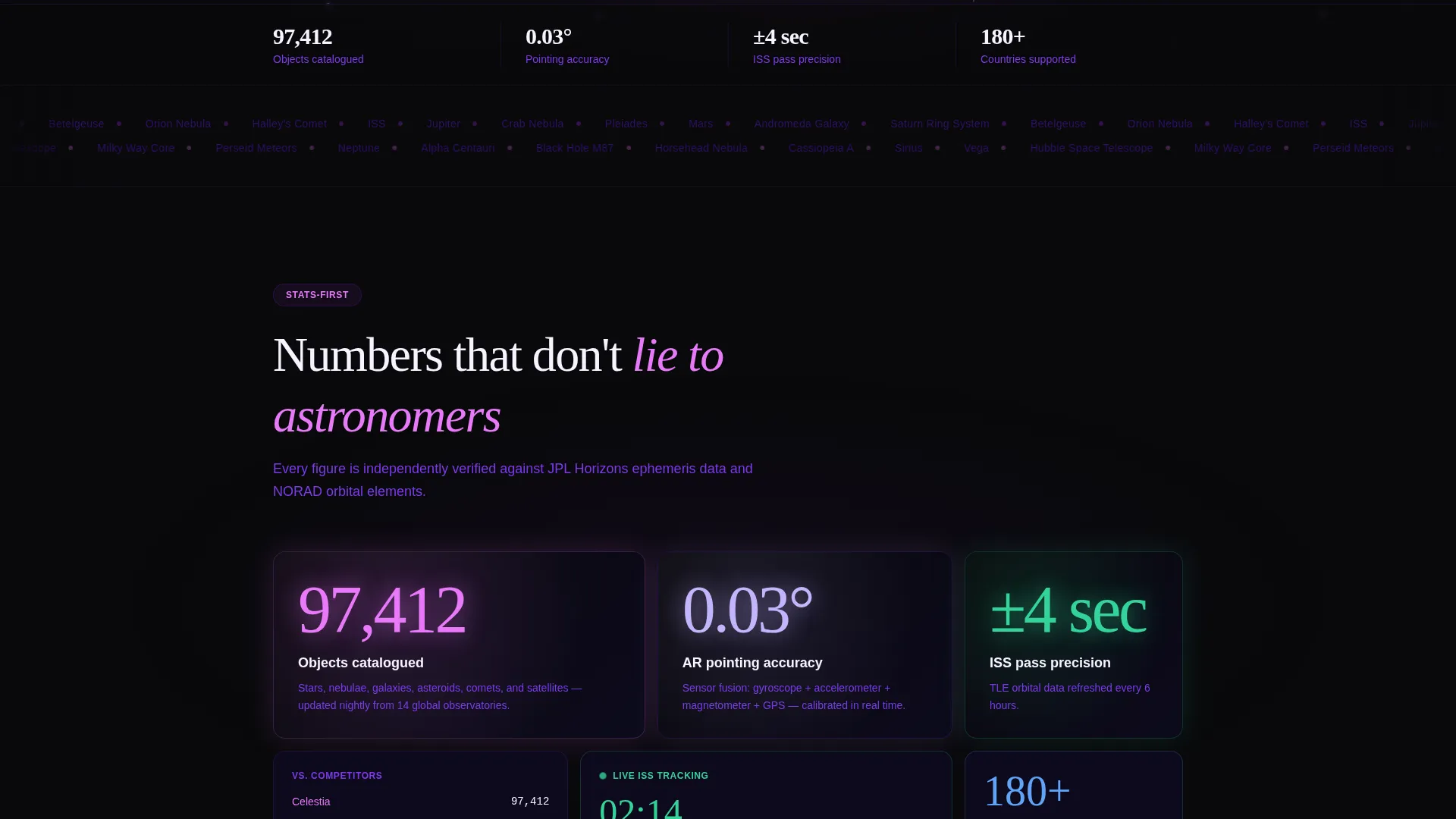
- Stats-first data grid cards showing oversized metrics with contextual comparison tiles
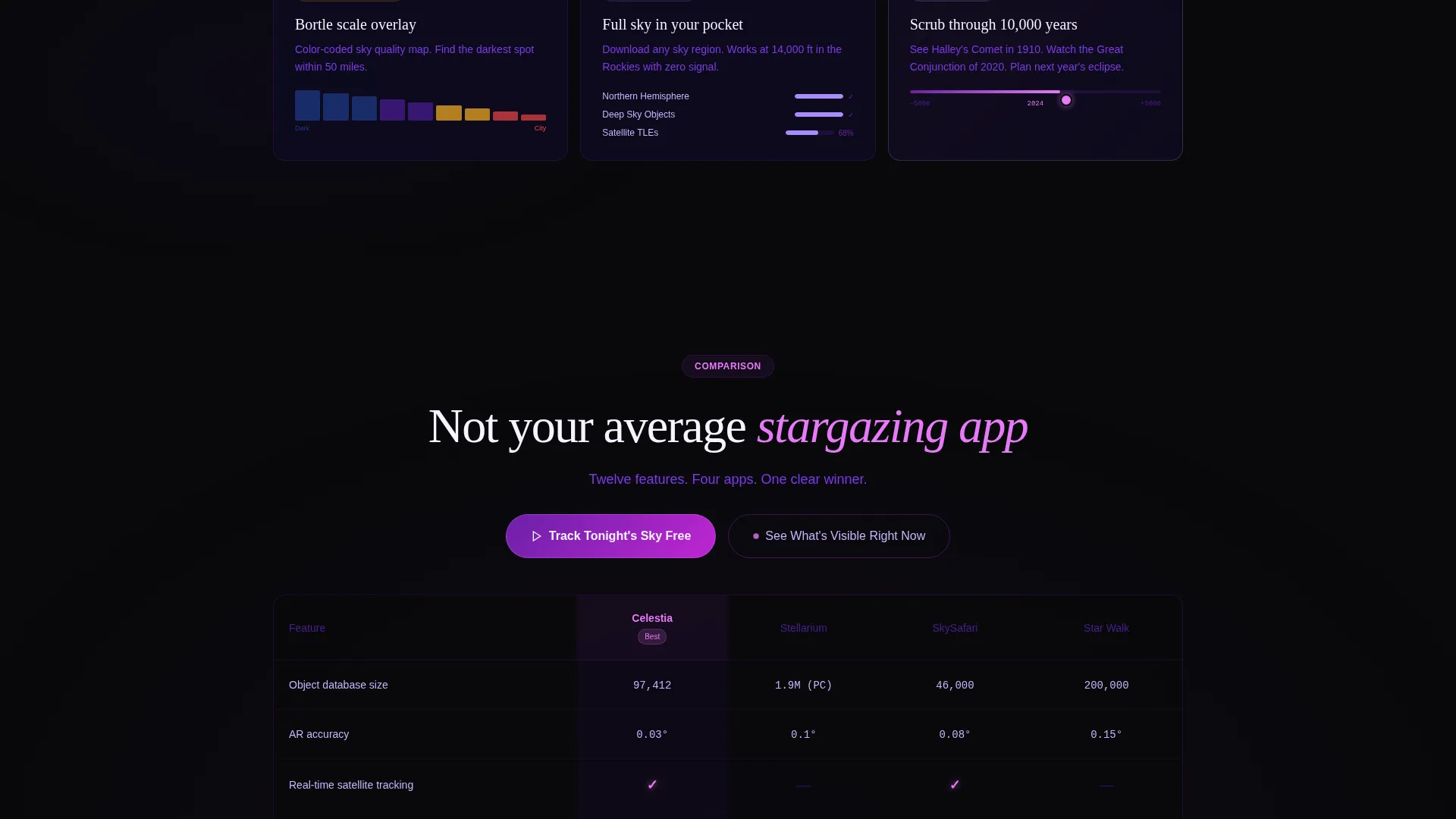
- A twelve-row competitor comparison table with glowing accent checkmarks and void black gap indicators
- Dual call-to-action placements and a secondary GPS-based live sky preview path
Feature list
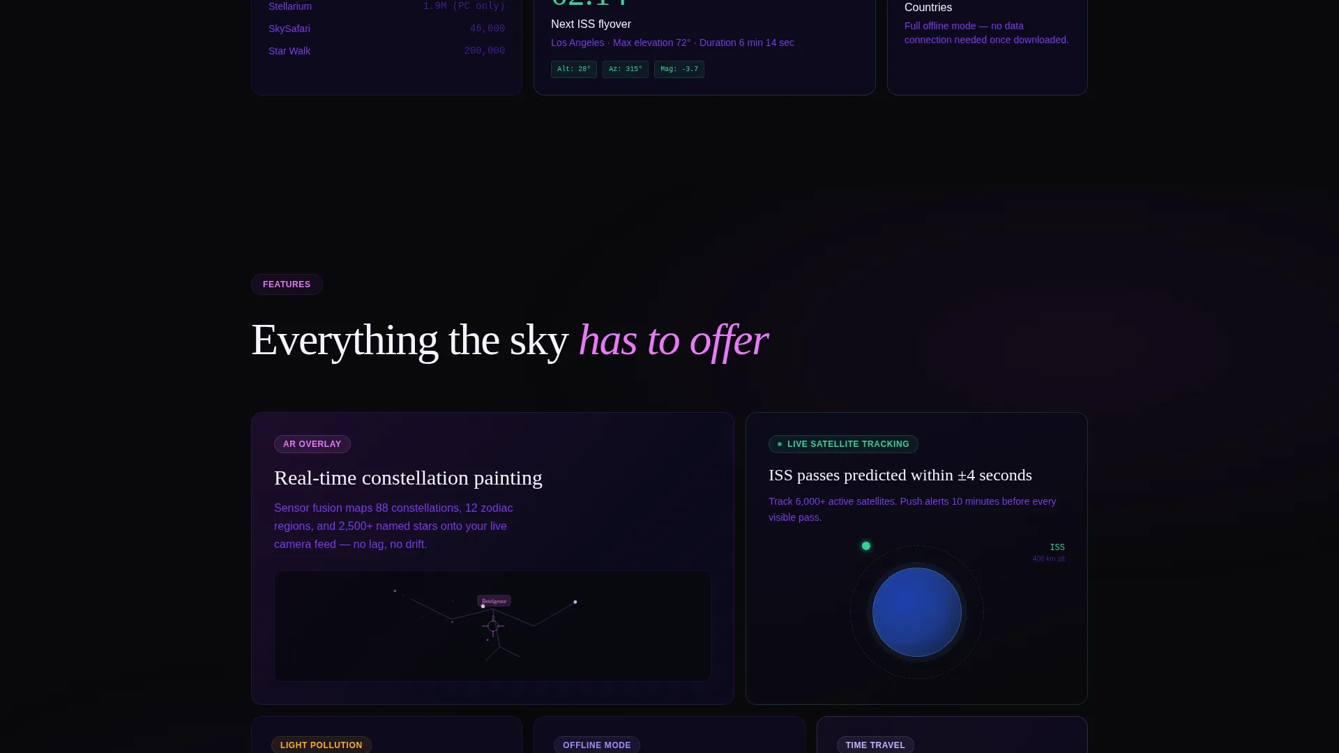
This template includes the following built-in layout and interaction features, all sourced directly from the design brief.
Live-Typed API Code Snippet Header
The header opens with a syntax-highlighted code block rendered in violet and pink against void black. It auto-types line by line, cursor blinking, before the returned JSON data explodes outward into a full 3D sky map that fills the viewport. The transition runs in approximately three seconds.
Stats-First Data Grid Cards
Every major scroll stop opens with an oversized metric rendered in pale starlight numerals. Stats like "97,412 objects catalogued," "0.03° pointing accuracy," and "ISS pass predictions within plus or minus 4 seconds" appear before any explanatory copy. Contextual comparison tiles slide in from the edges using Dynamic Motion easing.
Competitor Comparison Table
A persistent split-view table anchors the middle of the page, comparing the app against three named competitors across twelve feature rows. Rows include object database size, augmented reality accuracy, offline mode, real-time satellite tracking, and light-pollution overlay. Checkmarks glow in ionized pink; gaps display void black dashes.
Dual Call-to-Action Layout
The primary call to action, "Track Tonight's Sky Free," appears both above and below the comparison table to capture visitors at different scroll depths. A secondary path, "See What's Visible Right Now," triggers a live location-based sky preview using only a GPS permission prompt.
Dynamic Motion Scroll System
The scroll behavior is engineered to feel like a telescope tracking across the sky. Each section snaps into focus, holds for reading, then releases into the next with acceleration easing. Motion is directional and intentional, not decorative.
Void and Violet Color System
The palette uses absolute void black, deep nebula violet, ionized hydrogen pink, and pale starlight for text and labels. Violet gradients layer behind the black to prevent flatness, and accent elements pulse faintly to reinforce the live, variable-star feel of the interface.
Page sections overview
| Section | Purpose |
|---|---|
| API Code Header | Opens with live-typed sky-query code that animates into a 3D sky map |
| Hero Stats Card | Delivers the first oversized metric with contextual comparison tiles |
| Object Database Stat | Highlights the 97,412 catalogued objects data point |
| Accuracy Data Card | Showcases the 0.03-degree pointing accuracy stat |
| ISS Prediction Stat | Features the ISS flyover prediction accuracy figure |
| Comparison Grid | Pits the app against three competitors across twelve feature rows |
| Primary call to action Block (Above) | Places "Track Tonight's Sky Free" before the comparison table |
| Primary call to action Block (Below) | Repeats the primary call to action after the comparison table |
| Live Sky Preview | Invites GPS-based sky preview via "See What's Visible Right Now" |
Design & branding system
The visual identity is built around a Dynamic Motion theme with a Void and Violet color system. Every design choice references long-exposure astrophotography, where the black is never truly empty and light sources pulse with color.
- Color palette: absolute void black (#09090B), deep nebula violet (#6B21A8), ionized hydrogen pink (#E879F9), and pale starlight (#F5F3FF) for data labels and body text
- Layered violet gradients prevent the dark background from feeling flat, and accent elements carry a subtle pulse animation inspired by variable stars
- Typography uses oversized pale starlight numerals for stats and high-contrast text placement to keep data legible against the deep background
Mobile & speed optimization
The template is structured to maintain its immersive atmosphere across screen sizes without losing the scroll-snap behavior or data grid readability that make it effective on desktop.
- The snap-scroll system and Dynamic Motion easing are designed to translate cleanly to touch-based scrolling on mobile devices
- Data grid cards and the competitor comparison table are laid out to reflow for narrower viewports without breaking visual hierarchy
- The code snippet header and viewport-filling sky map are built to adapt to portrait and landscape orientations
How this template helps you convert
Celestia is designed to move hesitant visitors toward a download by making the app's value undeniably visible before asking for any commitment.
- The stats-first layout builds credibility on every scroll stop, giving visitors concrete accuracy and database figures before they encounter a single marketing claim.
- The competitor comparison table removes ambiguity by showing exactly where the app leads, using visual contrast to make advantages immediately obvious.
- The dual call-to-action structure and the GPS-based live preview path capture visitors at two different intent levels, converting curiosity before requiring a full download decision.
Other information about this template
This template is categorized under Technology, Consumer App and Platform, with a niche focus on star-gazing and astronomy apps. It is a strong fit for teams positioning a sky-charting or space-data product in a competitive mobile app market.
- The template style is Dashboard and Data Grid, making it suitable for any data-rich consumer app that needs to display precision metrics with visual impact
- The header concept, a live-typed code snippet, is a credibility signal aimed at technically literate users such as college students, amateur astronomers, and developers
- The landing-page direction is Comparison and Versus, which suits launch campaigns where differentiating from established competitors is a primary goal
- The page is well-suited for promoting star-gazing apps, constellation tracking tools, satellite pass predictors, and related astronomy software products
Theme
Dynamic Motion
Creative direction
Stats-First Impact
Color system
Void & Violet
Style
Dashboard/Data Grid
Direction
Comparison/Versus
Page Sections
Live-typed API Code Snippet Header
Stats-first Data Grid Cards
Twelve-row Competitor Comparison Table
Dual Call-to-action Placement
Dynamic Motion Scroll System
Void and Violet Visual Identity
Related questions
What kind of app is this template designed for?
Can I customize the competitor names in the comparison table?
Does the live sky preview section require backend integration?
Can the stats and data figures in the cards be updated?
Is this template suitable for a dark-themed brand outside of astronomy?



