Celestia - Powerful Astronomy Landing Page Template
Celestia is a white-label astronomy landing page template built for planetariums, science museums, outdoor brands, and edtech platforms. It showcases three partner tiers in a structured feature comparison table, drives demo sign-ups with a two-step branded preview flow, and wraps everything in a deep midnight-blue observatory aesthetic that feels alive the moment visitors land.
by Rocket studio
Quick summary
Celestia is a single-page comparison table landing page template designed to sell white-label astronomy app partnerships. It presents three pricing tiers side by side, proves the platform is live with real-time sky data counters, and pushes visitors toward a branded demo in under sixty seconds. The visual tone mirrors a professional observatory control screen at 2 a.m.
Who this template is for
This template is built for organizations that want to offer a branded star-gazing app experience without building one from scratch. It speaks directly to decision-makers who need to show results quickly.
- Planetarium directors preparing a companion app before a new exhibit opens
- Outdoor recreation and camping brands bundling night-sky experiences into subscriptions
- Edtech companies adding astronomy modules to K-12 science curricula
What problem this template solves
Many astronomy platform providers struggle to communicate the depth of white-label flexibility to potential partners. A generic product page does not show how the app will actually look under a partner's logo. This template closes that gap visually and functionally.
- Partners cannot picture the product as their own without seeing a live branded preview
- Feature comparisons buried in PDFs or emails lose deals to competitors who show more clearly
- Enterprise leads require a separate capture path that a standard sign-up form cannot handle
What you get with this template
This template delivers a complete, conversion-focused landing page structure ready to customize. Every section serves a specific role in moving a prospective partner from curiosity to committed demo request.
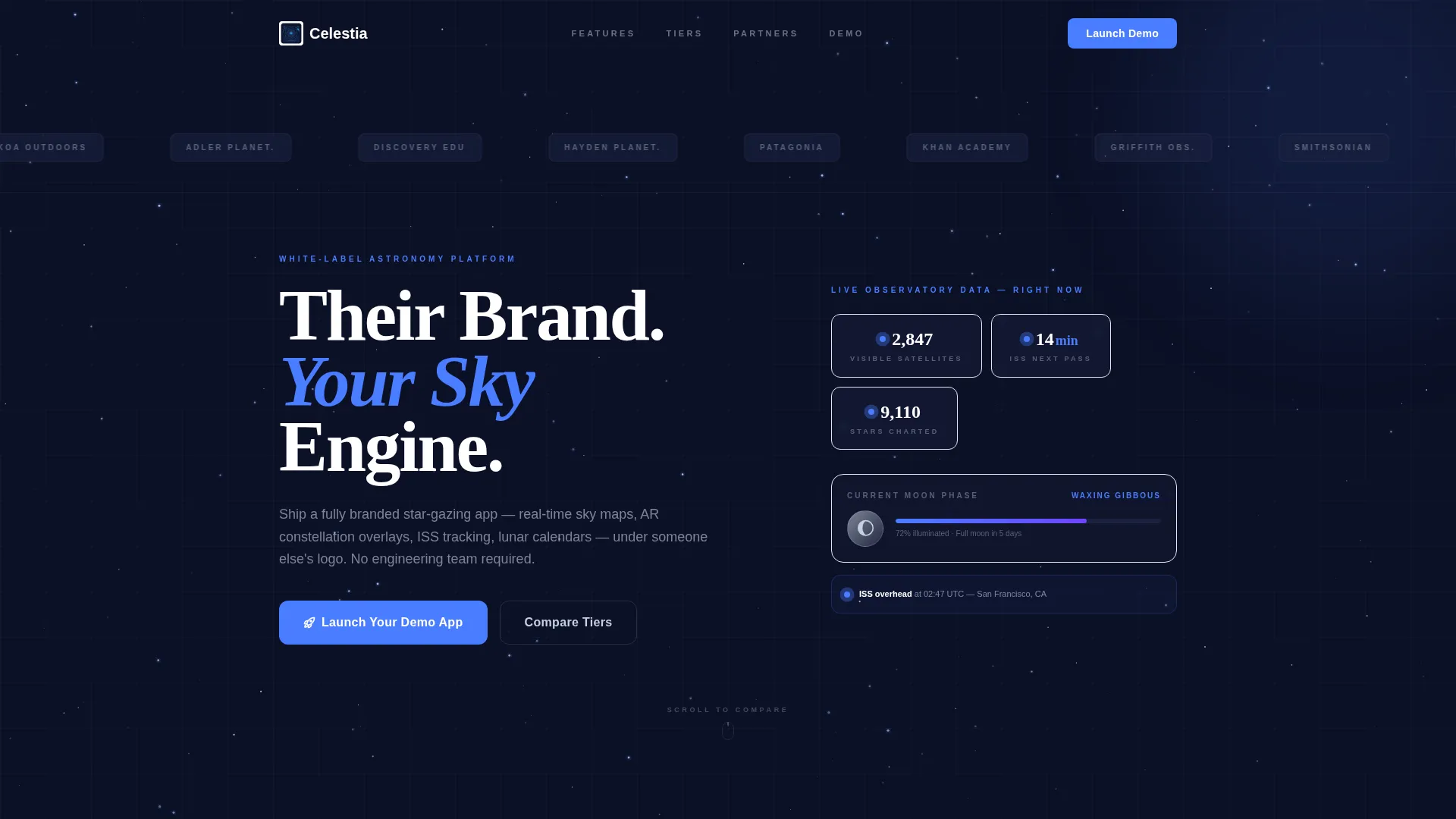
- A scrolling logo bar header showing recognizable partner brand categories in celestial silver monochrome
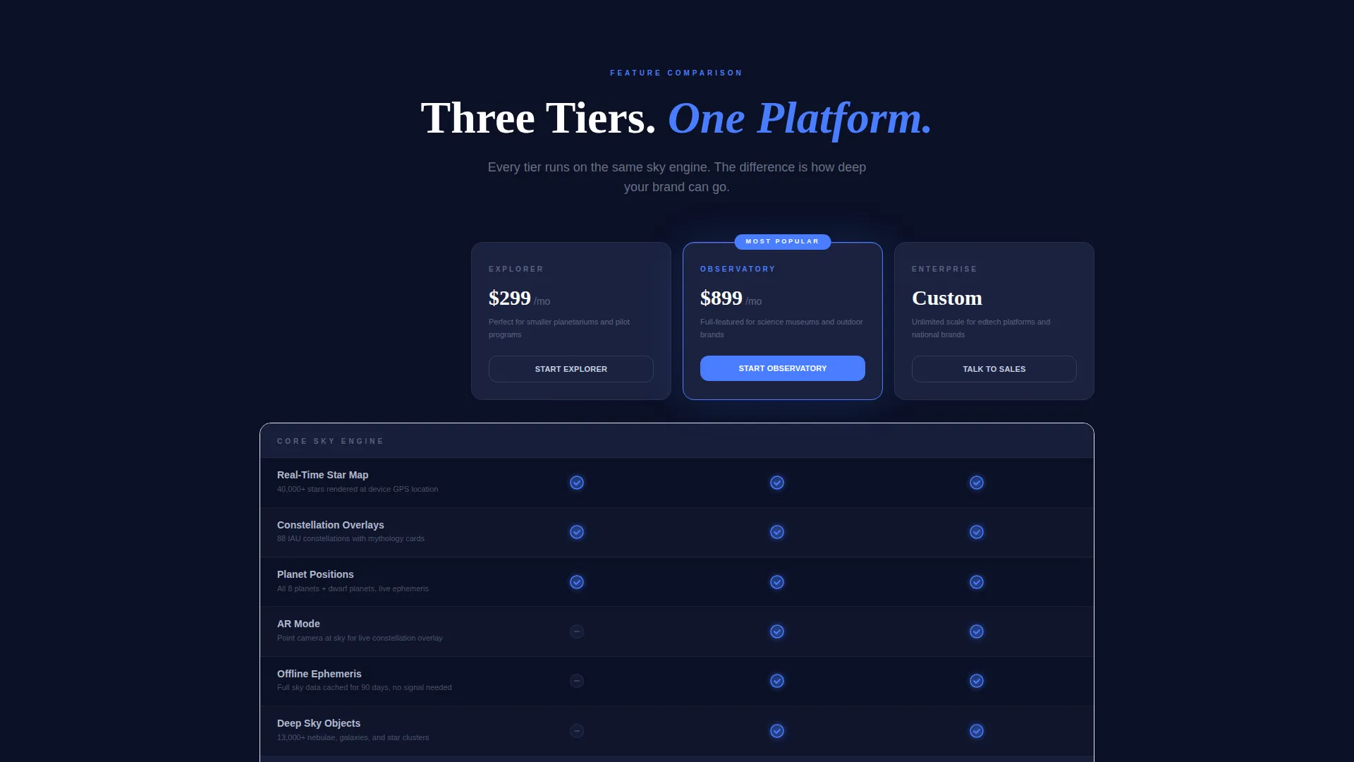
- A three-tier feature matrix comparing Explorer, Observatory, and Enterprise capabilities row by row
- A pinned "Launch Your Demo App" call-to-action button on mobile with a two-step branded preview flow
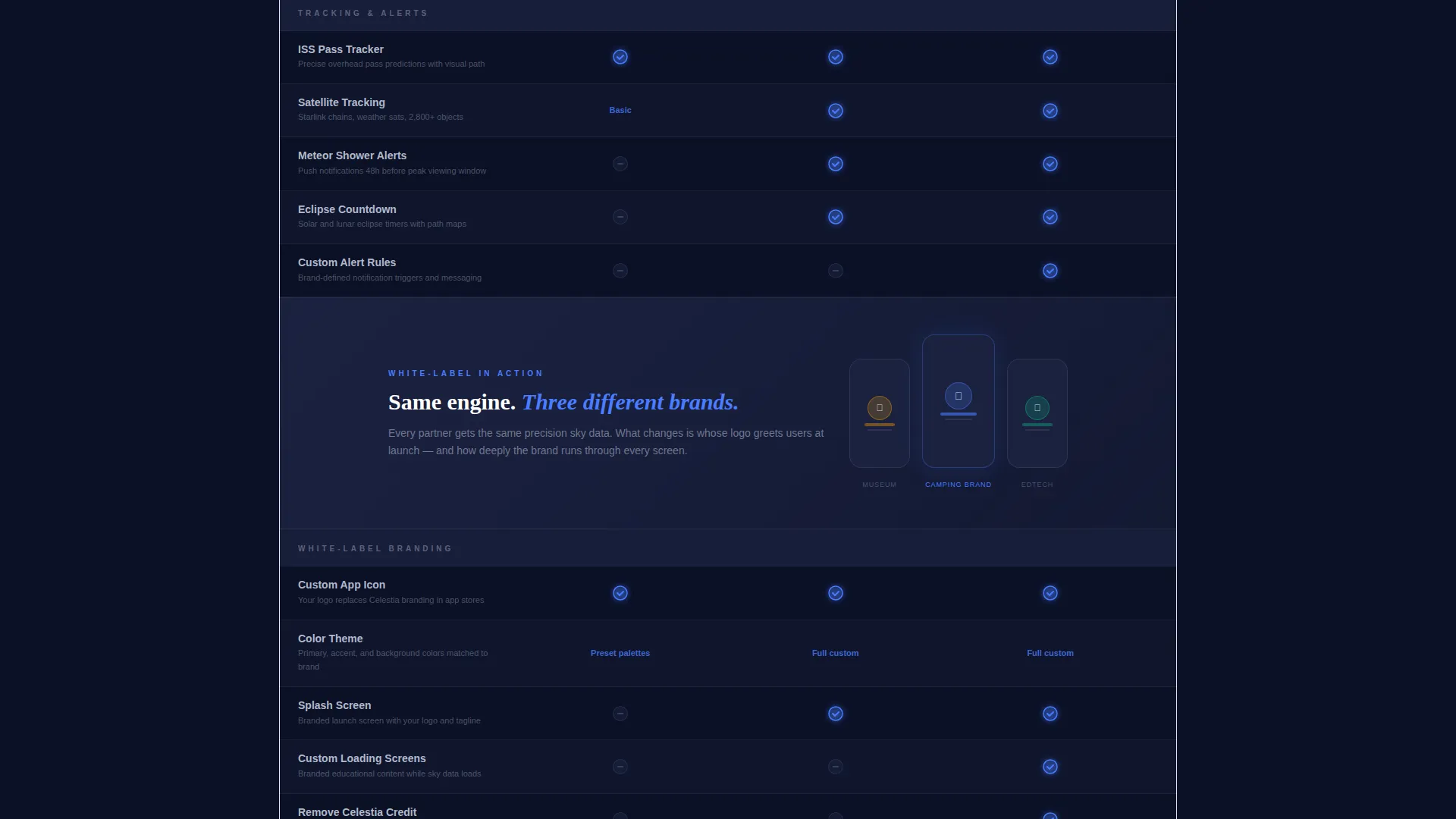
- Full-width breakout panels showing the app running under different partner brand identities
- A secondary enterprise lead capture form with company name, estimated user base, and launch timeline fields
Feature list
This landing page template comes with purpose-built sections and interactive components that reflect the astronomy platform's actual depth.
Live Sky Data Dashboard Strip
A live-updating counter sits directly below the hero headline. It displays tonight's visible satellite count, current moon phase, and the next International Space Station pass time. This proves the platform is running right now, not a static mockup.
Three-Tier Comparison Table
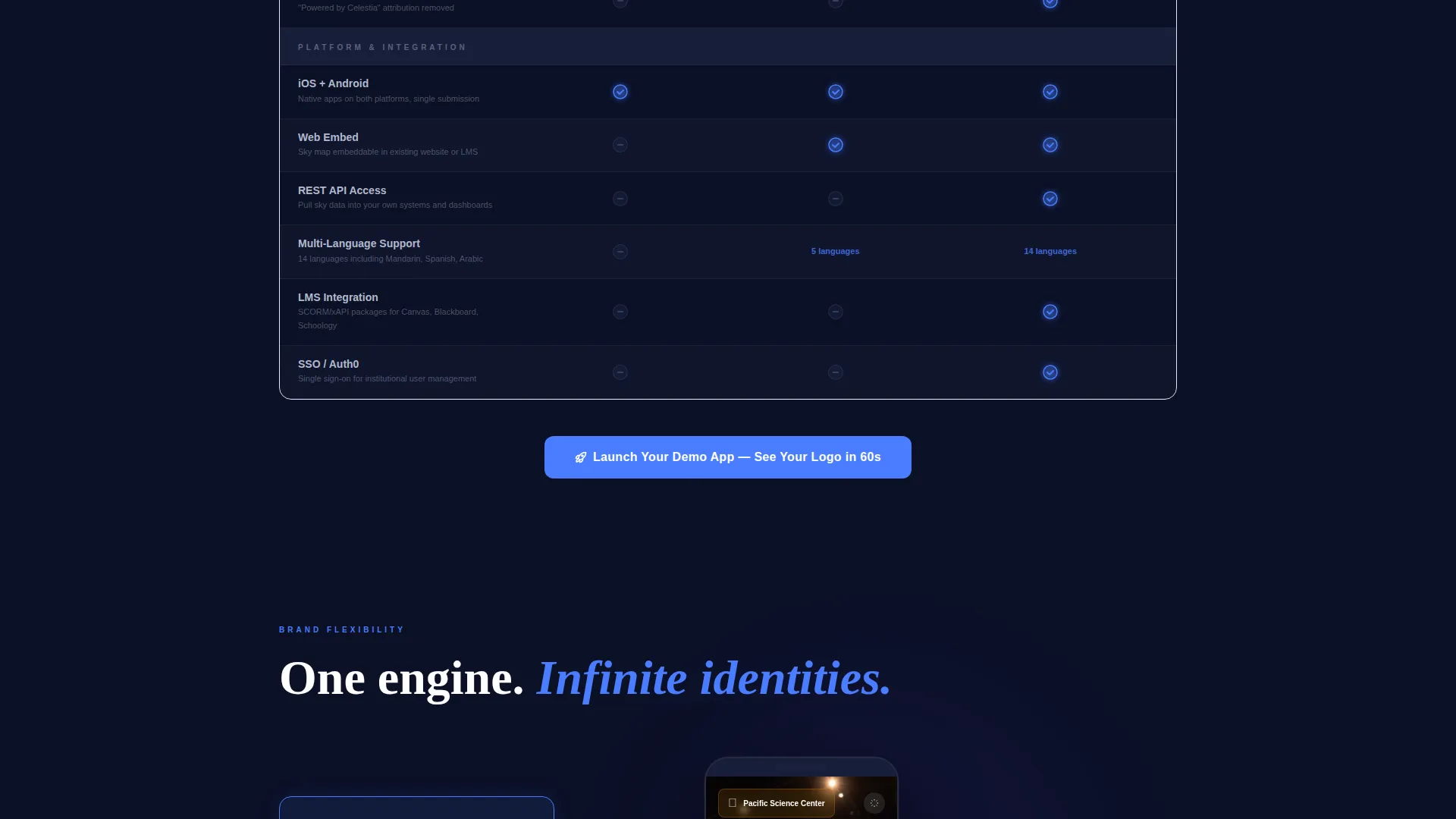
The core of the page is a structured side-by-side feature matrix. Explorer, Observatory, and Enterprise tiers sit in columns while capabilities such as the real-time star map, augmented reality constellation overlay, offline ephemeris data, push notifications for meteor showers, custom branding depth, API access, and multi-language support fill the rows. Checkmarks pulse in pulsar blue; unavailable features appear in muted charcoal.
Branded Demo Two-Step Flow
The primary call-to-action opens a two-step partner onboarding flow. The partner enters their brand name and uploads a logo in step one. Step two delivers an instant branded preview link they can open on their phone, showing their own logo on a working sky map in under sixty seconds.
Full-Width Breakout Panels
Between table sections, full-width visual panels show the app running as a museum-branded version on one device and a camping-brand version on another. These panels build the white-label case visually rather than relying on copy alone.
Enterprise Lead Capture Form
A secondary conversion path labeled "Talk to Our Integrations Team" captures high-intent enterprise visitors. The form collects company name, an estimated user base from a dropdown, and a launch timeline selection, giving the sales team qualified context before the first call.
Persistent Mobile Call-to-Action
On mobile viewports, the "Launch Your Demo App" button stays pinned to the bottom of the screen throughout the scroll. It also repeats after each comparison section on all screen sizes, keeping the conversion action always within reach.
Page sections overview
| Section | Purpose |
|---|---|
| Logo Bar Header | Establishes credibility with recognizable partner brand categories scrolling in monochrome |
| Hero Headline Strip | Delivers the core value proposition and brand positioning statement |
| Live Data Counter | Proves the platform is active with real-time sky, satellite, and moon data |
| Tier Comparison Table | Compares Explorer, Observatory, and Enterprise features row by row |
| Breakout Visual Panel | Shows white-label flexibility with museum and camping brand device mockups |
| Demo call to action Block | Drives partner sign-ups with the two-step branded preview flow |
| Enterprise Lead Form | Captures qualified enterprise leads with contextual qualification fields |
| Pinned Mobile call to action | Keeps the primary action visible throughout the entire scroll on mobile |
Design & branding system
The visual identity follows a Dashboard Pro theme built around a Midnight Blue color system. Every color choice deliberately mirrors a professional observatory control environment, where darkness protects night vision and every glowing element earns its place.
- Deep void navy (#0B1026) for the primary background, telescope-barrel charcoal (#1B2240) for card surfaces and table rows, and celestial silver (#C8D0E0) for body text and grid lines
- Pulsar blue (#4A7DFF) powers all interactive accents, toggle states, and call-to-action buttons, while nebula violet (#6E44FF) appears exclusively on hover states and active tier highlights
- A clean sans-serif typeface carries the headline "Their Brand. Your Sky Engine." with all logo bar assets rendered in monochrome celestial silver against the void-navy background
Mobile & speed optimization
The template is structured to deliver a focused experience on mobile devices without losing the visual density that makes the feature matrix useful on desktop.
- The primary call-to-action button pins to the bottom of the mobile viewport and stays visible throughout the full page scroll
- The comparison table layout adapts so tier columns remain readable on smaller screens without forcing horizontal scrolling
- Full-width breakout panels scale cleanly to fill the viewport, keeping the device mockups and brand examples legible at any size
How this template helps you convert
Every design and layout decision in this template pushes a prospective partner toward one clear action: requesting a branded demo. The page earns that click rather than demanding it.
- The live sky data counter at the top of the page removes skepticism immediately. Visitors see real numbers updating in real time, which signals that the platform is production-ready, not a concept.
- The three-tier comparison table builds urgency by framing the decision as a competitive one. The scroll communicates that other organizations in the same category are already using this platform, making inaction feel costly.
- The two-step branded demo flow lowers the barrier to commitment. Entering a brand name and uploading a logo takes seconds, and receiving a working preview link keeps the promise tangible and immediate.
Other information about this template
This template is categorized under Technology, specifically the Consumer App and Platform subcategory, targeting the white-label star-gazing and astronomy app niche. It is a strong fit for organizations evaluating partner platform options and comparing astronomy app providers before committing.
- The Feature Matrix creative direction and Comparison Table template style make this layout well suited for any SaaS or platform product that sells through tiered partnership agreements
- The header Logo Bar concept and App Download landing page direction together create a trust-then-convert flow that works for both inbound discovery and direct outreach campaigns
- The Dashboard Pro theme and Midnight Blue color system are cohesive enough to carry the design without modification, while remaining easy to adapt with a partner's own brand palette during white-label setup
Theme
Dashboard Pro
Creative direction
Feature Matrix
Color system
Midnight Blue
Style
Comparison Table
Direction
App Download
Page Sections
Three-tier Feature Comparison Table
Live Sky Data Counter
Two-step Branded Demo Flow
Full-width Breakout Panels
Persistent Mobile Call-to-action Button
Enterprise Lead Capture Form
Related questions
Can I customize the partner tiers and feature rows in the comparison table?
Does the two-step demo flow require a developer to set up?
Is this template suitable for a product with only one pricing tier?
How does the enterprise lead form differ from the main demo flow?
Can the live sky data counter display real figures?



