Census - Powerful Eldercare Landing Page Template
Census is a dark-themed, card-grid landing page template built for elder care management software. It presents resident records, medication schedules, and compliance data through a dramatic Data Command interface. Designed for nursing home administrators and regional directors, the single-page layout stacks visual proof methodically, guiding every visitor toward a personalized demo without a single form.
by Rocket studio
Quick summary
Census is a single-page, card-grid landing page template crafted for elder care management software. It uses a Void & Violet color system and a Data Command visual theme to present operational data with quiet authority. The layout follows an Industry Report structure, building a methodical case from daily pain points to compliance risk, and ends with a click-through to a personalized demo.
Who this template is for
This template speaks directly to people managing complex, high-stakes elder care operations. It is not built for general healthcare marketing. It is built for professionals who already live inside spreadsheets and audit checklists every day.
- Nursing home administrators managing state audit paperwork and documentation compliance
- Regional directors overseeing multiple facilities from a single operational desk
- Clinical coordinators tracking fall incidents, staffing ratios, and medication schedules across systems
What problem this template solves
Elder care facilities lose compliance battles not because staff are careless, but because critical data lives in too many places at once. A landing page that looks generic fails to earn trust from a technically literate, time-pressured audience. Census solves both problems together.
- Scattered resident records, medication logs, and compliance filings make audits slow and error-prone
- Generic software marketing pages fail to resonate with administrators who need proof, not promises
- No single visual presentation communicates the depth and urgency of elder care operational control
What you get with this template
You get a fully structured, single-page layout that leads visitors from a gripping data-driven header through escalating evidence sections, and delivers them to a conversion point that feels earned. Every section is purposeful and designed to build trust progressively.
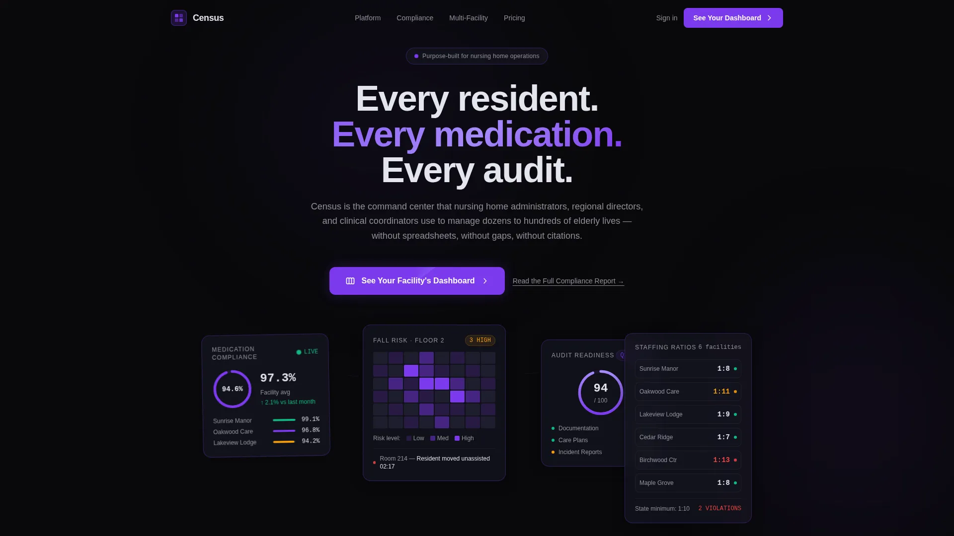
- A dramatic Dark Glass Panels header with live-data-style user interface cards showing medication compliance, fall-risk maps, audit scores, and staffing ratios
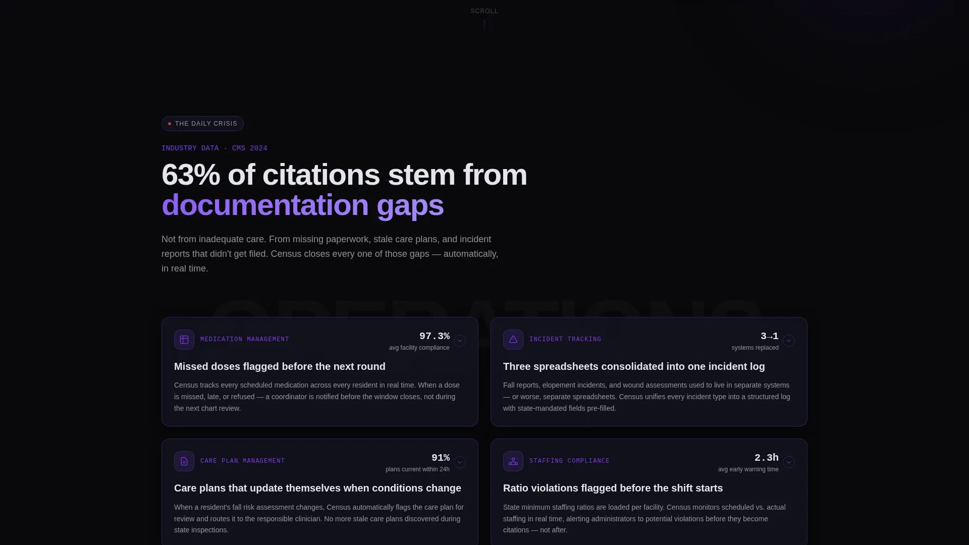
- Modular card-grid sections each opening with a bold industry statistic, followed by the product module that addresses it
- A persistent bottom bar carrying the primary call to action, plus a secondary text link for research-phase visitors
Feature list
This template comes with a set of tightly integrated design and layout decisions drawn directly from the source brief. Each feature serves the specific needs of an elder care software audience.
Dark Glass Panel Header
The header replaces stock imagery with a grid of translucent, frosted-glass user interface cards. Each card displays a different live-data fragment: a medication compliance percentage, a fall-risk heat map, an audit-readiness score with a violet progress ring, and a staffing ratio ticker. Cards are layered at slightly different depth levels, with a soft violet glow bleeding between the seams.
Modular Card Grid Layout
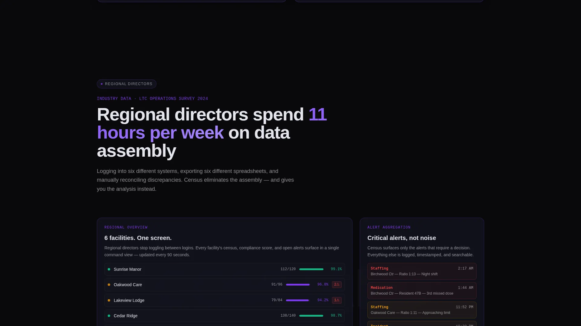
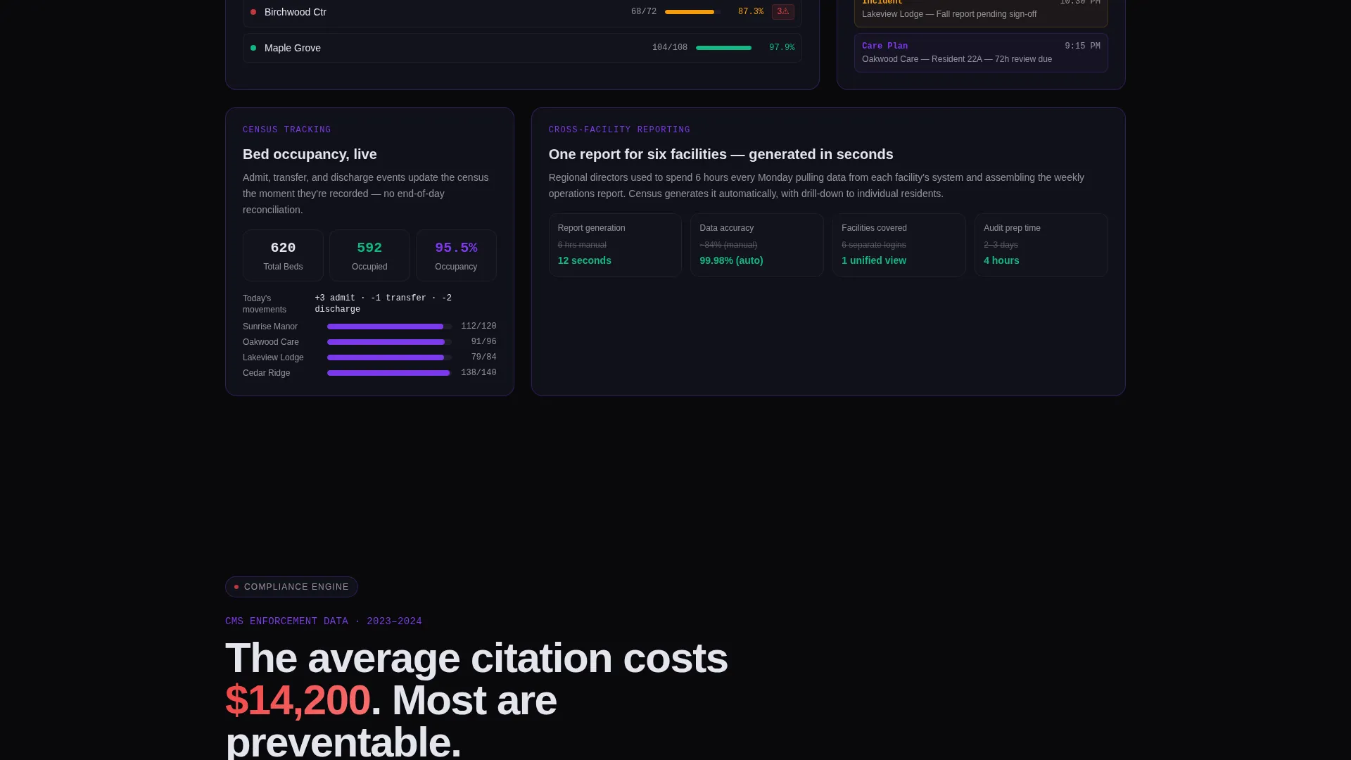
The page body is built from modular card-grid sections. Each section opens with a bold, real industry statistic, then presents the corresponding product module. Cards can be clicked to expand, revealing deeper feature screenshots and micro-case studies. The rhythm escalates from daily operational problems through quarterly compliance challenges to annual liability exposure.
Persistent Click-Through Bottom Bar
A bottom bar is fixed to the page at all times. It carries the primary call to action "See Your Facility's Dashboard," which leads visitors to a personalized demo environment. No form is required on the page. A secondary text link, "Read the Full Compliance Report," captures research-phase visitors via a gated PDF that collects only an email address.
Void & Violet Color System
The entire template is built on absolute void black backgrounds, deep graphite floating cards, electric violet active states and data highlights, and cool clinical white typography. The palette is designed to feel like the inside of a server rack lit by status indicators, giving every screen element a sense of live operational readiness.
Industry Report Scroll Structure
Scrolling through the page feels like paging through a definitive annual report on elder care operations. Each section deposits another data point into the visitor's mental model. The cumulative effect makes the cost of not converting feel genuinely reckless, without using manipulative language.
High-Contrast Typography System
All body copy and data labels use cool clinical white at high contrast against void and graphite backgrounds. This mirrors terminal readout aesthetics. The result is a page that is both visually distinctive and easy to read under real-world conditions, including low-light environments.
Page sections overview
| Section | Purpose |
|---|---|
| Dark Glass Header | Displays live-data user interface cards establishing immediate product credibility |
| Statistics Hook Row | Opens with bold industry pain statistics to earn attention fast |
| Resident Records Module | Presents the centralized resident data management feature card grid |
| Medication Schedule Module | Highlights medication compliance tracking with expandable cards |
| Fall Incident Tracker | Showcases fall-risk monitoring and incident documentation module |
| Compliance Filing Module | Addresses audit-readiness with documentation gap evidence and solution cards |
| Staffing Ratio Module | Covers staffing oversight with real-time ratio data card grid |
| Liability Exposure Section | Escalates from operational to annual legal risk, building urgency |
| Persistent call to action Bar | Anchors the demo click-through at every scroll position on the page |
| Secondary Capture Link | Offers gated compliance report PDF for research-phase visitors |
Design & branding system
The visual identity is built around a Data Command theme. Every color, typography, and layout decision reinforces the feeling of a quiet, authoritative control room where every system is being watched.
- Color palette: absolute void black (#09090B) for backgrounds, deep graphite (#161621) for floating cards, electric violet (#7C3AED) for active states and data highlights, and cool clinical white (#E4E4ED) for text and chart lines
- Card styling: graphite panels with subtle 1-pixel violet borders that brighten on hover, layered at varying depth levels with a soft violet glow between seams
- Typography: high-contrast white terminal-style readouts throughout, with no decorative imagery or stock photography anywhere on the page
Mobile & speed optimization
The modular card-grid structure is inherently flexible, allowing each section to reflow cleanly across viewport sizes. The design avoids heavy image assets by using user interface-driven visuals rather than photography, keeping the page lean by default.
- Card grid modules collapse into single-column stacks on smaller screens without losing hierarchy or data legibility
- The persistent bottom bar remains accessible at all viewport widths, keeping the primary call to action always reachable
- Dark backgrounds and vector-style data visuals reduce reliance on large raster image files across the layout
How this template helps you convert
Census is structured as a click-through funnel, not a form-gated barrier. Conversion happens because the page earns it section by section, not because it demands information upfront.
- The Dark Glass Panels header immediately signals product sophistication, filtering out casual visitors and capturing the attention of operations-focused decision makers who recognize what they are looking at
- Each card-grid section stacks a specific data point, industry statistic, and product response, building an evidence-based case that makes the demo click feel like a logical conclusion rather than a sales step
- The persistent "See Your Facility's Dashboard" bar ensures the primary call to action is never more than a glance away, while the secondary "Read the Full Compliance Report" link retains visitors who need more time before committing
Other information about this template
This template is designed for the elder care vertical SaaS market and pairs well with platforms building modular software for the long-term care industry. It is a strong fit for teams using modern no-code or low-code builders who need a visually distinctive, proof-driven landing page that stands apart from generic healthcare templates.
- The template style is Card Grid (Modular), making individual sections easy to reorder, replace, or expand as product features evolve
- The creative direction follows an Industry Report structure, giving the page editorial credibility that resonates with compliance-oriented buyers
- The landing page direction is Click-Through, meaning the page is intentionally form-free and built to qualify visitors through content before asking for any commitment
- The header concept, Dark Glass Panels, is a defined design pattern in this template and can be adapted with actual product screenshots or live dashboard previews during implementation
Theme
Data Command
Creative direction
Industry Report
Color system
Void & Violet
Style
Card Grid (Modular)
Direction
Click-Through
Page Sections
Dark Glass Panel Header
Modular Card Grid Sections
Persistent Click-through Call to Action Bar
Void & Violet Color System
Industry Report Scroll Structure
Related questions
Is this template suitable for a single elder care software product?
Does this landing page include any forms?
Can I adapt the card grid sections to match my own product modules?
Who is the ideal visitor this landing page is designed to convert?
Does the template use stock photography or hero images?



