AI for Senior Care Portfolio Website Template
Census is a Bold Brutalist landing page template built for senior living operators who need to show, not just tell, the revenue their portfolio is leaving on the table. It follows a hub-and-spoke anchor navigation structure, a cockpit-dark Slate and Sky color system, and a spec-sheet creative direction that earns trust through engineering transparency rather than lifestyle imagery.
by Rocket studio
Quick summary
Census is a single-page, anchor-nav landing page template for an algorithmic senior care pricing platform. The design reads like a cockpit instrument panel: dark matte surfaces, sky-blue data highlights, and blunt section labels that guide revenue directors, CFOs, and operations leaders straight to the numbers that matter.
Who this template is for
This template is built for regional senior living operators and the revenue-focused teams who support them. It speaks directly to people who already understand occupancy math and need a faster way to defend rate decisions.
- Revenue directors who compare occupancy and acuity data across multiple communities every morning
- CFOs and operations vice presidents who need hard evidence to justify rate increases to ownership groups
- Platform teams marketing an AI-driven pricing engine to operators running eight to forty communities
What problem this template solves
Senior living operators often know their memory-care or assisted living wings are underpriced, but they cannot prove it quickly enough to act. Spreadsheet-based rate reviews are slow, inconsistent, and hard to defend in a boardroom.
- The template positions a pricing platform as the authoritative source for per-bed rate recommendations, not another report to interpret
- It removes the friction between recognizing a revenue gap and taking the first step toward closing it
- The click-through flow routes qualified visitors to a preliminary revenue gap estimate before any sales conversation begins
What you get with this template
You get a fully structured, single-page landing experience organized around four blunt anchor sections: Ingest, Model, Price, and Monitor. Each section builds on the last, moving the visitor from awareness to conviction without detours.
- A persistent ghost-outlined call-to-action button in the sticky anchor nav and a full-width brutalist call-to-action block at page bottom
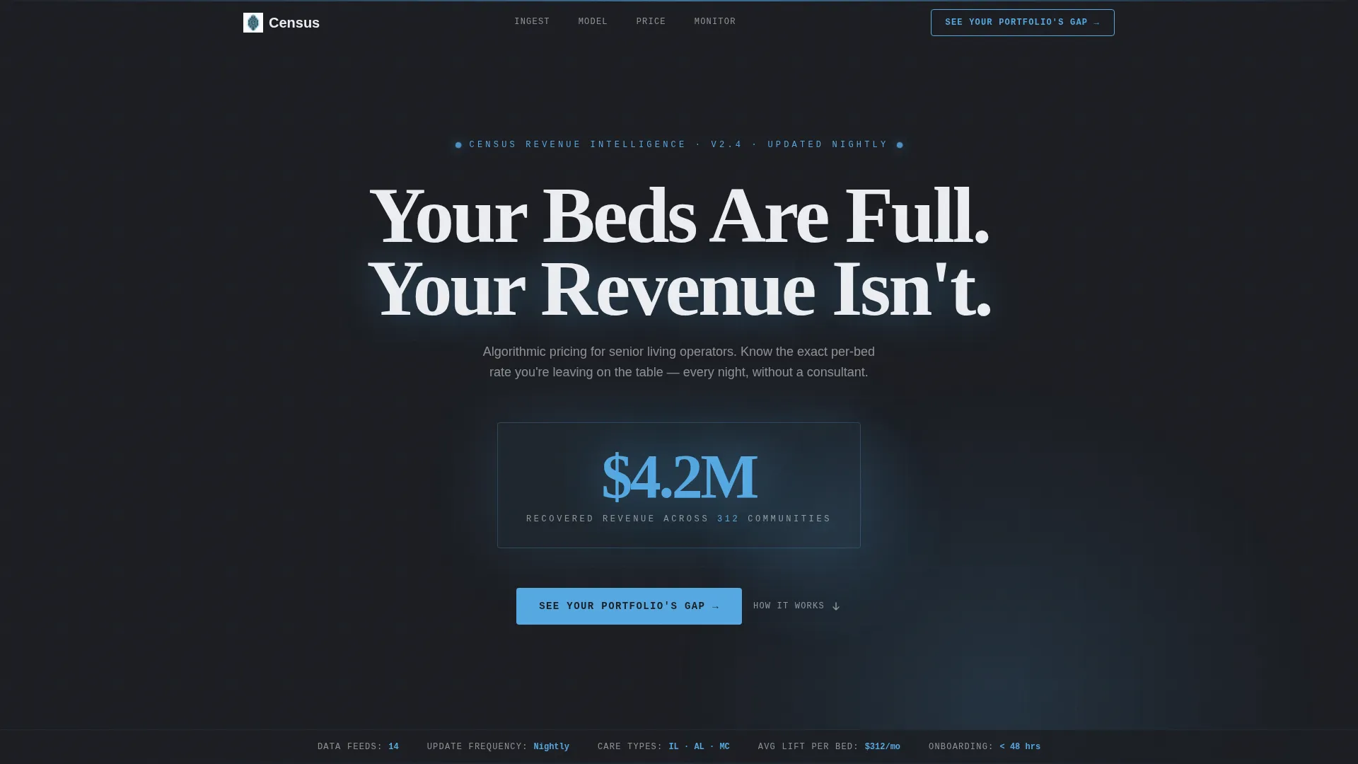
- A near-black full-bleed header with an animated number counter and a pulsing radial sky-blue glow
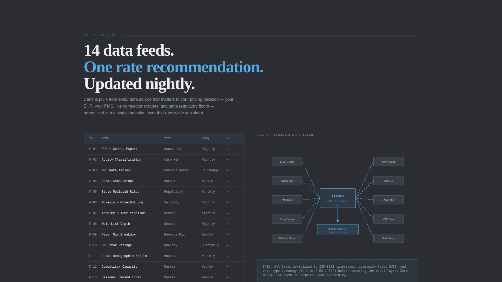
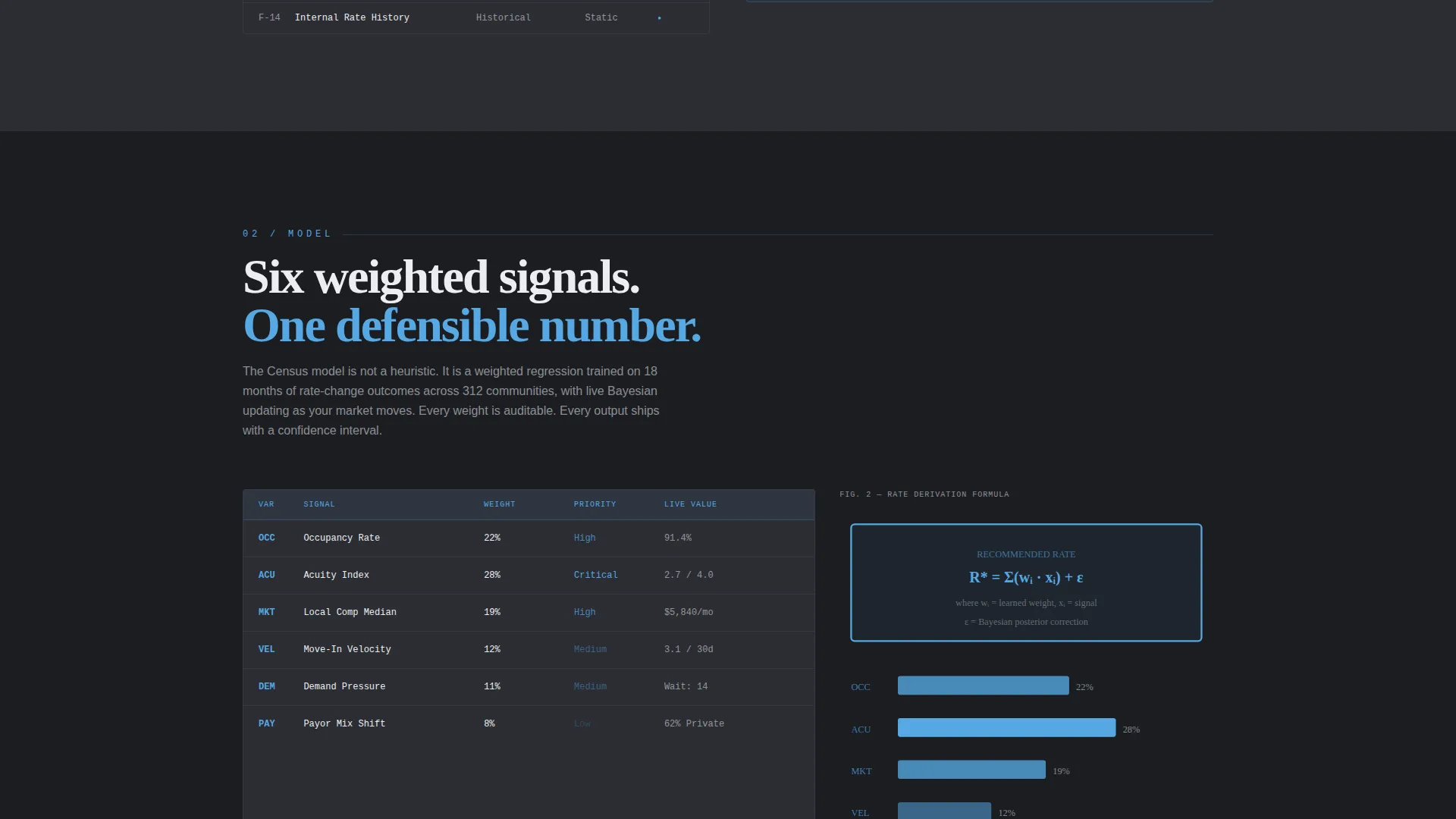
- Brutalist diagrams and schematic line art rendered in sky blue on slate, replacing stock photography with engineering-style visual proof
Feature list
This section covers the core built-in components and design capabilities included in the Census template.
Dark Full-Bleed Header with Animated Counter
The header fills the entire viewport in near-black (#1B1D22) with a centered brutalist slab headline. An animated number counter ticks upward to surface a recovered-revenue figure, and a radial sky-blue glow intensifies as the counter climbs, creating immediate momentum on page load.
Hub and Spoke Anchor Navigation
A sticky anchor nav links to four labeled spoke sections: Ingest, Model, Price, and Monitor. Each label is a single blunt word. The persistent ghost-outlined call-to-action button lives inside this nav, keeping the conversion path visible at every scroll depth.
Spec Sheet Section Structure
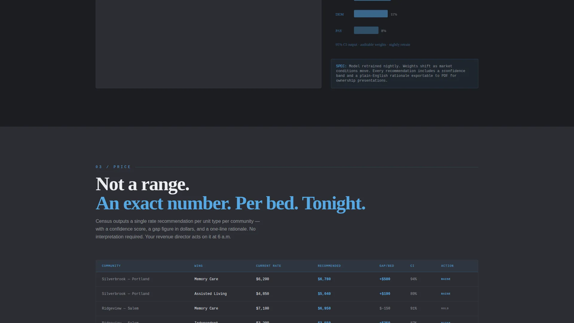
Each spoke section opens with a bold metric or specification line, followed by a tight explanatory paragraph and a brutalist schematic diagram. The format mirrors a technical data sheet, building credibility through granularity rather than marketing language.
Sky Blue Data Highlight System
The sky blue (#56A8E2) color is reserved exclusively for interactive elements and data highlights across the page. This creates a clear visual hierarchy: dark surfaces recede, and blue draws the eye to the numbers and actions that matter most.
Click-Through Qualification Flow
The call-to-action routes visitors to a qualification page, not a demo calendar. The qualification page asks for community count, average occupancy percentage, and primary care type (independent living, assisted living, or memory care) to generate a preliminary revenue gap estimate.
Full-Width Brutalist Footer Block
The page closes with a full-width call-to-action block styled in the same brutalist system as the rest of the page. It repeats the "See Your Portfolio's Gap" prompt in a format that feels conclusive, not decorative.
Page sections overview
| Section | Purpose |
|---|---|
| Full-Bleed Header | Opens with headline and animated revenue counter |
| Anchor Nav Bar | Persistent nav with ghost call-to-action button |
| Ingest Section | Shows data feed inputs and nightly update cadence |
| Model Section | Explains the algorithmic pricing model logic |
| Price Section | Surfaces per-bed rate recommendations and gap data |
| Monitor Section | Covers ongoing portfolio-level rate monitoring |
| Footer call to action Block | Full-width close with qualification click-through |
Design & branding system
The visual identity is Bold Brutalist with a Slate and Sky color system. Every surface is intentionally dark and matte, so the sky-blue accents carry full visual authority.
- Core palette: poured-concrete charcoal (#2B2D33), deep gunmetal (#3D4049), near-black header (#1B1D22), sky blue (#56A8E2) for interactive and data elements, and cold white (#ECEEF1) for typography
- Typography uses a heavy brutalist slab typeface for headlines, creating the density and authority of a printed spec sheet
- No lifestyle photography or stock imagery; all visual proof comes from schematic diagrams and data-forward layouts rendered in sky-blue lines on slate
Mobile & speed optimization
The template is structured for clean performance across screen sizes. The cockpit aesthetic translates naturally to mobile because the layout is already stripped of decorative imagery.
- The anchor nav collapses cleanly on smaller viewports without losing the persistent call-to-action button
- Section layouts use tight, column-based compositions that reflow predictably on tablet and mobile screens
- The absence of large photographic assets keeps the visual weight low and the page composition focused
How this template helps you convert
The Census template is engineered to move a skeptical senior care operator from curiosity to a qualifying click in a single scroll. Every structural decision supports that outcome.
- The animated counter in the header creates immediate proof of scale, giving the visitor a number to react to before they read a single line of body copy
- The spec-sheet section structure rewards the technically minded CFO or operations leader who needs granular evidence before committing to any next step
- The click-through call-to-action lowers commitment by promising a preliminary revenue gap estimate rather than a sales call, making the first conversion ask feel useful rather than intrusive
Other information about this template
This template is part of a broader library of AI-focused and senior care technology page designs. A few additional details worth knowing before you build.
- The template style is Hub and Spoke with Anchor Navigation, meaning each labeled section functions as a self-contained spoke that can be updated independently
- The creative direction is Spec Sheet, which means copy length is intentionally tight and every visual element carries a functional purpose
- The click-through destination asks three questions: community count, average occupancy percentage, and primary care type, keeping the qualification step fast and low-friction
- This template suits platforms in the senior care AI price optimization space where trust is built through data density, not brand familiarity
Theme
Bold Brutalist
Creative direction
Spec Sheet
Color system
Slate & Sky
Style
Hub & Spoke (Anchor Nav)
Direction
Click-Through
Page Sections
Animated Revenue Counter Header
Sticky Hub and Spoke Anchor Nav
Spec Sheet Section Layout
Sky Blue Interactive Highlight System
Click-through Qualification Flow
Full-width Brutalist Close Block
Related questions
Who is this landing page template designed for?
Does this template include a contact form or demo booking flow?
Can I adapt the four anchor section labels to fit a different product?
What makes this design feel credible to a senior care operator?
What color system does this template use?



