Micro-SaaS & Developer Tools Professional Website Template
Cert is a bold brutalist SSL certificate manager landing page built on a glassmorphic card grid layout. It targets DevOps engineers, IT directors, and agency CTOs who need to monitor, automate, and audit certificates at scale. The page uses a feature tab switcher, a scrolling feature matrix, and a pinned lead-generation form to turn visitors into qualified signups.
by Rocket studio
Quick summary
Cert is a single-page SSL certificate manager landing page template. It combines a feature tab switcher header, a scrolling modular card grid, and a sticky lead-generation form. The design follows a bold brutalist theme with a glassmorphic color system, dark backgrounds, frosted glass cards, electric green accents, and amber expiry indicators, built for DevOps and SaaS infrastructure teams.
Who this template is for
This template speaks directly to technical buyers who manage certificates professionally. It mirrors the real language and real pain of infrastructure operations, so the right visitor feels seen the moment the page loads.
- DevOps engineers managing hundreds of subdomains across staging, production, and client environments
- IT directors at mid-market SaaS companies who have experienced production outages caused by expired certificates
- Agency CTOs overseeing certificate portfolios across dozens of client properties
What problem this template solves
Certificate management is invisible until it fails. Teams rely on spreadsheets, calendar reminders, and manual cron jobs that silently break. By the time someone notices, the padlock is already red and production is already down.
- Expired certificates that cause unplanned production outages with no early warning
- Manual renewal workflows that break silently and leave subdomains exposed
- No centralized view of certificate status, chain-of-trust health, or compliance standing
What you get with this template
This template delivers a complete, ready-to-customize landing page structured around three core selling angles: monitoring, automation, and audit. Every section is pre-built and purposeful.
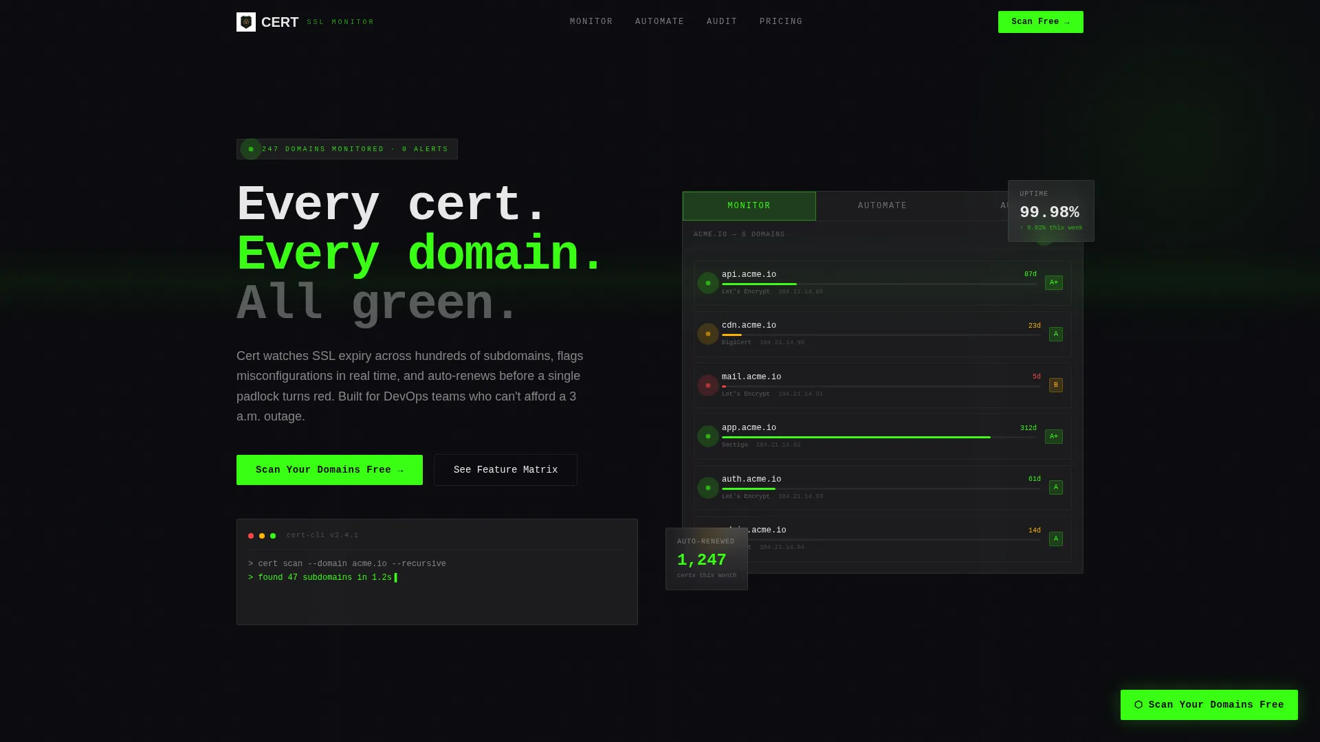
- A feature tab switcher header with three live-styled dashboard tabs showing Monitor, Automate, and Audit states
- A scrolling feature matrix card grid that escalates from problem framing to capability proof, row by row
- A sticky lead-generation form pinned to the bottom-right with a domain scan input, certificate authority dropdown, and work email field
Feature list
This template includes the following built-in components and design capabilities drawn directly from the source brief.
Feature Tab Switcher Header
Three frosted glass tabs labeled "Monitor," "Automate," and "Audit" sit across the top of a live-styled dashboard mockup. Clicking each tab swaps the card content below, letting visitors explore the product's three core capability areas without leaving the page fold.
Live-Styled Domain Monitor Grid
The default Monitor tab is pre-populated with realistic subdomain data including api.acme.io, cdn.acme.io, and mail.acme.io. Each domain card displays a padlock icon, a days-until-expiry counter, and a color-coded status dot in green, amber, or red so visitors immediately recognize their own infrastructure in the interface.
Automation Workflow Cards
The Automate tab reveals renewal workflow diagrams with ACME protocol badges. This section communicates what the product handles end to end: discovery, issuance, installation, and revocation, all without manual intervention.
Audit and Compliance Scorecard
The Audit tab displays a compliance scorecard with letter grades and cipher suite details. This gives security-conscious evaluators the technical depth they need to justify the tool to their team or management.
Scrolling Feature Matrix
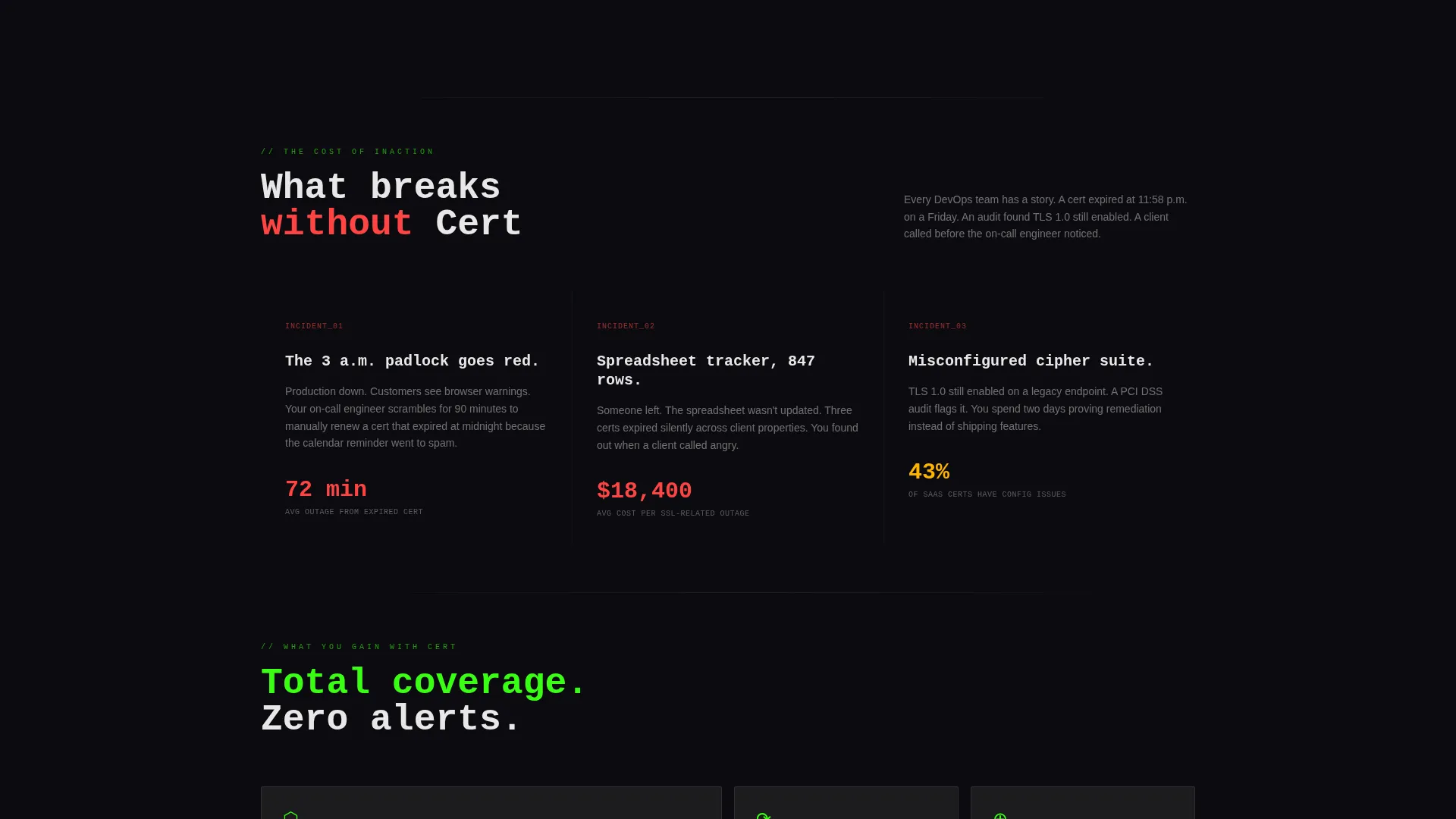
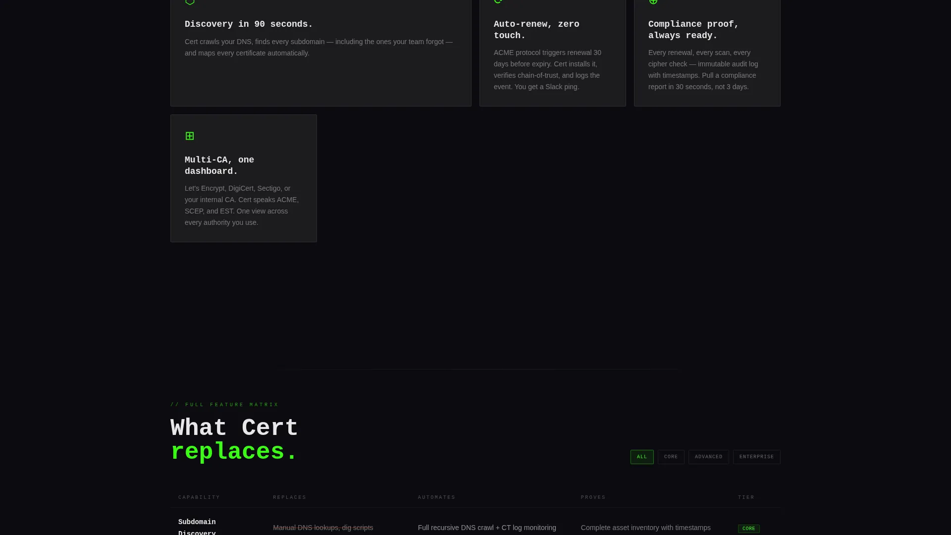
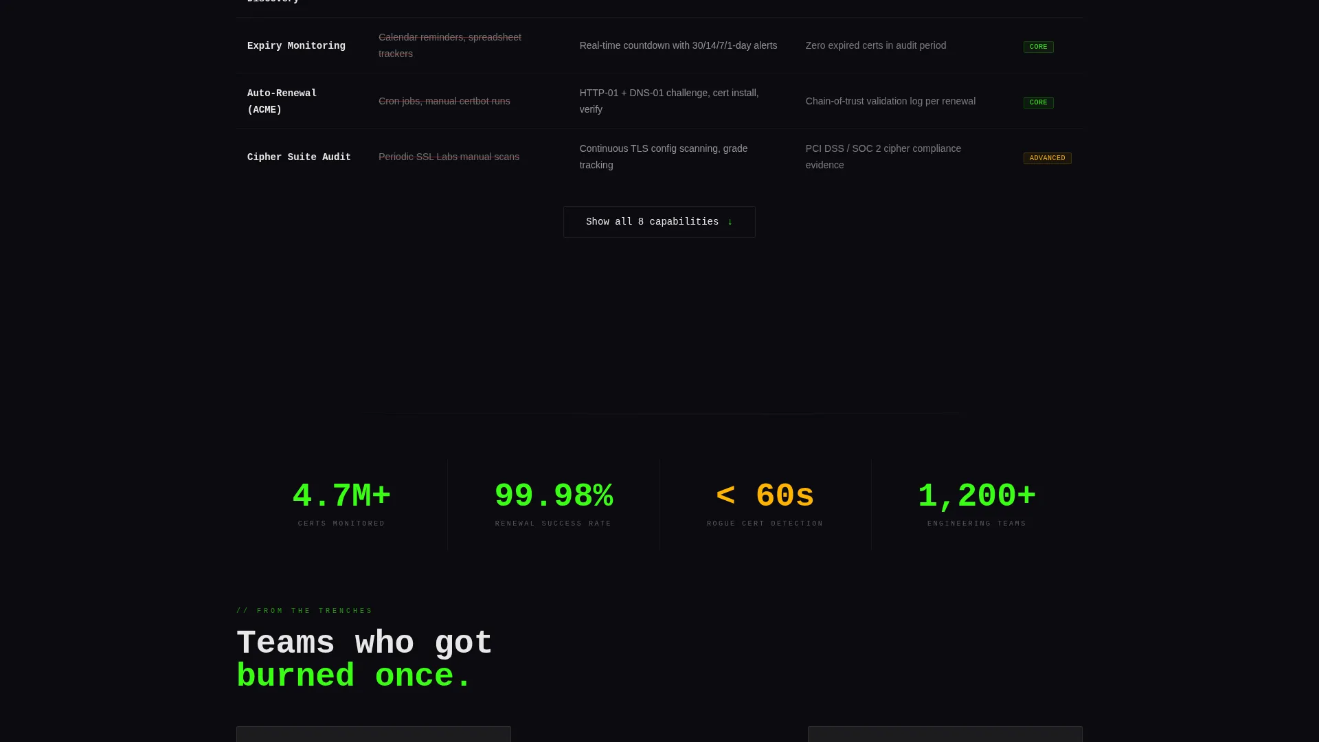
The card grid below the header is organized into rows that compare each capability across three dimensions: what it replaces, what it automates, and what it proves. The rhythm escalates deliberately from "what breaks without this" to "what you gain with this," raising the stakes with each row.
Sticky Lead-Generation Form
A frosted card form stays pinned to the bottom-right corner after the first scroll. When dormant, it collapses to a green pill button. When active, it expands to show a root domain input, a certificate authority preference dropdown, and a work email field under the primary call-to-action "Scan Your Domains Free."
Page sections overview
| Section | Purpose |
|---|---|
| Tab Switcher Header | Introduces Monitor, Automate, and Audit capabilities via interactive frosted glass tabs |
| Domain Monitor Grid | Shows pre-populated subdomain cards with expiry counters and status indicators |
| Automation Workflow Row | Visualizes renewal workflow diagrams with ACME protocol context |
| Audit Scorecard Row | Presents compliance grades and cipher suite detail for technical evaluators |
| Feature Matrix Grid | Escalates problem-to-solution framing across modular card rows |
| Sticky Scan Form | Captures leads via a pinned form with domain input, CA dropdown, and email field |
| Secondary call to action Row | Offers a "See Full Feature Matrix" link leading to an expandable comparison table |
Design & branding system
The visual identity is built on a bold brutalist foundation rendered through a glassmorphic color system. Every design decision reinforces the feeling of a translucent heads-up display floating over a dark server room.
- Color palette: void black (#0B0B0F) for backgrounds, frosted panel white at 12% opacity (#FFFFFF1F) for glass cards, electric green (#39FF14) for valid-state accents and calls-to-action, and warning amber (#FFB300) for expiry indicators
- Typography: brutalist mono-spaced type that reads like terminal output, with oversized headings and generous card padding
- Interactive states: borders glow faintly, status dots pulse green for healthy certificates, and the sticky form collapses to a green pill button when dormant
Mobile & speed optimization
The card grid layout is modular by design, which means each section scales cleanly across screen sizes. The glassmorphic aesthetic relies on CSS-level blur and opacity rather than heavy image assets, keeping the visual weight manageable on smaller devices.
- Modular card grid adapts across viewport widths without breaking the brutalist proportions
- Sticky form collapses to a compact pill button on smaller screens, keeping the viewport uncluttered
How this template helps you convert
Every structural choice in this template is aligned to move a technical evaluator from recognition to action.
- The pre-populated Monitor tab with realistic subdomain data creates immediate product recognition, making the visitor feel the tool already understands their environment before they sign up.
- The feature matrix card grid escalates the narrative from risk to relief, so by the time a visitor reaches the sticky form, inaction feels genuinely costly.
- The two-path conversion design serves both high-intent and research-mode visitors: "Scan Your Domains Free" captures ready buyers, while "See Full Feature Matrix" keeps evaluators on the page instead of bouncing.
Other information about this template
This template is designed for the SSL certificate manager niche within the broader micro-SaaS and developer tools category. It is well suited for teams building or marketing certificate monitoring products.
- The template style is a card grid (modular) layout, which makes it straightforward to add, remove, or reorder capability rows without redesigning the full page
- The lead-generation direction means the primary success metric is domain scan signups, not passive content consumption
- The page is built as a single-page landing page, not a multi-page website, so all content lives within one scrollable flow
- The feature tab switcher pattern is reusable for any product with distinct operational modes, making the header concept adaptable beyond certificate management
Theme
Bold Brutalist
Creative direction
Feature Matrix
Color system
Glassmorphic
Style
Card Grid (Modular)
Direction
Lead Generation
Page Sections
Feature Tab Switcher with Three Modes
Pre-populated Domain Monitor Grid
Automation Workflow Diagram Cards
Audit Compliance Scorecard View
Escalating Feature Matrix Card Grid
Sticky Pinned Lead-generation Form
Related questions
Who is this landing page template designed for?
Can I customize the domain cards and tab content?
How does the sticky lead-generation form work?
What does the Feature Matrix section show?
Is this template suitable for a product still in beta?



