Certify - Authoritative AI Certification Landing Page Template
Certify is a single-page comparison table landing page template built for generative AI training and certification programs. It uses a monochrome steel color system, a logo bar header, and a feature matrix layout to guide mid-career professionals, learning and development directors, and freelance developers toward one clear action: requesting a program syllabus.
by Rocket studio
Quick summary
Certify is a lead generation landing page template designed for generative AI certification academies. It opens with a recognizable employer logo bar, then descends through three structured comparison tables that do the persuading before a visitor reaches the call-to-action. The result is a page that qualifies visitors and converts them with minimal copy friction.
Who this template is for
This template is built for organizations that sell structured, credential-backed generative AI training. It fits programs that need to justify their value against free alternatives and position their outcomes clearly.
- Mid-career product managers who want a credential that supports their next performance review
- Learning and development directors tasked with upskilling entire departments before a quarterly deadline
- Freelance developers who need a certification that hiring managers will actually recognize
What problem this template solves
Generative AI programs face a crowded market. Free tutorials, online course platforms, and short bootcamps all compete for the same professional audience. The real challenge is not visibility but credibility. Visitors arrive skeptical and leave if they cannot quickly compare what makes one program worth paying for.
- Buyers cannot easily compare program quality against free or cheaper alternatives
- Course tier differences are hard to communicate without a structured side-by-side view
- Outcome data like salary lift and placement rates rarely appears in a scannable, sourced format
What you get with this template
The template delivers a single-page, scroll-driven layout structured entirely around comparison tables. Every section is designed to reduce decision friction and move a qualified visitor toward one specific action.
- A horizontal logo bar showing partner and employer logos rendered in monochrome chrome on forge-black
- Three distinct comparison tables covering program-versus-alternatives, course tier breakdowns, and outcome data with footnoted sources
- A floating electric mint call-to-action bar with a progressive-disclosure form that collects role, company size, and email in sequence
Feature list
This section covers the core functional and design components included in the Certify template.
Employer and Partner Logo Bar
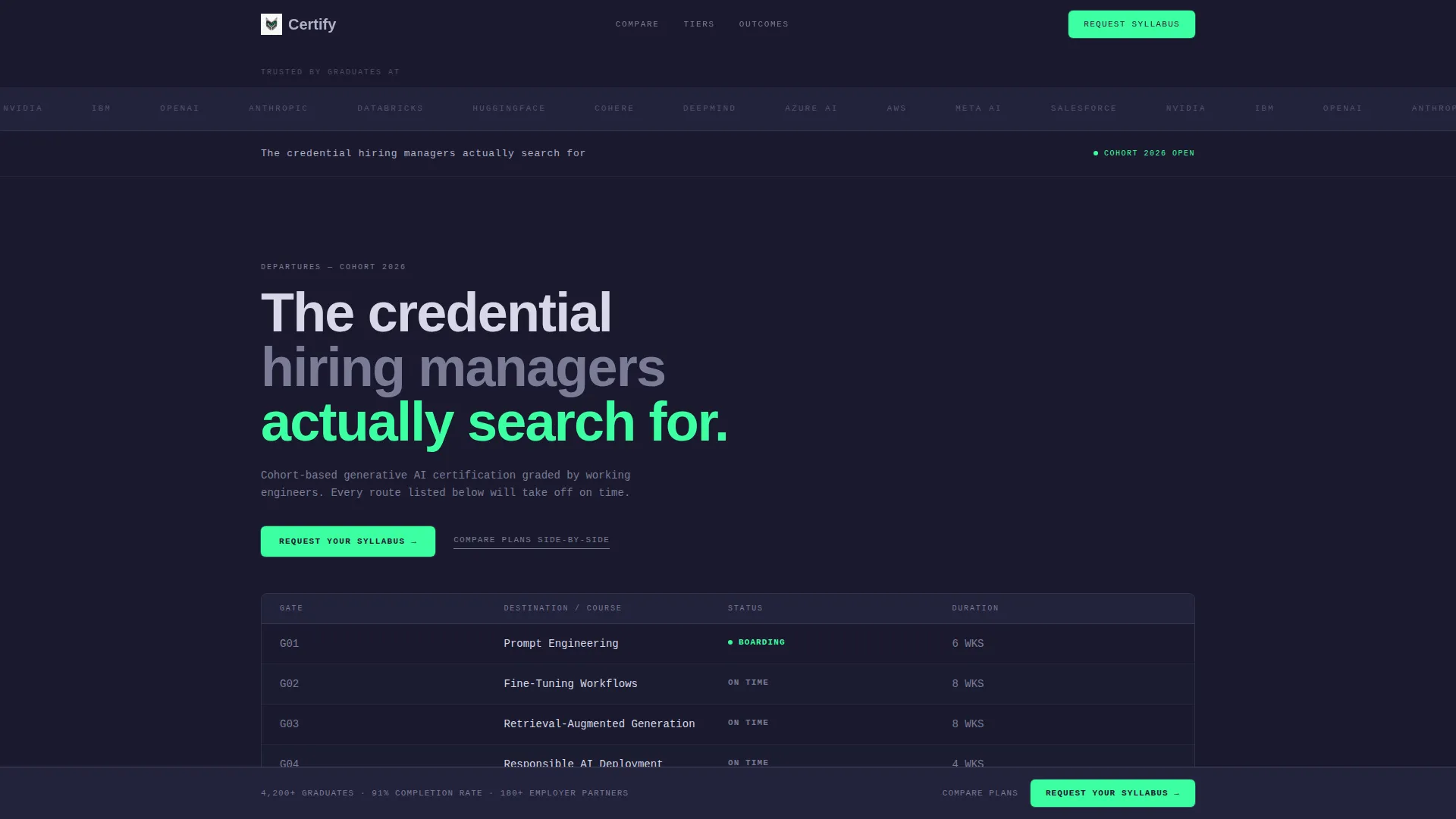
The header section features a horizontal scroll of recognizable employer and partner logos. Logos are rendered in monochrome chrome on a forge-black background. This treatment signals graduate employability without using a single word of copy.
Three-Table Feature Matrix Layout
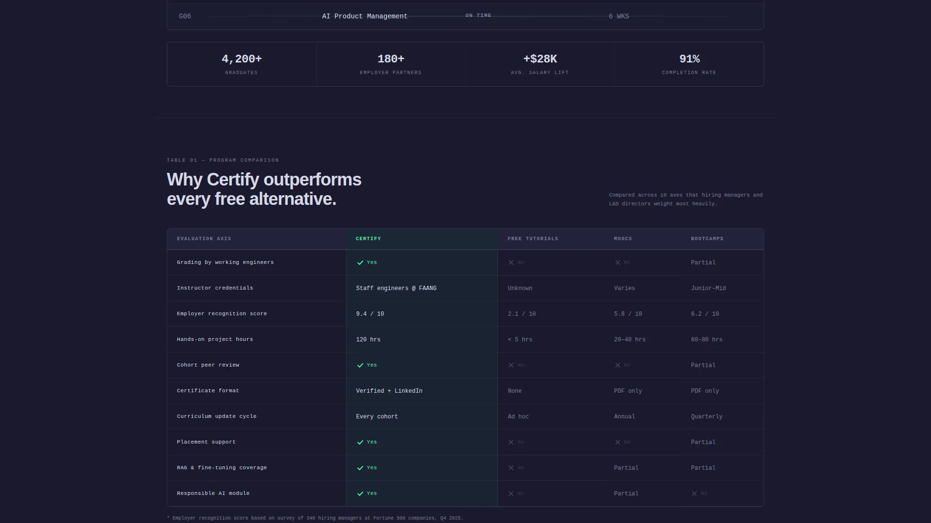
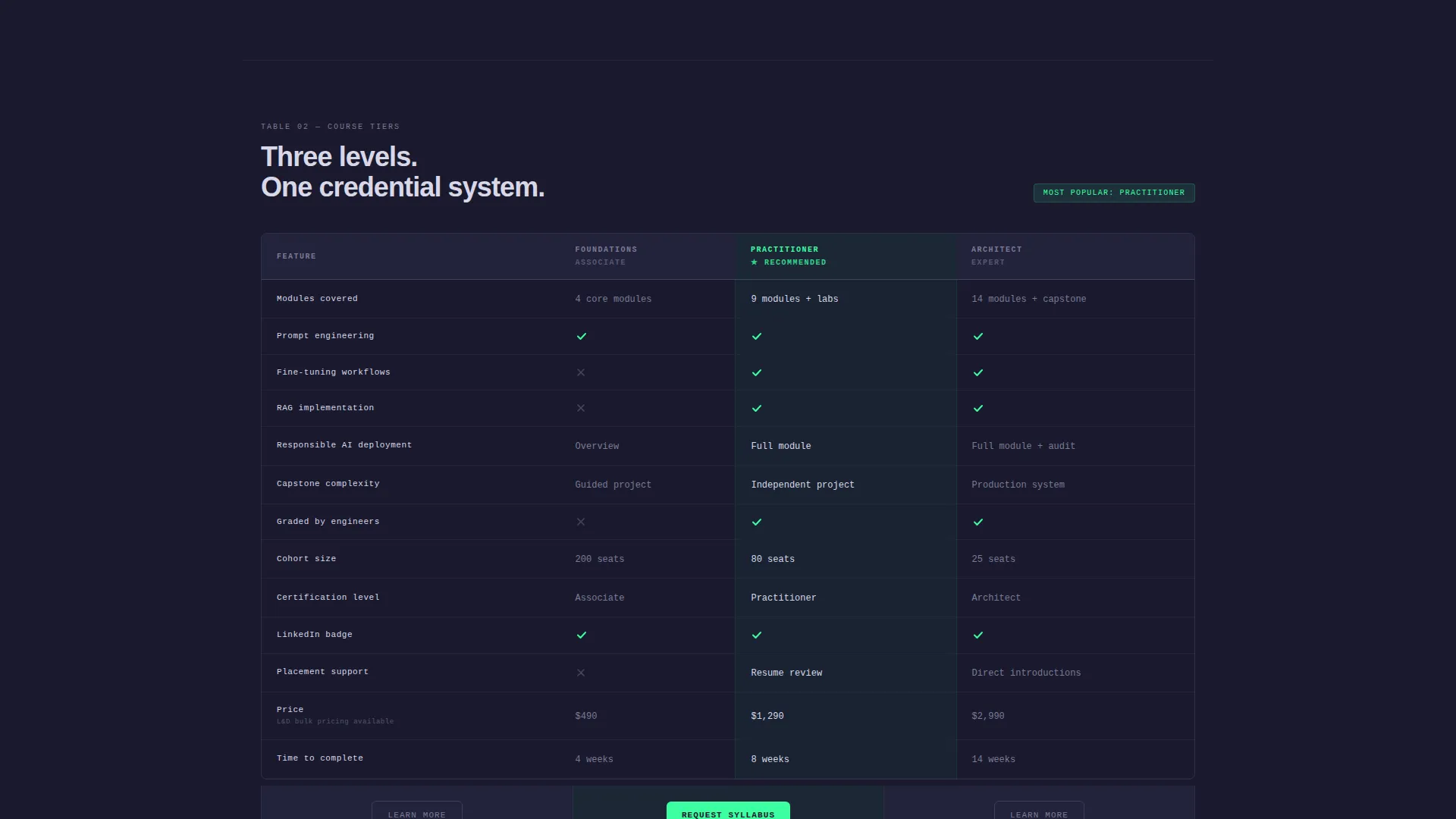
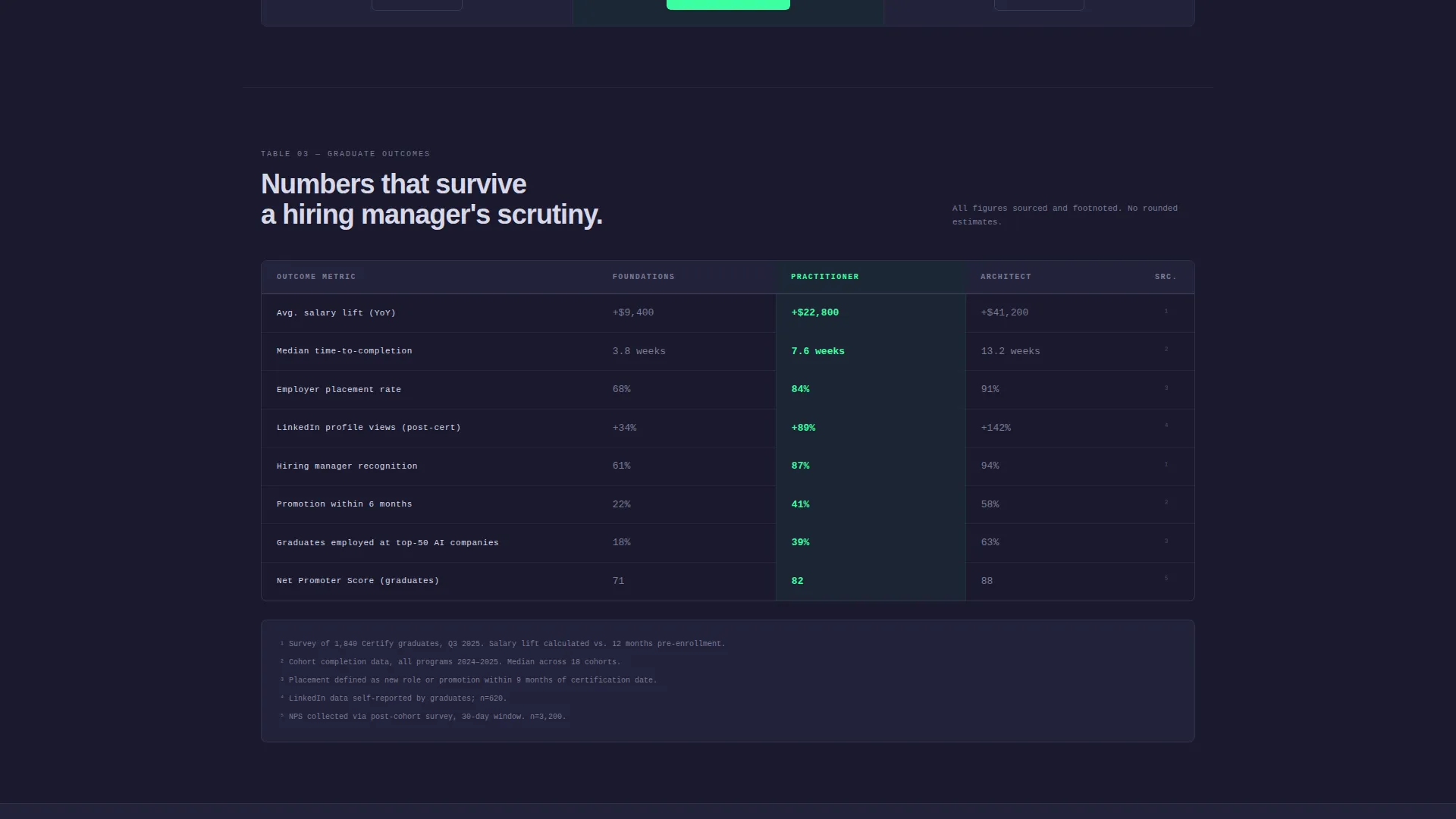
The page descends through three progressively specific comparison tables. The first compares this program against free tutorials, massive open online courses, and bootcamps. The second breaks down course tiers side by side. The third presents outcome data with sourced footnotes in every cell.
Floating Lead Capture Bar
After the visitor passes the first comparison table, a pinned floating bar appears at the bottom of the viewport. It carries the primary call-to-action in electric mint and stays visible throughout the rest of the scroll, keeping the conversion path accessible at all times.
Progressive Disclosure Lead Form
The lead form uses a three-step progressive disclosure sequence. It asks for professional role first via a dropdown, then company size, then email address. This order qualifies the lead before it reaches the next stage of the sales process.
Secondary Anchor Link Navigation
A secondary call-to-action labeled "Compare Plans Side-by-Side" acts as an anchor link. It jumps the visitor directly to the course tier comparison table. This path serves visitors who are evaluating options but are not yet ready to submit their information.
Monochrome Steel Visual System
The entire template is built on a four-value color system: forge-black, brushed gunmetal, polished chrome, and electric mint. Electric mint is reserved exclusively for interactive elements, active states, and call-to-action buttons. Every other surface uses the steel palette to maximize information density and reduce visual distraction.
Page sections overview
| Section | Purpose |
|---|---|
| Partner Logo Bar | Establish employer credibility above the fold |
| Positioning Headline | Anchor the program's core value in one line |
| Program versus. Alternatives | Compare rigor, credentials, and project hours against free options |
| Course Tier Table | Break down Foundations, Practitioner, and Architect tiers side by side |
| Outcomes Data Table | Present salary lift, completion time, and placement rates with sourced footnotes |
| Floating call to action Bar | Keep the syllabus request action visible throughout the scroll |
| Lead Capture Form | Qualify and collect visitor details through progressive disclosure |
Design & branding system
The visual identity follows a Directory and Discovery theme built on the Monochrome Steel color system. The palette is deliberately cold and engineered, designed to feel like a milled aluminum surface under fluorescent light.
- Core palette: forge-black (#1A1A2E), brushed gunmetal (#3D3D5C), polished chrome (#B0B0C8), and electric mint (#3DFFA2) used only for interactive and active elements
- Typography is set in polished chrome against forge-black backgrounds, optimizing contrast for dense information layouts
- No hero images, no illustrations, and no warm tones anywhere on the page; every design decision prioritizes data clarity over decoration
Mobile & speed optimization
The template is structured for a lean, distraction-free scroll experience. The comparison table layout is designed to reflow cleanly across viewport sizes without losing its information hierarchy.
- Tables are built to adapt to narrower screens, keeping the most critical columns visible at smaller breakpoints
- The floating call-to-action bar is positioned to remain functional on mobile without blocking table content
- The progressive disclosure form reduces input steps per screen, lowering friction for visitors completing the form on a phone
How this template helps you convert
The entire page architecture is oriented toward one outcome: a qualified lead submitting a syllabus request. Every scroll step tightens the case before the visitor reaches the form.
- The logo bar immediately establishes that real employers have hired or endorsed graduates, so the visitor starts reading from a position of trust rather than skepticism.
- The feature matrix structure builds a compounding argument across three tables, turning each row of data into a micro-conversion moment before the visitor reaches the primary call-to-action.
- The anchor link secondary path captures visitors who are in evaluation mode rather than decision mode, keeping them engaged with the page rather than bouncing to a competitor.
Other information about this template
This template is part of a broader set of generative AI technology templates designed for the training and certification niche. A few additional details worth knowing before you use it:
- The template supports programs covering prompt engineering, fine-tuning workflows, retrieval-augmented generation (the process of grounding a language model's responses in a curated knowledge base), and responsible deployment topics
- The cohort-based course model and engineer-graded assessment format are reflected in the comparison table axes, so the template content structure aligns with that specific program type
- The outcomes table section includes a footnote pattern, which means your program's data on salary lift, time to completion, and employer placement rate should be ready before you publish
- This template is categorized under Generative AI Technology within the Technology category on the marketplace, making it discoverable for buyers searching for AI-specific landing page solutions
- The Intersection Match Score of 13 indicates a strong alignment between this template's design direction and the specific niche it serves
Theme
Directory & Discovery
Creative direction
Feature Matrix
Color system
Monochrome Steel
Style
Comparison Table
Direction
Lead Generation
Page Sections
Employer and Partner Logo Bar
Three-table Feature Matrix
Floating Lead Capture Bar
Progressive Disclosure Lead Form
Anchor Link Secondary Path
Monochrome Steel Color System
Related questions
Who is the Certify template designed for?
Can I use this template if my program has fewer than three course tiers?
What information do I need before publishing this template?
Does the floating call-to-action bar appear on all devices?
Is the lead form connected to a CRM out of the box?



