Beauty & Salon Digital Presence Professional Website Template
Certify is a beauty training landing page template built for course and certification platforms serving stylists, nail techs, estheticians, and barbers. It combines a dark, violet-glow visual identity with interactive comparison tables, a problem-to-solution scroll arc, and a clear app download conversion path, all in one bold, single-page layout.
by Rocket studio
Quick summary
Certify is a single-page landing page template designed for beauty and salon course discovery platforms. It opens with a dramatic dark header, moves visitors through a problem-to-solution arc, and anchors its value in detailed comparison tables. The design feels like a professional salon studio, dark, focused, and magnetic.
Who this template is for
This template is built for founders and marketers running beauty education or course discovery platforms. It speaks directly to an audience of motivated, career-focused learners in the beauty industry.
- Beauty course platform operators listing accredited programs across multiple disciplines
- Independent academies or training hubs offering certifications in hair, skin, lash, and nail techniques
- App-first education brands that want to drive installs through a compelling pre-download landing experience
What problem this template solves
Finding the right beauty certification course online is genuinely frustrating. Learners face confusing accreditation claims, inflated academy prices, and course listings that bury the details they actually need. This template gives platforms a structured way to cut through that noise.
- Confusing accreditation information spread across multiple sites with no clear comparison
- Overpriced or outdated course options with no side-by-side way to evaluate value
- No single destination where learners can filter by discipline, price, schedule, and skill level
What you get with this template
The template delivers a complete, conversion-focused landing page layout. Every section is purpose-built and sequenced to earn the visitor's trust before asking for the app download.
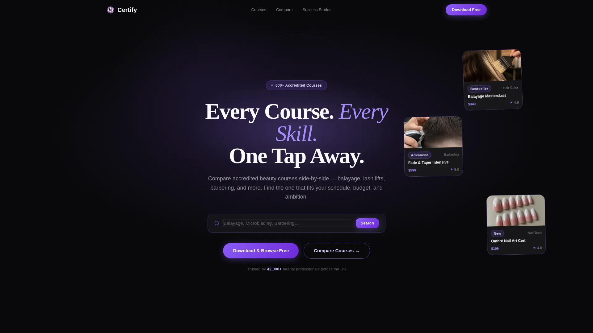
- A dark full-bleed header with a centered violet glow effect, headline, ghost-text search bar, and three rotating course preview cards
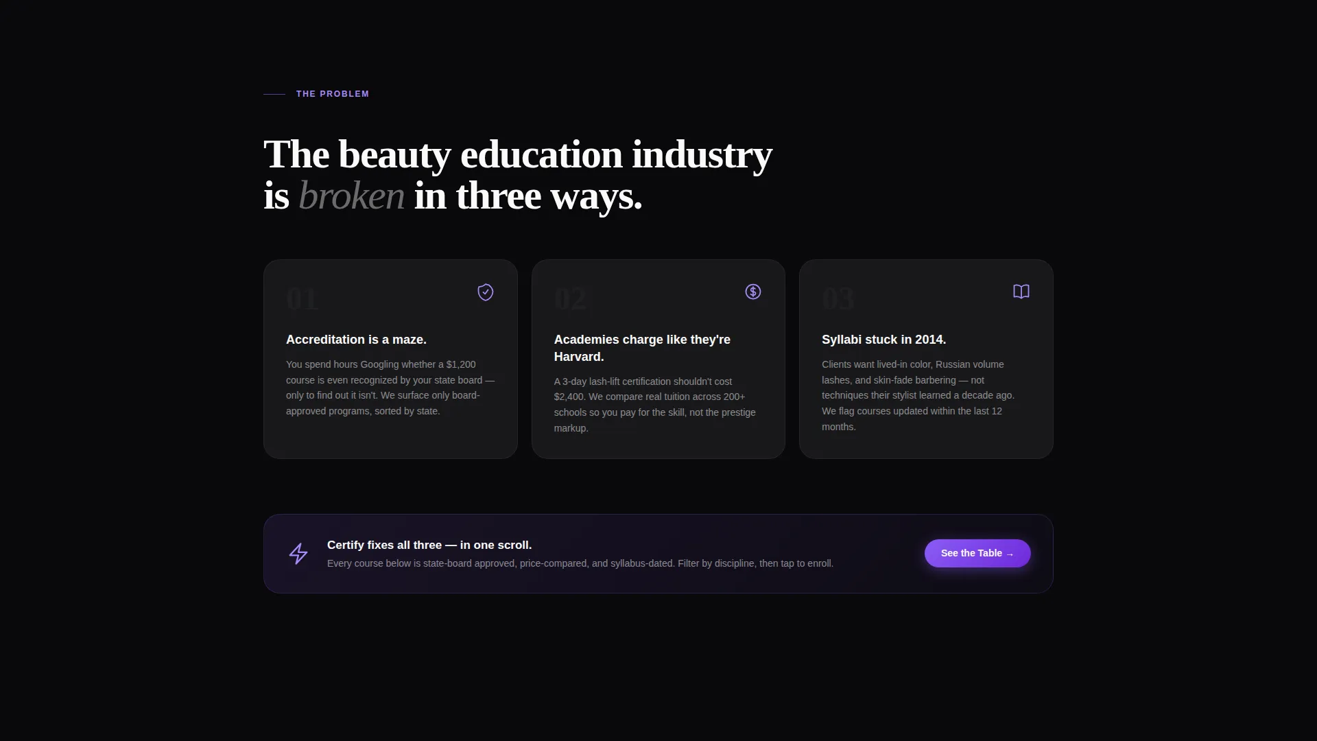
- A problem statement section with stark white-on-black cards naming common learner pain points
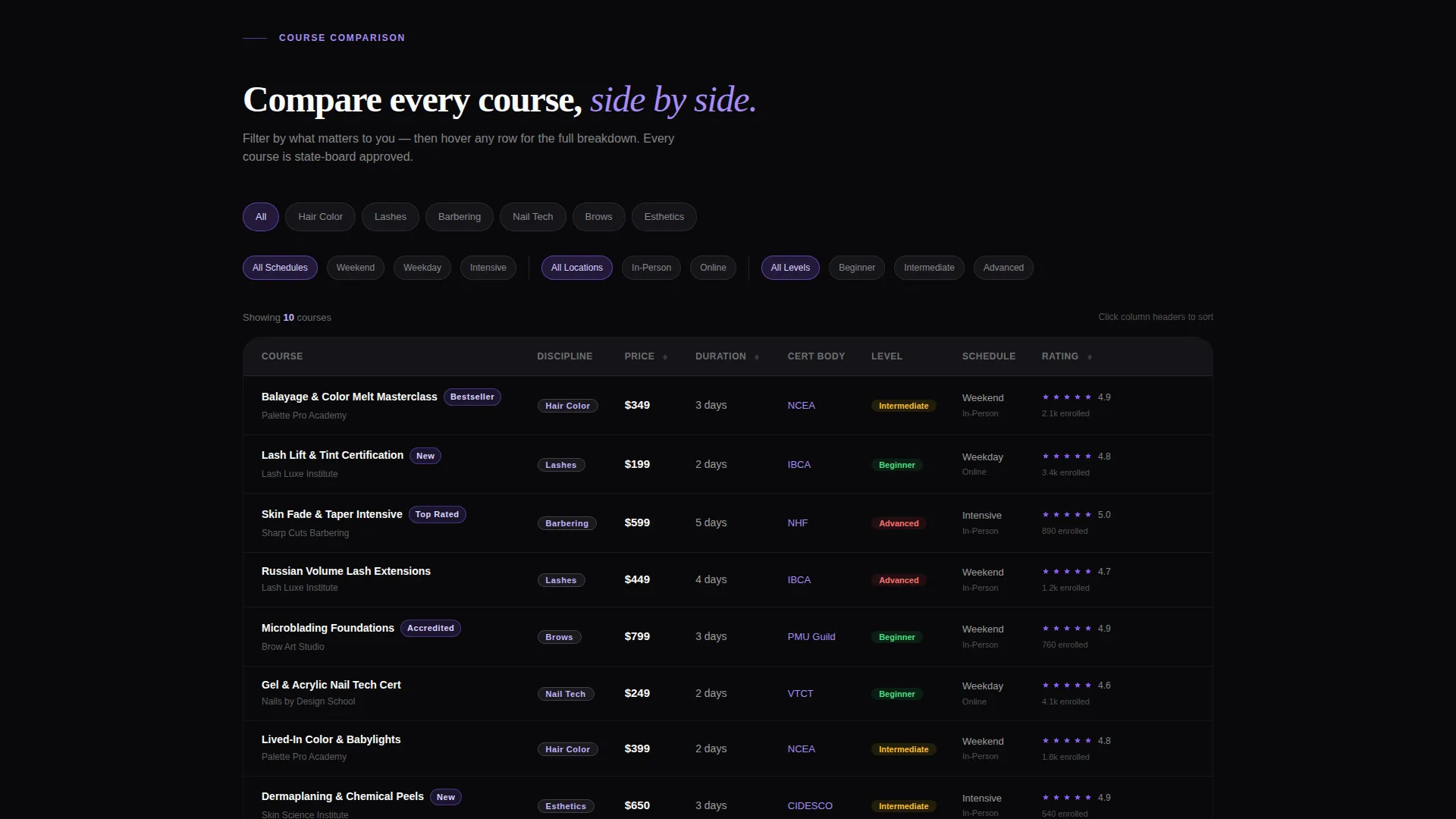
- Interactive comparison tables with filterable columns for price, duration, certification body, skill level, and student rating
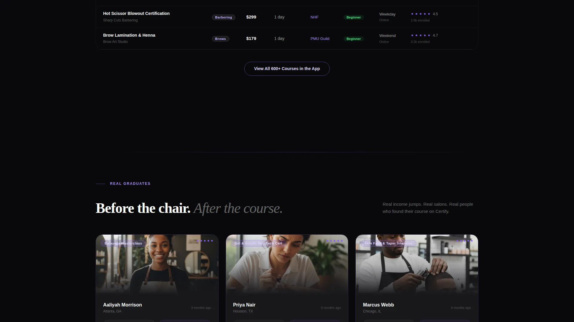
- Graduate success stories displayed as before-and-after career snapshots
- A floating mobile bottom bar with app download calls to action and a secondary email capture offer for the free course guide
Feature list
This template is built around components that do real work. Each feature connects directly to a specific conversion moment in the visitor's scroll journey.
Violet-Glow Dark Header
The header opens with a full-bleed black background and a single violet light source radiating from center screen. A bold headline sits inside the glow alongside a ghost-text search bar and three floating course cards with discipline-specific thumbnails. Cards rotate gently on scroll, creating motion without distraction.
Interactive Comparison Tables
The core of the layout is a set of stacked comparison tables where courses appear side by side. Columns cover price, duration, certification body, skill level, and student rating. Each row responds to hover with a violet flood effect, making it easy to scan and compare options at a glance.
Course Filter Controls
Visitors can narrow the comparison tables by discipline, location, and schedule. This puts the learner in control immediately, reducing scroll fatigue and helping them reach relevant options faster.
Problem Statement Cards
A dedicated section below the header uses white-on-black cards to name the real frustrations beauty learners face. This honest framing builds credibility before the platform presents its solution, making the comparison tables feel like relief rather than a sales pitch.
Graduate Career Snapshots
Success stories are formatted as before-and-after career panels showing real graduates, the salons they now work in, and income changes. This mirrors the transformation language beauty learners already understand from the services they will one day perform.
App Download Conversion Bar
On mobile, a pinned bottom bar carries the primary call to action with app store badges outlined in violet. A secondary email capture path offers a free course guide for visitors who are not yet ready to install, keeping them in the nurture flow.
Page sections overview
| Section | Purpose |
|---|---|
| Dark Glow Header | Introduce platform with search and course card previews |
| Problem Statement Cards | Name learner pain points to build immediate credibility |
| Comparison Table Block | Let visitors compare courses across key decision columns |
| Filter Controls Row | Allow narrowing by discipline, location, and schedule |
| Graduate Career Snapshots | Show real outcomes to close the trust gap before call to action |
| App Download Bar | Drive primary conversion with pinned mobile call to action badges |
| Email Capture Offer | Capture leads not ready to install via free course guide |
Design & branding system
The visual identity follows a Directory and Discovery theme using a Void and Violet color system. The palette is designed to feel like a UV gel lamp glowing in a dim studio, dark, intentional, and confident.
- Void black (#09090B) dominates all backgrounds and table cells, creating depth and focus
- Electric violet (#8B5CF6) drives every interactive element including calls to action, hover states, and progress indicators
- Soft lilac mist (#DDD6FE) accents section dividers and secondary badges without softening the overall tone
- Highlight white (#FAFAFA) keeps course names, pricing, and body copy razor-sharp against the dark backgrounds
Mobile & speed optimization
The template is structured with a mobile-first conversion experience in mind. The most important action on mobile is always visible without scrolling.
- The floating bottom bar pins the app download call to action to the screen base on mobile, removing friction from the most critical conversion step
- Course cards in the header are designed to stack cleanly on smaller screens while preserving the scroll-rotation effect
- Comparison tables are built to remain scannable on narrow viewports without losing column clarity
How this template helps you convert
The conversion logic is built into the page structure itself. Visitors are guided through a deliberate sequence that earns trust before asking for commitment.
- The problem statement section immediately validates the visitor's frustration, making them receptive to the comparison tool that follows
- Interactive tables and filter controls let visitors self-qualify by finding courses that match their budget, schedule, and discipline, so the app download feels like the natural next step to save their shortlist
- The two-path conversion setup captures both ready visitors via app download and hesitant visitors via the free course guide email capture, maximizing the total number of people who stay connected to the platform
Other information about this template
This template is part of the Certify design system, built specifically for the beauty and salon course discovery niche. It is well suited for any platform connecting learners with accredited training across disciplines like balayage, microblading, lash lifting, barbering, and esthetics.
- The template style is Comparison Table, making it a strong fit for platforms with large or growing course catalogs
- The Directory and Discovery theme means the layout scales visually even when course volume is high
- The creative direction follows a Problem-to-Solution Arc, which is a proven structure for education and certification platforms
- The header concept uses a Dark Full-Bleed and Glow approach that differentiates the platform visually from generic course listing sites
- The primary conversion direction is App Download, and the layout supports both App Store and Google Play badge placement
- The template is designed to serve career changers, working parents studying on flexible schedules, and currently employed stylists pursuing advanced certifications
Theme
Directory & Discovery
Creative direction
Problem→Solution Arc
Color system
Void & Violet
Style
Comparison Table
Direction
App Download
Page Sections
Violet-glow Dark Header
Interactive Comparison Tables
Course Filter Controls
Problem Statement Cards
Graduate Career Snapshots
Dual-path App Download Conversion
Related questions
What kind of platform is this template designed for?
Can I use this template for a single course or academy?
Does the template include the email capture for the free course guide?
How does the app download call to action work on mobile?
Are the comparison tables interactive?



