FinOps Technology Specialist Professional Website Template
Certify is a FinOps training and certification landing page template built for platforms that turn cloud engineers and finance teams into credentialed practitioners. The design follows a Data Command theme with an Acid Digital color system. A Feature Tab Switcher header, Spec Sheet data cards, and persistent calls to action create a high-proof, click-driven experience that makes the credential feel essential before the visitor scrolls past the fold.
by Rocket studio
Quick summary
Certify is a single-page landing page template for FinOps training and certification platforms. It combines a tab-switching dashboard header, scrollable data cards, and a sticky conversion bar to move cloud engineers and finance professionals from skepticism to enrollment. The design language feels like a live cloud console, precise, data-forward, and built to earn trust through evidence.
Who this template is for
This template is built for training businesses and certification platforms operating at the intersection of cloud infrastructure and financial operations. It suits teams that need to communicate credential value to a highly technical, cost-conscious audience.
- Platform engineers drowning in untagged cloud spend who need structured upskilling
- Finance controllers managing multi-cloud budgets without the vocabulary to parse them
- Engineering leaders preparing to defend cloud costs in front of a skeptical finance team
What problem this template solves
Cloud cost chaos is a real business problem. Teams that lack certified FinOps skills often miss waste, misprice reserved capacity, and struggle to justify infrastructure spend. A generic course page cannot convince these buyers. This template solves the credibility gap by presenting proof before persuasion.
- Unstructured training pages lose technical buyers who expect data, not marketing copy
- Finance stakeholders need salary lift figures, pass rates, and comparison tables before they commit
- Without a persistent call to action path, high-intent visitors abandon before reaching enrollment
What you get with this template
You get a complete, single-page layout designed specifically for a FinOps certification platform. Every section is a structured data card that communicates value through metrics, not paragraphs.
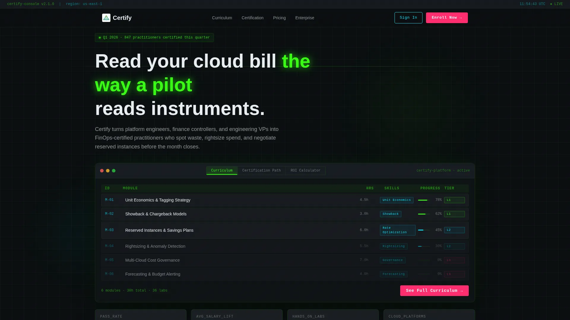
- A Feature Tab Switcher header with three tabs: Curriculum, Certification Path, and ROI Calculator
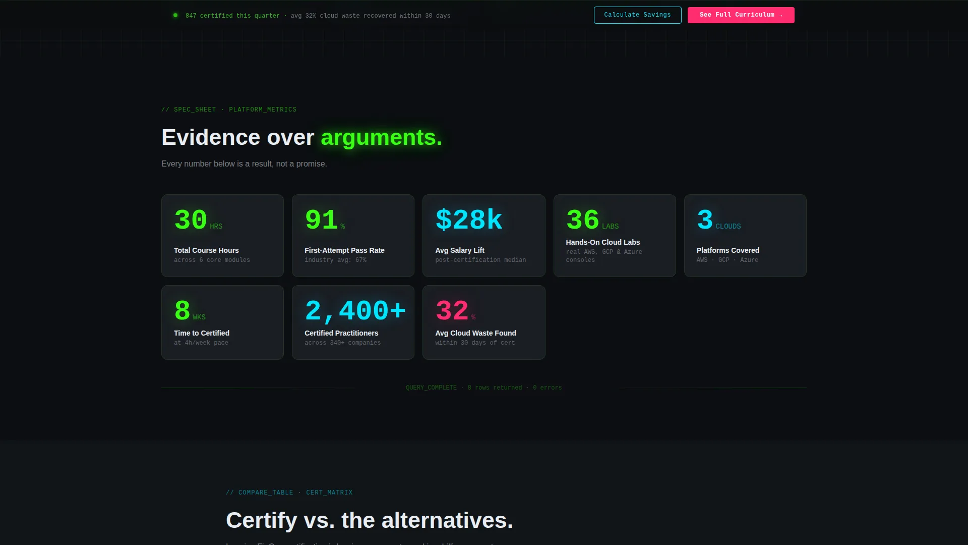
- Scrollable Spec Sheet data cards showing course hours, exam pass rates, salary lift, labs count, and cloud platforms covered
- A sticky bottom conversion bar with the primary call to action that appears after the second scroll fold
Feature list
This template delivers purpose-built components for a FinOps certification product. Each feature is grounded in the source brief and designed to serve the specific needs of technical and financial buyers.
Feature Tab Switcher Header
The header renders a simulated cloud console chrome with three clickable tabs. Switching tabs animates the dashboard panels without a page reload, giving visitors the immediate feeling of using the platform. The default tab displays a course module grid with completion percentages, skill tags, and difficulty tier badges.
Spec Sheet Data Cards
Each scroll section is a discrete data card presenting oversized monospaced numbers and micro-labels. Metrics such as course hours, exam pass rates, average salary lift post-certification, hands-on lab counts, and cloud platforms covered are laid out in grid cells. This format persuades through evidence rather than prose.
Comparison Table Block
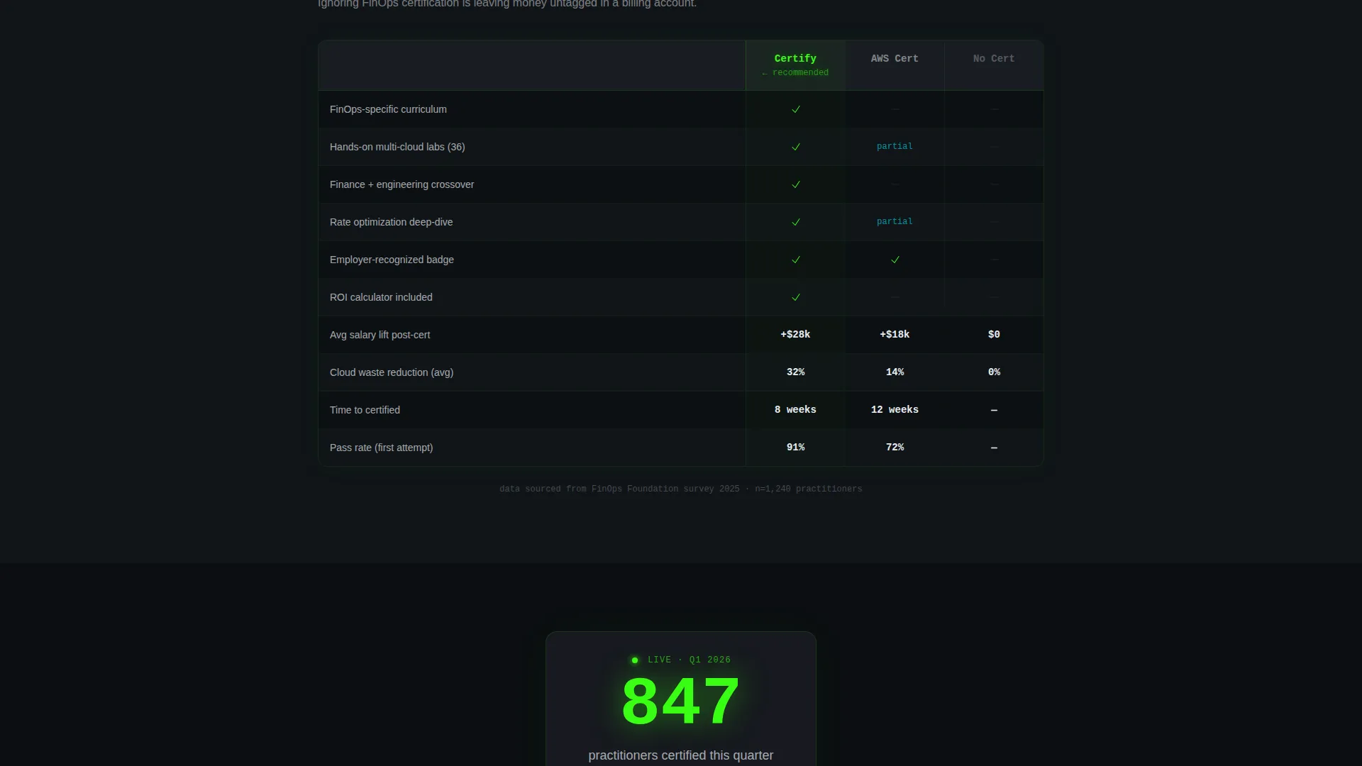
A structured comparison table positions this certification against alternative credentials and no certification. It gives finance and engineering buyers a clear side-by-side reference. The format mirrors the technical datasheets these audiences already trust.
Live Practitioner Counter
A real-time style counter displays the number of practitioners certified in the current quarter. This social-proof element adds urgency and scale without requiring editorial copy. It pulses within the Acid Digital color system to draw attention naturally.
Persistent Sticky call to action Bar
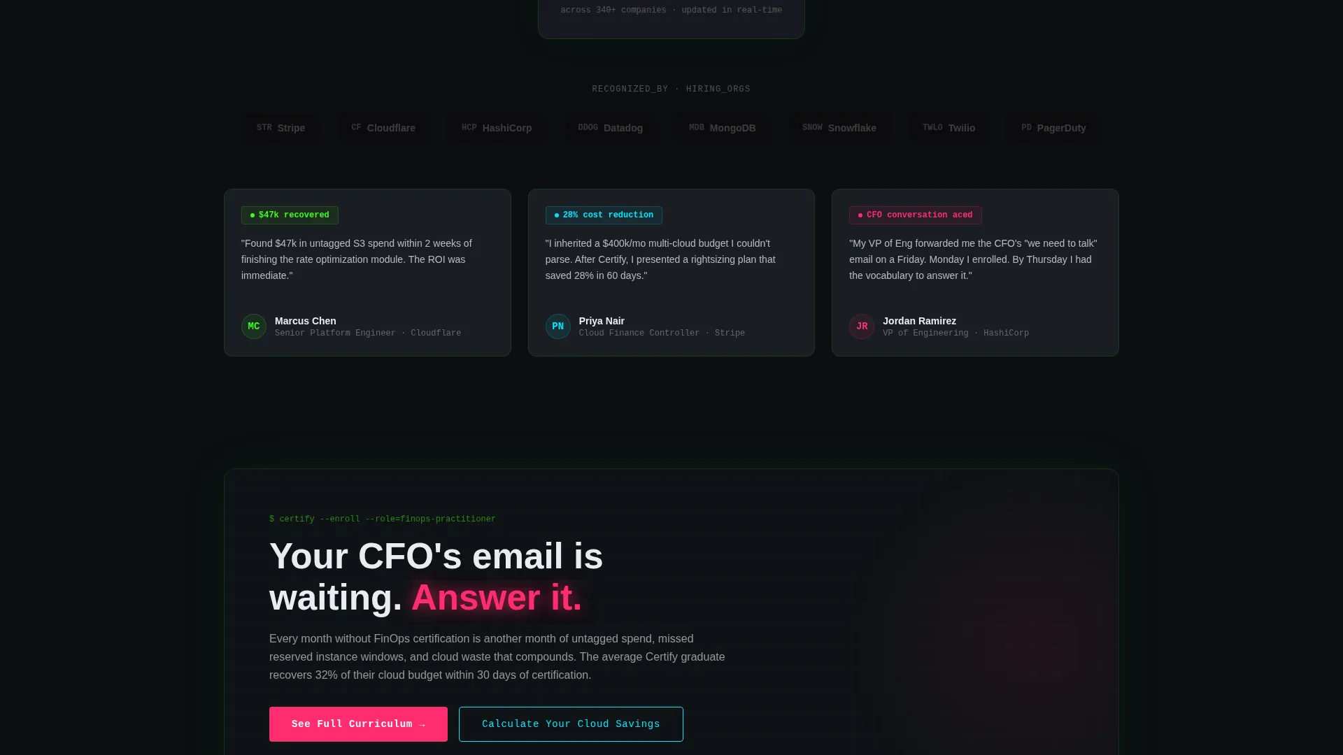
After the second scroll fold, a bottom bar locks into place carrying the primary call to action: "See Full Curriculum." It routes visitors to a detailed course catalog page. This ensures the conversion path stays visible no matter how deep a visitor scrolls.
Secondary ROI Calculator call to action
A secondary call to action, "Calculate Your Cloud Savings," links to an interactive return-on-investment tool. It estimates waste reduction based on team size and monthly spend. The tool offers a value-first conversion path that captures email in exchange for a personalized savings report.
Page sections overview
| Section | Purpose |
|---|---|
| Tab Switcher Header | Shows curriculum, certification path, and ROI tabs inside a console-style chrome |
| Course Module Grid | Displays modules with completion percentages, skill tags, and difficulty badges |
| Spec Sheet Cards | Presents key metrics as oversized data cells to build evidence-based trust |
| Comparison Table | Benchmarks this cert against alternatives to clarify credential value |
| Employer Logo Strip | Shows recognizing organizations to establish real-world credential acceptance |
| Practitioner Counter | Displays live-style quarterly certification count as social proof |
| Sticky call to action Bar | Keeps primary enrollment action visible throughout the full scroll journey |
Design & branding system
The visual identity follows a Data Command theme using the Acid Digital color system. The palette is built around deep blacks and high-contrast glows that make every metric feel live and intentional.
- Void black (#0B0E11) as the page base, carbon-fiber charcoal (#1A1D23) for card surfaces, terminal phosphor green (#39FF14) for data visualizations and progress states
- Signal cyan (#00E5FF) marking interactive affordances and tab highlights throughout the layout
- Caution magenta (#FF2D6F) reserved exclusively for calls to action and urgency states, so it fires with full visual weight when the page wants a click
Mobile & speed optimization
The template is structured for lean, fast rendering on all screen sizes. The data card grid adapts to narrower viewports without sacrificing the density that makes the Spec Sheet format work.
- Tab switcher interaction is touch-friendly, keeping the header usable on mobile devices without degrading the console aesthetic
- Oversized monospaced number cells reflow gracefully into single-column stacks on smaller screens
- The sticky call to action bar is persistent on mobile, ensuring the primary conversion action remains accessible at every scroll depth
How this template helps you convert
Every layout decision in this template is oriented toward getting a qualified visitor to click through to enrollment or the ROI tool. Proof is front-loaded so that hesitation dissolves before the call to action appears.
- The tab-switching header puts visitors inside a simulated dashboard immediately, building platform confidence before any copy makes a claim about quality.
- Six data points accumulated through the Spec Sheet scroll make ignoring the credential feel like leaving measurable value behind, priming the visitor for the sticky call to action.
Other information about this template
This template is built for the FinOps Technology category within the broader Technology niche. It is designed for platforms that train practitioners in cloud financial management, unit economics, showback, rate optimization, and reserved instance strategy.
- The template style is Dashboard and Data Grid, suited for platforms that want their marketing page to mirror the product experience
- The creative direction is Spec Sheet, meaning persuasion flows from data density rather than editorial narrative
- The landing page direction is Click-Through, routing visitors to a full course catalog and a separate ROI tool rather than converting on the page itself
- Skill tags such as Unit Economics, Showback, and Rate Optimization are rendered as spec badges within the course module grid
- The template is compatible with use cases involving multi-cloud environments including common public cloud platforms referenced in cloud cost management contexts
Theme
Data Command
Creative direction
Spec Sheet
Color system
Acid Digital
Style
Dashboard/Data Grid
Direction
Click-Through
Page Sections
Feature Tab Switcher Header
Spec Sheet Data Card Grid
Credential Comparison Table
Live Practitioner Counter
Persistent Sticky Call to Action Bar
Secondary ROI Calculator Call to Action
Related questions
What type of business is this template designed for?
Can I customize the tab labels and metric cards?
How does the ROI Calculator call to action work in this template?
Does the tab switcher require special coding knowledge to set up?
Is the sticky call to action bar always visible during scrolling?



