Certify - Powerful Seniorcare Landing Page Template
Certify is a dashboard-style landing page template built for senior care training platforms. It opens with a live learner portal preview, leads visitors into an interactive Career Path Calculator, and flows through proof, curriculum, and salary comparison sections. The primary call to action drives free trial sign-ups, with a secondary email capture for undecided visitors.
by Rocket studio
Quick summary
Certify is a single-page template designed for digital academies that train and certify senior care professionals. It opens like a learner dashboard you have already logged into, walks visitors through a personalized career calculator, and builds trust through graduate proof and curriculum data cards before pushing them into a free trial enrollment flow.
Who this template is for
This template speaks directly to training platforms that need to convert skeptical, time-pressed visitors into enrolled learners. It works for organizations offering structured credentials in senior care specialties.
- Senior care course platforms targeting career-changers from retail, food service, and entry-level roles
- Training providers serving Certified Nursing Assistants (CNAs) who want specialty credentials in memory care, hospice, or home health
- Adult learning programs that need to quickly establish authority with family caregivers facing urgent, real-world responsibility
What problem this template solves
Most course landing pages ask visitors to scroll through static text before they understand whether the program is right for them. That mismatch costs enrollments. Certify solves this by leading with a personalized tool instead of a pitch.
- Visitors with no time to browse get an instant, tailored certification timeline and salary projection before they read a single paragraph
- Platforms struggle to communicate ROI to career-changers; the built-in salary comparison chart and Bureau of Labor Statistics (BLS) sourced data make the financial case visually and quickly
- Generic course pages feel impersonal; the dashboard aesthetic and leaderboard elements signal that real learners are already inside
What you get with this template
Certify delivers a fully structured single-page layout built around the health-tech dashboard visual system. Every section has a defined job, from the first-impression header to the fixed bottom call-to-action bar.
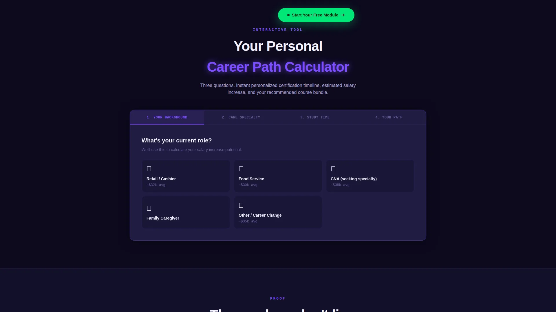
- An interactive Career Path Calculator section with three-question flow, personalized timeline output, salary bump estimate, and recommended course bundle display
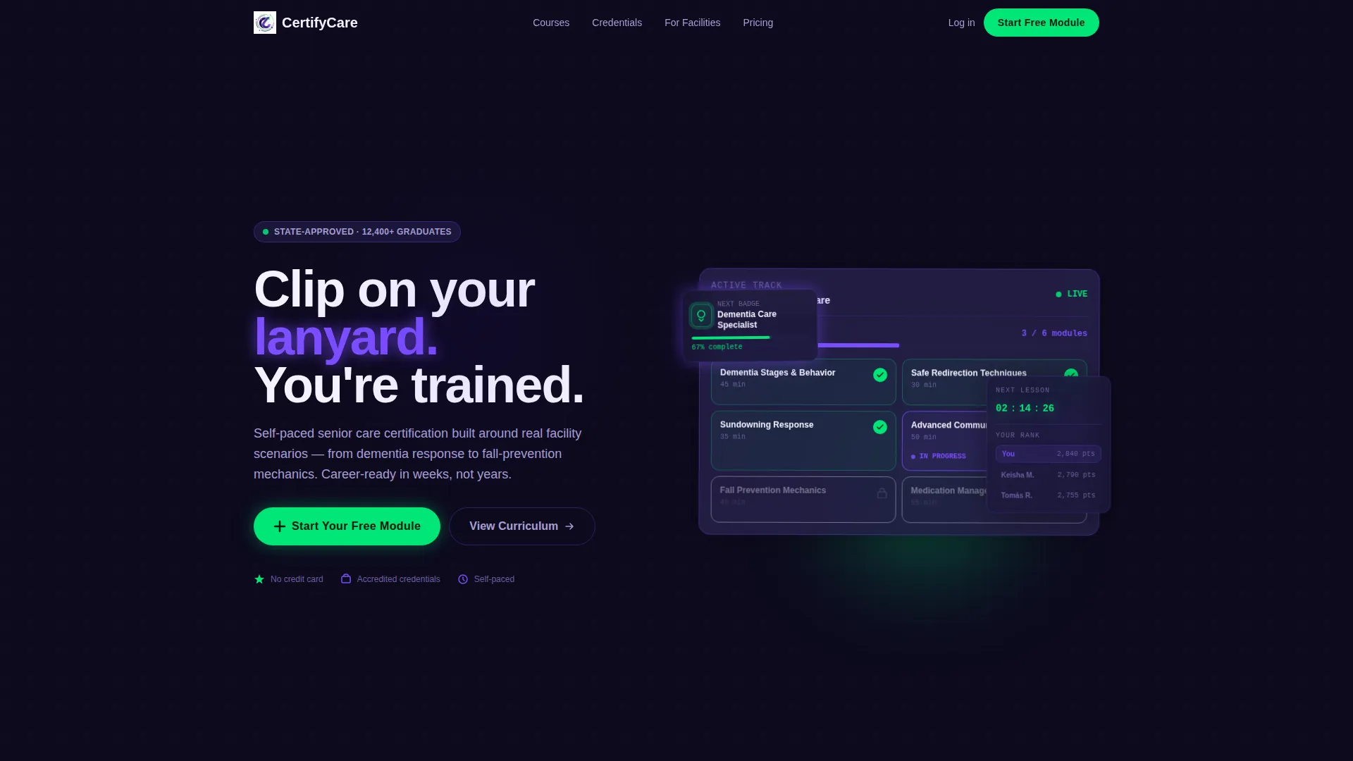
- A Dashboard Preview header that shows a stylized learner portal with module tiles, a circular progress ring, credential badge, leaderboard snippet, and countdown timer
- A click-through conversion structure with a fixed "Start Your Free Module" button and a secondary "Download the Career Guide" email capture path positioned at peak motivation
Feature list
This template is built around a small number of high-impact components. Each one earns its place by doing a specific conversion job.
Interactive Career Path Calculator
Visitors answer three questions: their current role, preferred care specialty, and available weekly study hours. The tool instantly outputs a personalized certification timeline, an estimated salary increase sourced from BLS data, and a recommended course bundle. All results render inside the same dashboard grid aesthetic as the rest of the page.
Live Dashboard Preview Header
The header mimics a real learner portal. It displays a module tile grid for an Advanced Dementia Care track, with completed modules marked in pulse green, one blinking "In Progress" tile showing a 67% circular progress ring, and locked future modules shown in a grayed-out state. A sidebar shows a credential badge in progress, a leaderboard snippet, and a next-lesson countdown timer.
Flipping Curriculum Data Cards
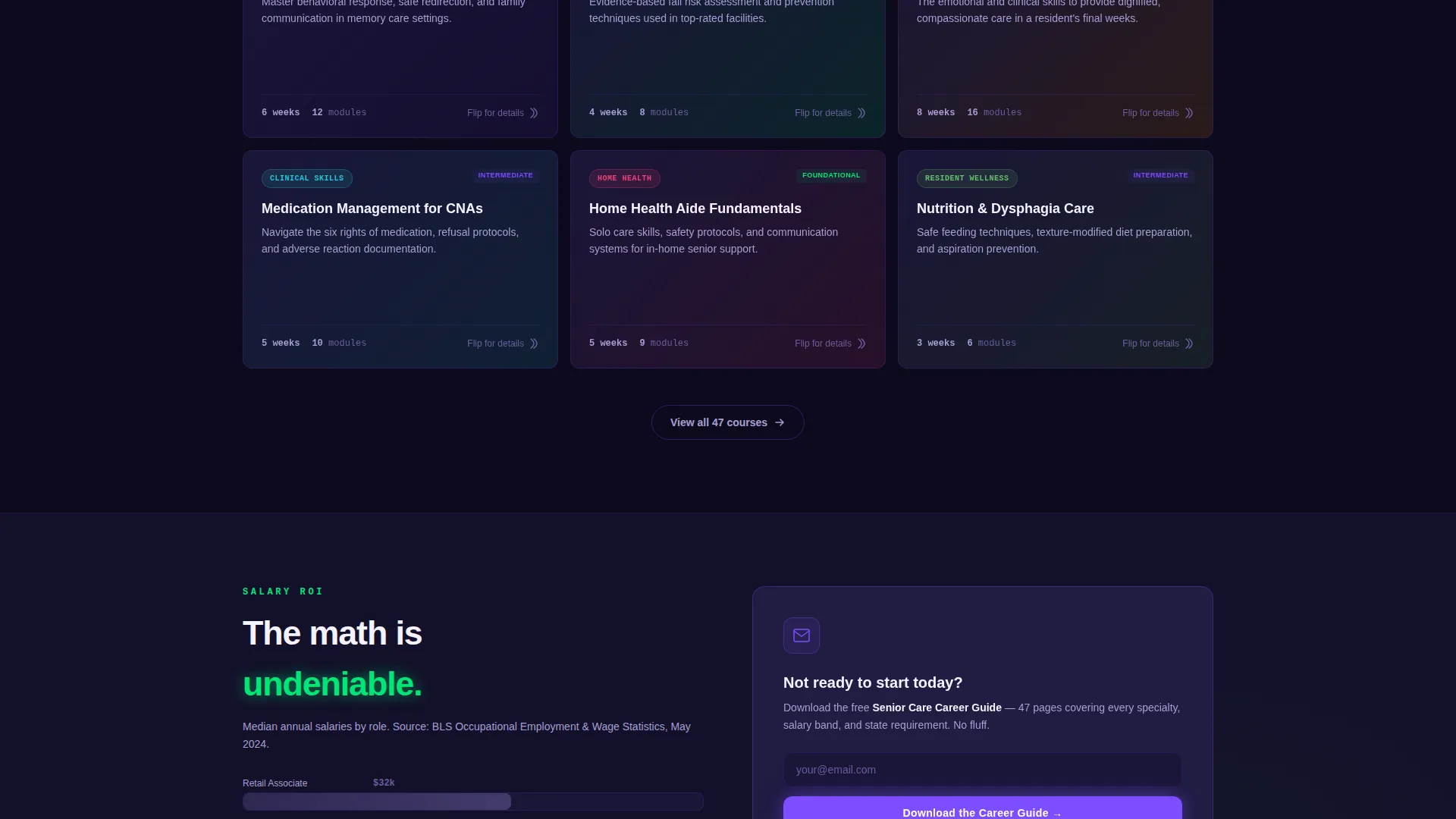
Course curriculum is presented as interactive data cards in a grid layout. Each card flips on interaction to reveal detailed module information. This keeps the curriculum section visually compact while giving engaged visitors the depth they want.
Salary Comparison Chart
A dedicated section presents a visual salary comparison chart that makes the return on investment clear. The chart is positioned to appear after the proof section, where visitor motivation is at its highest point in the scroll flow.
Fixed Viewport Call-to-Action Bar
Once a visitor scrolls past the calculator results, a "Start Your Free Module" button in pulse green stays fixed to the bottom of the viewport. It remains visible throughout the entire scroll journey without interrupting content reading.
Social Proof and Credentials Section
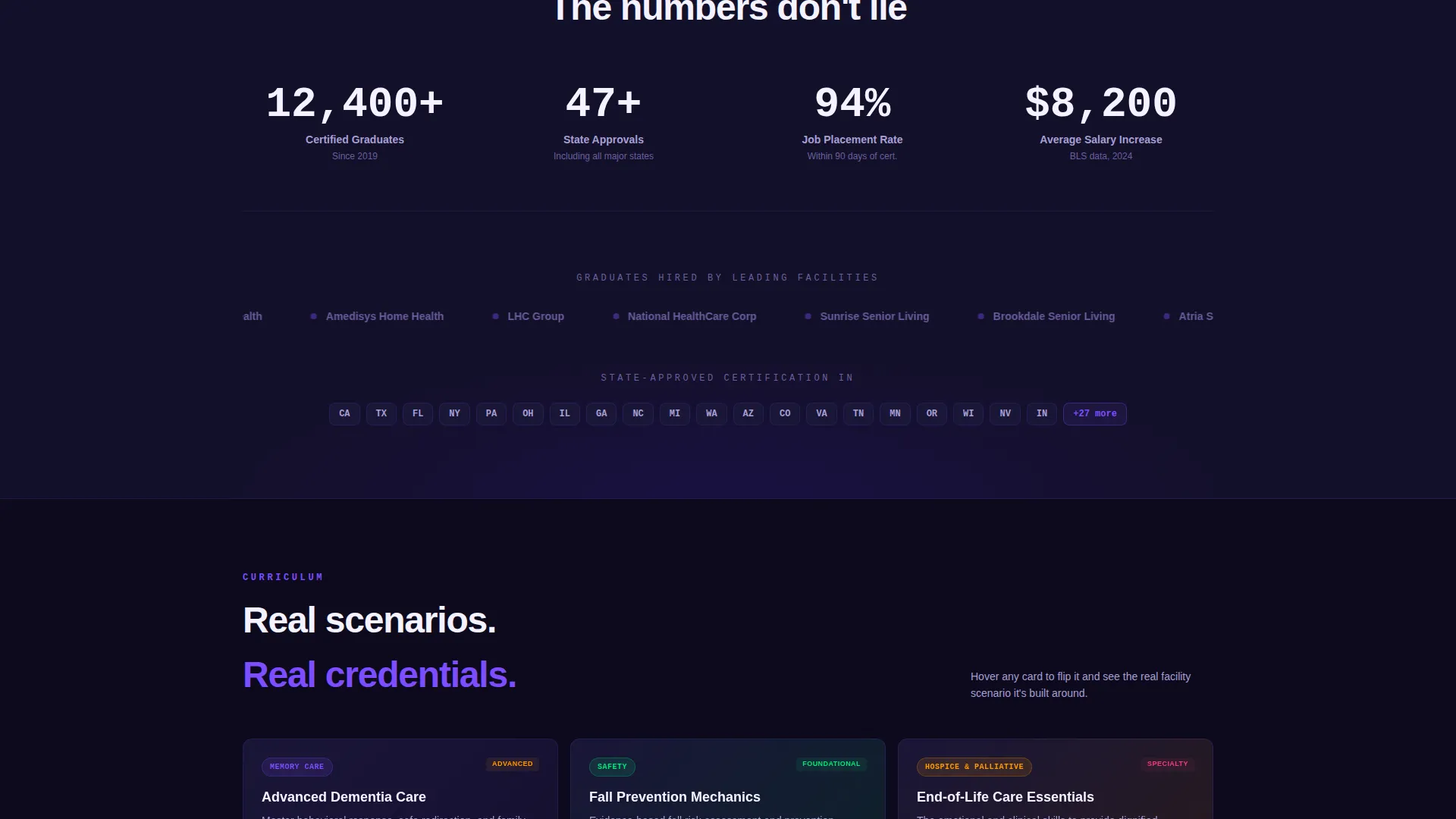
A dedicated proof band displays 12,400+ certified graduates, facility partner logos, and state-approval seals. This section appears early in the scroll sequence, immediately after the calculator, to reinforce trust before the curriculum pitch begins.
Page sections overview
| Section | Purpose |
|---|---|
| Dashboard Preview Header | Opens the page as a live learner portal to signal immediate familiarity |
| Career Path Calculator | Personalizes the pitch with a three-question tool before any scroll |
| Calculator Results Display | Shows custom timeline, salary projection, and course bundle recommendation |
| Social Proof Band | Builds trust with graduate count, partner logos, and approval seals |
| Curriculum Data Cards | Presents course modules as interactive, flippable grid cards |
| Salary Comparison Chart | Visualizes ROI to motivate undecided career-changers |
| Career Guide Capture | Offers a secondary email path after the salary section |
| Fixed Bottom call to action | Keeps the free trial button visible throughout the scroll journey |
Design & branding system
The visual identity follows a Startup Velocity theme built on the Electric Indigo color system. The palette is designed to feel like a focused health-tech application rather than a passive marketing page.
- Deep dashboard indigo (#3D17C6) anchors data panel backgrounds; luminous violet (#7C4DFF) highlights progress bars and active states; clinical white (#F4F2FF) surfaces cards cleanly against the dark panels
- Pulse green (#00E676) is used exclusively on completion badges, progress indicators, and all primary call-to-action buttons to create a clear visual hierarchy that directs the eye
- The overall aesthetic is deliberately app-like: glowing, energized, and focused, designed to make visitors feel they are looking at software they have already joined rather than a brochure they are being sold
Mobile & speed optimization
The dashboard grid layout is structured to reflow cleanly from widescreen to mobile viewports. The fixed bottom call-to-action bar is particularly important on mobile, where it keeps the primary conversion action within thumb reach at all times.
- Module tile grids and data card layouts adapt to single-column stacking on smaller screens without losing the visual structure of the dashboard aesthetic
- The Career Path Calculator is designed as a compact three-step interaction that works comfortably in a vertical mobile scroll without requiring horizontal scrolling or zooming
How this template helps you convert
Certify is structured as a click-through landing page with one primary goal: move the right visitor into a free trial sign-up. Every section is sequenced to build confidence and reduce hesitation before the ask.
- The Career Path Calculator creates a personalized experience before any generic pitch copy appears, which increases relevance and reduces early bounce for visitors who are still evaluating whether this program fits their situation.
- The proof section, salary chart, and credential badge elements compound trust incrementally as visitors scroll, so by the time they reach the secondary "Download the Career Guide" capture point, they have already seen enough evidence to act on either path.
Other information about this template
Certify is built for the intersection of health-tech design and senior care education. It suits platforms that want to position their course offering as a serious professional credential rather than a casual online class.
- The template style is Dashboard/Data Grid, which signals software credibility rather than a standard blog-style course page
- The creative direction is Calculator/Tool First, a conversion pattern well suited to audiences who need to see personal relevance before committing attention
- The click-through landing page direction means there is no embedded form on this page; the primary call to action routes to the platform's own signup screen, keeping the page light and focused
- The Electric Indigo color system and Startup Velocity theme are consistent with modern health-tech and edtech visual conventions, making the template appropriate for platforms that want to compete visually with well-funded digital products
Theme
Startup Velocity
Creative direction
Calculator/Tool First
Color system
Electric Indigo
Style
Dashboard/Data Grid
Direction
Click-Through
Page Sections
Interactive Career Path Calculator
Live Dashboard Preview Header
Flipping Curriculum Data Cards
Salary Comparison Chart
Fixed Bottom Call to Action Bar
Social Proof and Credentials Band
Related questions
Does this template include an actual working calculator?
Is there a form on this landing page?
Can I change the color system to match my existing brand?
Who is the target learner this page is designed to speak to?
Does the page work without the salary comparison data?



