Sports & Fitness Training Professional Website Template
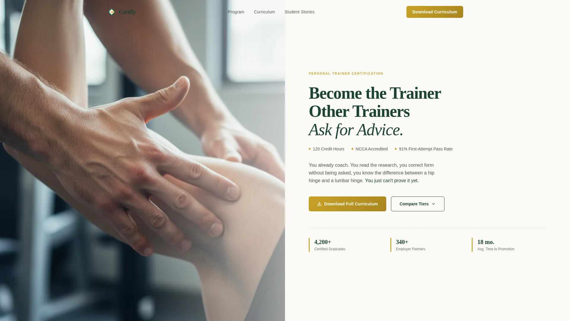
Certify is a single-page landing page template built for rigorous personal trainer certification programs. It combines a Half-Page Photo+Text header, a three-tier comparison table, and narrative scroll panels to guide visitors from curious gym-floor enthusiast to confident program applicant. The Botanical color system and Institutional Authority theme give every section scholarly credibility without feeling cold.
by Rocket studio
Quick summary
Certify is a landing page template designed for serious personal trainer certification programs. It pairs a cinematic header with a structured three-column comparison table and short story panels that keep readers scrolling. Two conversion paths lower friction: a curriculum guide download and a free practice exam offer. The result is a page that earns trust before it asks for anything.
Who this template is for
This template suits certification providers who need to communicate real academic depth. It speaks directly to ambitious, self-taught fitness enthusiasts who need formal credentials to advance their careers.
- Fitness education organizations offering accredited personal trainer certification programs
- Career-changers and former athletes ready to turn practical knowledge into professional qualifications
- Program marketers who need a page that proves curriculum depth before asking for a lead
What problem this template solves
Most certification landing pages read like product brochures. They list features without giving prospects a reason to care or a way to compare options honestly. Visitors leave unconvinced.
- Prospective students cannot tell the difference between rigorous certifications and weekend-webinar programs
- Programs with genuine academic depth have no structured way to showcase curriculum detail, practicum hours, and exam standards side by side
- High-intent visitors who are not ready to enroll have no low-friction path to stay connected
What you get with this template
The template delivers a complete single-page layout with every section pre-structured and purposefully ordered. Content and conversion work together from the first scroll to the final call to action.
- A Half-Page Photo+Text header with a serif headline and credential subhead, built to communicate authority instantly
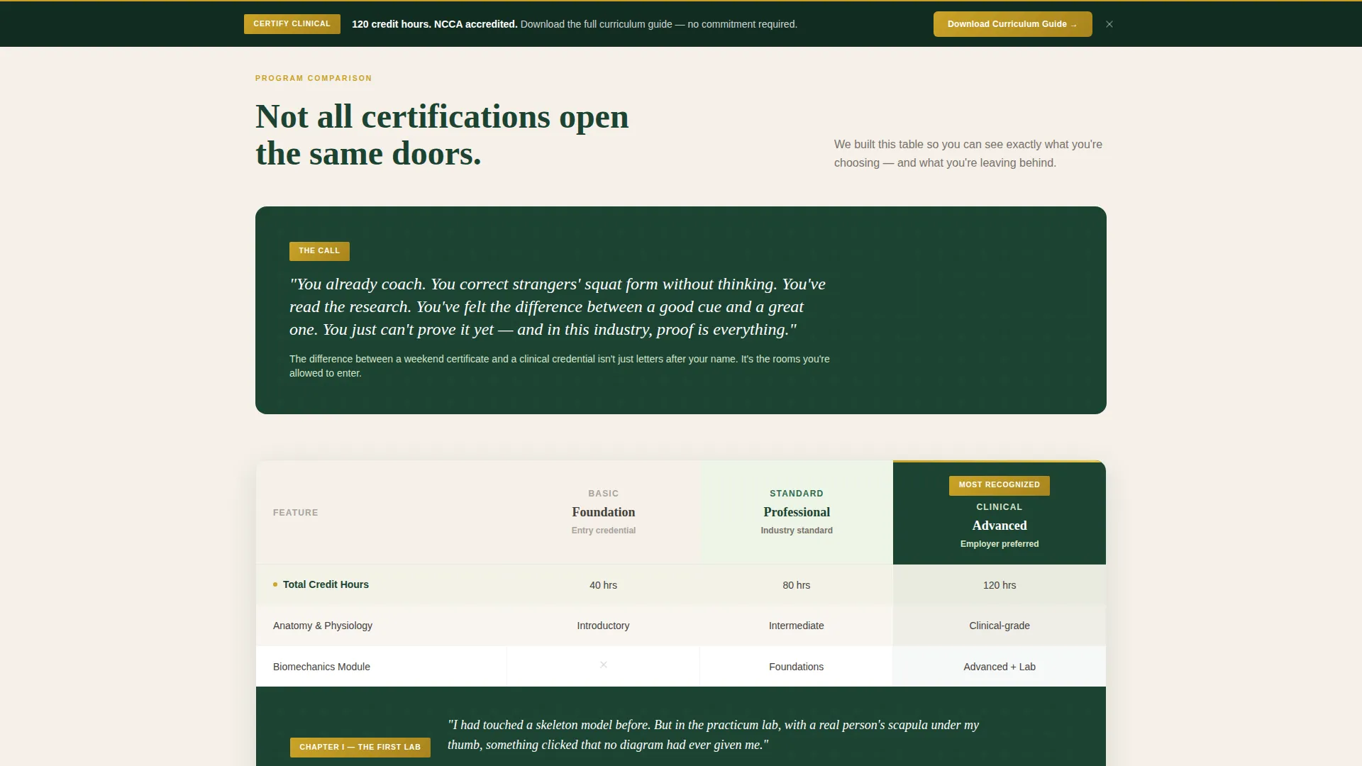
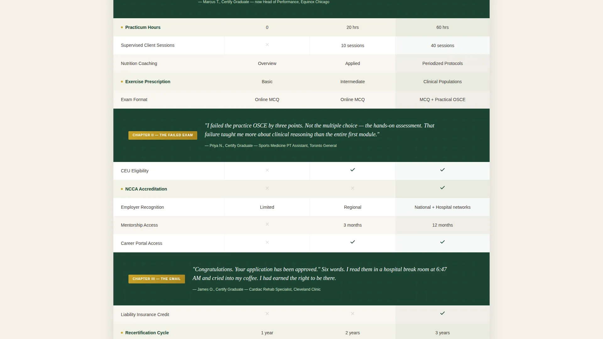
- A three-tier comparison table showing curriculum modules, practicum hours, exam format, continuing education unit eligibility, and employer recognition logos
- A sticky download bar, a curriculum guide form, and a low-friction practice exam opt-in path
Feature list
This template was built around one idea: a page that gives genuine value before it asks for anything in return.
Three-Tier Certification Comparison Table
Three certification options sit side by side in a structured table. Each column reveals curriculum modules, practicum hours, exam format, continuing education unit eligibility, and employer recognition logos. Visitors can evaluate options without leaving the page.
Dual Conversion Path Design
The primary call to action prompts visitors to download the full curriculum guide. A secondary path offers ten real practice exam questions gated only by an email address. Both paths are built into the page layout and reduce friction for visitors at different stages of readiness.
Sticky Call-to-Action Bar
A sticky bar with the curriculum guide download prompt appears after a visitor reaches roughly 40 percent of page depth. This keeps the primary conversion action visible throughout the scroll without interrupting the reading experience.
Narrative Scroll Panels
Short story panels sit between comparison table rows. Each panel captures a moment in a student's journey, an anatomy lab, a retaken exam, a congratulations email. These panels give the comparison table emotional context and keep the page from feeling like a spreadsheet.
Hero's Journey Scroll Arc
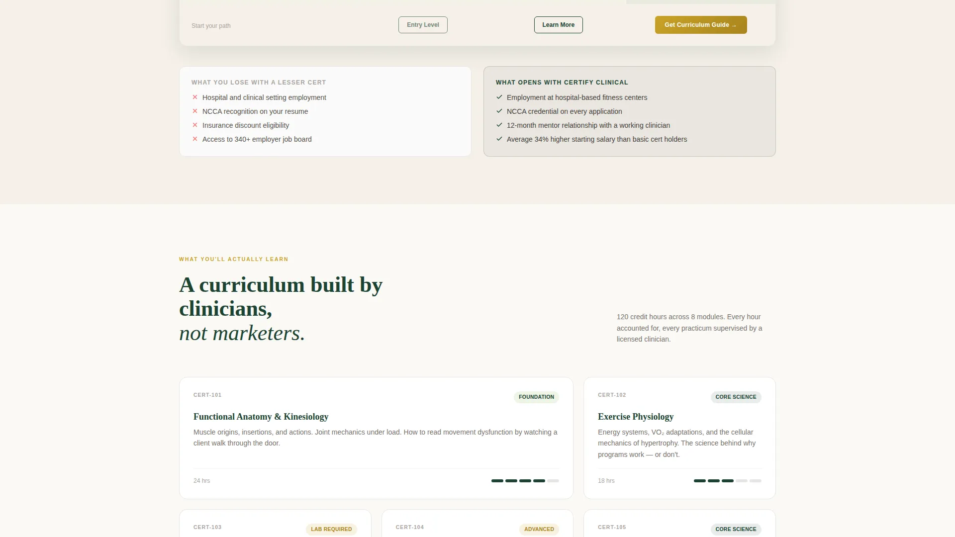
The page opens with the call to action framed as recognition: "You already coach, you just can't prove it yet." The scroll descends through comparison, stakes, and proof. Every section deepens the visitor's sense of what they stand to gain and what they risk by choosing a lesser program.
Gated Lead Capture Form
The curriculum guide form collects a first name, an email address, and one qualifying question: whether the visitor is currently training clients. The yes/no toggle keeps the form short while giving the program a useful first data point about each lead.
Page sections overview
| Section | Purpose |
|---|---|
| Half-Page Header | Anchor authority with editorial photography and serif headline |
| Credential Subhead Bar | Display credit hours, accreditation body, and pass rate at a glance |
| Opening Narrative Panel | Frame the visitor's existing knowledge as unproven coaching ability |
| Three-Tier Comparison Table | Compare certification levels across curriculum, practicum, and exam criteria |
| Interstitial Story Panels | Humanize the comparison with real student journey moments |
| Stakes Escalation Section | Clarify what a weaker certification costs and what this one opens |
| Curriculum Guide Form | Capture qualified leads with a short, three-field download form |
| Practice Exam Opt-In | Offer a low-friction secondary path for visitors not ready to commit |
| Sticky Download Bar | Keep the primary call to action visible after 40 percent scroll depth |
Design & branding system
The Botanical color system pairs institutional weight with natural warmth. Every color choice reinforces the program's academic seriousness without making the page feel sterile.
- Deep evergreen (#1B4332) anchors headers and navigation, lending scholarly authority to every section label
- Chalk-white (#FAF9F6) backgrounds give body text and comparison cells clean, well-margined breathing room
- Dried sage (#A3B18A) softens secondary section backgrounds, while pressed-flower amber (#C9A227) is reserved strictly for calls to action and credential badge accents
Mobile & speed optimization
The layout is structured to remain clear and navigable on smaller screens. The comparison table and sticky bar are the two most layout-sensitive components, and both are built with mobile reading in mind.
- The three-column comparison table is designed to reflow cleanly on narrower viewports so no credential detail gets clipped
- The sticky call-to-action bar is sized for easy tap targets on mobile devices without obscuring key content
How this template helps you convert
Conversion on this page is earned, not demanded. The template builds proof before it asks for commitment.
- The comparison table gives away genuine curricular detail, establishing credibility and making the curriculum guide feel like a natural next step rather than a cold data grab.
- The dual conversion path meets visitors where they are: the curriculum guide form captures high-intent leads, while the practice exam opt-in keeps lower-intent visitors connected with minimal friction.
Other information about this template
This template sits at the intersection of the Education and Training category and the Sports and Fitness Training subcategory, with a specific focus on the personal trainer certification niche. It is a strong fit for organizations looking to position themselves against lower-rigor alternatives in a crowded market.
- The template style is a Comparison Table landing page, making it well suited for programs with multiple certification tiers or credential tracks
- The Institutional Authority theme is designed to signal academic credibility, which is especially relevant in fitness education where program quality varies widely
- The Hero's Journey creative direction keeps the scroll emotionally engaging so visitors feel personal investment before they reach any form
- The Content and Resource landing page direction means the page leads with value, giving prospects real curriculum information before requesting contact details
Theme
Institutional Authority
Creative direction
Hero's Journey
Color system
Botanical
Style
Comparison Table
Direction
Content/Resource
Page Sections
Three-tier Certification Comparison Table
Dual Conversion Path Design
Sticky Call-to-action Bar
Narrative Scroll Panels
Gated Lead Capture Form
Hero's Journey Scroll Arc
Related questions
Who is this landing page template designed for?
Can I use this template for a single certification tier instead of three?
What makes this template different from a standard course landing page?
What information does the lead capture form collect?
Is this template suitable for a program that is not yet fully accredited?



