Verified Credential Landing Page Template
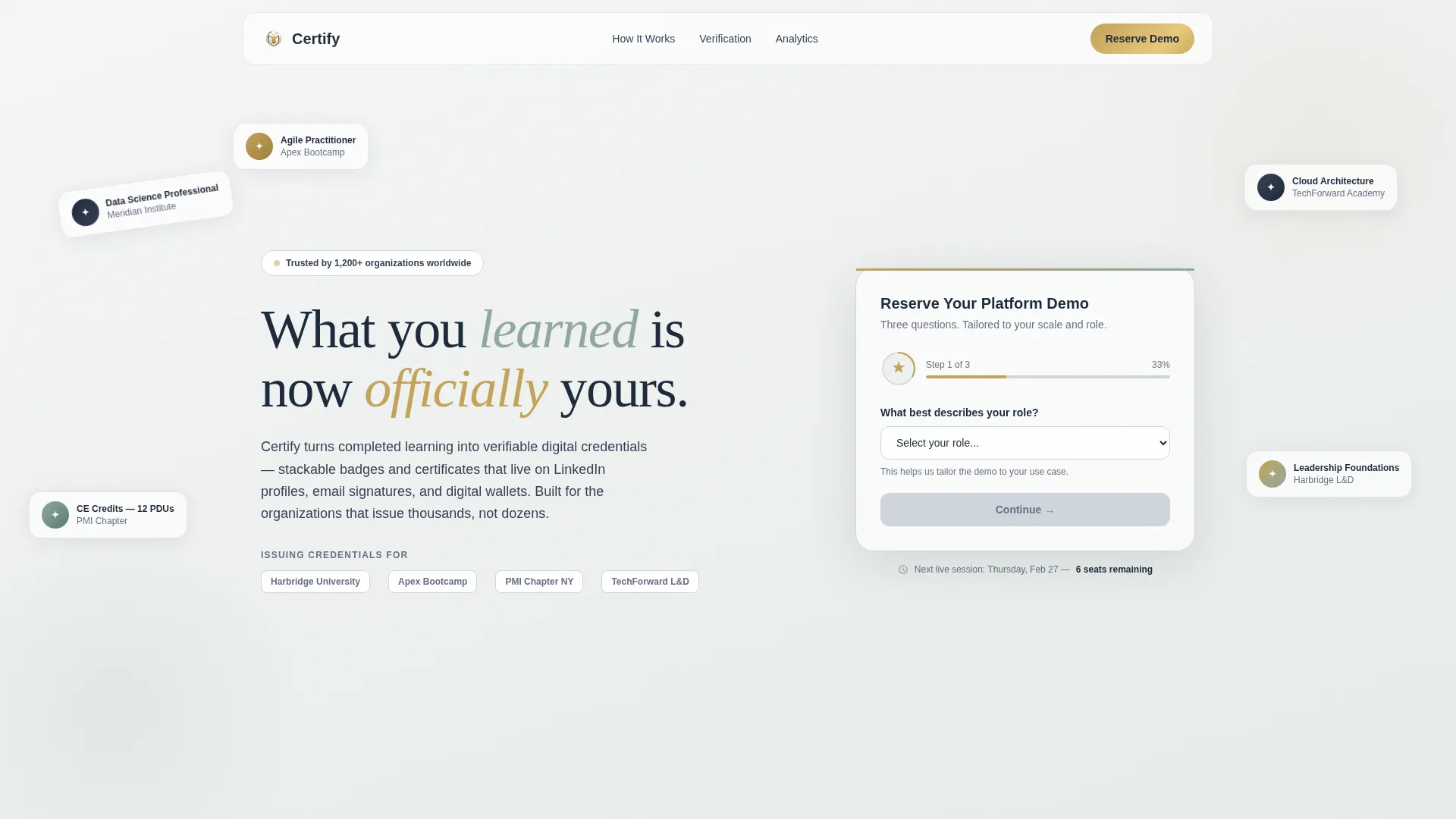
Certify is a zigzag landing page template built for certification and badge platforms. It guides visitors through a Hero's Journey scroll experience, from credential creation to organizational impact. A three-step header form pre-qualifies registrants by role and volume, and every section builds toward one focused goal: reserving a platform demo.
by Rocket studio
Quick summary
Certify is a single-page landing page template designed for digital credential platforms. It combines an Educational Guide visual theme with a Hero's Journey narrative scroll, a multi-step qualification form, and a focused event registration flow. The result is a page that feels authoritative yet approachable, built to turn informed visitors into confirmed demo registrants.
Who this template is for
This template speaks directly to the people who issue credentials at scale. It anticipates their specific concerns and frames the product around real operational workflows.
- Learning and development directors building internal skill taxonomies who need a credible, professional presence for their credentialing program
- Bootcamp operators whose graduates need portable, verifiable proof of completion that travels beyond the classroom
- Professional association administrators issuing continuing education credits to large member bases on a quarterly cycle
What problem this template solves
Most platforms selling credential tools show screenshots and bullet points. Visitors leave without truly understanding the value chain a single badge creates. This template fixes that.
- It replaces passive feature lists with a narrative scroll that shows the full lifecycle of one credential, from course completion to hiring manager verification
- It pre-qualifies visitors through a role-and-volume intake form so the demo conversation starts with context, not cold introductions
- It reframes badges as measurable business infrastructure rather than a cosmetic add-on, shifting the visitor's question from "why badges" to "how soon"
What you get with this template
You get a fully structured, single-page landing page that handles both storytelling and lead qualification in one scroll. Every section has a defined job, and the layout keeps visitors moving forward.
- A three-step multi-step form in the header that collects role, annual credential volume, and contact details before the demo is booked
- A zigzag alternating content layout that follows the credential journey from learner achievement through issuer dashboard to LinkedIn profile, verification link, and HR system integration
- A sticky bottom bar with a secondary call to action showing a live session date and remaining seat count, designed to create informed urgency
Feature list
This template includes a focused set of design and interaction features drawn directly from the brief. Each one serves the page's core conversion goal.
Three-Step Qualification Form
The header houses a multi-step form that moves through role selection, annual issuance volume, and contact capture. Each step transition animates a small badge icon that fills in progressively, visually echoing the credential being assembled. A micro-progress bar runs across the top of the form to orient visitors at every step.
Hero's Journey Narrative Scroll
The page tells the story of one credential from start to finish. Sections escalate from personal learner achievement to issuer dashboard activity to organizational trust and industry-wide portability. This structure gives every content block a narrative purpose, not just a product description role.
Zigzag Alternating Section Layout
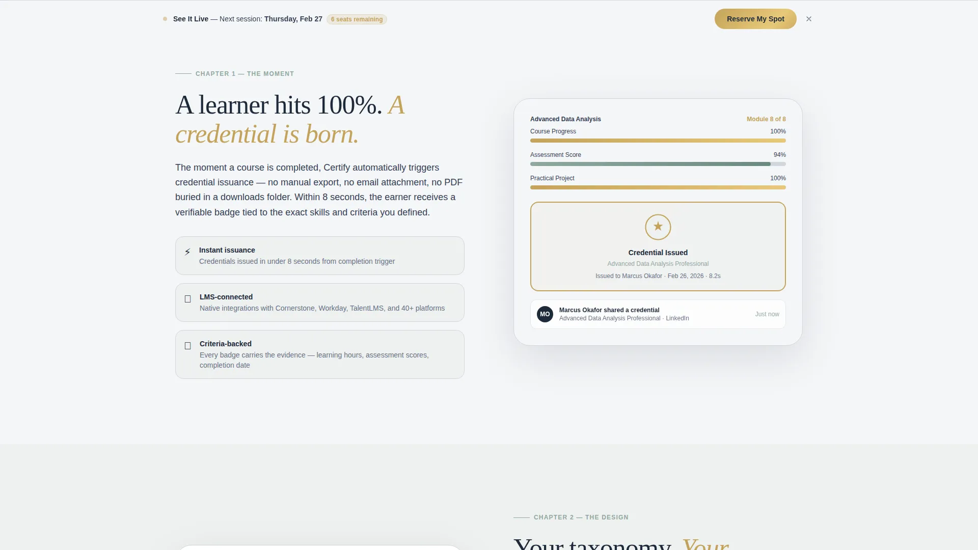
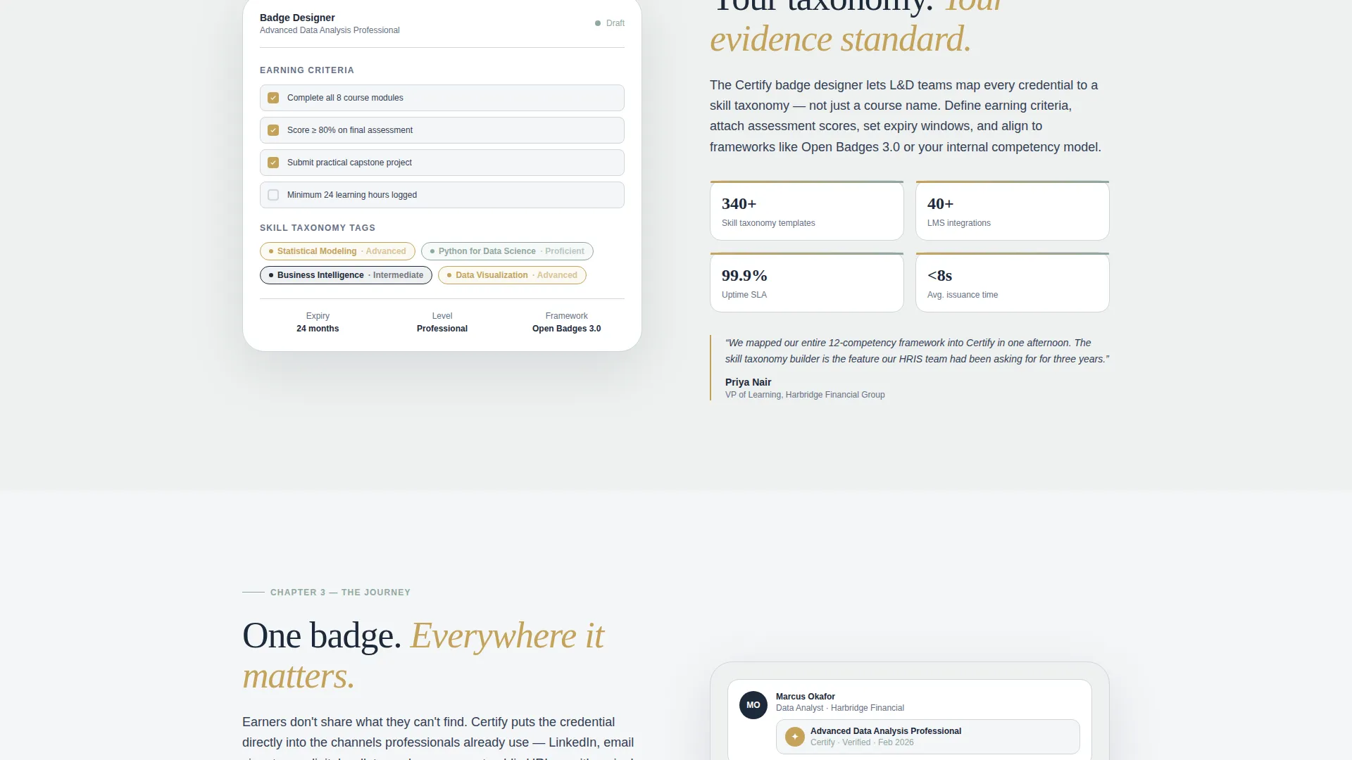
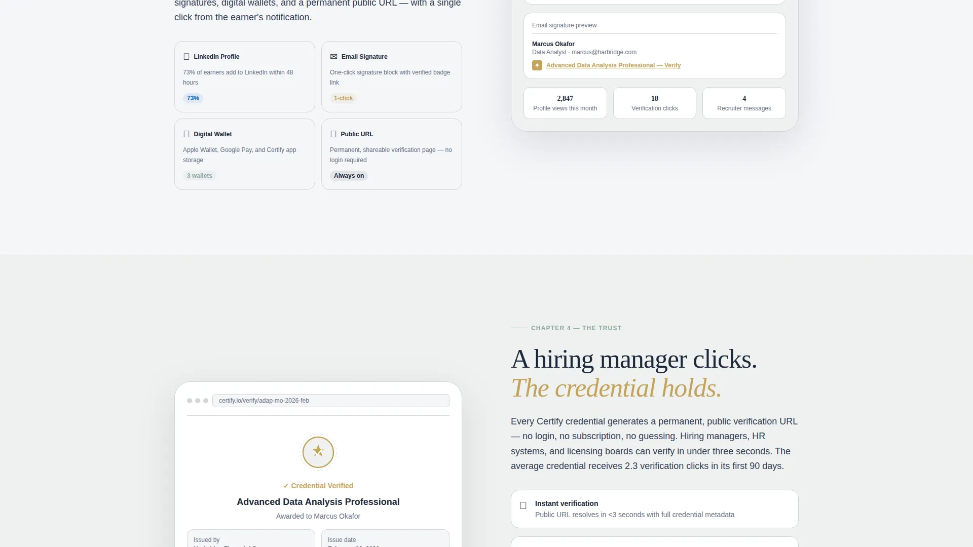
Content panels alternate sides as the visitor scrolls. Each panel carries a distinct moment in the credential lifecycle, accompanied by wireframe illustrations such as a progress bar hitting one hundred percent or a badge appearing inside a LinkedIn profile view. The alternating rhythm keeps the page visually dynamic and easy to scan.
Credential Analytics Section
Near the bottom of the page, a data-rich section presents aggregate metrics including issuance volume, verification clicks, and earner engagement rates. This section is designed to reframe the platform as measurable business infrastructure for decision-makers who need to justify investment.
Sticky Secondary Call to Action Bar
After the third scroll section, a sticky bottom bar reappears and persists. It carries the secondary call to action "See It Live" alongside a session date and remaining seat count. This keeps the registration prompt visible without interrupting the reading experience.
Credential Gold Interactive States
Buttons, hover states, and focused form fields use a warm credential gold color that distinguishes interactive elements from the calm neutral background. The gold reads as earned rather than decorative, reinforcing the platform's tone of quiet authority.
Page sections overview
| Section | Purpose |
|---|---|
| Header with Form | Qualify visitors by role and issuance volume before the demo |
| Learner Achievement | Show the credential lifecycle starting at course completion |
| Issuer Dashboard | Illustrate how badges are designed with criteria and metadata |
| Badge Distribution | Demonstrate portability across LinkedIn, email, and digital wallets |
| Verification and Trust | Show hiring manager verification and HR system connectivity |
| Analytics Overview | Present issuance volume, verification clicks, and earner engagement |
| Primary Demo call to action | Drive event registration with "Reserve Your Platform Demo" |
| Sticky Session Bar | Surface secondary call to action with live date and seat count |
Design & branding system
The visual identity follows an Educational Guide theme built on a Soft Mist color palette. The overall feel is a university library at dawn, calm and authoritative without feeling cold or corporate.
- The background alternates between cloud white (#F4F6F8) and a faint sage wash, with morning fog gray (#D0D5DD) used for ruling lines, card borders, and structural separators
- Muted sage (#8FA89E) handles progress indicators and section accents, while deep scholarly ink (#1D2939) anchors all headlines and body text for strong contrast and readability
- Credential gold (#C4A35A) activates all interactive states including buttons, hover responses, and focused form fields, giving interactive moments a distinct earned quality that stands apart from the neutral base
Mobile & speed optimization
The template is structured for clean rendering across screen sizes. The zigzag layout and multi-step form are both designed with mobile reading in mind.
- The three-step header form requires no scrolling within the form itself, keeping the interaction compact and manageable on smaller screens
- Alternating content panels restack vertically on narrow viewports so the narrative sequence stays intact and readable without horizontal overflow
- The sticky bottom bar is sized to remain unobtrusive on mobile while keeping the secondary call to action accessible throughout the scroll
How this template helps you convert
Every design and content decision in this template serves a single conversion goal: getting qualified visitors to reserve a platform demo. The page earns that registration systematically.
- The multi-step header form pre-qualifies every registrant by role and annual volume before they ever reach the demo booking step, so the sales conversation starts with context already established
- The Hero's Journey scroll builds cumulative conviction section by section, so by the time a visitor reaches the final call to action, they have already traced the full value of a single issued credential from personal achievement to organizational data layer
- The sticky session bar introduces scarcity through a live date and seat count, giving hesitant visitors a concrete, time-bound reason to act without resorting to generic urgency language
Other information about this template
This template is categorized under Education and Training, with a specific focus on the online course platform and certification and badge platform niche. A few additional details worth noting before you use or customize the template.
- The template style is Zigzag/Alternating, meaning each content section mirrors and offsets its neighbor, creating visual rhythm without requiring custom layout work
- The primary call to action is "Reserve Your Platform Demo," framed around event registration, making this template well suited for platforms that use live demos or guided walkthroughs as their main sales motion
- The credential gold interactive color (#C4A35A) is intentionally distinct from the neutral base palette, so button and form states are immediately recognizable without requiring additional design work
Theme
Educational Guide
Creative direction
Hero's Journey
Color system
Soft Mist
Style
Zigzag/Alternating
Direction
Event Registration
Page Sections
Three-step Qualification Form
Hero's Journey Narrative Scroll
Zigzag Alternating Layout
Credential Analytics Section
Sticky Secondary Call to Action Bar
Credential Gold Interactive States
Related questions
Who is this landing page template designed for?
Can I adapt the multi-step form to match my own qualification questions?
Does this template support a single-page layout or multiple pages?
What is the primary conversion goal of this template?
How does the color system work for customization?



