Chain - Powerful Blockchain Landing Page Template
Chain is a dashboard-style blockchain consulting landing page built for agencies that architect smart contracts, audit Solidity codebases, and ship decentralized protocols. A live-data stats wall leads the page, followed by a chain comparison grid, before-and-after case study cards, and a regulatory heatmap. The primary call to action drives downloads of a proprietary audit and monitoring tool.
by Rocket studio
Quick summary
Chain is a single-page, data-grid landing page for a blockchain consulting and development agency. It opens with an oversized metrics wall, then walks visitors through a chain-by-chain comparison grid, client case study cards, and a regulatory readiness heatmap. The page closes every section with a "Download Chain Scanner" call to action backed by a multi-platform download modal.
Who this template is for
This template is built for technically credible blockchain service firms that need to present hard data, not marketing promises. It suits teams whose work spans smart contract architecture, Solidity auditing, and decentralized protocol development.
- DeFi founders preparing for a mainnet launch who need a page that signals readiness and depth
- Enterprise innovation leads tasked with tokenizing real-world assets and evaluating a development partner
- DAO treasurers and governance leads who need proof of on-chain experience before committing
What problem this template solves
Most agency templates rely on vague value propositions and hero images. Blockchain buyers are technical and skeptical. They need verifiable proof before they engage, and a generic layout fails that test immediately.
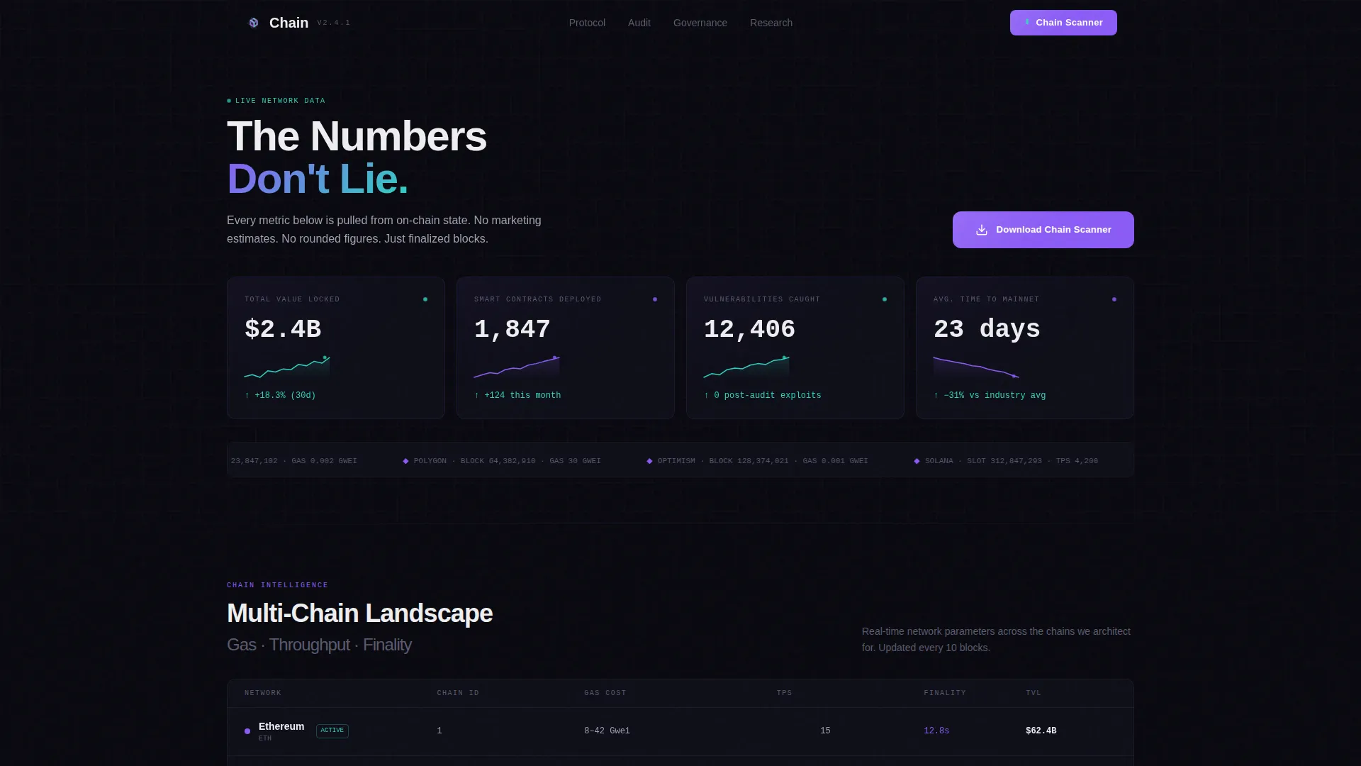
- It replaces soft marketing claims with a live-data stats wall showing total value locked, contracts deployed, vulnerabilities caught, and average deployment timelines
- It communicates analytical depth through a chain comparison grid and jurisdiction heatmap, making complexity visible rather than hiding it
- It earns the app download by presenting proprietary data first, so the call to action lands on a visitor who already trusts the source
What you get with this template
The template delivers a complete, single-page layout structured like an industry report. Every section is designed to escalate the visitor's understanding of the blockchain landscape before asking them to act.
- A stats wall header with four oversized metric tiles, each carrying a sparkline and violet glow border effect
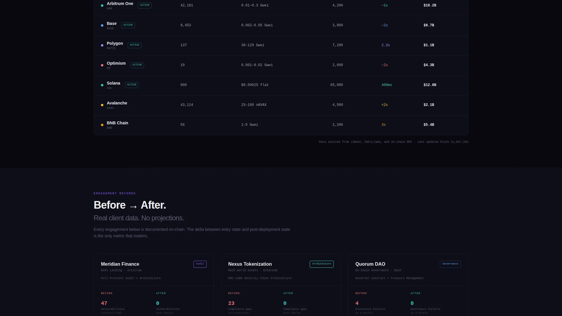
- A chain-by-chain comparison grid covering gas costs, transactions per second, and finality times across networks
- Client case study cards formatted as before-and-after metric comparisons, a regulatory readiness heatmap by jurisdiction, and a sticky-bar call to action that reappears after the second scroll section
Feature list
This template includes purpose-built components drawn directly from the brief. Each one serves the agency's goal of converting technically minded visitors into tool downloads and qualified inquiries.
Live-Data Stats Wall Header
Four oversized metric tiles open the page with real figures: $2.4 billion in total value locked across client protocols, 1,847 smart contracts deployed, 12,406 audit vulnerabilities caught before mainnet, and a 23-day average deployment-to-launch time. Each tile carries a subtle sparkline beneath the number and a violet glow on the tile border.
Chain-by-Chain Comparison Grid
A dense data grid compares active blockchain networks across three dimensions: gas costs, transactions per second (TPS), and finality times. This component lets visitors assess network trade-offs at a glance and signals the agency's cross-chain fluency without a single marketing claim.
Before-and-After Case Study Cards
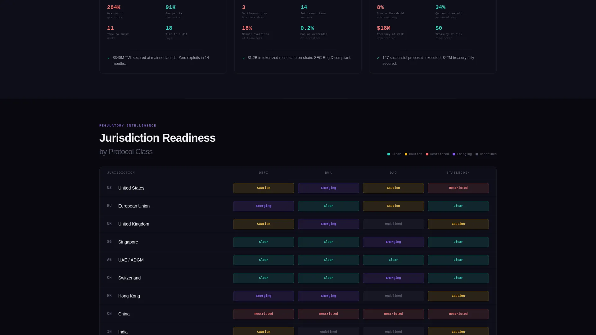
Each client engagement is presented as a paired metrics card. Cards show pre-audit vulnerability counts against post-audit results and pre-optimization gas spend against post-optimization figures. The format is clinical and specific, building trust through documented outcomes.
Regulatory Readiness Heatmap
A jurisdiction-by-jurisdiction heatmap visualizes regulatory complexity across relevant markets. It escalates visitor awareness of compliance risk and frames the agency as a necessary guide through that complexity rather than a simple vendor.
Sticky Download Bar with Modal
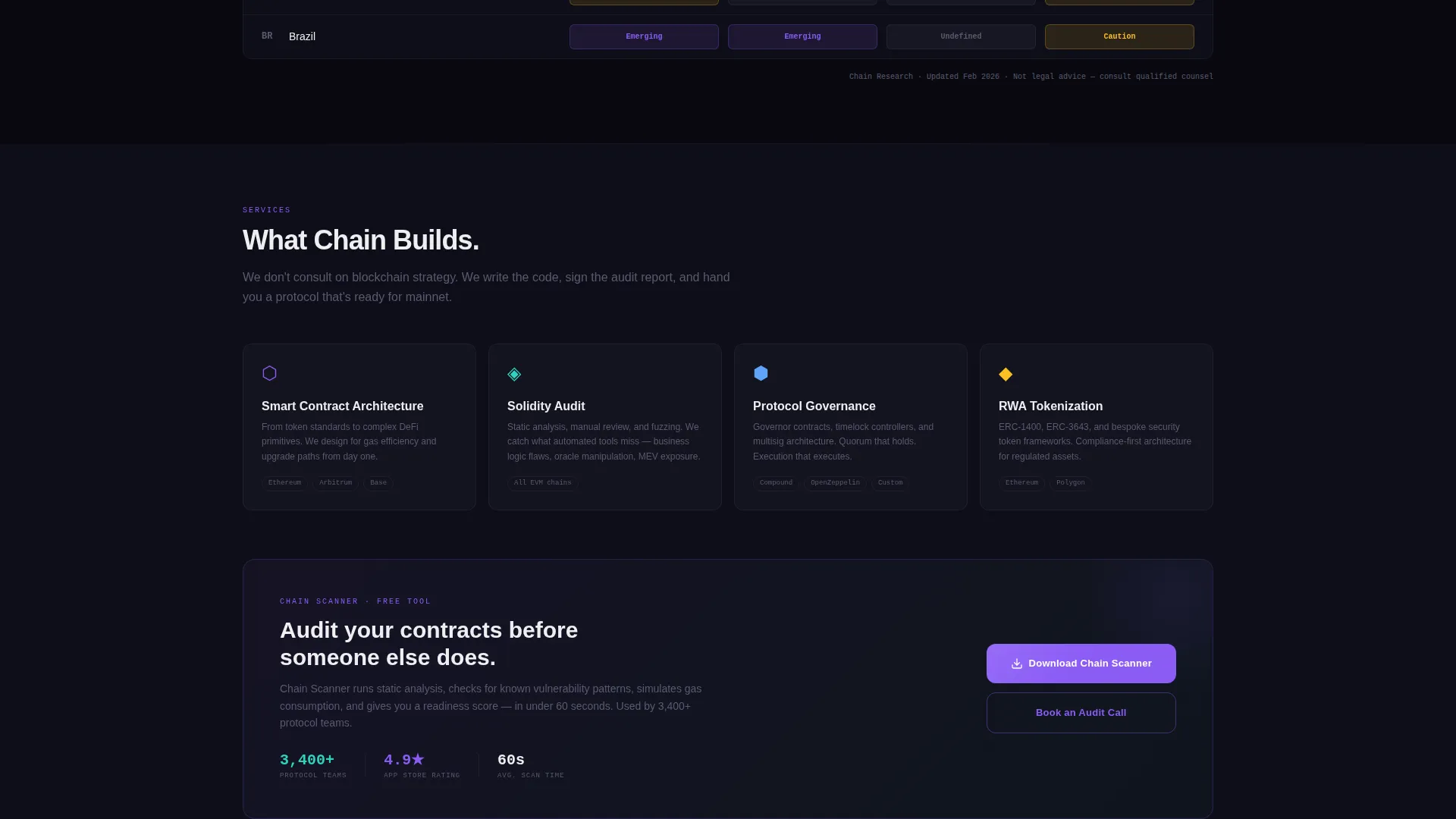
The "Download Chain Scanner" call to action appears first beneath the stats header, then resurfaces as a sticky bottom bar after the second scroll section. Clicking opens a modal with platform toggles for iOS, Android, and CLI, an email field for the download link, and a single checkbox for the weekly on-chain intelligence digest.
Dashboard Pro Dark Grid Layout
The full page uses a void black base with a dense, card-based grid structure. Violet marks active states and interactive elements. Teal fires on success confirmations and positive metric indicators. Signal white keeps data legible across all panels.
Page sections overview
| Section | Purpose |
|---|---|
| Stats Wall Header | Opens with four live-metric tiles to anchor credibility immediately |
| Chain Comparison Grid | Compares gas costs, TPS, and finality across networks |
| Case Study Cards | Shows before-and-after client metrics for audit and gas work |
| Regulatory Heatmap | Maps compliance complexity across jurisdictions by region |
| Primary Download call to action | First "Download Chain Scanner" button beneath the stats header |
| Sticky Download Bar | Reappears after second scroll section as a persistent bottom bar |
| Download Modal | Platform toggles, email field, and digest opt-in checkbox |
Design & branding system
The visual identity uses the AI Iridescent color system layered over a Dashboard Pro dark theme. The result looks like a block explorer running at full capacity, dark surfaces, glowing confirmations, and data that feels live.
- Core palette: void black (#09090F) for all panel and card backgrounds, holographic violet (#8B5CF6) for active states and primary interactions, iridescent teal (#2DD4BF) for success states and positive metric changes, and signal white (#EEEEF0) for all primary text
- Violet casts a faint glow on tile borders throughout the stats wall, giving the impression that the data itself is generating light
- The overall aesthetic follows an industry report cadence, meaning each visual section escalates information density to build analytical authority before the call to action appears
Mobile & speed optimization
The dashboard grid layout adapts to smaller screens without sacrificing data density. The sticky download bar remains accessible across scroll depth on mobile, keeping the call to action reachable at any point in the reading journey.
- Card-based grid sections reflow cleanly for narrower viewports, maintaining legibility of metric tiles and comparison grids
- The sticky bottom bar is designed to stay visible on mobile without obscuring content, so visitors can act without losing their place in the page flow
How this template helps you convert
The page is structured to earn trust before it asks for anything. Visitors move through escalating proof before they ever see a persistent call to action.
- The stats wall opens with four specific, high-credibility numbers that immediately separate this agency from generic competitors and give visitors a reason to keep reading
- The comparison grid and case study cards build analytical authority section by section, so by the time the sticky download bar appears, visitors have already absorbed enough proprietary data to trust the tool behind it
- The download modal reduces friction by offering three platform options and a single optional opt-in, making the conversion step feel low-commitment and technically relevant
Other information about this template
This template is categorized under Technology, with a subcategory focus on blockchain and cryptocurrency services. It is specifically designed for the blockchain consulting and development agency niche. The Dashboard Pro theme and AI Iridescent color system are the foundational design frameworks used throughout the layout.
- The template style is a dashboard and data grid layout, suited for data-heavy service presentations where numbers carry the argument
- The header concept is a stats and metrics wall, replacing a traditional hero image with live-looking numerical proof
- The creative direction follows an industry report format, escalating complexity across sections to make the implicit case that expert guidance is necessary
- The primary call-to-action direction is an app download, driving visitors toward the agency's proprietary Chain Scanner audit and monitoring tool
Theme
Dashboard Pro
Creative direction
Industry Report
Color system
AI Iridescent
Style
Dashboard/Data Grid
Direction
App Download
Page Sections
Live-data Stats Wall Header
Chain-by-chain Comparison Grid
Before-and-after Case Study Cards
Regulatory Readiness Heatmap
Sticky Download Bar with Modal
Dashboard Pro Dark Grid Layout
Related questions
Who is this landing page template designed for?
Can I edit the metric numbers in the stats wall?
How does the download modal work?
Does the sticky bar appear on mobile devices?
Can this template support a different primary call to action?



