Precision Perishables | Free Website Template | Rocket
Chain is a data-first, hub-and-spoke landing page template built for frozen and perishable food last-mile delivery services. It leads with a live-stats header, side-by-side competitor comparisons, proof-of-delivery visuals, and a route audit conversion flow. The Teal Catalyst color system gives it the look of a cold-chain monitoring dashboard running at full capacity.
by Rocket studio
Quick summary
Chain is a single-page, anchor-nav landing page template for B2B cold-chain and perishable food last-mile delivery services. It opens with five animated performance metrics, then walks visitors through spec comparisons, proof-of-delivery evidence, customer-fit cards, and a cost-per-drop breakdown. Every section is designed to make switching providers feel inevitable.
Who this template is for
This template is built for logistics and supply chain operators who need to convert skeptical B2B buyers with hard data, not lifestyle copy. It fits teams that already have the numbers and want a page that lets those numbers do the work.
- Regional grocery chains and their VP of Supply Chain or Head of Logistics
- Meal-kit operations directors whose customer satisfaction scores depend on arrival temperature
- Seafood distributors and pharma-adjacent perishables operators needing Food Safety Modernization Act (FSMA) chain-of-custody documentation
What problem this template solves
Cold-chain logistics providers struggle to differentiate on a standard landing page. Buyers arrive with a specific question: "Can you prove your temperature compliance?" Generic hero images and bullet-point promises do not answer that question. Chain solves this by replacing soft marketing copy with a structured comparison format that turns data into a closing argument.
- Providers lose credible deals because their pages cannot show compliance rates, variance data, or cost-per-drop comparisons side by side
- Buyers in frozen and perishable food logistics need audit-ready proof, not assurances, before they will switch carriers
- The absence of a clear, data-led conversion path means high-intent visitors leave without requesting a route audit or downloading a spec sheet
What you get with this template
You get a fully structured hub-and-spoke landing page with an anchor navigation bar that follows the scroll. Every spoke section is a self-contained data argument. The page is designed desktop-first for B2B decision-makers, with mobile parity built in.
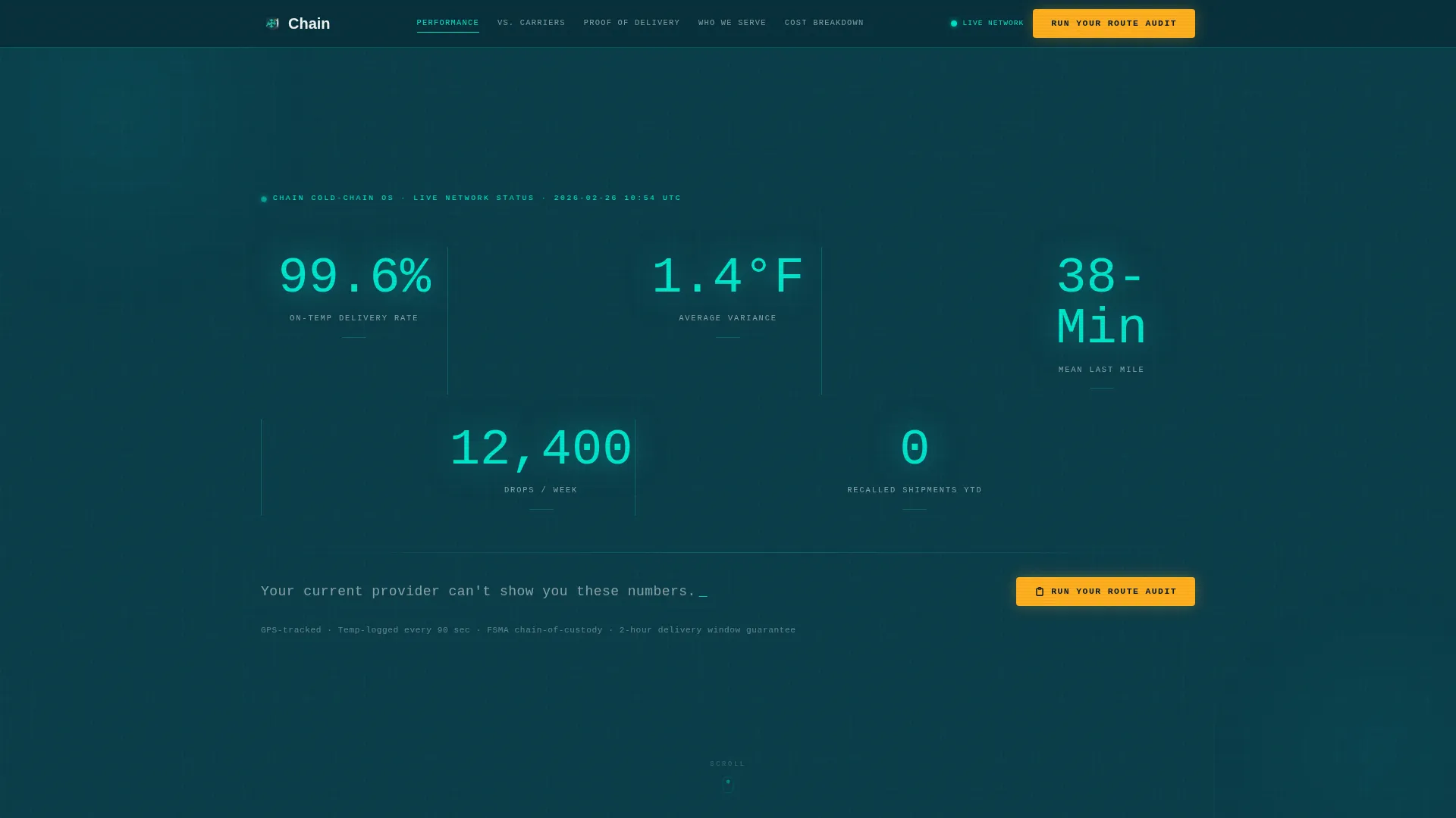
- A live-stats header with five counting-animation metrics rendered in monospace type against deep cold-room teal
- Five named spoke sections covering spec comparison, proof of delivery, ideal customer profiles, and cost breakdown, each reachable from the persistent anchor nav
- Two conversion paths: a three-field Route Audit modal triggered by an alert amber call-to-action button, and a gated PDF spec sheet download at the foot of each comparison table
Feature list
This section describes the core functional and design capabilities built into the Chain template as defined in the source brief.
Live-Stats Metrics Header
The header displays five typographic performance stats in live-wire cyan against a deep cold-room teal background. Each number runs a counting animation on load, simulating a real-time data pull. A single white tagline sits beneath the stats to anchor the competitive framing.
Anchor Navigation Bar
A persistent anchor nav stays pinned to the top of the viewport as visitors scroll. It links directly to each spoke section and keeps the primary call-to-action button visible at all times. This removes friction between reading a section and acting on it.
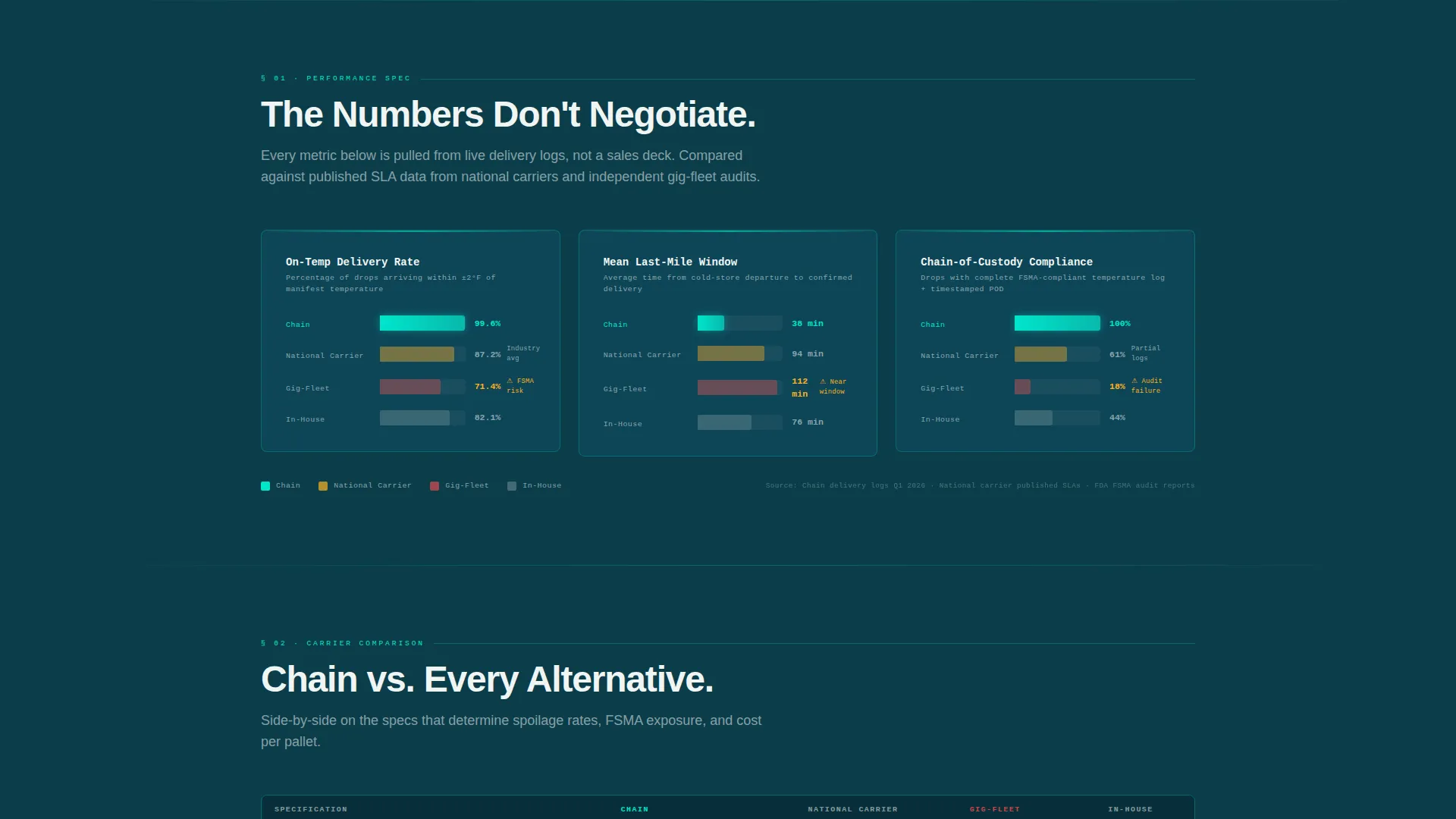
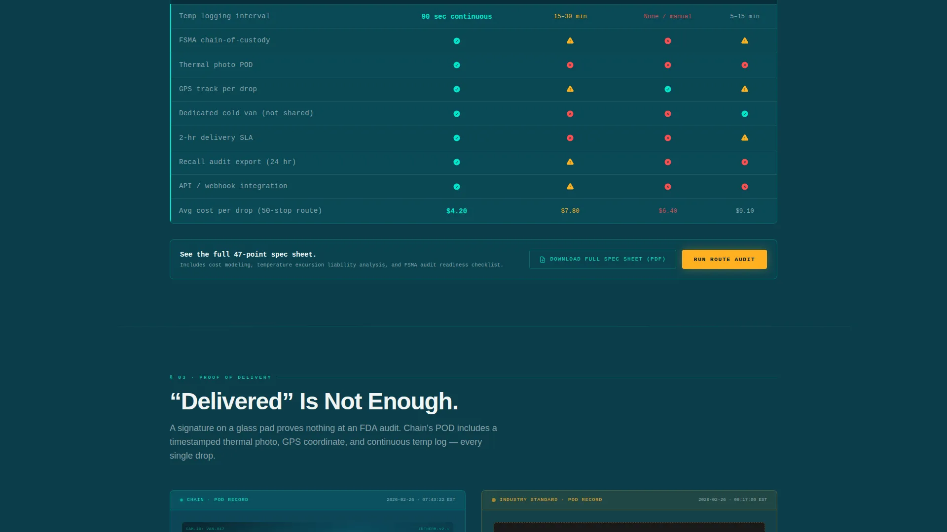
Spec Comparison Section
Side-by-side bar charts compare temperature compliance rates and other key metrics against named competitor archetypes: National Carrier, Gig-Fleet, and In-House operations. Sortable comparison tables include cost-per-drop breakdowns. Alert amber flags highlight competitor columns to draw the eye to performance gaps.
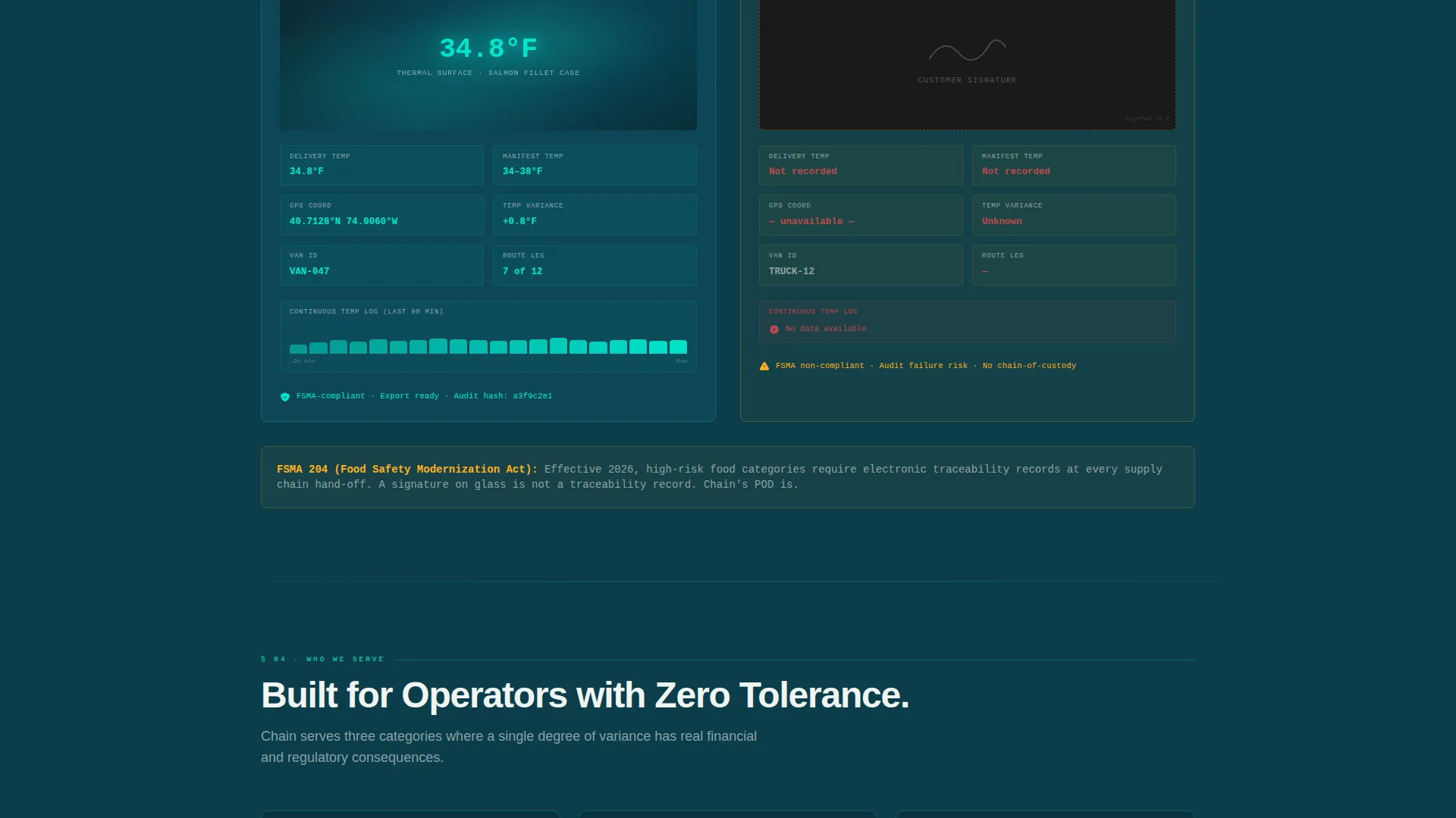
Proof-of-Delivery Comparison
A visual comparison block shows Chain's timestamped thermal photo proof of delivery alongside a generic signature-pad screenshot. The contrast is immediate and specific. This section addresses the chain-of-custody documentation requirement that FSMA-audited seafood distributors and pharma perishables operators need.
Ideal Customer Profile Cards
Three cards present the primary buyer segments: regional grocery chains, meal-kit companies, and seafood or pharma-grade perishables operators. Each card frames the buyer's specific pain point and links it to a corresponding data argument elsewhere on the page.
Route Audit Conversion Modal
The primary call-to-action opens a three-field modal form asking for current monthly drop volume, primary product category (frozen, chilled, or ambient), and the ZIP code of the busiest delivery zone. The form is designed to feel diagnostic, not sales-driven, so submission feels like getting an answer rather than starting a pitch.
Page sections overview
| Section | Purpose |
|---|---|
| Stats Metrics Header | Opens with five animated performance numbers and a competitive tagline |
| Spec Comparison Charts | Side-by-side bar charts and sortable tables versus competitor archetypes |
| Proof of Delivery | Visual contrast between Chain thermal photos and generic signature pads |
| Who It Serves | Three ideal customer profile cards for grocery, meal-kit, and seafood buyers |
| Cost Breakdown | Cost-per-drop table with Route Audit modal and gated PDF download |
| Linear Footer | Single-row footer pattern with supporting links and legal text |
Design & branding system
The template uses the Teal Catalyst color system, which is built to evoke a cold-chain monitoring dashboard running at 2 a.m. The palette is dark, luminous, and purposeful, with each color assigned a specific functional role.
- Deep cold-room teal (#0B3D4A) serves as the primary page background, giving every section a controlled, clinical atmosphere
- Live-wire cyan (#00E5CC) renders all data highlights, animated stats, and interactive accents in a color that reads as live and precise
- Clinical white (#F0F5F4) is used for card surfaces and body text, keeping data legible against dark backgrounds
- Alert amber (#FFB020) is reserved strictly for the primary call-to-action button and competitor-column comparison flags, making both unmissable
Mobile & speed optimization
The template is built desktop-first to match how B2B supply chain decision-makers typically research and evaluate vendors. Mobile parity is included so the page remains fully functional on any device size.
- Scroll-reveal animations, GSAP stagger effects, and cursor parallax are handled by client-side components, keeping static content fast to render
- Server Components handle all static content sections, separating animation load from core page delivery
- The anchor nav collapses appropriately on smaller screens so the call-to-action remains accessible throughout the scroll
How this template helps you convert
Chain is structured around a single conversion logic: show the visitor their current provider's weakness in every section, then offer an audit that quantifies the gap. The page earns the click before it asks for it.
- The stats header immediately establishes a performance benchmark with hard numbers (99.6% on-temp delivery, 1.4°F average variance, zero recalled shipments year-to-date), making any unnamed competitor's absence of data feel like a liability
- Each comparison section escalates the argument with bar charts, sortable tables, and visual proof-of-delivery contrasts, so by the time a visitor reaches the cost breakdown, switching providers feels like a logical conclusion rather than a risk
- The Route Audit call-to-action is framed as a diagnostic tool, not a sales form, which lowers the psychological barrier to submission and increases the likelihood of high-intent leads converting
Other information about this template
This template is suited to the frozen and perishable food last-mile delivery niche but can also serve adjacent cold-chain logistics services that compete on compliance data. The spec-sheet creative direction and hub-and-spoke structure make it adaptable for any provider whose value proposition relies on measurable performance gaps.
- The template is built in English with USD pricing conventions and US date formatting, matching the primary North American B2B logistics market
- Typography uses DM Sans for body and headline copy paired with JetBrains Mono for all data, stats, and monospace display elements, reinforcing the data-command aesthetic
- Animation intensity is high by design: counting stats, scroll reveals, GSAP stagger transitions, and cursor parallax are all specified in the brief and integral to the page's dashboard feel
- The gated PDF download path at the foot of each comparison table provides a secondary lead-capture mechanism for buyers who are not yet ready to request a full route audit
Theme
Data Command
Creative direction
Spec Sheet
Color system
Teal Catalyst
Style
Hub & Spoke (Anchor Nav)
Direction
Comparison/Versus
Page Sections
Live-stats Counting Header
Persistent Anchor Navigation
Spec Comparison Charts and Tables
Proof-of-delivery Visual Block
Route Audit Conversion Modal
Gated PDF Spec Sheet Download
Related questions
What type of business is this template designed for?
Can I update the performance stats shown in the header?
What are the two conversion paths built into this template?
Does the template include actual competitor performance data?
Is this template suitable for cold-chain services outside of food logistics?


