Expert Directory & Marketplace Platforms Appointment Booking Website Template
Chair is a sleek, card-grid landing page template built for salon and barber directories. It guides visitors from a frustrating search experience to confident booking through a cinematic Problem-to-Solution layout. The dark, steel-toned design, filterable stylist cards, and side-by-side comparison mechanic make it easy for anyone to find and choose their next cut with real evidence instead of guesswork.
by Rocket studio
Quick summary
Chair is a single-page, card-grid directory template designed for salon and barbershop discovery platforms. It opens with a cinematic dark header, walks visitors through the problem of unreliable stylist searches, then flips the experience into a live, filterable directory. The design is built around intent: every section earns the next click.
Who this template is for
This template is built for founders and designers launching a local service discovery platform in the salon and barber space. It is equally useful for product teams prototyping a directory-style marketplace.
- Entrepreneurs building a city-wide salon or barber directory product
- Designers creating a high-fidelity prototype for a grooming discovery platform
- Teams who need a modular, card-grid landing page ready to customize and launch
What problem this template solves
Finding a reliable barber or stylist online is still a frustrating experience. Blurry portfolio photos, ghost profiles, and blind review picks leave people guessing right up until they sit in the chair.
- Visitors cannot compare stylists fairly without consistent, real portfolio evidence
- No-show availability info and filtered-out negative reviews destroy trust before a booking
- Generic directory layouts bury the information people actually need: specialty, distance, and next open slot
What you get with this template
You get a fully structured, single-page directory landing page built around a modular card grid. Every section is purposeful and ordered to move a frustrated visitor toward a confident booking action.
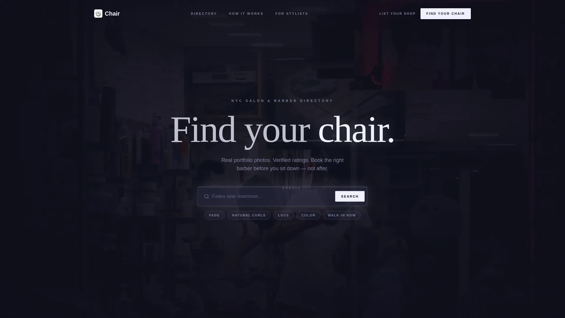
- A dark full-bleed header with a centered, glowing search bar pre-filled with ghost text
- A Problem-to-Solution scroll arc that visualizes the broken search experience before revealing the working directory
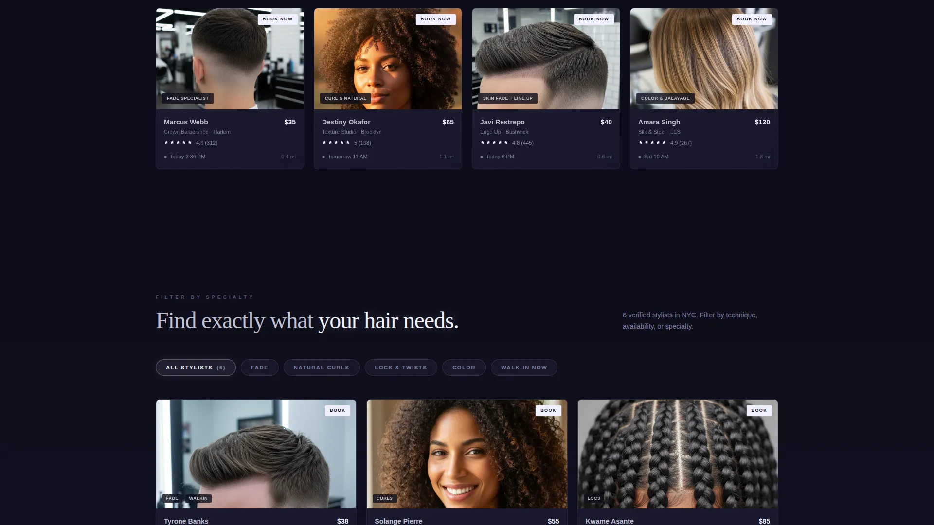
- Stylist cards with portfolio thumbnails, ratings, distance, next-available slot, and a "Book Now" badge
Feature list
This template ships with a focused set of layout components that reflect how real directory users think and behave. Each feature addresses a specific friction point in the salon discovery journey.
Cinematic Full-Bleed Header
The header uses a dark, inside-the-barbershop photograph facing the storefront window. A neon sign reflects in the glass, a single barber chair catches overhead light, and a glowing search bar floats center-frame. Ghost text reading "Fades near downtown..." gives an instant cue for what the directory does.
Problem-to-Solution Scroll Arc
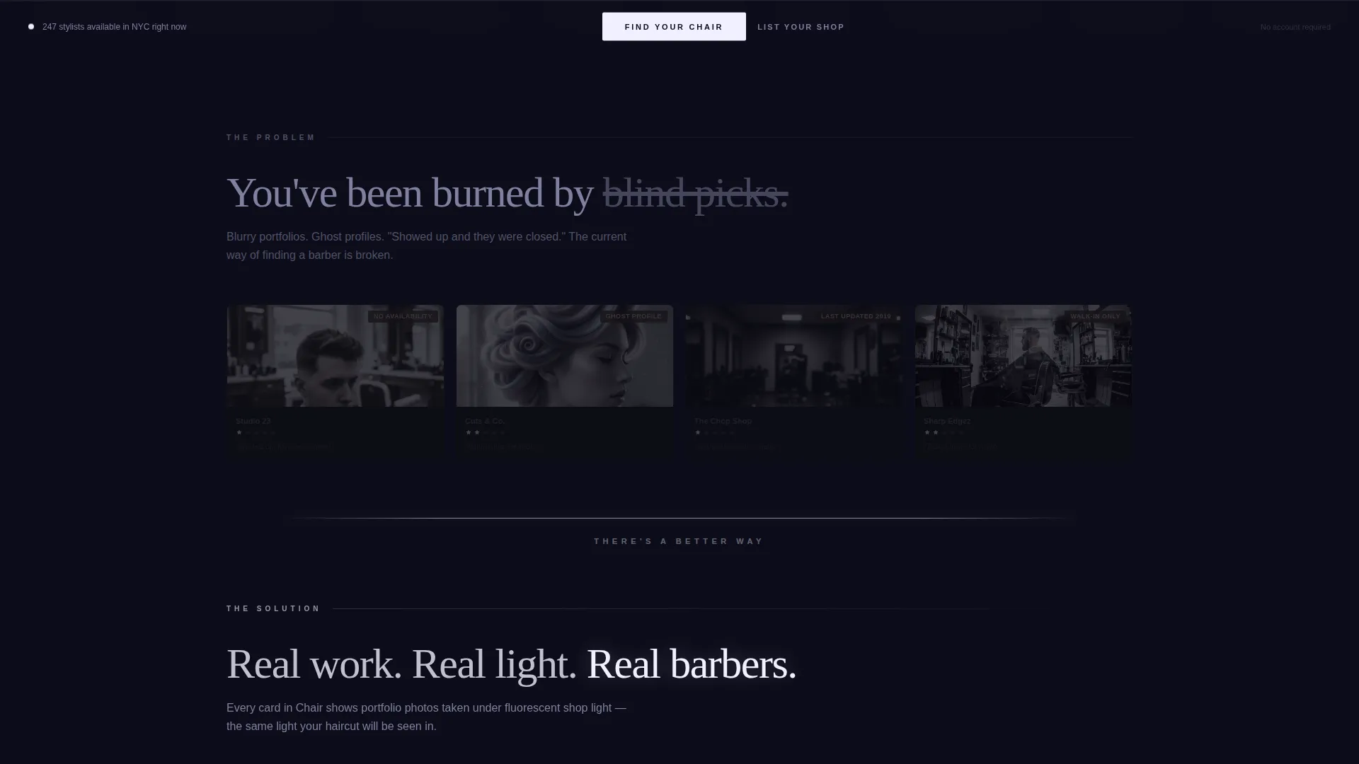
The page opens with a mosaic of broken experiences: one-star snippets, blurry photos, "No availability" badges, and ghost profiles rendered in dimmed, desaturated cards. A horizontal rule of glowing white marks the hard break. Below it, the same card grid comes alive with real stylist data.
Modular Filterable Card Grid
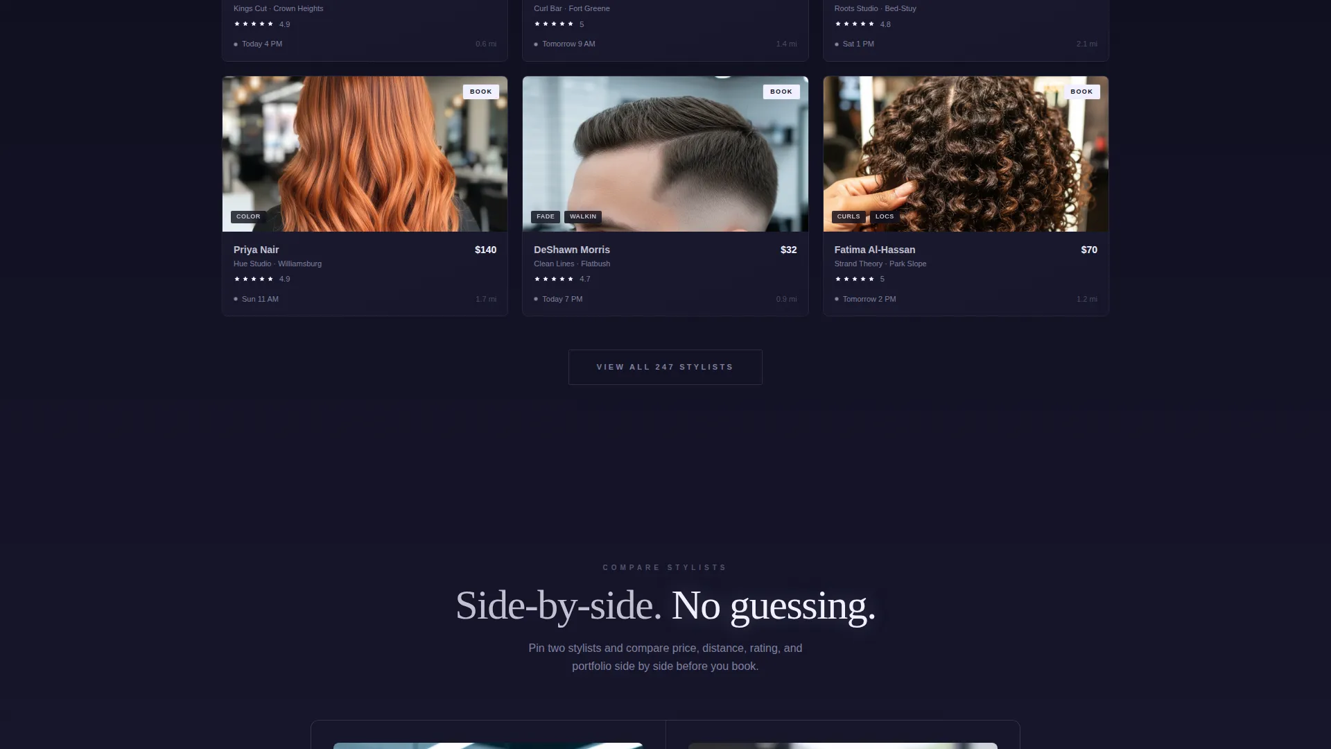
Each stylist card displays a sharp portfolio thumbnail, specialty tag, star rating, distance, next available appointment slot, and a "Book Now" action badge. The grid is filterable by fade technique, curl specialty, and walk-in availability, so visitors narrow down choices in seconds.
Side-by-Side Stylist Comparison
Two stylist cards can be pinned and placed in a two-column comparison view. The layout surfaces price, distance, rating, and portfolio style in parallel. The booking button activates only after at least one card has been explored, so every click carries real intent.
Sticky "Find Your Chair" call to action Bar
A sticky bottom bar appears after the problem section resolves on scroll. The primary call to action, "Find Your Chair," stays visible throughout the rest of the page. A secondary path, "List Your Shop," lives in the navigation for salon owners who land organically.
Progressive Glow Reveal Design
Each section below the fold gets progressively brighter as the visitor scrolls. The hot-white glow accent spreads across active cards, filter interactions, and call-to-action pulses. The effect mirrors lights turning on across a city block, reinforcing the sense of discovery with every scroll step.
Page sections overview
| Section | Purpose |
|---|---|
| Dark header hero | Establishes cinematic mood and invites the first search action |
| Problem mosaic section | Shows the broken stylist-search experience in dimmed, desaturated cards |
| Visual break rule | Marks the hard transition from problem to solution with a glowing white line |
| Live directory grid | Displays active stylist cards with real data, filters, and booking badges |
| Filter controls bar | Lets visitors narrow results by fade technique, curl specialty, or walk-in status |
| Comparison view panel | Pins two stylist cards side by side for direct price, distance, and rating comparison |
| Verified reviews strip | Shows verified client reviews with photos for additional social proof |
| Sticky call to action bar | Anchors the "Find Your Chair" action and "List Your Shop" secondary path |
Design & branding system
The visual identity follows a Monochrome Steel palette that feels like a stainless-steel comb under shop lighting. Everything reads cool and hard-surfaced until an interaction brings warmth and focus to the selected element.
- Core colors: deep charcoal (#1A1A2E) for backgrounds, brushed gunmetal (#3D3D5C) for card surfaces, and clipper-chrome silver (#C0C0D0) for body text
- Accent color: hot-white glow (#F0F0FF) used exclusively on hover states, active cards, and call-to-action pulses to make every interaction feel like flipping a switch
- Backgrounds run charcoal-to-gunmetal subtle gradients, keeping depth without distraction, while the glow-white appears only where the visitor acts
Mobile & speed optimization
The card grid layout is modular by design, which means it reflows naturally across screen sizes without losing the visual hierarchy. The sticky call to action bar and filter controls are positioned to stay accessible on smaller screens.
- Modular card components stack cleanly on mobile without breaking the Problem-to-Solution narrative flow
- The sticky bottom bar keeps the primary "Find Your Chair" action reachable on any device without requiring a scroll back to the top
- Touch-friendly card interactions and tap-activated glow states preserve the cinematic feel on mobile screens
How this template helps you convert
The entire page is structured around earning the booking click with evidence rather than asking for blind trust. Every design and layout decision reduces hesitation and increases the visitor's confidence before they act.
- The Problem-to-Solution Arc makes the pain of bad directory experiences visceral first, so the working directory feels like genuine relief rather than just a feature list.
- The side-by-side comparison mechanic replaces hope with side-by-side evidence, and the booking button only activates after a card is explored, ensuring visitors click with intent rather than impulse.
- The progressive glow reveal rewards continued scrolling and makes the page feel alive, keeping visitors engaged long enough to reach the sticky "Find Your Chair" call to action.
Other information about this template
Chair fits naturally into the Directory and Discovery theme within the Technology category, specifically under Directory and Marketplace Platforms serving the Salon and Barber Directory niche. A few additional details worth knowing before you build:
- The template style is Card Grid (Modular), making individual stylist cards easy to duplicate, reorder, or extend with additional data fields
- The creative direction follows a Problem-to-Solution Arc, a layout approach well suited to any local service marketplace where trust is earned through evidence
- The header concept is Dark Full-Bleed with Glow, combining a full-width photograph, a charcoal wash overlay, and a single pulsing interactive element to create cinematic stillness
- The landing-page direction is Comparison-versus, meaning the layout is specifically optimized for side-by-side decision-making rather than a linear read-and-scroll experience
- Two distinct user paths are built in: one for end users seeking a stylist through "Find Your Chair," and one for salon owners discovering the platform through "List Your Shop" in the navigation
Theme
Directory & Discovery
Creative direction
Problem→Solution Arc
Color system
Monochrome Steel
Style
Card Grid (Modular)
Direction
Comparison/Versus
Page Sections
Cinematic Dark Full-bleed Header
Problem-to-solution Scroll Arc
Modular Filterable Card Grid
Side-by-side Stylist Comparison
Sticky Find Your Chair Call to Action Bar
Progressive Glow Reveal on Scroll
Related questions
Can I customize the stylist card fields to match my directory's data?
Does the template include the comparison feature out of the box?
Who is the secondary 'List Your Shop' call to action designed for?
Is the Problem-to-Solution section required, or can I remove it?
What screen sizes does the card grid support?



