Specialist Dental Digital Presence Careers & Recruitment Website Template
Chairside is a bento grid landing page template built for dental job boards. It pairs a Dashboard Pro aesthetic with a Void and Violet color system to create a recruiter-grade experience for hygienists, assistants, and associate dentists. Live job stats, salary badges, and practice profiles are all laid out up front, so every visitor immediately sees the value of the platform.
by Rocket studio
Quick summary
Chairside is a single-page bento grid template designed for dental job boards. It opens with a scrolling logo ticker, surfaces live hiring stats, and walks visitors through job listings, practice profiles, and candidate tools in three distinct grid sections. The dark Dashboard Pro interface and electric violet accents create a focused, high-energy feel from the first scroll to the final call to action.
Who this template is for
This template was built for a specific kind of platform: one where the job seeker and the hiring manager both arrive with professional intent. It works equally well for a startup dental job board as it does for an established niche hiring platform expanding into dentistry.
- Dental job board founders who want a credible, conversion-focused landing page from day one
- Office managers and practice owners looking for a clean employer-facing entry point to post roles
- New graduate dentists, dental hygienists, and dental assistants searching for transparent, well-detailed job listings
What problem this template solves
Most generic job board templates treat every industry the same. Dental hiring has real specifics: salary ranges, patient volume, operatory count, and software in use all matter before a candidate clicks apply. This template is built around that reality.
- Job seekers waste time clicking listings that hide pay, equipment details, and practice culture until after they apply
- Practice owners struggle to stand out against large dental service organizations when their listings look identical to everyone else
- Generic landing pages fail to communicate platform credibility quickly, causing qualified dental professionals to bounce before engaging
What you get with this template
You get a fully structured bento grid landing page that layers platform credibility, job discovery, and candidate tooling into a single scrollable experience. Every section is purposeful and nothing is decorative for its own sake.
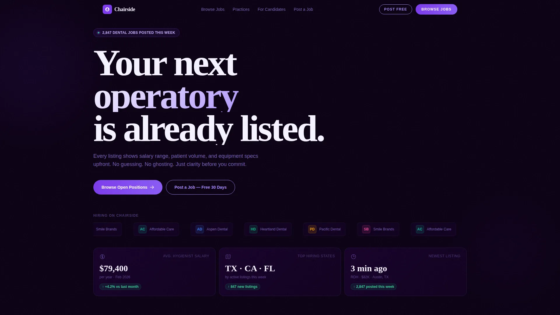
- A header zone with a live dental employer logo ticker, a bold headline, and three real-time stats cards showing salary data, top-hiring states, and newest listings
- Three distinct bento grid sections covering job cards with salary badges, practice profiles with ratings and tech stacks, and candidate tools including resume parsing and license verification
- A persistent mobile bottom bar and repeated primary call-to-action placements that funnel visitors toward browsing open positions without requiring a signup wall
Feature list
This template delivers a set of components built specifically around dental hiring intent. Each one reflects a design and layout decision grounded in the source brief.
Scrolling Dental Employer Logo Bar
A horizontal ticker of dental group logos scrolls smoothly beneath the hero headline. Each logo is clickable, signaling real employer inventory and building immediate platform trust with first-time visitors.
Live Job Stats Bento Cards
Three cards below the header ticker display active hiring data at a glance. Average hygienist salary for the current month, top-hiring states, and newest listings with minute-level timestamps communicate that the platform is active and up to date.
Job Cards with Salary and Distance Badges
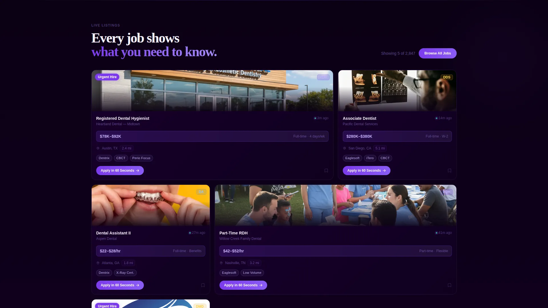
The first main grid shows individual job listings styled as cards. Each card carries a salary badge, a distance tag, and "Apply in 60 Seconds" micro-copy to reduce friction and set clear candidate expectations before any click.
Practice Profile Grid with Tech Stack Display
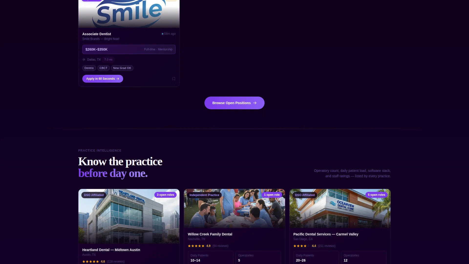
The second bento grid surfaces practice profiles complete with operatory photos, Glassdoor-style rating indicators, and software tech stack labels such as practice management and imaging system labels. Candidates can evaluate fit before they even visit a listing.
Candidate Tools Grid
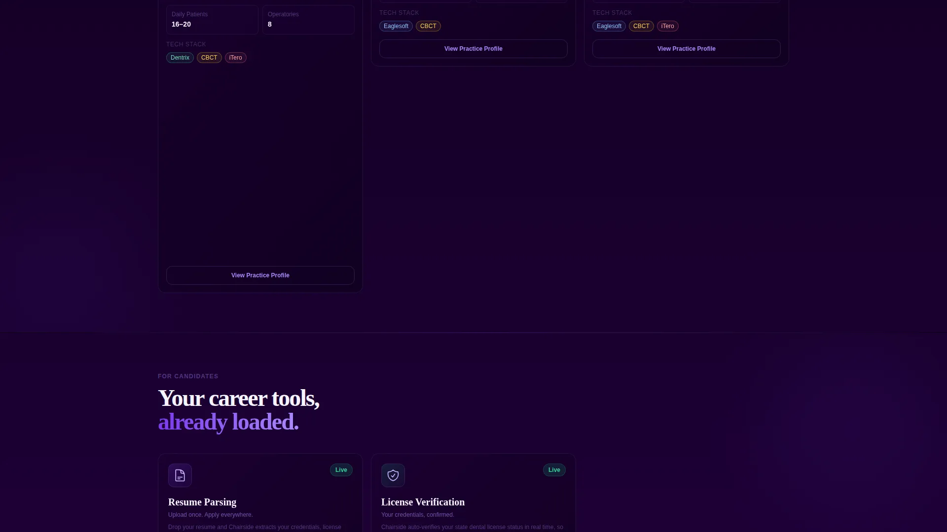
The third grid section covers the platform's candidate-facing features. Resume parsing, license verification status, and continuing education tracking are each presented as individual bento cards that animate in on scroll, reinforcing the sense of a live, fully loaded dashboard.
Persistent Mobile Call-to-Action Bar
On mobile viewports, a fixed bottom bar keeps the primary "Browse Open Positions" call to action visible at all times. This ensures the conversion path is never more than one tap away regardless of how deep into the page a visitor has scrolled.
Page sections overview
| Section | Purpose |
|---|---|
| Logo Bar Header | Establish employer credibility with scrolling dental group logos and a bold job-count headline |
| Live Stats Cards | Show three real-time hiring metrics to signal platform activity immediately |
| Job Listings Grid | Display salary-badged job cards with distance tags and fast-apply micro-copy |
| Practice Profiles Grid | Let candidates preview operatory photos, ratings, and software tech stacks |
| Candidate Tools Grid | Highlight resume parsing, license verification, and CE tracking features |
| Primary call to action Band | Repeat the "Browse Open Positions" call to action after the job preview section |
| Employer Ghost Button | Offer a secondary "Post a Job" path for office managers arriving from the employer side |
| Mobile Bottom Bar | Keep the primary call to action pinned at the bottom on mobile viewports |
Design & branding system
The visual identity uses the Void and Violet color system, which pairs a deep void black background with electric violet accents to create a command-center feel. The palette is intentionally dark and focused, evoking a professional tool rather than a consumer app.
- Core colors: void black (#0B0014) as the primary background, electric violet (#7C3AED) for active states and primary buttons, muted orchid (#A78BFA) for secondary text and data labels, and clinical white (#F5F3FF) for card surfaces and input fields
- Typography uses bold sans-serif headlines for hierarchy and legibility against dark backgrounds, keeping the interface scannable at a glance
- Violet concentration increases as the visitor scrolls deeper into the page, creating a subtle animation effect that builds visual momentum without distracting from the content
Mobile & speed optimization
The template is structured with mobile dental job seekers in mind. Office managers and candidates often browse during brief windows between patient appointments, so the layout needs to deliver value immediately on smaller screens.
- The bento grid reflows cleanly for mobile viewports, keeping job cards, stats, and profile sections readable without horizontal scrolling
- The persistent bottom call-to-action bar ensures the primary conversion action stays accessible throughout the full mobile scroll experience
- Scroll-triggered scale-up animations are applied to bento widgets to load progressively, mimicking a dashboard populating on first login
How this template helps you convert
The page is built around a specific conversion philosophy: let visitors find value before asking anything of them. No signup wall appears before browsing, which means the platform earns trust through content before it asks for registration.
- The header immediately establishes inventory credibility with a live job count headline and recognizable employer logos, giving first-time visitors a reason to keep scrolling rather than bouncing
- Repeated "Browse Open Positions" placements at the header, after the job preview grid, and as a persistent mobile bar mean the primary call to action is always one click away without feeling intrusive
- The secondary "Post a Job, Free for 30 Days" ghost button creates a parallel conversion path for employer-side visitors, capturing both audience segments within the same single-page flow
Other information about this template
Chairside is built on the Dashboard Pro theme and uses the Void and Violet color system to distinguish it visually from typical light-mode job board templates. The Launch Energy creative direction ensures the page feels alive and active rather than static.
- The template style is a bento grid, meaning layout blocks vary in size and weight to create visual rhythm across the page
- The header concept is a Logo Bar, a horizontal ticker pattern commonly associated with credibility and social proof sections on SaaS and marketplace landing pages
- The Click-Through landing page direction means every design decision prioritizes moving the visitor toward filtered job search results, with registration deferred until after the visitor has found listings worth saving
- This template falls under the Dental Digital Presence subcategory within the Technology category, making it a relevant starting point for any dental-specific platform looking to establish a professional digital front
Theme
Dashboard Pro
Creative direction
Launch Energy
Color system
Void & Violet
Style
Bento Grid
Direction
Click-Through
Page Sections
Scrolling Dental Employer Logo Bar
Live Job Stats Bento Cards
Job Cards with Salary and Distance Badges
Practice Profile Grid with Tech Stack Display
Candidate Tools Grid
Persistent Mobile Call-to-action Bar
Related questions
Can I customize the job stats shown in the header cards?
Does the template work for both job seekers and employers?
Is a visitor required to sign up before browsing jobs?
Can the practice profile cards show different software or equipment details?
What type of dental professionals is this template most suited for?



