Dental Digital Presence Appointment Booking Website Template
Chairside is a dental scheduling landing page template built around a live-data dashboard aesthetic. It presents real-time appointment grids, utilization metrics, and feature matrices that speak directly to office managers, solo practitioners, and multi-location dental groups. The design uses a dark, iridescent cockpit palette that makes every number feel earned and every click feel deliberate.
by Rocket studio
Quick summary
Chairside is a single-page dental booking and scheduling landing page template built around a live stats dashboard. It surfaces real-time chair utilization, auto-filled cancellations, and projected daily production inside an animated hero. A dense, interactive Feature Matrix drives the scroll. Two focused calls to action move visitors toward a demo or a revenue calculator without a single form field.
Who this template is for
This template is designed for dental practices and scheduling platforms that need to demonstrate their product's value instantly. It speaks to operators who live inside their schedule every morning and trust numbers over marketing language.
- Office managers running six or more hygienists across multiple operatories
- Solo practitioners moving away from paper daybooks toward digital scheduling
- Multi-location dental service organizations whose front desks lose revenue to no-shows and booking gaps
What problem this template solves
Dental scheduling tools often struggle to communicate their value before a visitor loses interest. A wall of feature descriptions rarely convinces a busy office manager. This template replaces passive copy with a live-feeling dashboard that shows the product working.
- Visitors cannot immediately see how the tool handles missed appointments, double-booked providers, or idle chairs
- Generic landing pages fail to connect with the specific daily pressure of running a full operatory schedule
- No-show revenue loss is invisible until it is quantified, which kills urgency before the first click
What you get with this template
You get a complete, single-page layout built to convert dental scheduling buyers through data, not description. Every section is structured to mirror how an office manager actually evaluates a tool.
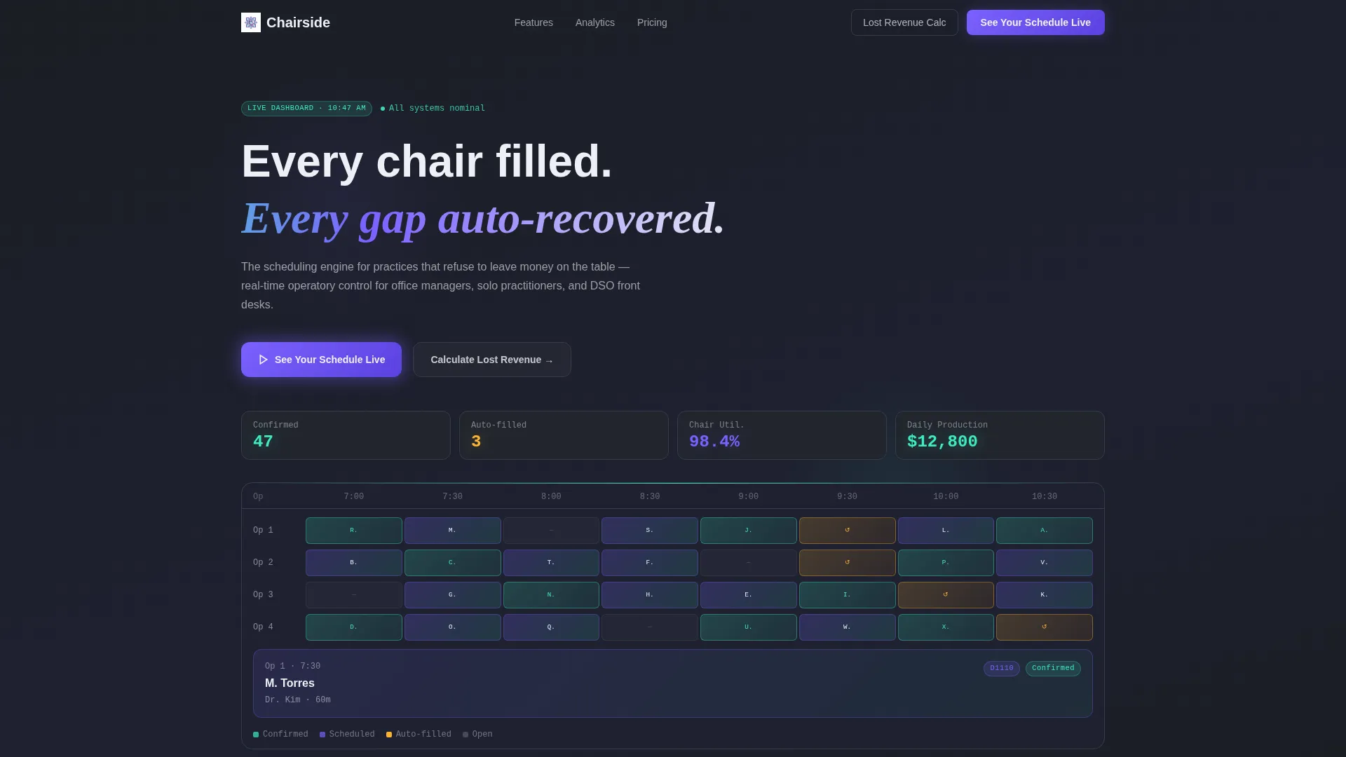
- An animated hero dashboard showing live appointment counts, chair utilization percentage, projected daily production, and auto-recovered cancellations
- A scrollable Feature Matrix organized into three capability groups: scheduling intelligence, patient communication, and analytics
- Two conversion paths: a primary "See Your Schedule Live" demo button and a secondary "Calculate Your Lost Revenue" calculator link
Feature list
This template ships with six distinct design and content components, each serving a specific role in the buyer journey.
Animated Stats Hero Dashboard
The header replaces stock photography with a live scheduling grid. It displays ticking metrics including confirmed appointments, auto-filled cancellation slots, chair utilization rate, and projected daily production. An expanded operatory card shows a patient name, procedure code, provider, and appointment duration for added realism.
Interactive Feature Matrix Grid
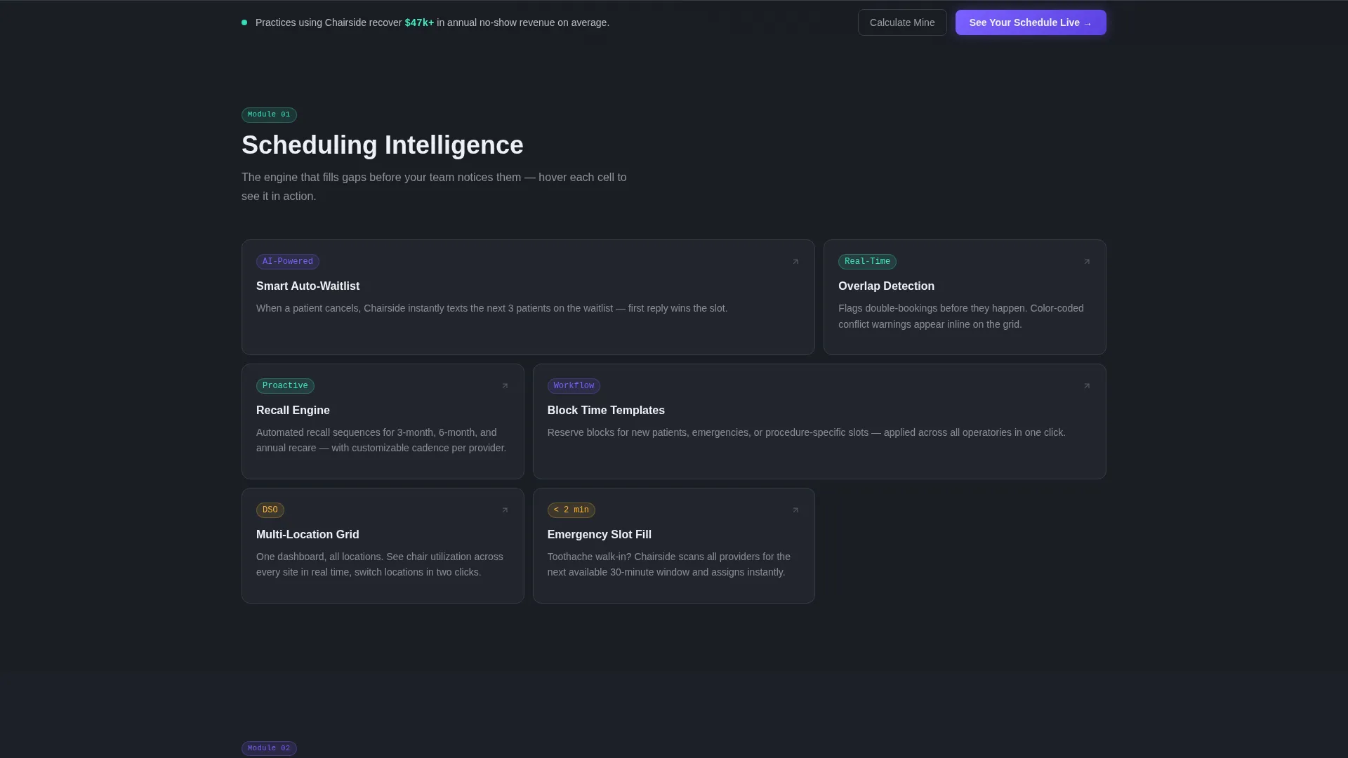
The core scroll section organizes platform capabilities into a dense, auditable grid. Each cell covers a specific function and expands on hover to reveal a micro-demonstration. The matrix is divided into three groups: scheduling intelligence, patient communication, and practice analytics.
Scheduling Intelligence Section
This matrix group covers auto-waitlist management, smart recall, and overlap detection. It lets visitors stress-test the scheduling logic against their own daily scenarios without reading a features page.
Patient Communication Section
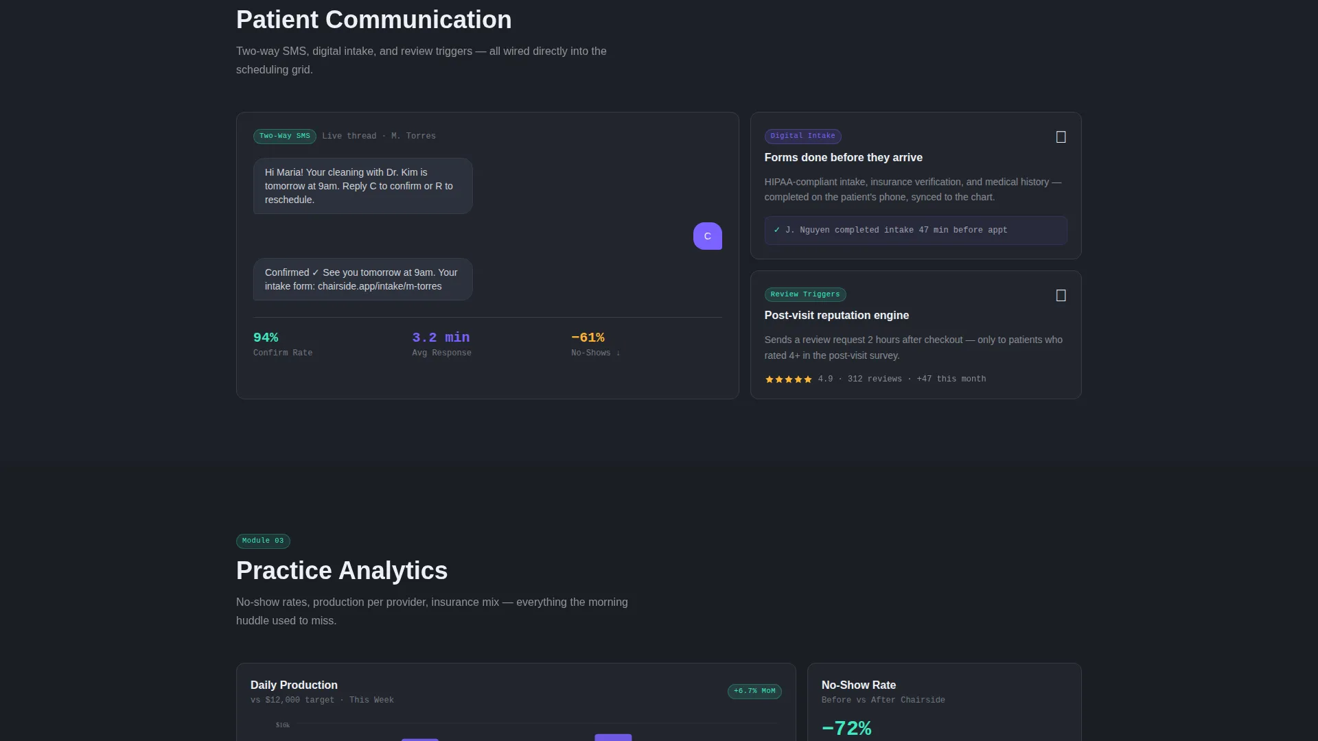
This group surfaces two-way SMS messaging, digital patient intake, and review trigger capabilities. Each cell is self-contained so visitors can evaluate only the functions relevant to their practice size.
Practice Analytics Section
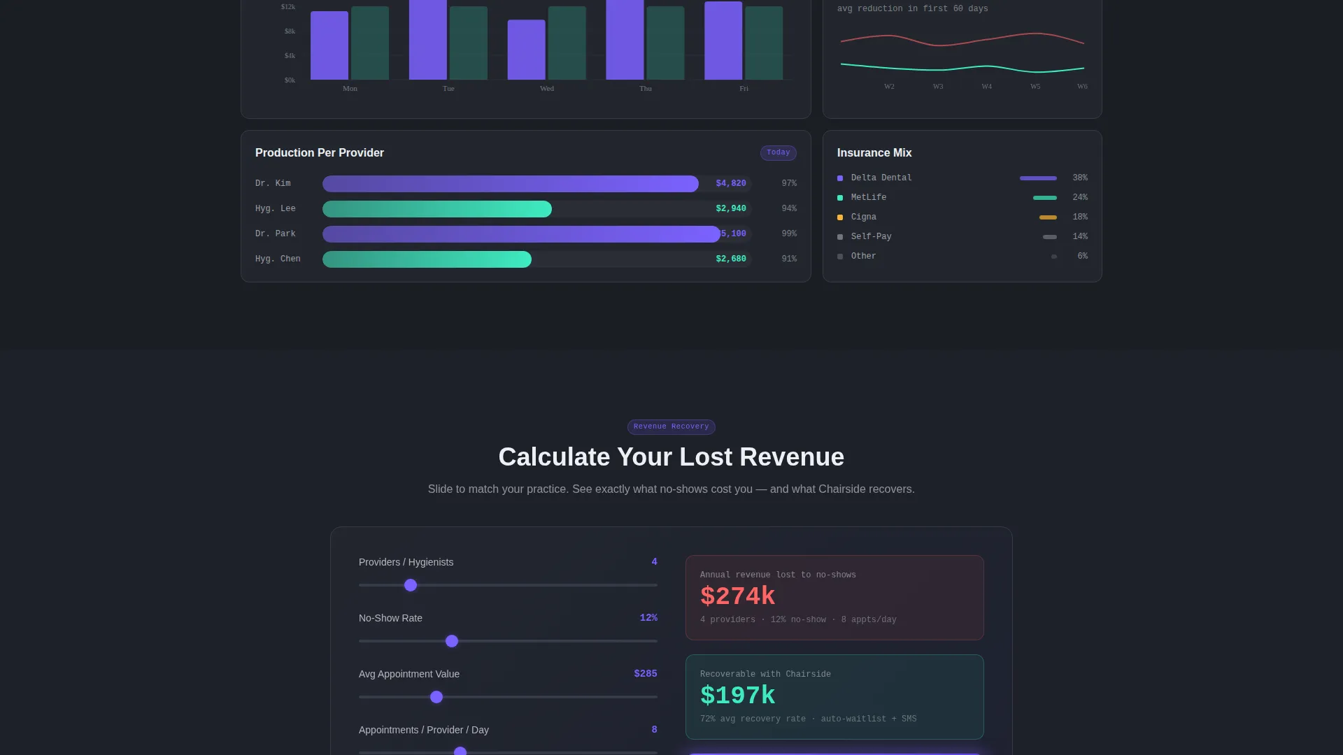
The analytics section presents no-show rate tracking, production per provider metrics, and insurance mix breakdowns. Data-driven buyers can quickly identify the reporting layer they need.
Dual Call-to-Action System
The primary call to action, "See Your Schedule Live," appears first inside the hero dashboard as a glowing button and repeats as a sticky bar after the second matrix section. A secondary call to action, "Calculate Your Lost Revenue," links to an embedded calculator that estimates annual income lost to no-shows based on practice size.
Page sections overview
| Section | Purpose |
|---|---|
| Hero Dashboard Header | Display live scheduling metrics and primary call to action |
| Scheduling Intelligence Matrix | Showcase auto-waitlist, recall, and overlap detection |
| Patient Communication Matrix | Cover SMS, digital intake, and review triggers |
| Practice Analytics Matrix | Present no-show rates, provider production, and insurance mix |
| Sticky call to action Bar | Repeat primary demo button after second matrix section |
| Revenue Calculator Link | Drive urgency with a secondary lost-revenue estimator |
Design & branding system
The visual identity follows a Dashboard Pro theme using an AI Iridescent color palette. The overall feel is a cockpit display reflected in polished resin: dark, luminous, and subtly prismatic.
- Deep graphite (#1A1D23) forms the primary background, with shifting violet-blue (#7B61FF) used for active states and data highlights
- Cool holographic teal (#3EEBC2) marks confirmation badges and success metrics, while soft pearl white (#EDF0F5) covers card surfaces and body text
- No stock photography appears anywhere in the layout; every visual element is a data point, a grid cell, or a glowing interface component
Mobile & speed optimization
The template is structured for a clean, responsive experience across screen sizes. The dashboard hero and matrix grid adapt to smaller viewports without losing the data-forward visual hierarchy.
- Metric cards and operatory detail panels reflow into stacked layouts on mobile, keeping key numbers legible at any screen width
- The sticky call-to-action bar remains anchored at the bottom of the viewport on mobile, ensuring the demo path stays one tap away throughout the scroll
How this template helps you convert
This template removes every friction point between a curious visitor and a committed demo request. It works by making the product feel real before the visitor reaches a sign-up screen.
- The animated hero shows a fully booked schedule in motion, establishing immediate credibility and making the tool's core benefit tangible within the first three seconds of the visit.
- The Feature Matrix lets buyers self-qualify by scanning capability groups at their own pace, which builds confidence faster than a guided walkthrough or a long sales page.
- The revenue calculator link reframes the decision from "should I try this" to "how much am I already losing," creating urgency that drives the final click to the demo sandbox.
Other information about this template
This template is built inside the Dashboard Pro theme and pairs naturally with a dental booking and scheduling site that needs to stand apart from generic practice management software pages. The AI Iridescent color system and Data Grid layout style make it a strong fit for technology-forward dental brands.
- Template style: Dashboard and Data Grid, suited for platforms that lead with metrics and live-data interfaces
- Creative direction: Feature Matrix, designed for buyers who evaluate tools by scanning capabilities rather than reading case studies
- The header concept is Stats and Metrics, not a hero image, making the first impression functional rather than decorative
- Intersection category alignment: Technology, Dental Digital Presence, Dental Booking and Scheduling Site
Theme
Dashboard Pro
Creative direction
Feature Matrix
Color system
AI Iridescent
Style
Dashboard/Data Grid
Direction
Click-Through
Page Sections
Animated Live Metrics Hero
Three-group Feature Matrix
Dual Conversion Path Design
Sticky Demo Bar Placement
No-form Click-through Flow
AI Iridescent Dashboard Palette
Related questions
Who is the ideal user for this landing page template?
Does this template include a contact form or sign-up flow?
Can I update the metrics shown in the hero dashboard?
How many sections does the Feature Matrix include?
Is this template suitable for a solo dental practice website?



