Software & SaaS Professional Website Template
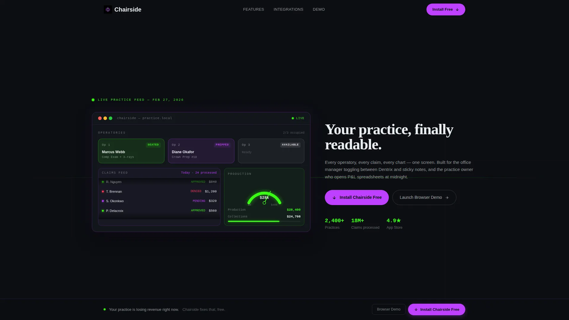
Chairside is a dental practice software landing page template built on a card grid layout with a Data Command visual identity. It opens with a live interactive dashboard preview, guides visitors through animated feature modules, and drives conversions through a sticky install bar with auto-detected operating system badges. No forms, no friction, just the product working.
by Rocket studio
Quick summary
Chairside is a modular card grid landing page template for dental practice management software. The design uses an Acid Digital color system, opens with an in-browser interactive dashboard, and closes with a sticky install call-to-action. It is built to convert office managers, associate dentists, and practice owners into app installs without a single form field.
Who this template is for
This template is designed for dental software teams and indie developers who need a high-impact landing page that speaks directly to clinical staff and practice leaders. It works best when the product is a real installed or browser-based application that benefits from an immediate live preview rather than a feature slideshow.
- Dental practice software companies launching a new desktop or tablet application
- Independent developers building scheduling, charting, or claims management tools for dental offices
- Practice owners or office managers evaluating a self-service product page they can adapt quickly
What problem this template solves
Most dental software product pages rely on static screenshots, lengthy feature lists, and gated demo forms. Potential users abandon before they understand what the product actually does. This template removes that friction by putting a functioning preview at the very top of the page, so visitors experience the product before reading a single headline.
- Eliminates the gap between "what the product claims" and "what the product feels like" by showing a live mock dashboard on load
- Removes conversion blockers such as email gates and form fields that push users away before they commit
- Replaces generic stock imagery with real interface moments, which builds immediate credibility with clinical professionals
What you get with this template
The template delivers a complete single-page layout structured as a series of card modules that deploy onto the screen with staggered micro-animations. Every section is purposeful and ordered to move a visitor from curiosity to download in one scroll.
- An interactive header dashboard with clickable operatory cards, a scrolling claims ticker, and a live production-versus-collections gauge
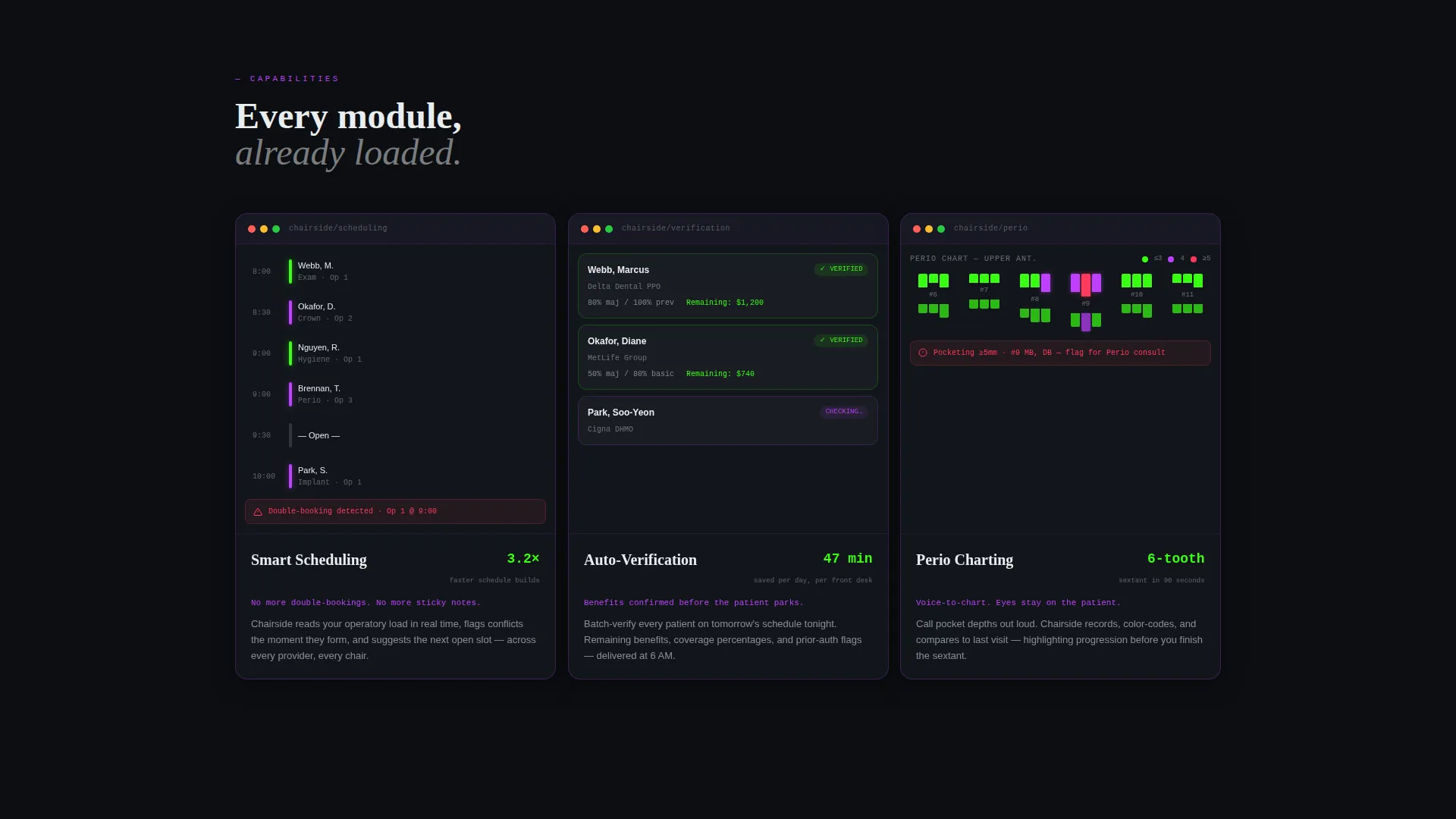
- Three animated feature card rows, a before-and-after claim resolution card, and an integration logo row, all with looping screen recordings inside device frames
- A sticky bottom bar with auto-detected operating system badges and a secondary browser demo path, requiring zero form input
Feature list
This section covers the core built-in components that make the Chairside template function as a conversion tool for dental software.
Interactive Header Dashboard
The header renders a functioning micro-dashboard in-browser. Visitors see three operatory cards color-coded by patient status, a scrolling claims ticker showing approved, denied, and pending claims, and a production-versus-collections gauge that ticks upward in real time. Clicking an operatory card expands patient detail. Hovering the claims ticker reveals payer names. The headline types itself letter by letter underneath.
Staggered Card Grid Animations
Every card module below the header enters the viewport with a micro-animation styled like a mission control panel coming online. The staggered timing creates a sense of a system booting up, which keeps visual momentum without relying on video backgrounds or heavy media files.
Looping Screen Recording Cards
The first feature card row contains three cards, one each for Smart Scheduling, Auto-Verification, and Perio Charting. Each card holds a looping four-second screen recording inside a device frame, showing the actual interface in motion rather than a static image.
Before-and-After Claim Resolution Card
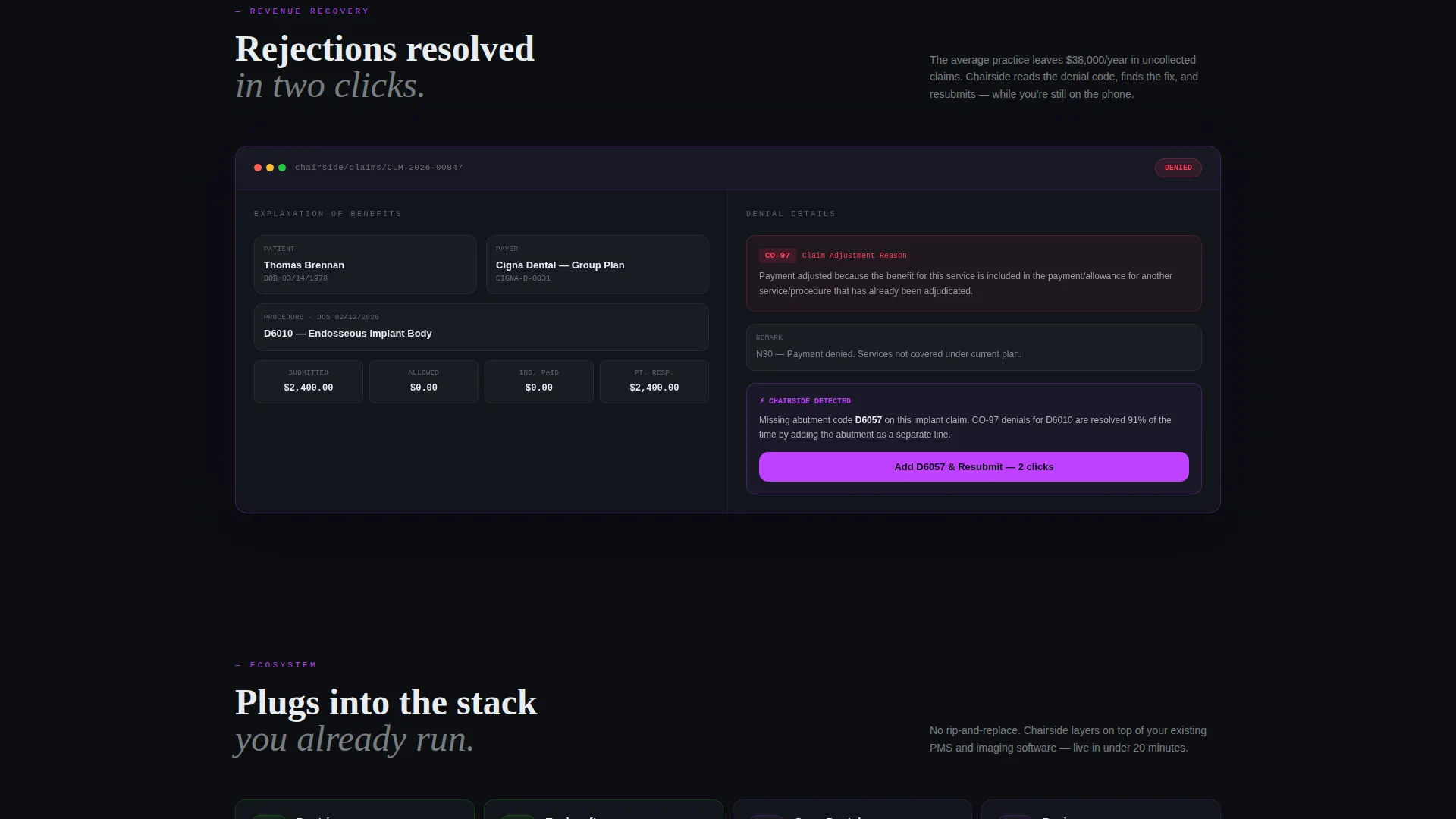
A single wide card in the second row demonstrates a real explanation-of-benefits rejection resolved in two clicks. This section directly addresses one of the most painful daily tasks for dental office staff and shows resolution speed without requiring a written explanation.
Sticky Install Bar with OS Detection
A sticky bottom bar activates after the second card row scrolls into view. It auto-detects the visitor's operating system and displays the correct badge for macOS, Windows, or iPad. The primary call-to-action reads "Install Chairside Free" and the secondary option offers "Launch Browser Demo."
Integration Logo Row
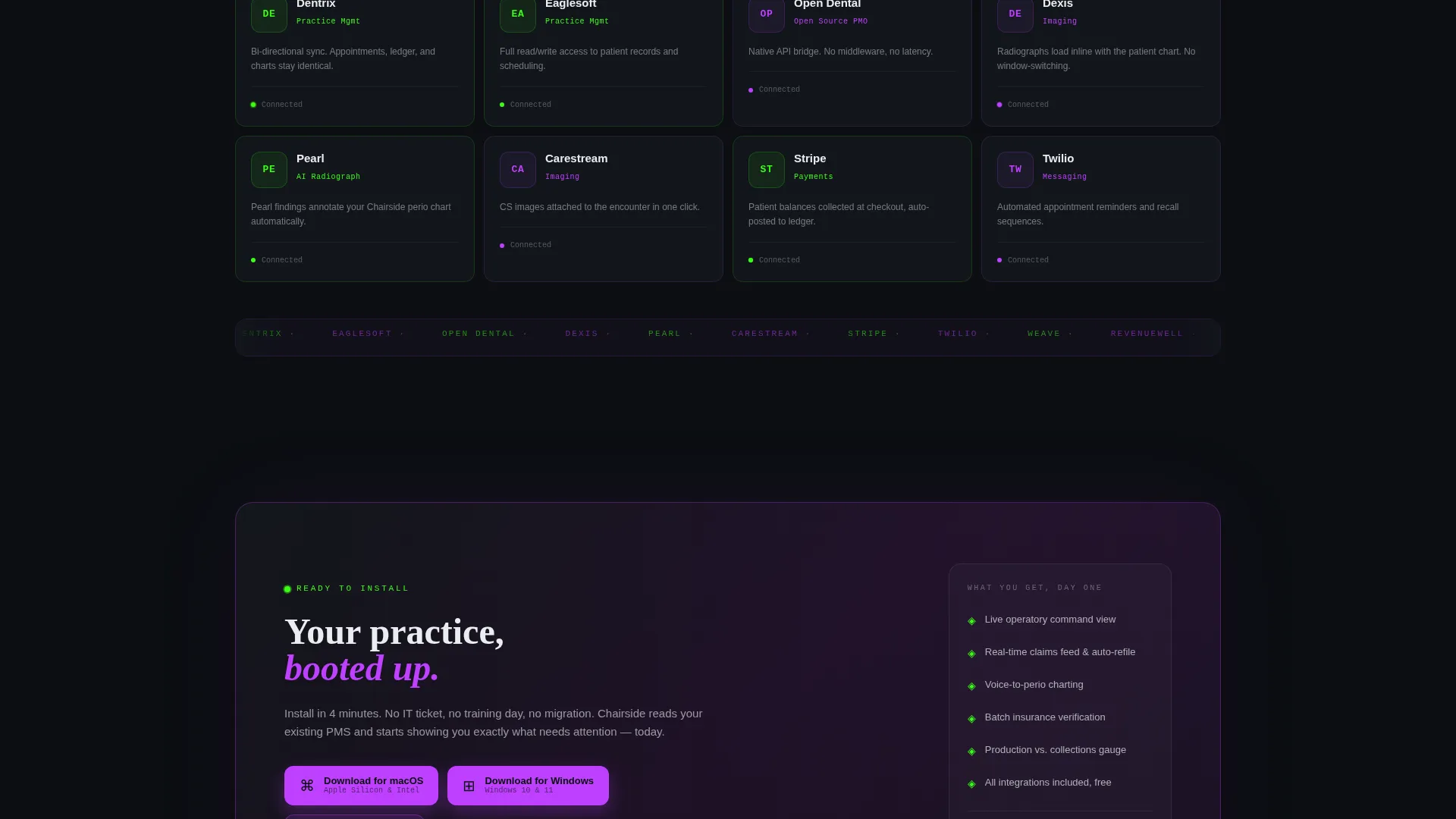
The third card row displays integration partner logos pulsing gently inside dark card surfaces. This row signals ecosystem compatibility to practice owners who need reassurance that the tool connects with their existing workflow.
Page sections overview
| Section | Purpose |
|---|---|
| Interactive Header Dashboard | Shows a live mock practice day and anchors the headline |
| Feature Cards Row | Highlights Smart Scheduling, Auto-Verification, Perio Charting with screen recordings |
| Claim Resolution Card | Demonstrates a before-and-after explanation-of-benefits rejection fix |
| Integration Logos Row | Signals compatibility with existing dental practice tools |
| Sticky Install Bar | Drives app download with OS-detected badges and a browser demo fallback |
Design & branding system
The Acid Digital color system drives every visual decision in this template. Void black dominates the background, clinical white surfaces the card modules, phosphor green activates on live data points and hover states, and electric violet marks primary actions and navigation anchors. The overall effect feels synthetic, hyper-alert, and clean, like a retinal scanner and a fresh pair of nitrile gloves meeting on screen.
- Four-color palette: void black (#0B0E11), terminal phosphor green (#39FF14), electric violet (#BF40FF), and clinical white (#EAEDF0)
- Card modules float on the void black background with hairline violet borders, keeping each unit visually distinct without heavy drop shadows
- No stock photography or illustration appears anywhere; all visual content is interface-native, either live dashboard elements or looping screen recordings
Mobile & speed optimization
The card grid layout adapts naturally to tablet viewports, which matters directly for this product's audience. Dental staff often work on mounted iPad stations or shared workstations, so the template is structured to load and respond well on those surfaces.
- Modular card grid structure scales down to tablet and mobile widths without breaking the visual hierarchy
- The sticky install bar includes an iPad badge alongside macOS and Windows, acknowledging that tablet users are a primary install target
- Micro-animations are timed and staggered at the card level, keeping each transition lightweight rather than running a single heavy scene
How this template helps you convert
The Chairside template is built around one conversion path: get the visitor to install the app. Every layout decision supports that path by reducing doubt before the call-to-action appears.
- The interactive header lets visitors experience the product working before reading any copy, which removes the biggest source of early-page skepticism for software products.
- The sticky install bar with auto-detected OS badges removes the last moment of hesitation by showing the visitor exactly which version to download, eliminating a small but real decision that often causes drop-off.
Other information about this template
This template is part of a broader set of Acid Digital themed layouts designed for technology and software products that benefit from a live-preview header approach. It is built as a single-page flow with no routing or multi-page structure required.
- The template style is Card Grid (Modular), meaning individual sections can be reordered or swapped without rebuilding the overall layout
- Creative direction follows a Launch Energy approach, where each new row entering the viewport feels like a system capability coming online for the first time
- The browser demo path ("Launch Browser Demo") serves as a secondary conversion option for visitors who prefer to evaluate before installing, reducing total abandonment without adding form friction
- The template is categorized under Technology, Software and Software as a Service (SaaS), and specifically targets the Dental Practice Software niche
Theme
Data Command
Creative direction
Launch Energy
Color system
Acid Digital
Style
Card Grid (Modular)
Direction
App Download
Page Sections
Interactive In-browser Dashboard Header
Staggered Card Module Animations
Looping Feature Screen Recording Cards
Before-and-after Claim Resolution Card
Sticky Os-detected Install Bar
Integration Partner Logo Row
Related questions
Does this template require any form fields or email capture to convert visitors?
Can I update the mock dashboard with my own product data or branded demo content?
Is this template suitable for a browser-based tool rather than a desktop application?
What do I need to supply to complete the feature card rows?
How does the integration logo row work inside the template?



