Champion - Powerful Ambassador Landing Page Template
Champion is a single-page ambassador and champion program landing page built around a high-contrast comparison table. It shows growth leads, community managers, and marketing heads exactly why manual referral tracking fails, then presents the Champion platform as the structured alternative. The design uses a Tech Glass visual system with deep slate, graphite, and sky-blue highlights to deliver launch-ready momentum.
by Rocket studio
Quick summary
Champion is a comparison table landing page designed for ambassador and champion program platforms. It front-loads a side-by-side breakdown of manual referral chaos versus a structured advocate system. The Tech Glass design and Launch Energy creative direction give the page a command-center feel, dark, focused, and built to drive app downloads.
Who this template is for
This template is built for teams who already know their users are their best acquisition channel but have no structured way to activate them. It speaks directly to the people responsible for growth at product-led companies.
- Growth leads at Series B software-as-a-service companies who need to move beyond spreadsheet-based referral tracking
- Community managers at fintech apps looking to reward and rank their most active advocates
- Head-of-marketing teams at direct-to-consumer brands ready to turn loyal customers into a measurable referral engine
What problem this template solves
Most ambassador programs fail before they start because there is no system behind them. Teams track referrals manually, forget to reward top performers, and have no visibility into who is actually driving signups. The result is untapped momentum sitting inside the user base with no way to surface it.
- No structured way to compare the current broken process against a working alternative
- No clear path to show prospects what automated tracking, gamified tiers, and real-time leaderboards actually look like in practice
- No page designed to close the gap between "I know I need this" and "I am downloading this now"
What you get with this template
You get a fully designed, single-page landing page that leads with evidence and ends with a clear download call to action. Every section is intentional and sequenced to build conviction fast.
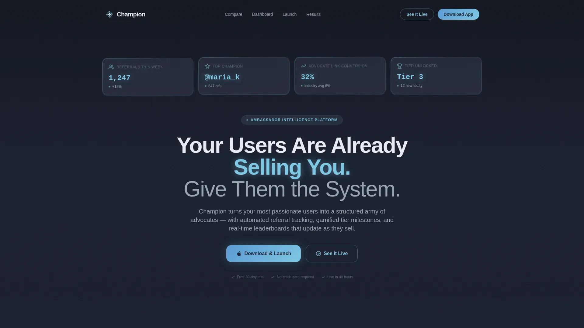
- A Dark Glass Panels header with animated metric callouts showing live-feeling referral data
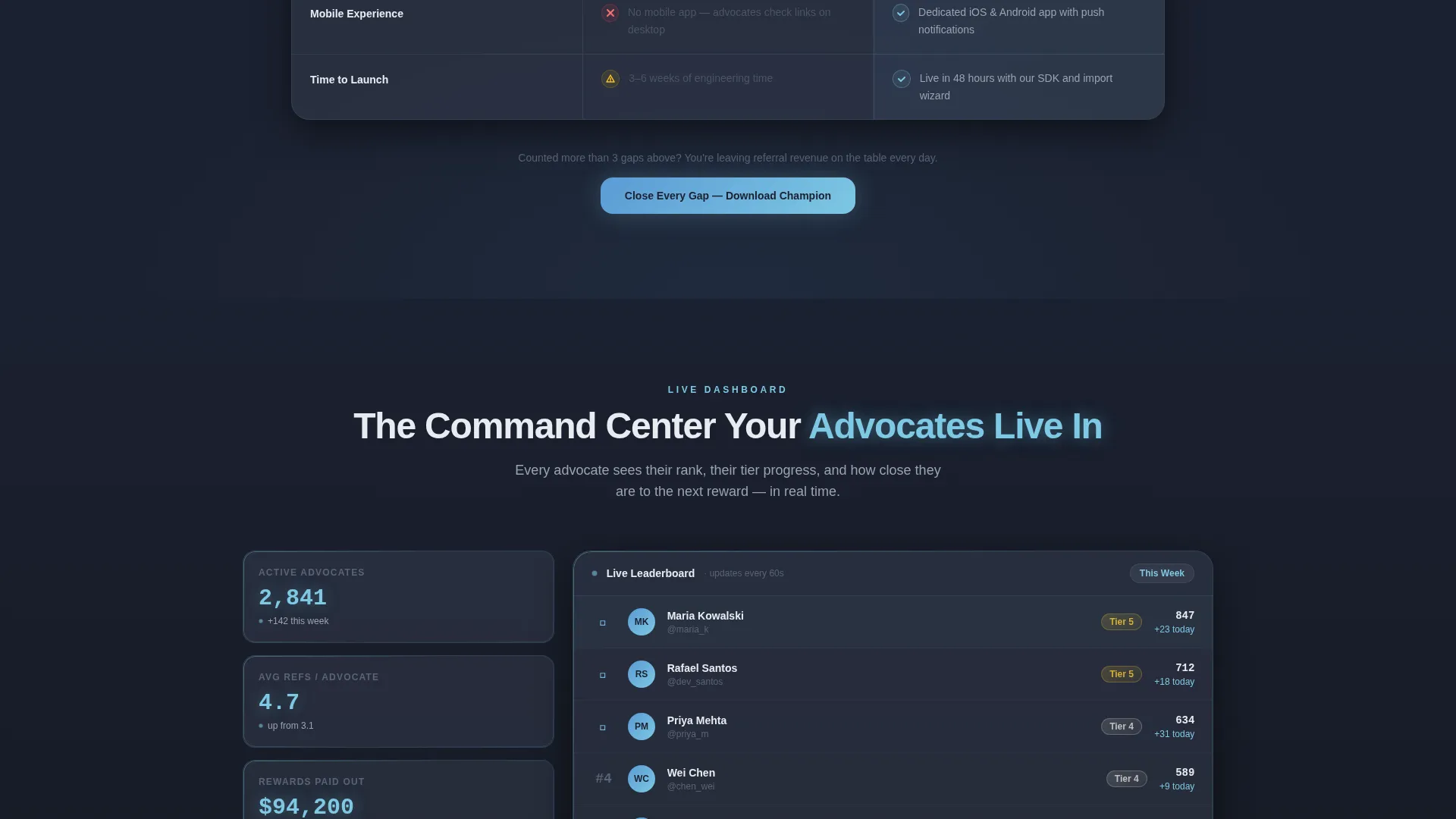
- A comparison table that pits manual referral chaos against the Champion system row by row, with muted slate on the left and sky-blue highlights on the right
- An ambassador dashboard preview, a three-step launch timeline, social proof with real numbers, and dual app download calls to action with a QR code for desktop visitors
Feature list
This template includes the following built-in sections and design components.
Animated Metric Header Panels
Four to five frosted-glass rectangles float against a deep obsidian background. Each panel animates a single live-feeling metric into view, such as referral counts, conversion rates, and tier unlocks. The effect feels like a command center powering on.
Side-by-Side Comparison Table
The core section of the page places current referral chaos on the left in muted slate and the Champion system on the right in sky-blue highlights. Each row animates in sequence, making the upgrade feel inevitable rather than pitched.
Ambassador Dashboard Preview
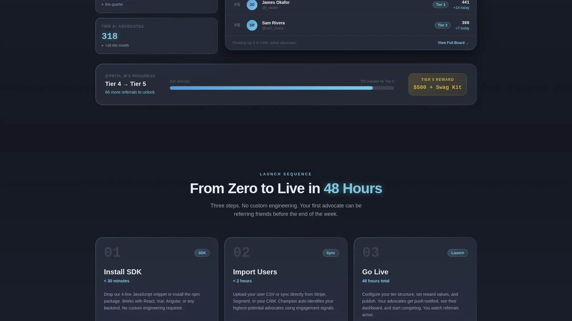
A live-preview section shows the ambassador dashboard with ranks climbing in real time. This lets prospects visualize the actual product experience before they download, reducing hesitation at the final step.
Three-Step Launch Timeline
A compact timeline reads "Install SDK, Import Users, Go Live in 48 Hours." It answers the most common pre-download question: how long does setup actually take? The answer is built directly into the page.
Social Proof with Specific Numbers
Growth lead quotes with hard numbers, such as "Ambassador channel drove 41% of Q3 signups," appear as credibility anchors. Each testimonial is formatted to feel earned and specific, not generic.
Dual App Download Call to Action
The primary call to action reads "Download and Launch Your Program" and is paired with App Store and Google Play badges. A tertiary QR code serves desktop visitors who want to download on their phone immediately.
Page sections overview
| Section | Purpose |
|---|---|
| Dark Glass Header | Animate live referral metrics and establish command-center tone |
| Comparison Table | Show manual chaos versus Champion system row by row |
| Dashboard Live Preview | Let prospects visualize the real product experience |
| Launch Timeline | Answer setup-time objections with a clear three-step sequence |
| Social Proof | Build trust with specific growth numbers from real users |
| App Download call to action | Drive the final tap with paired badges and a QR code |
Design & branding system
The Tech Glass theme uses a Slate and Sky color system that feels like looking through a tinted skyscraper window at dawn. Every surface, hover state, and active element is intentional and consistent.
- Background colors sit at deep obsidian slate (#1B2130), card surfaces lift to polished graphite (#3A4152), and near-white (#E8ECF1) handles all body text
- Atmosphere blue (#5B9BD5) and bright sky accent (#7EC8E3) drive interactive highlights, active-state glows, and every selected row pulse
- Frosted-glass card blur, faint edge-light on panels, and a medium-weight sans-serif typeface with subtle letterform glow define the visual texture throughout
Mobile & speed optimization
The page is structured as a single-page layout with a linear scroll sequence. This keeps the experience clean and fast on any screen size, with no navigation complexity to slow visitors down.
- Section flow is vertical and sequential, making the comparison table and dashboard preview easy to read on smaller screens
- The QR code call to action is included specifically for desktop visitors who want to convert on mobile without retyping a link
- Scroll-triggered row animations in the comparison table are designed to land one at a time, keeping the experience focused rather than overwhelming on narrow viewports
How this template helps you convert
The page is built around a single conversion psychology principle: self-diagnosis before the pitch. Visitors identify their own problem before they are ever asked to act.
- The comparison table forces an honest look at the current process. Visitors see their own referral chaos described in the left column before they ever read about the Champion system on the right. Recognition drives motivation faster than any headline.
- The dashboard preview and launch timeline close the imagination gap. Prospects can see what they will hold in their hands and understand that setup takes 48 hours or less. Concrete visuals and a short timeline remove the two biggest reasons people delay downloading.
- Dual download paths with a QR code mean no visitor loses momentum at the final step. Whether they are on desktop or mobile, the next action is always one tap or one scan away.
Other information about this template
This template is categorized under Documentation and Support with a Community and Forum subcategory, reflecting its focus on organizing and activating user communities through structured advocate programs.
- The template style is Comparison Table, which is well suited to ambassador and champion program platforms that need to show a clear before-and-after story
- The creative direction is Launch Energy, meaning the scroll pacing is designed to feel like a countdown sequence, with each section adding momentum toward the final download action
- The header concept is Dark Glass Panels, a design pattern that uses translucent frosted rectangles with blue edge-lighting to create a high-stakes, data-forward first impression

Theme
Tech Glass
Creative direction
Launch Energy
Color system
Slate & Sky
Style
Comparison Table
Direction
App Download
Page Sections
Animated Dark Glass Header Panels
Side-by-side Comparison Table
Ambassador Dashboard Live Preview
Three-step Launch Timeline
Social Proof with Hard Numbers
Dual App Download with QR Code
Related questions
What type of page is this template?
Who is this template designed for?
What is included in the comparison table section?
Can I customize the colors and copy in this template?
Does this template support both app store download paths?



