Changelog - Dynamic Beta Landing Page Template
A split-screen beta release notes landing page built for developer audiences. The Changelog template pairs raw technical diffs with human-readable feature previews, all wrapped in a Dynamic Motion visual identity. Stats animate on scroll, a Feature Tab Switcher cycles through version history, and two clear calls to action guide visitors toward downloading the beta or subscribing to release notes.
by Rocket studio
Quick summary
This is a single-page beta release notes landing page that turns shipped features, closed bugs, and performance wins into a compelling developer story. A 50/50 split-screen layout keeps technical detail and human context side by side. Animated metrics, a tabbed version switcher, and a platform-detection download modal make the page feel alive from first scroll to last.
Who this template is for
This template was designed for developer-facing products that ship fast and communicate often. It speaks directly to the people who read changelogs before they merge anything.
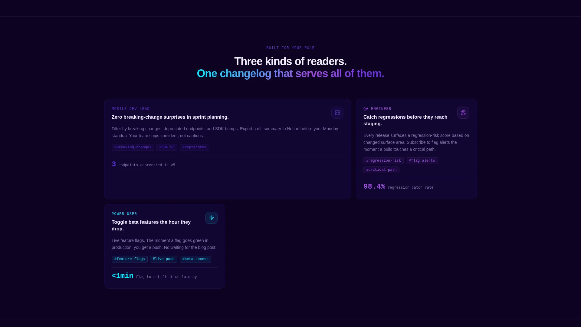
- Mobile development leads who need to spot breaking changes before sprint planning begins
- Quality assurance engineers scanning each release for regression flags and deprecated endpoints
- Power users and beta testers who enable new features the moment they go live
What problem this template solves
Most changelog pages are plain markdown files dropped into a docs folder. They list changes without context, offer no sense of scale, and give readers nothing to feel. Developers tune them out or skip them entirely.
- There is no visual weight behind critical metrics like cold-start improvements or deprecated endpoints
- Technical detail and user impact are never shown together, so context is lost between the diff and the description
- There is no clear path from "I read the notes" to "I installed the beta," which slows adoption
What you get with this template
You get a fully structured, single-page changelog landing page that pairs code-level detail with product narrative. Every section is designed to hold attention and reduce the gap between a developer reading the notes and actually downloading the build.
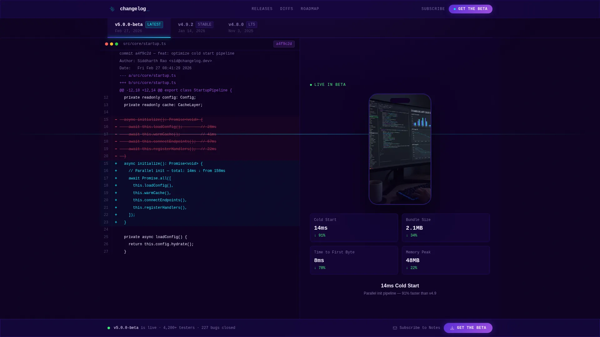
- A Feature Tab Switcher header with version-labeled tabs that snap the split screen into a new diff-plus-mockup state for each release
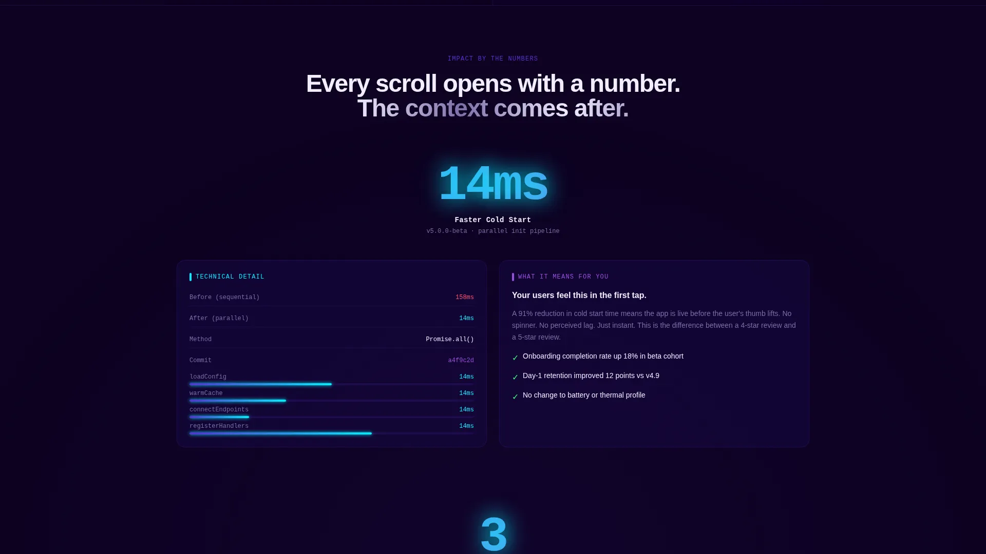
- Scroll-triggered stat animations that open each section with a single oversized metric before any supporting copy appears
- A sticky "Get the Beta" call-to-action bar and a platform-detection modal that serves the correct store badge or a QR code fallback for desktop visitors
Feature list
This template is built around a tight set of purposeful components. Each one serves the developer reader and the download goal at the same time.
Version Tab Switcher Header
Three tabs sit across the top of the viewport, each labeled with a version number. Clicking a tab snaps the 50/50 split screen into a new state instantly. The active tab carries a thin indigo underline that slides between tabs using spring easing.
Split-Screen Diff and Preview Layout
The left panel displays the raw diff for each version: additions highlighted in reactive cyan, deletions struck through in muted violet. The right panel shows the rendered feature inside a device mockup with a subtle looping animation that demonstrates the change in context.
Scroll-Triggered Metric Animations
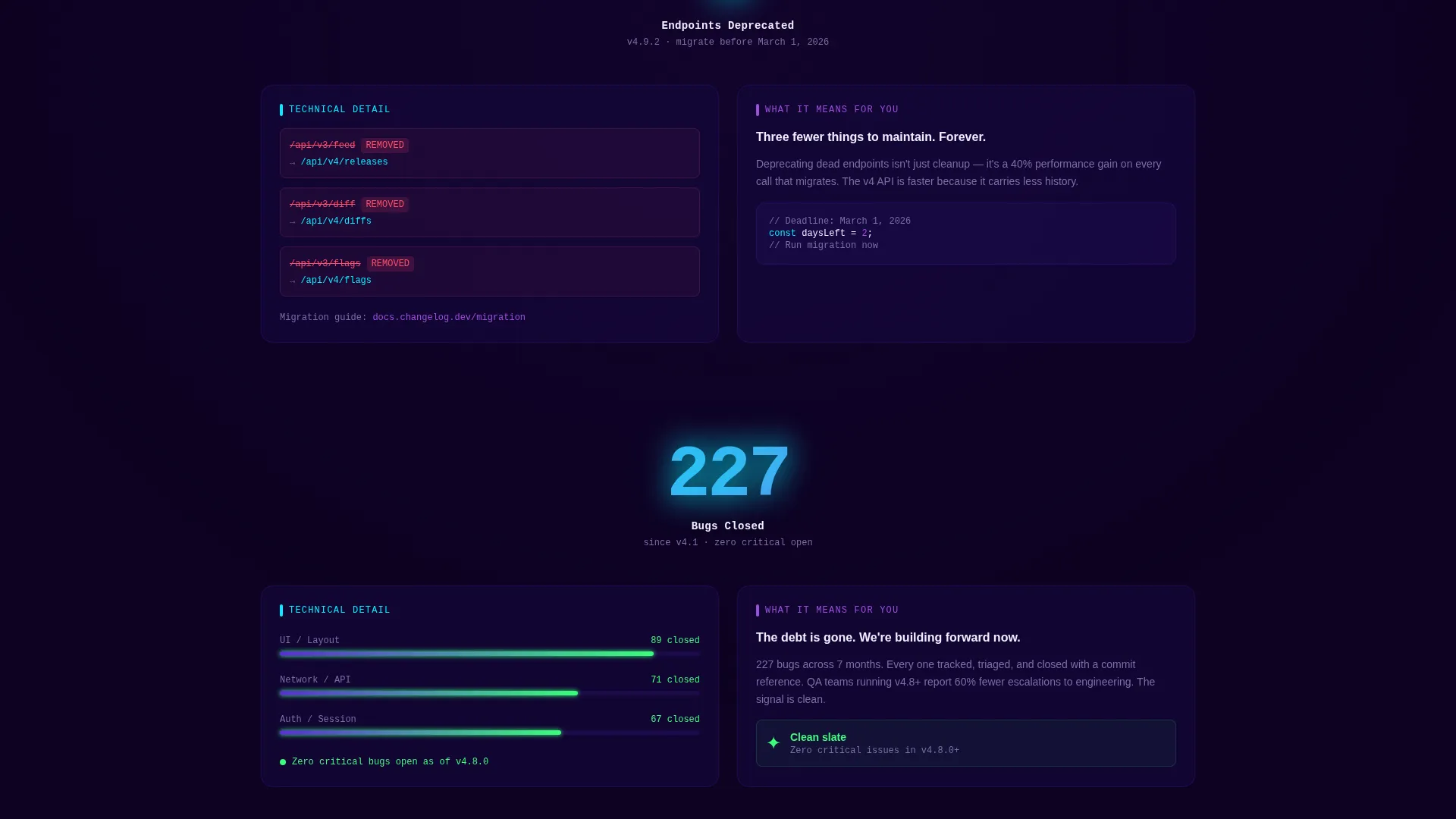
Every scroll checkpoint opens with a single oversized number that counts up from zero as it enters the viewport. Examples include cold-start time savings, deprecated endpoint counts, and cumulative bug totals. The stat does the selling before a single word of copy appears.
Platform-Detection Download Modal
Tapping the primary "Get the Beta" call to action opens a modal that detects the visitor's platform and displays the matching store badge. Desktop visitors see a QR code fallback so no one is left without a path to install.
Email Subscription Secondary Path
Below the primary download call to action sits a "Subscribe to Release Notes" option. Developers can enter their email to receive each new changelog before they commit to the install. This keeps the audience warm between releases.
Sticky Bottom Call-to-Action Bar
After the second scroll section, a persistent bottom bar carries the "Get the Beta" call to action across every subsequent section. It stays visible without interrupting reading, so the download path is always one tap away.
Page sections overview
| Section | Purpose |
|---|---|
| Feature Tab Switcher | Cycles version states across the split-screen viewport |
| Split-Screen Diff | Shows raw diff alongside a live device mockup |
| Stat Impact Opener | Animates a single oversized metric on scroll entry |
| Technical Detail Panel | Lists endpoint names, benchmarks, and commit context |
| Human Story Panel | Explains user impact and workflow changes per release |
| Roadmap Teaser | Previews unshipped features to build anticipation |
| Sticky call to action Bar | Keeps the download action visible after second scroll |
| Platform Modal | Detects device and serves the correct store badge |
| Email Subscription | Captures developer emails for changelog delivery |
Design & branding system
The visual identity follows a Dynamic Motion theme built on an Electric Indigo color system. The palette is intentionally dark and phosphorescent, evoking a code editor running late at night with the brightness turned all the way up.
- Core colors: deep void black (#0D0221) as the canvas, electric indigo (#5B2FD4) as the primary accent, and hot signal violet (#9D4EDD) for secondary highlights
- Reactive cyan (#00F0FF) is reserved exclusively for hover states and live counters, making interaction feel earned rather than decorative
- Motion is integral to the identity: spring-eased tab transitions, scroll-triggered number animations, and looping device mockup previews all reinforce the feeling that the product is always in motion
Mobile & speed optimization
The template is structured for fast rendering on the devices its audience actually uses. Mobile development leads and beta testers are unlikely to be sitting at a desktop when they check the latest release.
- The platform-detection modal automatically serves the correct store badge on mobile, removing friction from the install path
- The split-screen layout stacks responsively so diff and mockup content remains readable on smaller viewports
- Looping animations in the device mockup panels are subtle and contained, keeping visual weight low without sacrificing the motion identity
How this template helps you convert
The conversion strategy is baked into the page structure. Stats lead, context follows, and the call to action is always within reach.
- Oversized animated metrics establish credibility immediately, so visitors understand the scale of each release before reading a single sentence of copy
- The split-screen format keeps technical readers engaged by showing both the diff and the real-world impact in one glance, reducing the need to hunt for context elsewhere
- The sticky call-to-action bar and platform modal eliminate the steps between "I want this" and "I have it installed," while the email subscription path captures developers who are not ready to install yet
Other information about this template
This template lives inside the Documentation and Support category, specifically within the Changelog and Release Notes subcategory. It was purpose-built for the beta release notes niche, where the reader is both technically fluent and time-constrained.
- The template style is a 50/50 split screen, making it one of the more visually distinctive formats in the changelog and release notes space
- The creative direction is Stats-First Impact, meaning quantified results always precede prose explanations throughout the page
- The landing page direction targets app downloads, making it well-suited for mobile products with active beta programs and frequent release cycles
- The Dynamic Motion theme and Electric Indigo color system together create a visual language that signals technical sophistication without relying on illustration or photography
Theme
Dynamic Motion
Creative direction
Stats-First Impact
Color system
Electric Indigo
Style
Split Screen (50/50)
Direction
App Download
Page Sections
Version Tab Switcher with Spring Easing
50/50 Split-screen Diff and Mockup
Scroll-triggered Stat Animations
Platform-detection Beta Download Modal
Sticky Bottom Call-to-action Bar
Email Subscription Capture
Related questions
Can I customize the version tab labels to match my own release numbers?
Does this template work for products that release on both iOS and Android?
What happens to the split-screen layout on smaller screens?
Can I use this template if my product only has a few stats to share?
Is the email subscription field connected to a mailing service out of the box?



