Changelog — Live Product Updates Landing Page Template
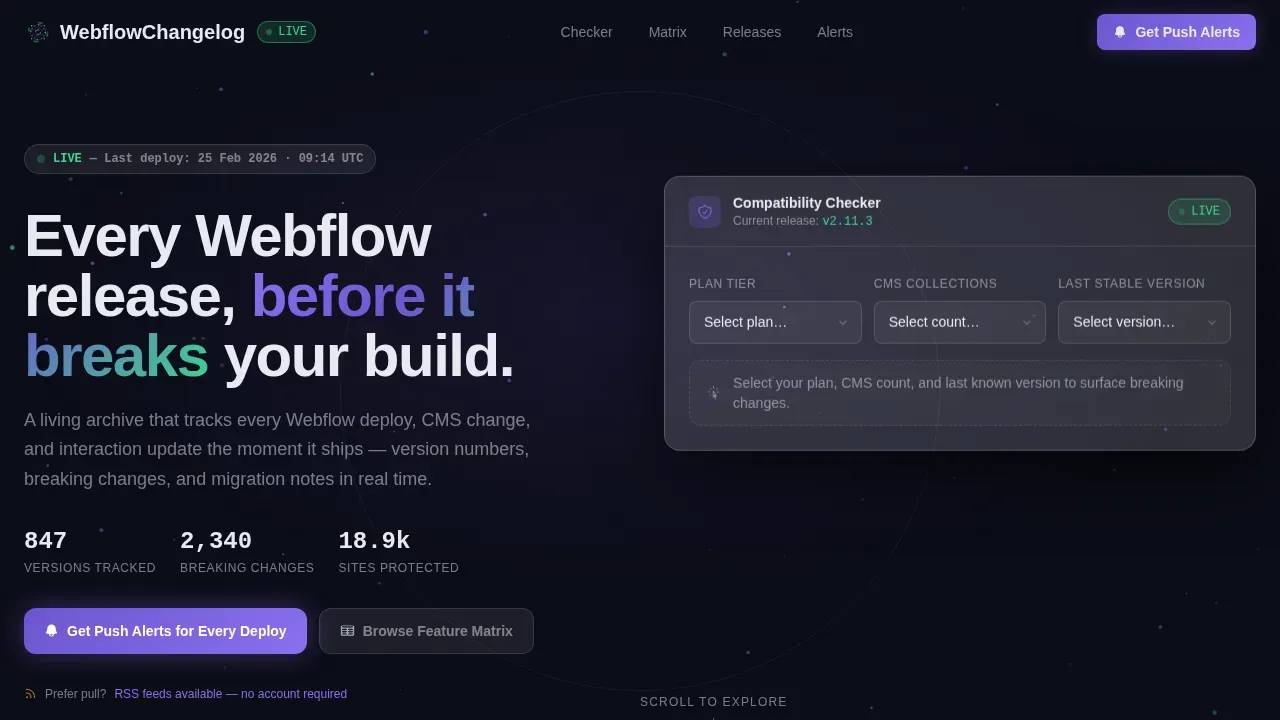
A real-time Webflow changelog landing page template built for developers and agency teams who can't afford to miss a breaking change. The page features a glassmorphic dark-space aesthetic, a compatibility checker that surfaces migration steps on the fly, a version-by-domain feature matrix, live release rows, and a push-alert conversion path, all on one focused, anchor-navigated landing page.
by Rocket studio
Quick summary
This changelog real time release tracker landing page template gives Webflow developers a living, queryable archive of every platform release. Built around a hub-and-spoke anchor navigation, it organizes release notes by product domain, surfaces breaking changes instantly through an interactive compatibility checker, and converts visitors toward push-alert app downloads. The design feels like a cockpit display, precise, always current, completely trusted.
Who this template is for
Agency leads, freelance designers, and developers who depend on Webflow every day need a reliable way to track every software change before it reaches a client build. This template speaks directly to that need.
- Webflow agency developers managing multi-client sites who need instant visibility into new features, bug fixes, and deprecated behavior across every release
- Freelance designers who open their laptops to a changed Designer interface and need clear, structured release notes before their first call of the day
- Product teams and indie makers who track Webflow as part of a broader project management workflow and want release summaries they can act on immediately
What problem this template solves
Webflow ships updates constantly. Without a structured changelog page, developers discover breaking changes only after a client site goes wrong. That delay costs time, trust, and money.
- No central source of truth for version numbers, deprecated features, or migration steps across CMS, Interactions, Hosting, and Logic
- Scattered communication across forum threads, social posts, and release emails that teams have to manually reconcile before every deploy
- No alert system that keeps users informed in real time, so developers are always reacting instead of preparing
What you get with this template
This template delivers a fully structured, anchor-navigated landing page ready to present release notes, product updates, and breaking-change data in a format that helps users act fast.
- Interactive compatibility checker that accepts plan tier, CMS collection count, and last-known stable version, then surfaces every breaking change between that version and today
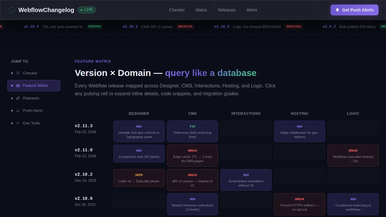
- Feature matrix section organizing releases across five capability domains with expandable inline cards containing code snippets and migration guides
- OS-detecting push-alert conversion path with a sticky call-to-action bar, a Webflow URL pre-configuration step, and an RSS feed secondary path for developers who prefer pull-based access
Feature list
This template includes a set of purpose-built sections and interactive components designed specifically for real-time release tracking. Each part is grounded in the prompt and built to convert.
Glassmorphic Compatibility Checker
The header is a calculator disguised as a compatibility tool. Users select their Webflow plan tier, CMS collection count, and last-known stable version from dropdowns. The tool instantly surfaces bug fixes, deprecated features, and required migration steps. Results slide in with spring-eased motion over a slowly orbiting particle field, so visitors experience the value of the tool before any call to action appears.
Version by Domain Feature Matrix
A navigable grid organizes every release into rows (version numbers) and columns (Designer, CMS, Interactions, Hosting, Logic). Each cell pulses when it contains a change. Clicking a cell expands an inline detail card with code snippets, migration notes, and forum links. This section drives scroll by letting developers query exactly the capability domain that matters to their current project.
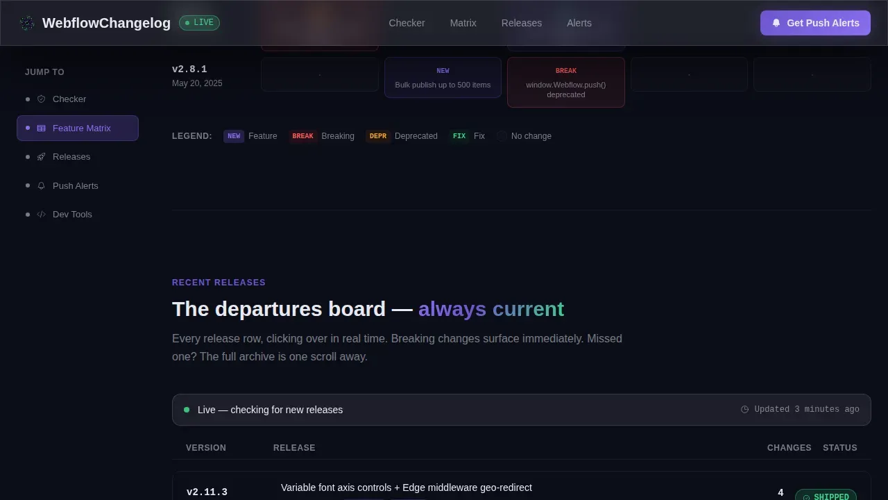
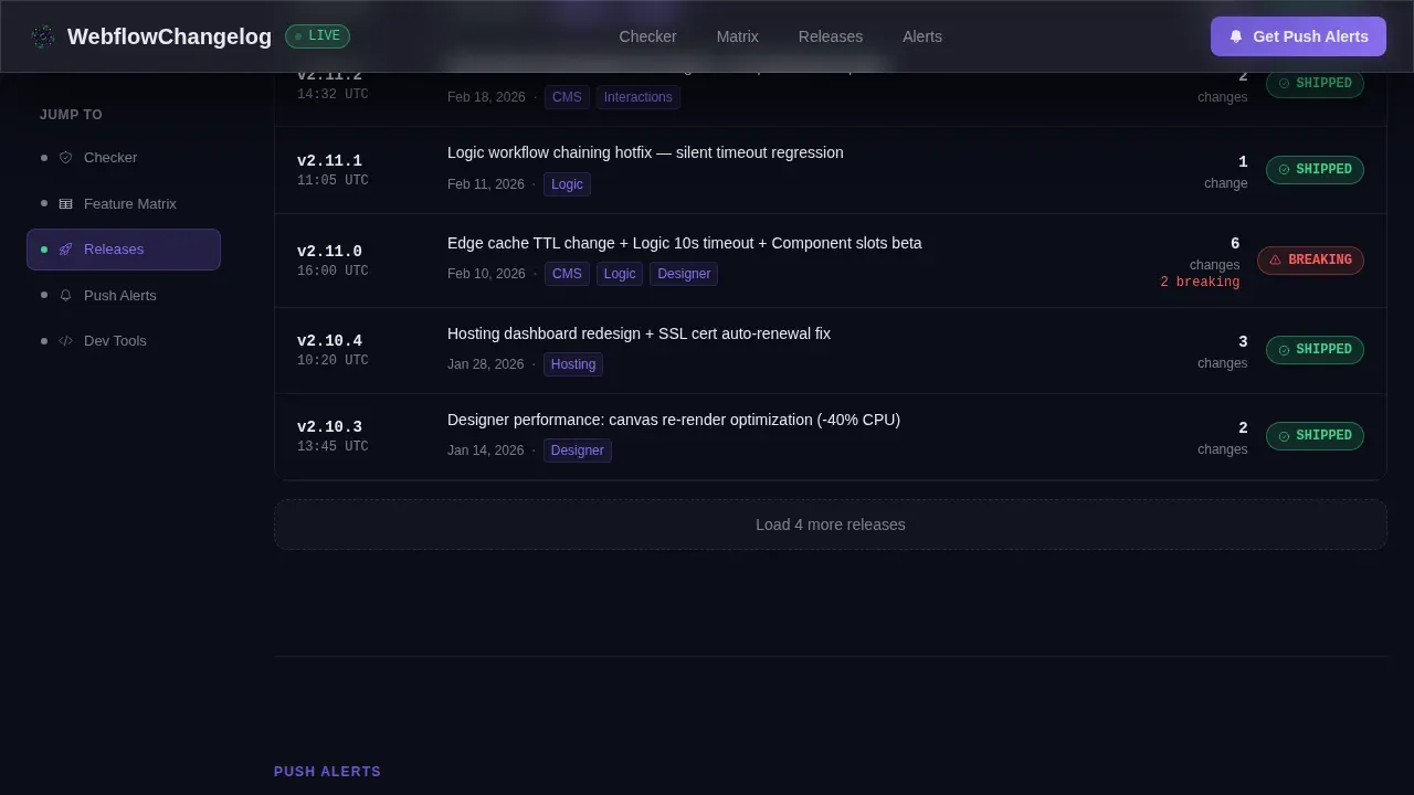
Live Release Departures Board
Recent releases appear as live ticker rows styled like a departures board. Each row shows a version badge, a release date, and color-coded status chips for new features, bug fixes, and performance improvements. The format is scannable in seconds and keeps users informed without requiring them to read a full article.
OS-Detecting Push Alert Download Flow
The primary call to action reads "Get Push Alerts for Every Deploy." It appears first inside the compatibility checker results and again as a sticky bottom bar after the second anchor spoke. The flow detects the visitor's operating system automatically and shows the correct download badge. Users enter only their Webflow team URL to pre-configure filtered notifications.
Anchor Navigation Hub and Spoke Structure
A pinned left-rail anchor navigation links each section to a product domain spoke. Visitors jump directly to Designer, CMS, Interactions, Hosting, or Logic updates. This structure makes the page feel less like reading and more like querying a database, which reduces friction and keeps attention focused on relevant releases.
RSS Feed and Developer Tools Secondary Path
A secondary conversion path offers an RSS feed link for developers who prefer pull over push. This section also surfaces any additional developer tool links and access points. No account is required for the RSS path, which means teams can start tracking releases with zero friction.
Page sections overview
| Section | Purpose |
|---|---|
| Hero Compatibility Checker | Accept plan, CMS count, and version inputs; display breaking changes and migration steps instantly |
| Feature Matrix Grid | Organize releases by version and domain; expand inline cards with code and migration notes |
| Recent Releases Board | Display live ticker rows with version badges, release dates, and status chips |
| Push Alerts Download | Convert visitors to push notifications with OS detection and Webflow URL pre-config |
| Developer Tools Feed | Offer RSS feed link and secondary developer access paths with no account required |
| Footer Developer Minimal | Provide navigation links, legal pages, and a minimal GitHub-style footer pattern |
Design & branding system
The visual identity uses a Dynamic Motion theme built on a Glassmorphic color system. Every surface implies depth, motion, and precision.
- Color palette: void black (#0B0D17) as the base, frosted glass panels at 8% opacity with a 12-pixel blur, electric indigo (#6E56CF) as the primary accent, and soft signal green (#3DD68C) for shipped-status badges
- Typography: DM Sans for all interface text and navigation labels; JetBrains Mono for version numbers, code display, and inline code snippets, a pairing that separates human communication from machine output at a glance
- Motion and interactivity: particle field background animation, spring-eased result reveals, pulsing matrix cells, ticker-row transitions, and GPU-accelerated transforms throughout; creative animations are central to the template's identity, not decorative additions
Mobile & speed optimization
This template is designed desktop-first for agency developers working on monitors, but it is fully responsive across all breakpoints with a mobile first fallback structure that keeps every section navigable on smaller screens.
- Fully responsive layout ensures the anchor navigation, feature matrix, and compatibility checker all reflow cleanly on tablet and mobile viewports without losing usability
- GPU-accelerated transforms power all animations, and Intersection Observer drives reveal timing, so motion loads progressively rather than all at once
- SEO optimized, mobile first page structure means the template is built to be indexed and discoverable without sacrificing the dense interactivity that desktop users rely on
How this template helps you convert
A changelog page that just lists entries is just a list. This template is built around a single, clear conversion goal: get Webflow developers to download the push-alert app and stay connected to every future release.
- Value before the ask: The compatibility checker delivers detailed information about breaking changes before any download prompt appears. Users trust the tool because it has already worked for them. That trust is what makes the "Get Push Alerts for Every Deploy" call to action feel logical, not interruptive.
- Layered conversion touchpoints: The primary call to action appears inside the checker results and again as a sticky bar after the second anchor spoke. The RSS feed path captures developers who are not ready to install an app. Both paths keep users informed and connected without forcing a single route.
- Consistent use of domain-specific language: Version numbers, release dates, and status tags written in clear action-based language help product managers and developers quickly understand each change. That clarity shortens the decision cycle and supports product adoption for every new release cycle.
Other information about this template
This template is suited to growing products, saas companies, and saas products that need a public changelog with real structure and motion. It works equally well for software teams maintaining open-source tools, for indie makers who want polished visuals without a custom build, and for product managers who need a single public changelog to replace scattered communication.
- The changelog template structure follows best practices for writing release notes: each entry carries a version number and release date, uses Semantic Versioning (for example, v2.1.0), and begins with a strong action verb to keep release summaries scannable and consistent
- Structured categorization across tags like "New," "Improved," "Fixed," and "Security" helps users informed across multiple releases; the template is designed for consistent use of these tags across every entry to maintain clarity over time
- For teams exploring changelog examples, well-known products like Slack, Notion, and Zoom each organize their release notes differently; this template supports a reverse-chronological, skimmable timeline format similar to how leading software change logs are structured, with the most recent updates at the top for immediate visibility
- The template ships with figma design files included, giving teams full access to every layout frame, component, and design token used in the build; figma design files are organized to match the live page structure exactly, making it straightforward to adapt branding or extend sections for private projects
- Multiple theme support means teams can apply light, dark, or custom palette variants without restructuring the page; the glassmorphic dark-space theme is the default, and the design files make it practical to swap colors across all pro blocks in one pass
- The template is seo optimized out of the box and built with tailwind css and shadcn ui component conventions in mind; lucide icons are used throughout the interface for status indicators, navigation labels, and feature matrix cells; tailwind css utility classes keep styling consistent and easy to extend
- Teams looking for the best changelog templates for developer-facing products will find that this template goes beyond a static list; it uses creative animations, interactive pro blocks, and a structured anchor nav to create a changelog page that feels like a live product rather than a documentation afterthought
- For teams that want to create changelogs and publish updates quickly, the free track variant of this structure can support a no code editing workflow; full access to the design files means developers can go from template to live public changelog without rebuilding from scratch
- User feedback features such as voting or comment triggers can be added by extending the inline card component in the feature matrix; the base template provides the layout and motion system, and teams can layer in those interactive elements as their product grows
- The template is completely free to use as a starting point; completely free access to the base layout means smaller teams and indie makers can build a professional changelog page without upfront cost, while pro blocks and extended figma design files are available for teams that need more
Theme
Dynamic Motion
Creative direction
Feature Matrix
Color system
Glassmorphic
Style
Hub & Spoke (Anchor Nav)
Direction
App Download
Page Sections
Glassmorphic Compatibility Checker Hero
Version by Domain Feature Matrix
Live Release Departures Board
Os-detecting Push Alert Conversion Path
Hub and Spoke Anchor Navigation
Figma Design Files and Multi-theme System
Related questions
What sections does this landing page template include?
Can I customize the color palette and branding?
Is this template suitable for non-Webflow changelog use cases?
How does the push-alert conversion flow work?
Does the template support multiple themes?



