Velocity HubSpot | Free Website Template | Rocket
The Changelog landing page template is built for teams who live inside their CRM and can't afford to miss a product update. It uses a scroll-reveal layout with glassmorphic panels, progressive card disclosure, and a click-through structure that turns release notes into a scannable, trust-building feed. No forms, no friction, just clear, fast-moving content that earns the click.
by Rocket studio
Quick summary
This is a single-page, scroll-reveal landing page template designed for publishing ongoing product updates and release notes. It pairs a dark glassmorphic visual system with an industry-report content cadence. Updates are revealed progressively as readers scroll, building from minor user interface changes to major platform shifts. The primary goal is click-through to a deeper article or gated digest.
Who this template is for
This template fits teams who need to stay current on platform changes and communicate those changes quickly to clients or colleagues. It suits anyone managing multiple accounts or portals who relies on accurate, timely update information.
- Revenue Operations managers who track changes across multiple portals before weekly syncs
- Agency partners who need to brief clients before a new feature causes confusion
- Solo marketers who open their CRM tool and notice something has changed without warning
What problem this template solves
Product updates ship quietly. Teams discover broken automations, missing buttons, or changed workflow triggers only after something goes wrong. A structured, always-current changelog page stops that reactive cycle.
- No central place to track feature flags, API endpoint additions, or rewritten workflow triggers
- Clients and colleagues get surprised by changes that a 60-second briefing could have prevented
- Update information is buried in dense release notes that require too much time to parse
What you get with this template
You get a fully structured scroll-reveal landing page that presents release notes as a prioritized, narrative feed. The layout escalates from low-impact cosmetic changes to major platform shifts, keeping readers engaged through the whole page.
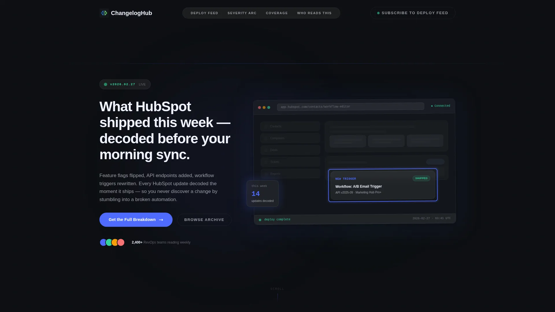
- A product screenshot header with a circled feature highlight, a pulsing version badge, and a typewriter headline
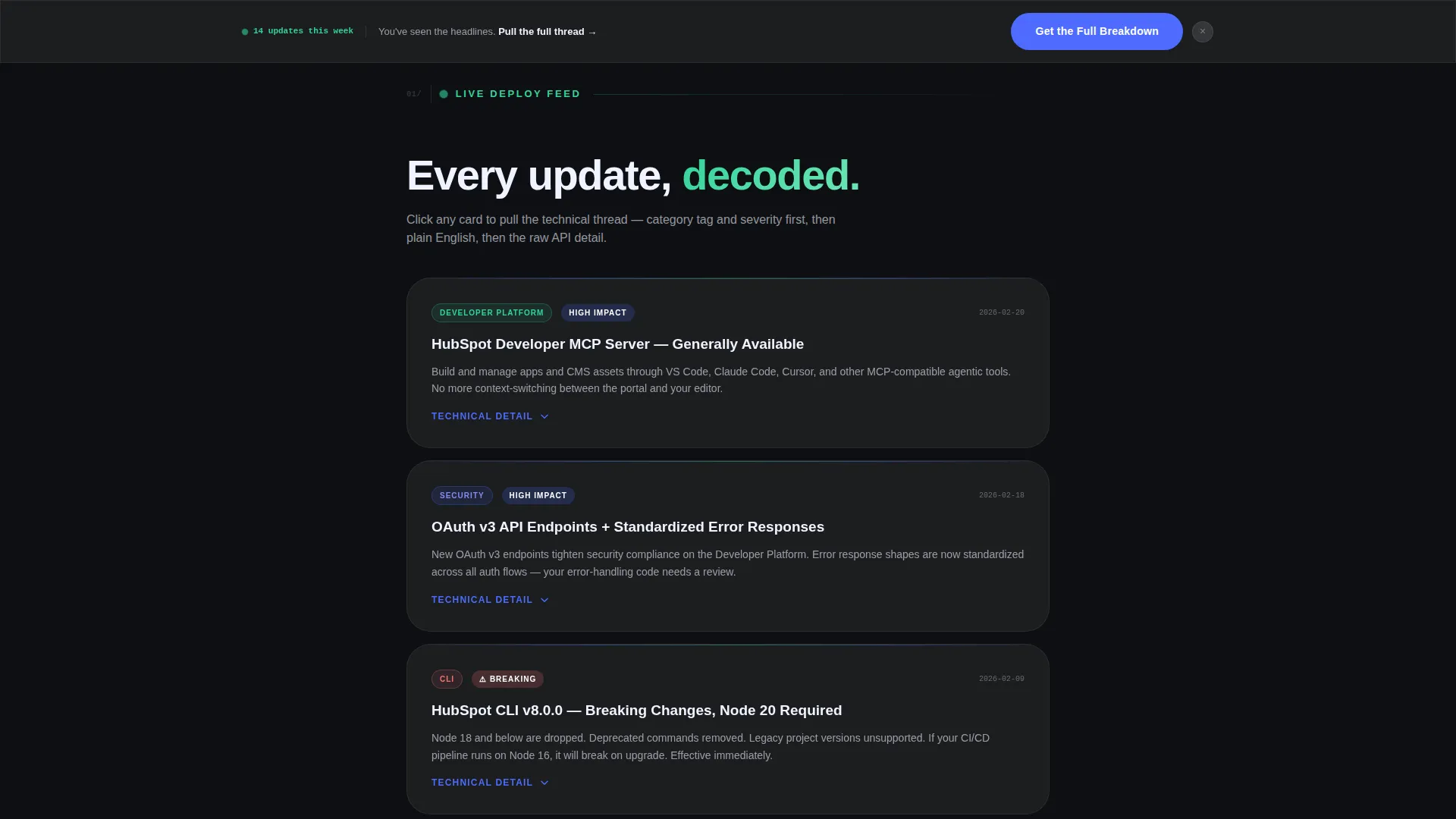
- Progressive card-based update sections that disclose category tags, severity labels, plain-English summaries, and expandable technical detail panels
- A sticky click-through call-to-action bar, a full-width closing call-to-action, and a ghost-button secondary option in the navigation
Feature list
This template includes purpose-built components designed for a changelog and release notes use case. Every element serves fast comprehension and confident action.
Scroll Reveal Card Layout
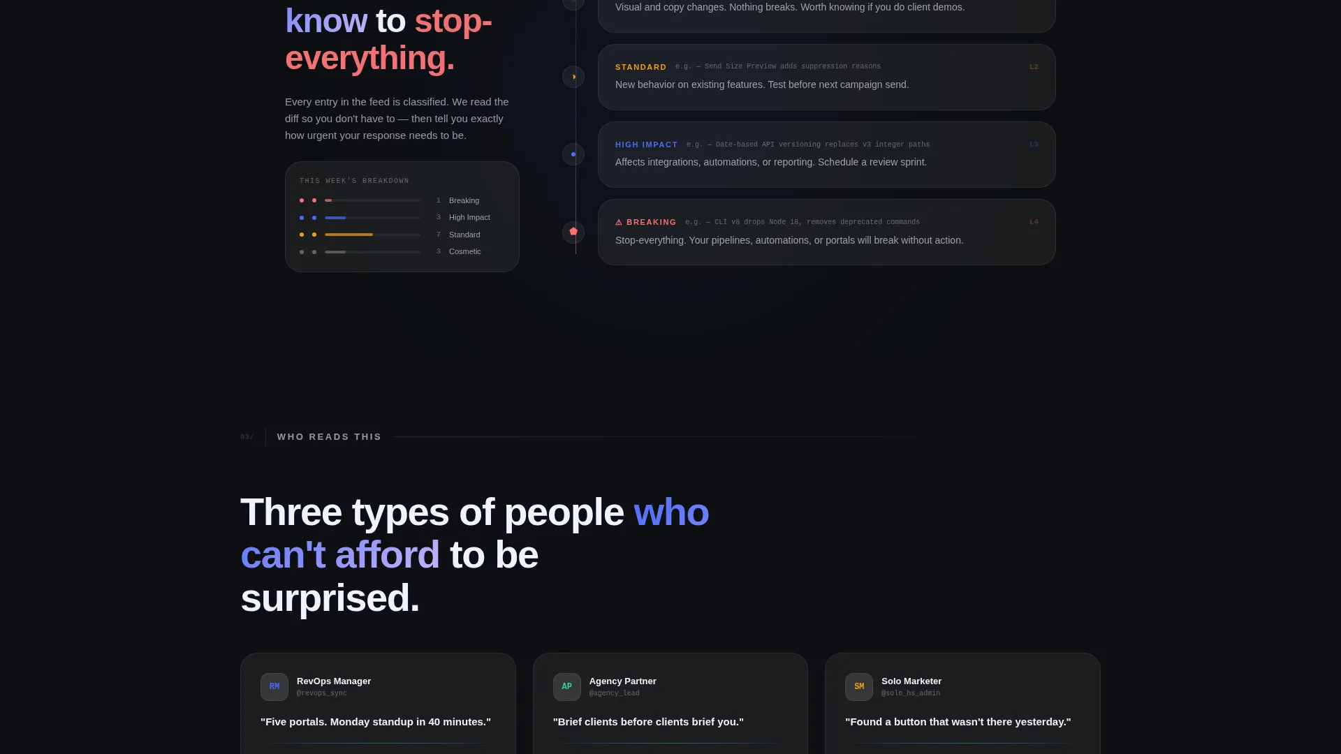
Updates are presented as data-dense cards that animate into view as the reader scrolls. Each card reveals its category tag and severity label first, then the plain-English summary, then an expandable technical detail panel on click. The escalating sequence moves from cosmetic tweaks to major platform shifts.
Animated Typewriter Headline
The header headline types itself out letter by letter on page load. This creates a sense of live delivery rather than a static document, reinforcing that the content is current and just arrived.
Pulsing Version Badge and Product Screenshot Header
A version badge in the top-left corner pulses to signal freshness. The header uses a pixel-perfect product interface screenshot with a single highlighted update circled in sprint-blue, while the rest of the interface is dimmed to 40% opacity so the new feature draws full attention.
Subtle Parallax Header Effect
The header user interface layers shift gently as the cursor moves. This adds depth and a sense of the interface being alive without distracting from the content itself.
Glassmorphic Divider Pulse
Frosted-glass divider lines pulse faintly between update sections. The visual rhythm mimics a heartbeat monitor, reinforcing the idea that this feed is live and continuously updated.
Dual Call-to-Action Structure
The primary call-to-action, "Get the Full Breakdown," appears first as a sticky frosted-glass bar after the third card and again as a full-width closer at the bottom. A secondary ghost-button call-to-action, "Subscribe to the Deploy Feed," floats in the navigation for readers ready to opt into ongoing updates.
Page sections overview
| Section | Purpose |
|---|---|
| Header with screenshot | Anchors the page with a live-feeling product image, version badge, and animated headline |
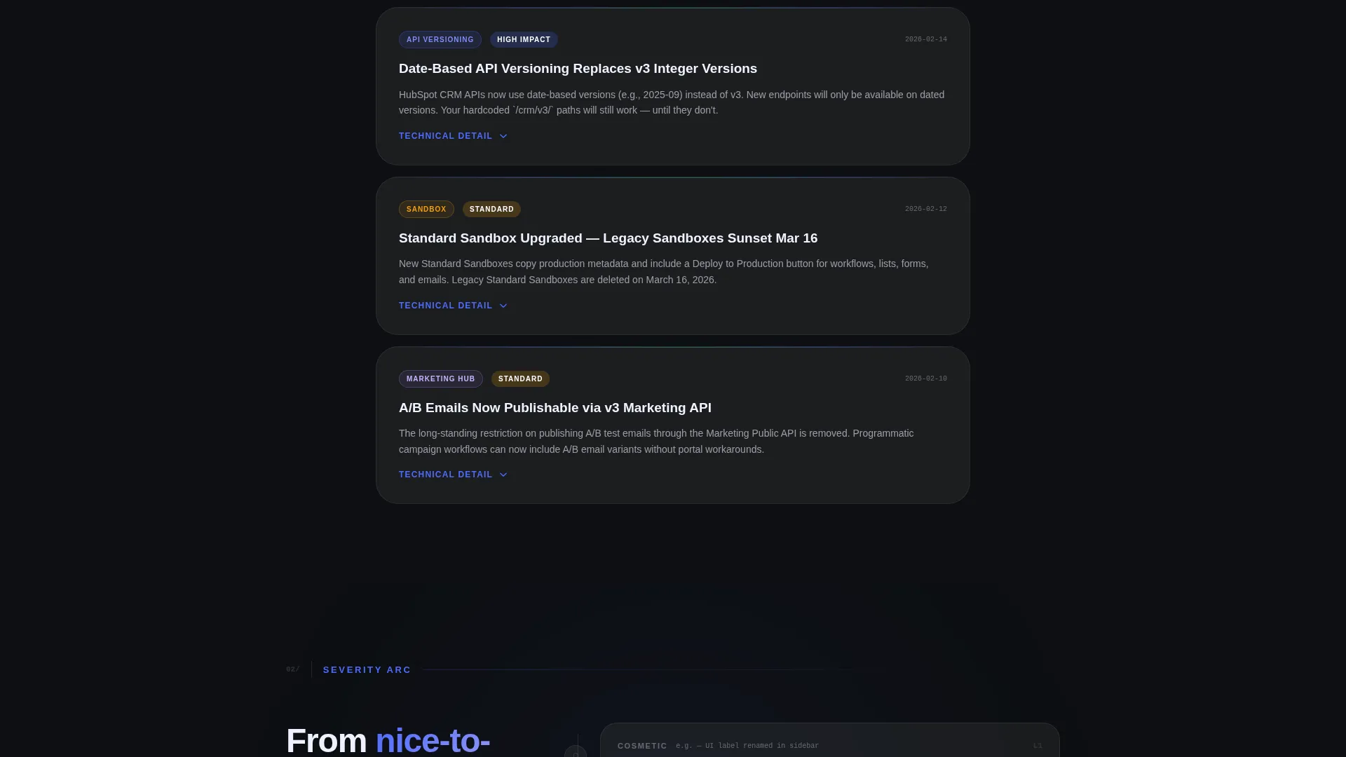
| Card feed opener | Introduces the first wave of low-severity cosmetic user interface updates via scroll-revealed cards |
| Mid-page escalation | Presents moderate-impact feature and API changes with expandable technical detail panels |
| Sticky call to action bar | Surfaces the primary click-through call-to-action after the third update card |
| Major platform updates | Delivers the highest-severity changes in the narrative arc's climax section |
| Full-width call to action closer | Closes the page with a bold call-to-action block that invites readers to get the full breakdown |
Design & branding system
The visual identity is built around a Startup Velocity theme expressed through a glassmorphic color system. Every layer feels like a dark-mode dashboard viewed through frosted glass, backlit and precise.
- Base layer in deep terminal black (#0D0F12), frosted glass panels at rgba(255,255,255,0.06) with a 12-pixel blur, electric sprint-blue (#4D6BFE) on all interactive surfaces, and soft signal-green (#34D399) reserved for shipped-status badges
- Typography and spacing are tuned for data-dense reading, with high contrast against the dark base to keep long update lists scannable
- Glassmorphic panels float over depth layers, and pulsing divider lines maintain a rhythm that feels live rather than archived
Mobile & speed optimization
The scroll-reveal interactions and layered glass panels are designed with a single-column mobile flow in mind. Progressive disclosure keeps the page from feeling overwhelming on smaller screens.
- Cards stack vertically on mobile, revealing content in the same escalating sequence without requiring horizontal scrolling
- The sticky call-to-action bar remains accessible at the bottom of the viewport on mobile, keeping the primary action reachable at any scroll depth
How this template helps you convert
This template earns the click rather than demanding it. By giving away category tags, severity labels, and plain-English summaries freely, it builds enough trust that clicking through feels like a natural next step.
- The progressive reveal structure creates narrative momentum, pulling readers from the first card through to the full-width closing call-to-action without a hard gate
- The dual call-to-action placement ensures the primary action is visible mid-scroll for decisive readers and again at the end for readers who finish the full feed
- The ghost-button subscribe option in the navigation captures high-intent readers who already know they want ongoing updates, turning a single visit into a recurring relationship
Other information about this template
This template is categorized under Documentation and Support, within the HubSpot Documentation subcategory. It is purpose-built for the HubSpot changelog and release notes niche, making it a strong fit for anyone building a resource around CRM platform updates.
- The template style is Scroll Reveal (Progressive), the theme is Startup Velocity, and the color system is Glassmorphic
- The header concept is a Product Screenshot, the creative direction follows an Industry Report cadence, and the landing page direction is Click-Through
- This template is designed to work within the HubSpot landing page builder ecosystem, making it immediately usable for teams already operating on that platform
Theme
Startup Velocity
Creative direction
Industry Report
Color system
Glassmorphic
Style
Scroll Reveal (Progressive)
Direction
Click-Through
Page Sections
Scroll Reveal Progressive Card Layout
Animated Typewriter Headline
Pulsing Version Badge with Product Screenshot Header
Glassmorphic Divider Pulse
Dual Call-to-action Placement
Subtle Parallax Header Depth
Related questions
Does this template include a form or email capture on the page?
Can I update the changelog cards regularly without redesigning the page?
Who is this template best suited for?
Is the typewriter headline animation editable?
What does the escalating card structure mean in practice?


