Healthcare Software Directory Website Template
Charted is a dark-themed, hub-and-spoke healthcare document management landing page built to convert practice managers, hospital IT directors, and specialty clinic owners. Stat-first sections prove speed and scale before any explanation appears. A persistent call-to-action drives visitors toward a guided product demo without a single form field on the page.
by Rocket studio
Quick summary
Charted is a single-page, anchor-nav template built for a clinical document management platform. It opens with rolling live-stat counters, funnels visitors through five focused spoke sections, and ends with a glowing API code snippet. Every design choice is built around one goal: earning the demo click before the visitor reaches the bottom.
Who this template is for
This template is made for teams that need to communicate speed, compliance, and scale to a highly skeptical healthcare audience. If your product solves paperwork pain in clinical settings, this page speaks your buyer's language.
- Practice managers buried in fax confirmations and misfiled charts
- Hospital IT directors facing Health Insurance Portability and Accountability Act (HIPAA) audit deadlines
- Specialty clinic owners losing billable hours to disorganized document workflows
What problem this template solves
Healthcare software buyers do not convert on vague promises. They need hard proof before they will click anything. This template solves the credibility gap by front-loading real numbers and letting the design itself communicate operational precision.
- Generic software landing pages fail to address compliance anxiety or retrieval speed
- Buyers stall when they cannot see measurable outcomes before committing to a demo
- Dense text-heavy pages lose clinical decision-makers who scan rather than read
What you get with this template
You get a fully structured, dark-canvas landing page with five anchor-linked spoke sections, a pinned navigation bar, and a persistent floating call-to-action button. Every section is pre-wired to carry a stat, a short paragraph, a visual element, and a contextual secondary call-to-action.
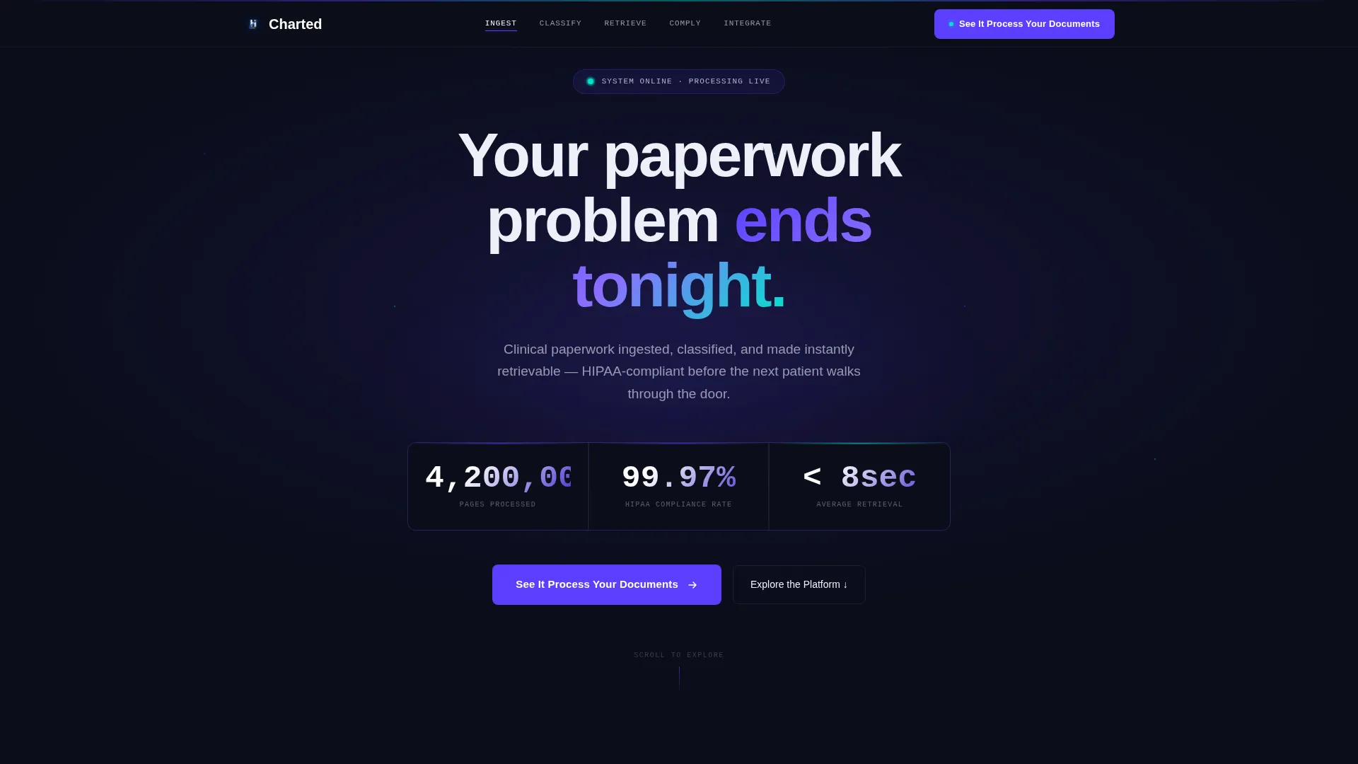
- A full-bleed dark header with animated rolling stat counters and a radial indigo glow effect
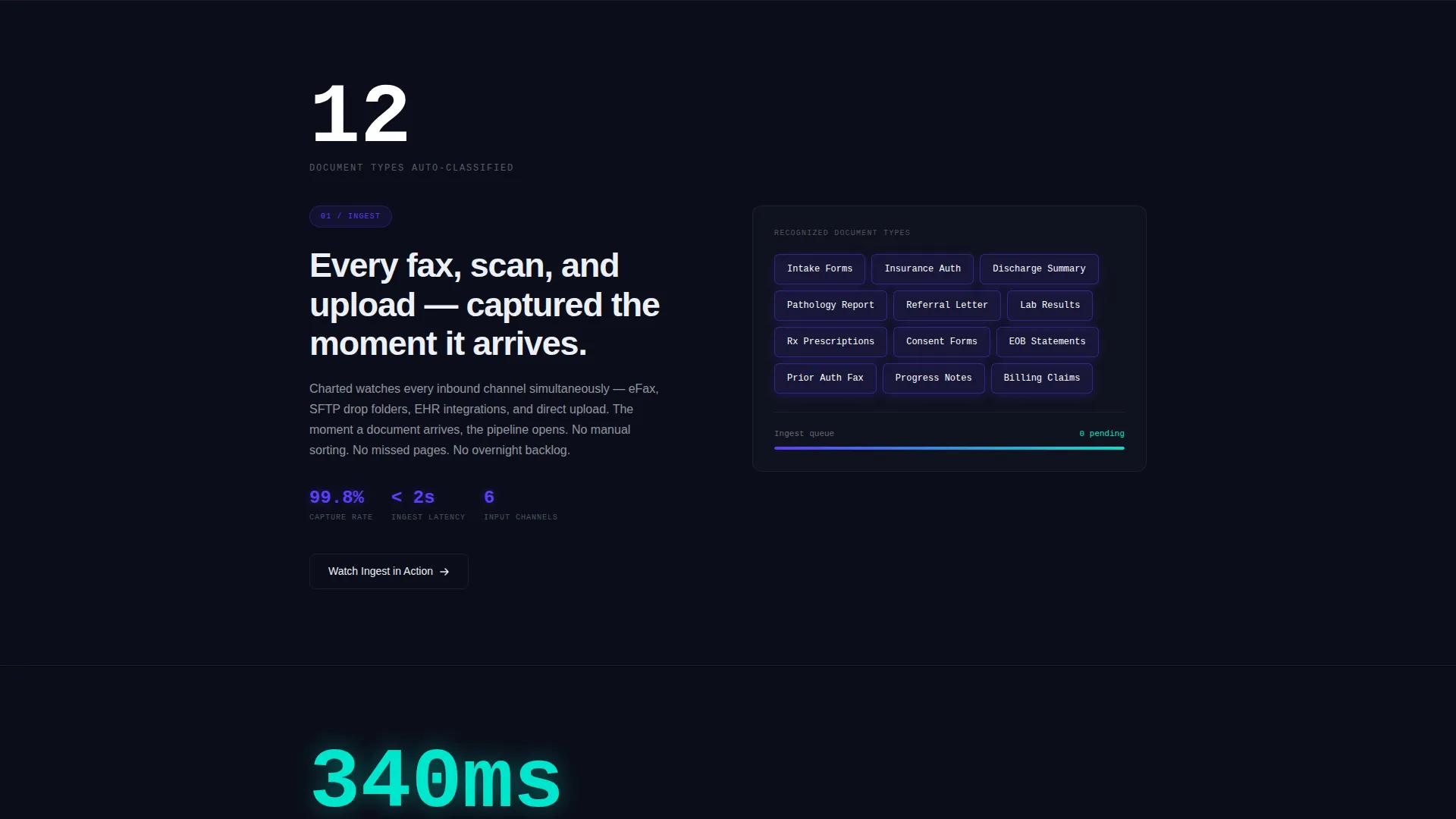
- Five spoke sections covering Ingest, Classify, Retrieve, Comply, and Integrate, each with its own oversized stat opener
- A primary call-to-action ("See It Process Your Documents") placed in the header and repeated as a floating button after the second spoke
Feature list
This template delivers a focused set of prompt-backed components designed to move a healthcare buyer from scroll to click.
Animated Stat Counter Header
The hero section displays three live-style rolling counters in a monospaced typeface against a pure void-black background. A radial indigo glow pulses outward from the center, creating urgency and credibility before any headline is read.
Pinned Anchor Navigation Bar
A thin indigo rule pins to the top of the viewport as the visitor scrolls. Five spoke labels, Ingest, Classify, Retrieve, Comply, and Integrate, let visitors jump directly to the feature area most relevant to them without losing their place.
Stats-First Spoke Sections
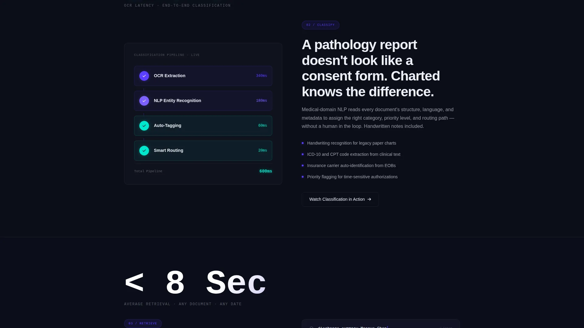
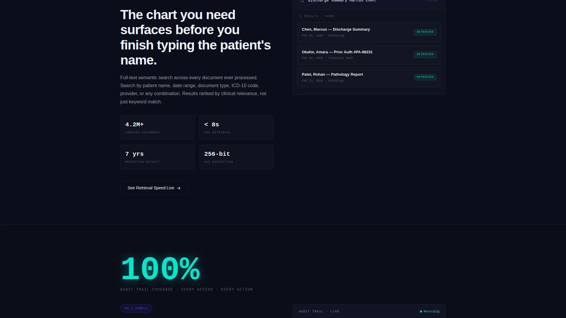
Each of the five spoke sections opens with an oversized stat, such as "340ms OCR Latency" or "100% Audit Trail Coverage," before any explanatory copy appears. This mirrors a live dashboard experience and keeps technical buyers engaged through the full scroll.
Persistent Floating Call-to-Action
After the second spoke section, a floating button stays visible throughout the remainder of the page. This ensures the primary conversion action is always one click away without interrupting the reading flow.
Contextual Secondary calls to action
Each spoke section includes its own smaller call-to-action, for example "Watch Classification in Action" or "Run a Compliance Check." These give hesitant visitors a lower-commitment entry point before they commit to the full demo.
Glowing API Code Snippet Block
The final Integrate spoke features a single code snippet rendered in reactive cyan against the void-black background. It communicates developer-readiness and compatibility with existing Electronic Health Record (EHR) systems in a single visual moment.
Page sections overview
| Section | Purpose |
|---|---|
| Dark Hero Header | Establishes credibility with rolling stat counters and the primary call-to-action |
| Anchor Nav Bar | Pins five spoke labels to the top for instant in-page navigation |
| Ingest Spoke | Introduces document ingestion capabilities with an oversized stat opener |
| Classify Spoke | Highlights auto-classification depth with a speed-focused stat and short diagram |
| Retrieve Spoke | Communicates retrieval speed and searchability with a supporting visual |
| Comply Spoke | Addresses audit trail coverage and HIPAA-readiness with compliance-focused copy |
| Integrate Spoke | Closes with the API code snippet and an EHR compatibility message |
| Floating call to action Button | Persists after the second spoke to keep the demo click always in reach |
Design & branding system
The visual identity runs on what the brief calls "Startup Velocity" expressed through an Electric Indigo color system. Every element lives inside the same dark theater so the data always reads as the brightest thing on screen.
- Background is a fixed deep void black (#0B0E1A) that never lifts across any section, keeping all data luminous
- Electric indigo (#5B3FFF) drives buttons, progress rings, navigation highlights, and the radial glow in the header
- Clinical white (#EDF0F7) is used for body text and card surfaces, while reactive cyan (#00E5CC) fires only on live data accents and success states such as the API snippet and completion indicators
Mobile & speed optimization
The layout is built to remain navigable and legible on smaller screens without losing the dark-canvas atmosphere or the stat-first hierarchy.
- The pinned anchor navigation collapses cleanly so spoke labels remain reachable on mobile viewports
- Oversized stat openers and short paragraph blocks are naturally suited to vertical scrolling on touch devices
How this template helps you convert
This template earns the click by proving platform performance before making any ask. The conversion architecture removes friction at every stage of the scroll.
- The header places the primary call-to-action directly beneath rolling proof-of-performance counters, so the first ask arrives with full credibility already established
- The persistent floating button removes the need to scroll back up, keeping conversion intent alive throughout the entire page without adding form fields or interruptions
- Contextual spoke calls to action give skeptical buyers a smaller commitment option, warming them toward the main demo click through feature-specific entry points
Other information about this template
This template is categorized under Technology and Healthcare Software, with a niche focus on healthcare document management. It is designed as a click-through landing page, meaning the sole conversion goal is a demo visit on the next page.
- The template style is Hub and Spoke with anchor navigation, a format well suited to platforms with multiple distinct feature pillars
- The creative direction is Stats-First Impact, which means every section earns reader attention with a number before any marketing copy appears
- The header concept is Dark Full-Bleed with Glow, using a radial gradient heartbeat effect to create a sense of live operational momentum
- No form fields appear anywhere on the page, reducing friction and keeping the visitor's only decision binary: click or keep scrolling
Theme
Startup Velocity
Creative direction
Stats-First Impact
Color system
Electric Indigo
Style
Hub & Spoke (Anchor Nav)
Direction
Click-Through
Page Sections
Animated Rolling Stat Counters
Pinned Anchor Navigation Bar
Stats-first Spoke Sections
Persistent Floating Call to Action Button
Contextual Secondary Ctas Per Spoke
Glowing API Code Snippet Block
Related questions
What type of businesses is this landing page template built for?
Does this template include form fields or lead capture?
How many sections does this landing page include?
Can I update the stat counters and spoke content to match my platform?
Why does the design keep a dark background across every section?



