Pediatric Vertical SaaS Comparison Website Template
The Charting pediatric landing page template is built for pediatric CRM platforms that need to demonstrate their product, not just describe it. It opens with a live interactive dashboard preview, guides visitors through a role-based comparison table, and closes with a contextual app download prompt. Every scroll layer earns attention by letting visitors explore the product firsthand.
by Rocket studio
Quick summary
Charting is a single-page comparison table landing page template for pediatric CRM platforms. It opens with a functioning dashboard preview featuring a fictional patient, lets visitors self-select their practice type, and reconfigures every section to match. The page closes with a device-aware app download prompt and a sticky secondary call to action.
Who this template is for
This template is built for healthcare technology teams who need to sell a complex clinical product to a non-technical buyer. It speaks equally well to the clinician testing the tool at midnight and the health system executive reviewing it in a board deck.
- Solo pediatricians who need a fast, credible way to evaluate charting and workflow software
- Practice managers overseeing multi-provider groups who want role-specific feature comparisons
- Health system CTOs looking for a clear visual pitch for unifying well-child data across many clinics
What problem this template solves
Most clinical software landing pages describe features through static text and screenshots. Buyers cannot feel how the product works. They leave unconvinced, or they schedule a demo they may never attend. This template removes that friction by turning the page itself into a product experience.
- Visitors cannot judge dashboard clarity from a screenshot, so the template puts a live interactive preview front and center
- Buyers from different practice sizes have different priorities, so the comparison table reconfigures based on the archetype they select
- Generic calls to action get ignored, so the download prompt adapts to the visitor's device and surfaces contextually after demonstrated interest
What you get with this template
This template delivers a fully structured, interaction-rich landing page layout designed around the pediatric CRM buyer journey. Every section has a defined role, and nothing is included without a conversion purpose.
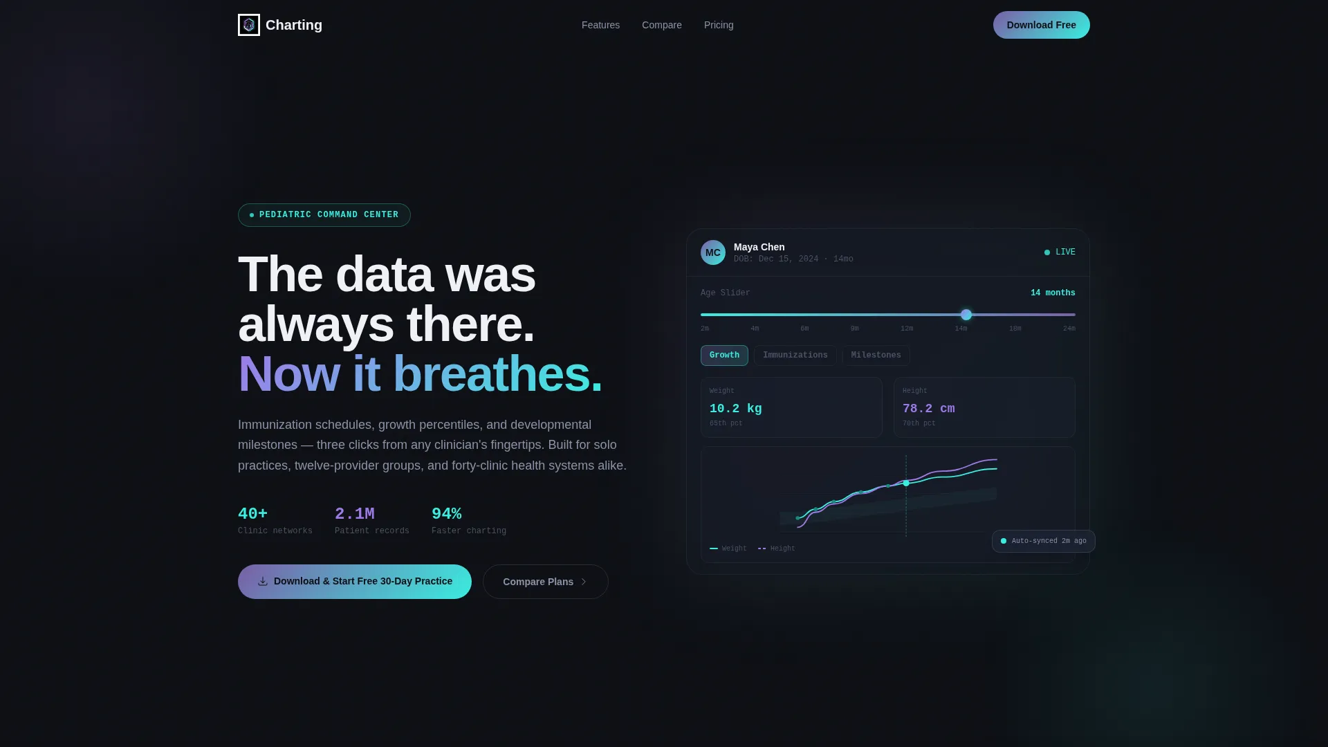
- An interactive header dashboard showing a fictional patient with live-updating growth charts, a color-coded immunization timeline, and a developmental screening score
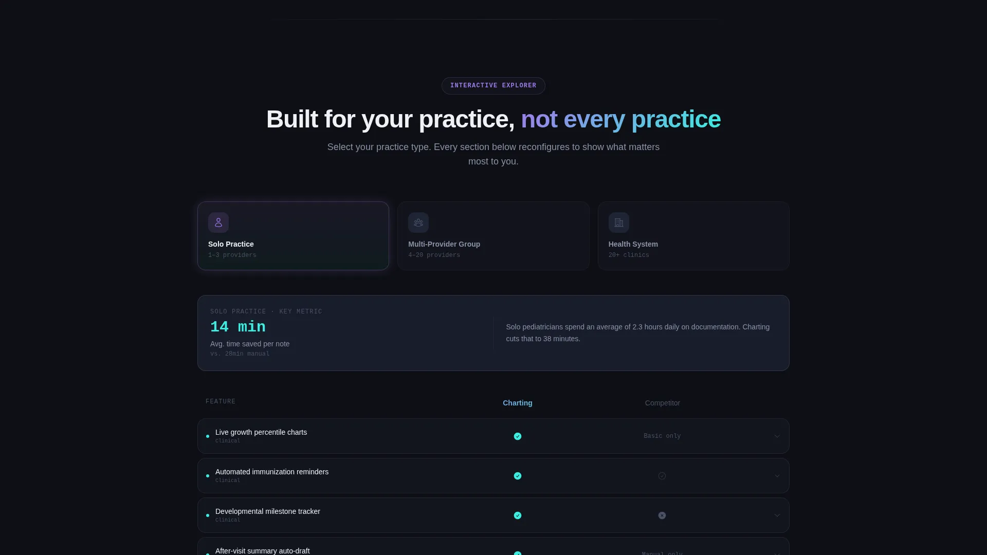
- A three-column comparison table with selectable practice archetypes (Solo Practice, Multi-Provider Group, Health System) that reorders content by relevance when a column is chosen
- A device-aware app download section with platform toggle buttons for iOS, Android, and Desktop, plus a sticky secondary bar that appears after 40 percent scroll depth
Feature list
This template is built around five core functional components, each serving a specific role in the buyer's decision journey.
Interactive Patient Dashboard Preview
The header section renders a functioning replica of the CRM dashboard around a fictional 14-month-old patient. Visitors can click tabs, hover over data points, and drag an age slider to watch records populate in real time. The product demonstrates its own intelligence before any marketing copy appears.
Role-Based Comparison Table
Three practice archetypes sit as selectable columns: Solo Practice, Multi-Provider Group, and Health System. Choosing one reconfigures the feature grid order, swaps metric callouts to role-specific key performance indicators, and rotates testimonial cards to matching practice sizes. Buyers see only what is most relevant to them.
Expandable Feature Row Micro-Demos
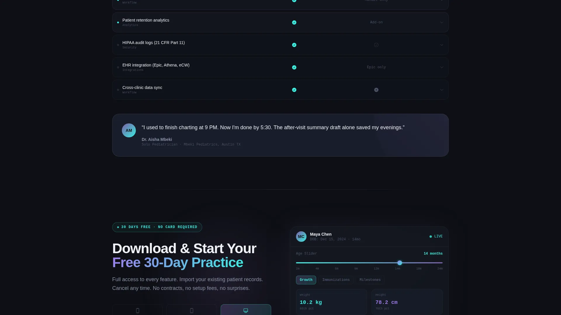
Each row in the comparison table can be tapped to expand a micro-demo. Hovering a metric reveals its methodology. Clicking a competitor column, displayed in a grayed-out state beside your platform, shows where the competitor falls short. The table teaches the product while it compares.
Contextual App Download Prompt
The primary call to action reads "Download and Start Your Free 30-Day Practice" with platform toggle buttons that surface based on the visitor's detected device. This keeps the download moment relevant whether the visitor is on a phone, tablet, or desktop computer.
Sticky Secondary Call-to-Action Bar
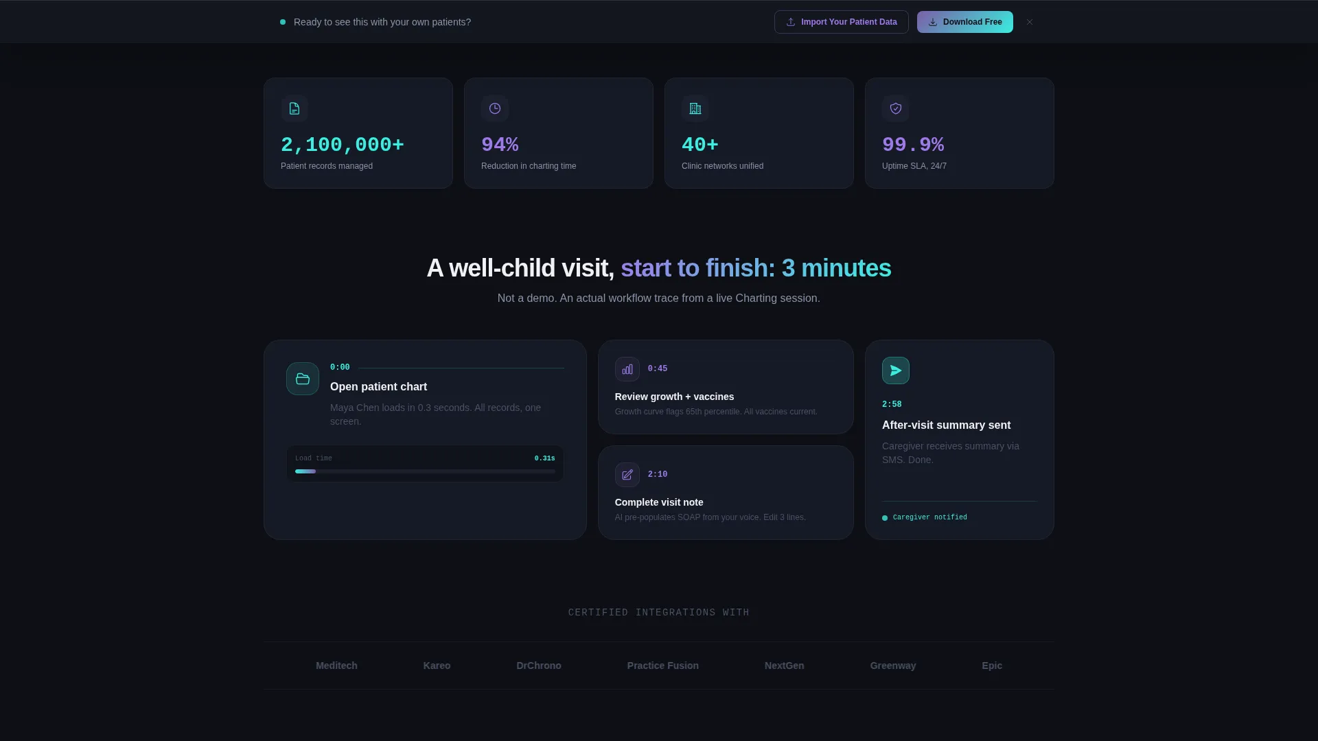
After a visitor scrolls past 40 percent of the page, a sticky bar appears offering "See It With Your Own Patient Data." This links to a guided import wizard and keeps a conversion path visible without interrupting the exploration flow.
Page sections overview
| Section | Purpose |
|---|---|
| Interactive Header Preview | Demonstrate the CRM dashboard with a live fictional patient before copy begins |
| Practice Archetype Selector | Let visitors choose Solo, Multi-Provider, or Health System to personalize the page |
| Role-Configured Feature Grid | Reorder features and KPI callouts based on the selected practice archetype |
| Expandable Comparison Table | Let buyers tap feature rows to open micro-demos and see competitor gaps |
| Testimonial Card Rotation | Surface practice-size-matched social proof as archetype selection changes |
| Contextual Download Prompt | Present device-aware platform toggle buttons for iOS, Android, and Desktop |
| Sticky Secondary Bar | Resurface a guided import wizard link after 40 percent scroll depth |
Design & branding system
The visual identity follows a Data Command theme using an AI Iridescent color palette. The result feels like clinical precision crossed with forward-looking technology: sterile enough to trust with patient records, dynamic enough to signal innovation.
- Core palette: deep operational black (#0D0F14) for backgrounds, holographic violet (#7B5EA7) for structural accents, neural-glow cyan (#3AEEE0) for active and highlighted elements, and soft clinical white (#F0F1F5) for surface panels
- Iridescent gradient shifts from violet (#9F7AEA) to cyan (#3AEEE0) activate on hover states and interactive elements, giving the interface a light-refracting quality without feeling decorative
- The overall aesthetic is described in the brief as light refracting through a prism onto surgical steel: futuristic but sterile, shimmering without ever feeling frivolous
Mobile & speed optimization
The template is designed around contextual device detection, which means the download section and call-to-action elements adapt based on what the visitor is using. The interactive preview and comparison table are built to function across screen sizes.
- Platform toggle buttons for iOS, Android, and Desktop appear based on the visitor's detected device, reducing friction at the download moment
- The sticky secondary bar is designed to surface at a scroll depth threshold rather than on page load, avoiding interference with the initial interactive experience
- The age slider and tab interactions in the header preview are built for both click and tap input, supporting desktop and mobile engagement patterns
How this template helps you convert
The page is structured to build buyer confidence progressively. Each layer adds a new reason to trust the product before the download prompt ever appears.
- The interactive header preview establishes product credibility immediately. Visitors interact with a real-feeling dashboard before reading a single feature claim, which creates a mental model of the interface before any persuasion begins.
- The role-based comparison table removes decision fatigue. By reconfiguring to match the visitor's practice type, the page eliminates irrelevant information and keeps every visible feature directly tied to the buyer's actual workflow.
- The contextual download prompt and sticky secondary bar create two conversion paths tuned to different commitment levels. Visitors who are ready can download immediately; visitors still exploring are nudged toward a guided data import rather than a cold sign-up.
Other information about this template
This template is part of the Charting template family, designed specifically for pediatric vertical SaaS products in the healthcare technology category. It is built as a single-page landing page, not a multi-page website, which keeps the buyer journey contained and measurable.
- The fictional patient used in the interactive preview is named Maya Chen, 14 months old, and includes growth chart data, an immunization timeline, and a developmental screening score
- The comparison table supports a grayed-out competitor column that visually loses when clicked, creating a built-in contrast moment without requiring separate competitor pages
- The template theme is Data Command and the creative direction is Interactive Explorer, meaning scroll behavior is designed to invite exploration rather than passive reading
- The header concept is Interactive Preview, which means the product's value proposition is demonstrated through direct interaction, not static imagery or video
Theme
Data Command
Creative direction
Interactive Explorer
Color system
AI Iridescent
Style
Comparison Table
Direction
App Download
Page Sections
Live Interactive Dashboard Preview
Selectable Practice Archetype Columns
Expandable Feature Row Micro-demos
Device-aware Download Prompt
Scroll-triggered Sticky Secondary Bar
Related questions
Who is this template designed for?
Does the interactive header preview use real patient data?
Can the comparison table be adapted for fewer practice types?
What makes this different from a standard software feature page?
Is this a single landing page or a multi-page website?



