Onboarding & User Guide Professional Website Template
The Checklist Streamlined Onboarding landing page template is a dashboard-style, single-page layout built for teams replacing scattered docs and missed tasks with one interactive checklist. It uses a glassmorphic dark-space visual system, an animated code-snippet header, and a problem-to-solution scroll arc that shows the broken state first, then resolves it step by step.
by Rocket studio
Quick summary
This template is a single-page onboarding checklist landing page built around a dashboard and data grid layout. It opens with an animated code snippet, walks visitors through a before-and-after problem arc, and closes with a freemium signup form. The glassmorphic design system uses deep void black, frosted panels, electric mint, and soft lavender to create a heads-up display feel.
Who this template is for
This template is built for teams and operators who manage new hire onboarding regularly. It fits people who feel the cost of disorganized processes every time a new person joins.
- Engineering managers onboarding multiple developers per quarter who need a repeatable, trackable process
- HR operations leads tired of chasing completion rates across spreadsheets and disconnected tools
- Startup founders who have grown past ten employees and have yet to formalize a written onboarding flow
What problem this template solves
Onboarding information lives in too many places at once. New hires face scattered documents, buried chat threads, and half-finished internal wikis, and managers have no clear view of what is done and what is not.
- No single source of truth means new hires miss critical steps and managers spend time following up manually
- Completion rates are invisible or tracked inside spreadsheets that quickly fall out of sync
- Multiple tools showing conflicting task statuses create confusion for both the new hire and the team
What you get with this template
You get a fully designed, single-page landing page layout that presents your onboarding checklist tool as a polished, trustworthy product. Every section is crafted to move a visitor from recognizing their problem to starting for free.
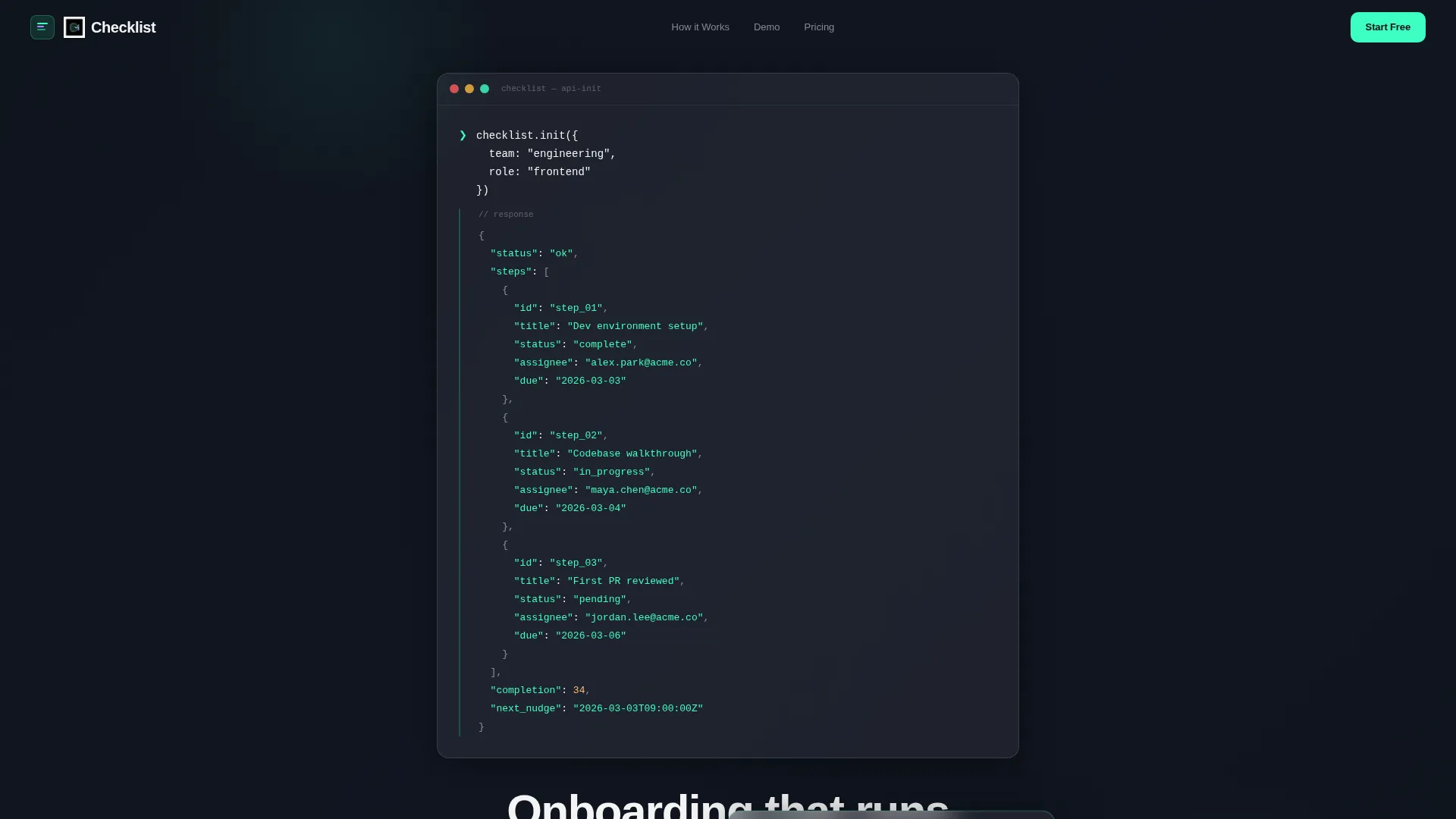
- An animated code-snippet hero section with a typed API call and a structured JSON response that blooms in mint green
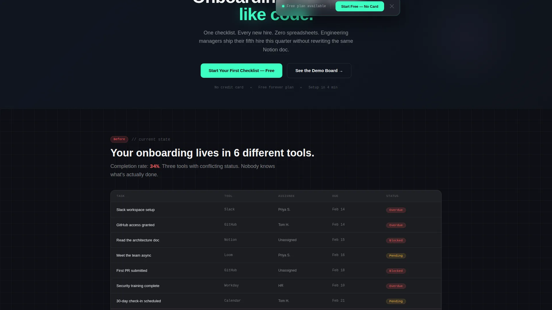
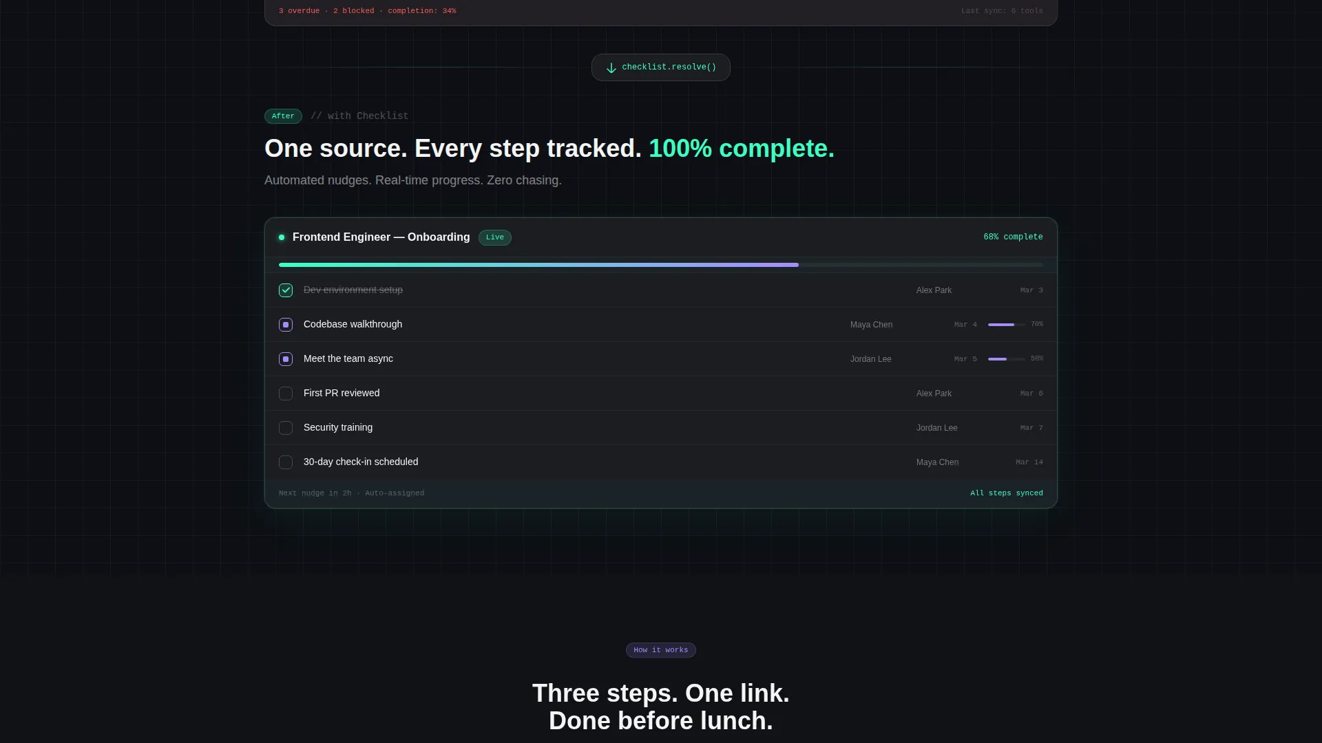
- A scrolling problem-to-solution arc with a simulated "before" data grid showing overdue tasks and low completion rates, transitioning into a clean resolved dashboard
- A progressive signup form with a work email field that expands to reveal team size and role selectors, with no credit card required
Feature list
This template ships with purpose-built layout sections and interactive design patterns grounded in the source brief.
Animated Code Snippet Header
The header opens with a syntax-highlighted code block showing a realistic API call to checklist.init() with a team and role parameter. Characters type in one by one like a live terminal session. The JSON response array then blooms below in electric mint, displaying onboarding steps with status, assignee, and due fields.
Problem-to-Solution Scroll Arc
The scroll journey begins in the mess. A simulated "before" dashboard shows overdue tasks highlighted in red, a 34% completion rate, and conflicting status indicators across three tools. As the visitor scrolls, glassmorphic panels slide over each problem section, resolving chaos into a clean, mint-green, 100% complete dashboard by the final section.
Interactive Demo Board Path
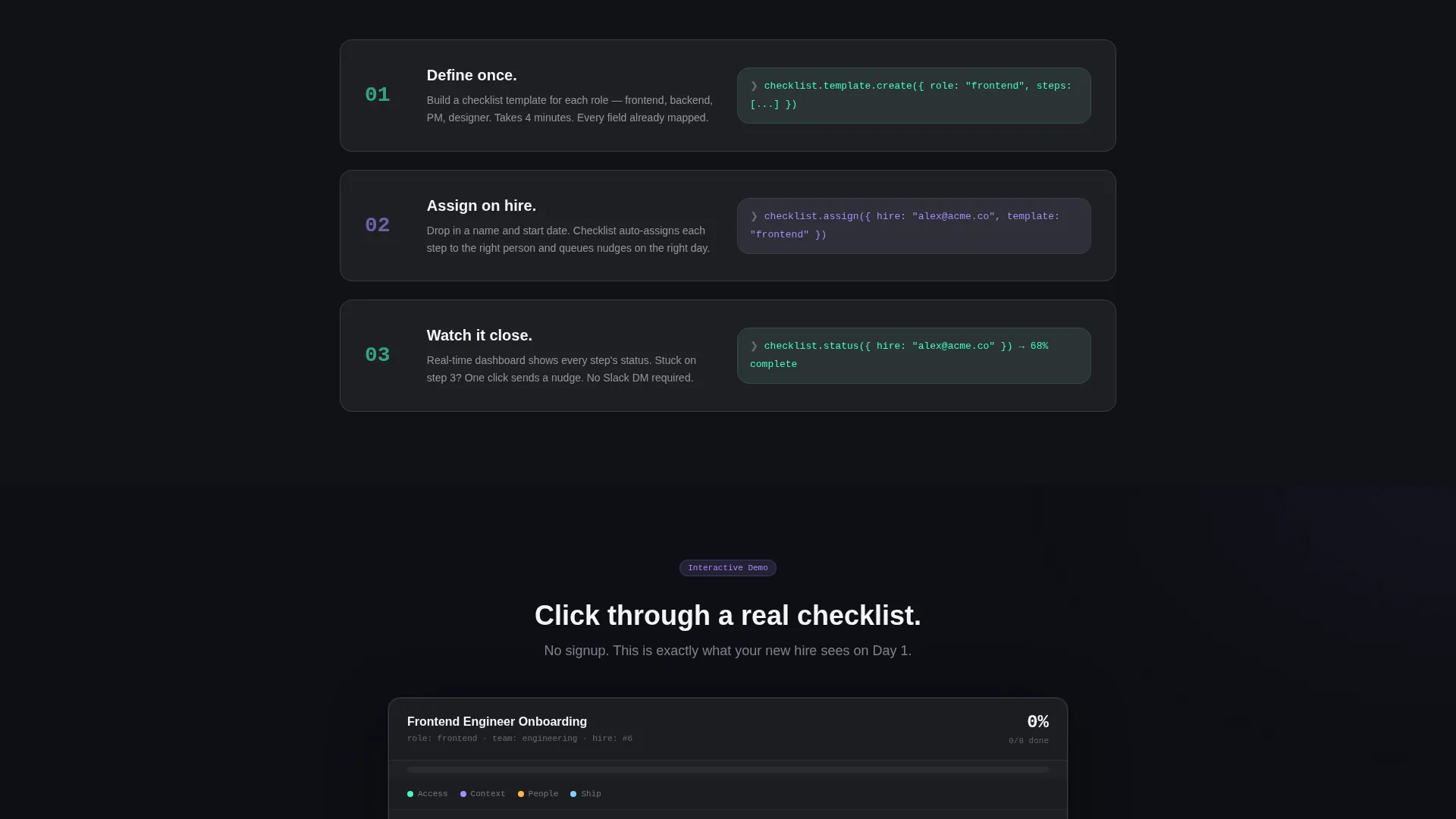
Visitors can click through a live demo checklist without signing up. This secondary conversion path seeds product familiarity before any commitment and gives hesitant visitors a hands-on feel for the tool without requiring an account.
Progressive Freemium Signup Form
The primary call to action is "Start Your First Checklist, Free." The signup form starts with a single work email field. On focus, it expands to show team size options (solo, 2 to 10, 11 to 50, 50 and above) and a role selector. No credit card is required at any point.
Floating Conversion Bar
After the second scroll section, a pinned floating bar carries the primary call to action. It stays visible as the visitor scrolls deeper into the page, keeping the free signup offer accessible without interrupting the scroll narrative.
Glassmorphic Dashboard user interface Components
Every interactive surface uses the frosted-glass panel treatment: deep void black backgrounds, white panels at 8% opacity with a 12-pixel blur, and borders styled to catch light like breath on cold glass. Progress states use electric mint and hover states use soft lavender, creating a consistent heads-up display aesthetic throughout.
Page sections overview
| Section | Purpose |
|---|---|
| Animated Code Header | Introduces the product concept through a live-terminal API snippet and headline |
| Hero Headline Fade | Delivers the core message: "Onboarding that runs like code" |
| Before State Grid | Shows the broken dashboard with red overdue tasks and low completion rate |
| Solution Reveal Panels | Glassmorphic panels slide in to resolve each layer of onboarding chaos |
| Floating call to action Bar | Keeps the free signup offer pinned after the second scroll section |
| Progressive Signup Form | Collects work email, team size, and role with no credit card required |
| Demo Board Path | Lets visitors explore a live interactive checklist before signing up |
| Final Clean Dashboard | Shows the resolved, 100% complete mint-green onboarding state |
Design & branding system
The visual identity follows a Directory and Discovery theme expressed through a glassmorphic color system. The palette feels like a heads-up display floating in dark space, with translucent cards stacked over depth.
- Core colors: deep void black (#0D0F14) for backgrounds, frosted glass panels (#FFFFFF at 8% opacity with a 12-pixel blur), electric mint (#3DFFC2) for progress states and active elements, soft lavender (#A78BFA) for secondary indicators and hover states
- Text is high-contrast white (#F4F4F5) throughout, with near-black backgrounds using subtle radial gradients to add depth without distraction
- Every interactive surface carries the frosted-panel treatment, and borders are styled to catch light, reinforcing the sense of a living dashboard the visitor can reach into
Mobile & speed optimization
The template layout is designed to translate the dashboard aesthetic cleanly across screen sizes. Glassmorphic panels and data grid components are structured to remain readable and usable on smaller viewports.
- Frosted card components and the animated code block are sized and spaced for mobile readability without losing the dark-space visual depth
- The progressive signup form collapses gracefully on small screens, keeping the email-first field prominent and the expansion flow intuitive
- The floating conversion bar is positioned to remain accessible on mobile without obscuring key content as the visitor scrolls
How this template helps you convert
This template is built around a deliberate conversion sequence. It earns the signup by making visitors feel the cost of inaction before presenting the free solution.
- The "before" data grid section surfaces real pain, showing overdue tasks, a 34% completion rate, and conflicting tool statuses, so visitors recognize their own situation immediately
- The problem-to-solution scroll arc resolves each pain point visually, building confidence that the tool works before a single word of marketing copy asks for anything
- The no-credit-card freemium form, the demo board path, and the pinned floating bar give visitors three low-friction entry points to start or explore, reducing drop-off at the decision moment
Other information about this template
This template sits at the intersection of the Documentation and Support category with the Onboarding and User Guide subcategory, focused specifically on the new user checklist niche. It is well suited for teams building or marketing tools in this space.
- The template style is a Dashboard and Data Grid layout, making it distinct from standard marketing landing pages
- The creative direction follows a Problem to Solution Arc, a scroll narrative structure that places the broken state first and resolves it section by section
- The header concept is a Code Snippet, which targets a technical audience and establishes product credibility before any feature list appears
- The freemium and trial landing page direction is baked into the page structure, with two conversion paths: the primary signup form and the secondary demo board
Theme
Directory & Discovery
Creative direction
Problem→Solution Arc
Color system
Glassmorphic
Style
Dashboard/Data Grid
Direction
Freemium/Trial
Page Sections
Animated Terminal Code Header
Before-and-after Data Grid
Progressive Freemium Signup Form
Interactive Demo Board Path
Pinned Floating Call to Action Bar
Glassmorphic User Interface Component System
Related questions
Who is this template designed for?
Do I need coding knowledge to use this template?
What makes this different from a standard marketing page?
Can visitors try the product before signing up?
Is a credit card required for the signup form?



