E-Commerce Digital Presence Comparison Website Template
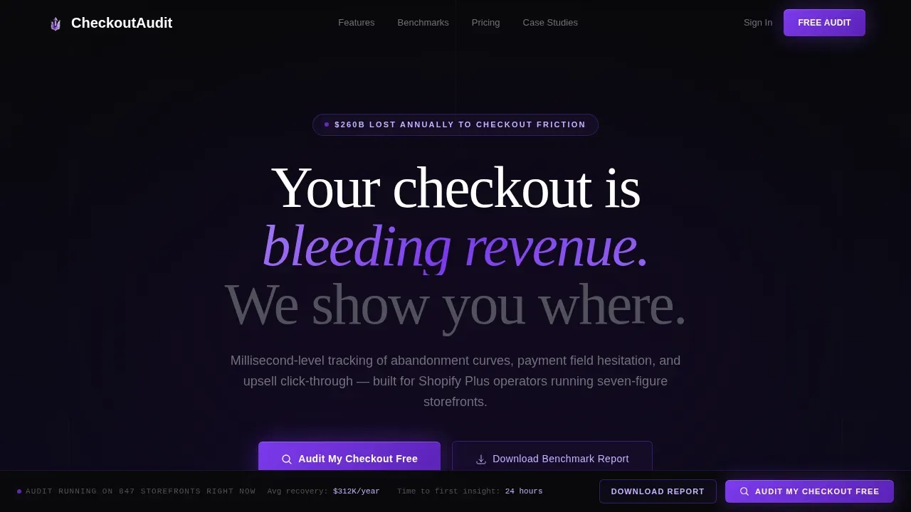
This checkout conversion optimizing audit landing page template is built for e-commerce teams who know their funnel is leaking revenue but need proof of exactly where. It presents a side-by-side comparison of current versus optimized checkout flows, layers in animated data reveals, a live dashboard mockup, and a dual lead capture path, turning skeptical visitors into free audit requests in a single, high-impact scroll.
by Rocket studio
Quick summary
This landing page is a high-pressure, evidence-first conversion machine designed around one goal: showing online stores exactly where their checkout flow is losing money. It opens with an interactive dashboard mockup, walks visitors through animated feature-by-feature comparison tables, and closes with a frictionless audit request form. The entire page design operates like a mission control room, every data point visible, every gap impossible to ignore.
Who this template is for
This template is built for operators and founders who run serious online stores and already suspect their checkout flow is costing them revenue. It speaks directly to people who need evidence before they act, not a generic sales pitch.
- Shopify Plus operators and DTC brand founders running seven-figure storefronts who are bleeding ad spend into a funnel with hidden drop offs
- E-commerce directors at mid-market retailers who manage product page performance across large catalogs and need a conversion rate audit they can present to stakeholders
- Performance marketers and agency leads looking to close more customers by demonstrating quantified lost revenue through a structured audit tool
What problem this template solves
Most landing pages built around audit offers fail because they talk about optimization in abstract terms. Potential buyers need to feel the cost of inaction before they submit a URL or an email. This template solves that specific gap.
- Invisible checkout friction causes drop offs that standard heat maps and basic analytics never surface, this page frames that gap as a crisis with real numbers like $260B in annual lost revenue from checkout friction
- A disorganized audit pitch fails to convert qualified leads because it asks for commitment before delivering value, this template structures the customer journey so evidence builds first, then the call to action lands
- A weak or vague value proposition pushes potential customers away before they reach the form, this page makes the value proposition concrete and urgent before asking for anything
What you get with this template
You get a fully structured, single-focus landing page that guides every visitor through a deliberate, evidence-stacked customer journey from macro stat to micro audit request. Every section is intentional and prompt-grounded.
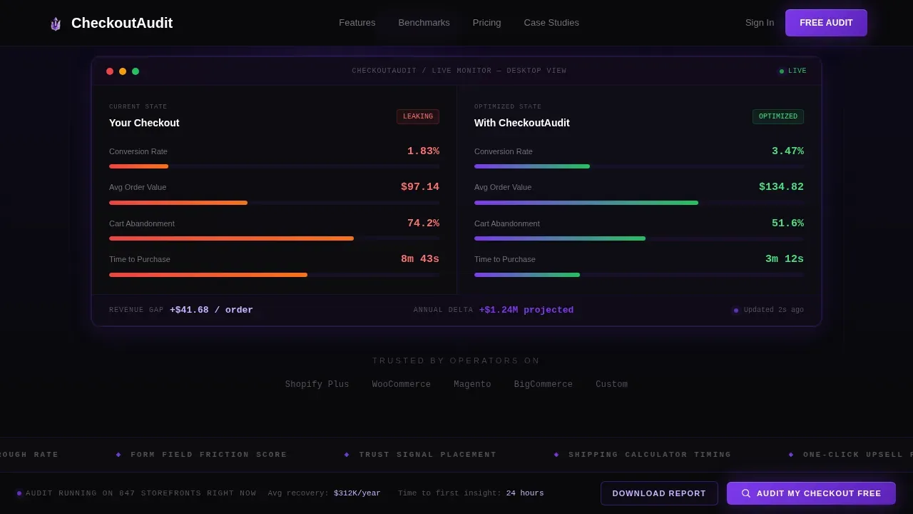
- An interactive hero section featuring a live, manipulable dashboard mockup showing two checkout flows side by side, "Your Current Checkout" versus "Optimized Checkout", with real-time metric toggles for conversion rate, average order value, and cart abandonment percentage, switchable between mobile and desktop views
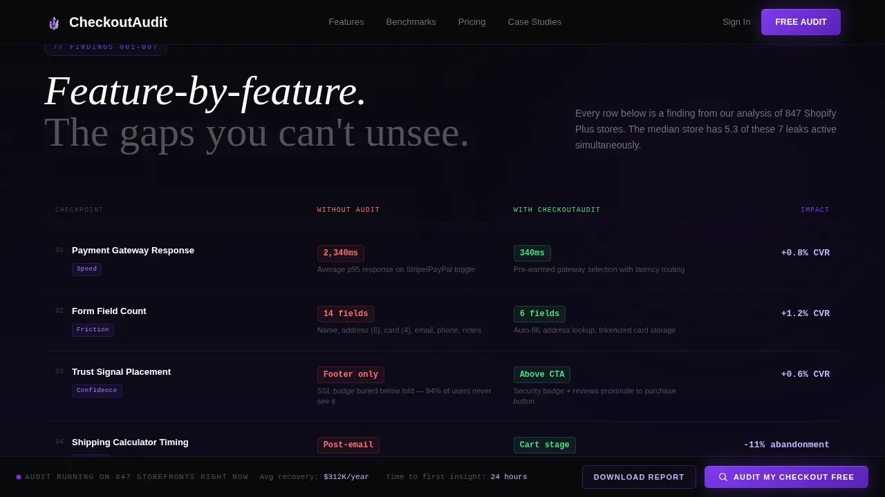
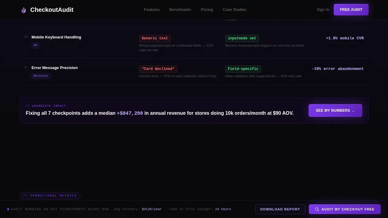
- Animated comparison table sections that reveal feature-by-feature gaps (payment gateway speed, form fields count, trust signal placement, shipping calculator timing, one-click upsell positioning) row by row as users scroll, building an analyst-style case for action
- A dual lead capture system with a primary path ("Audit My Checkout Free") anchored in a sticky bottom bar that activates after the third comparison section, and a secondary lead magnet path ("Download the Full Benchmark Report") gated behind email and platform type for earlier-stage potential buyers
Feature list
This template combines high interactivity with deliberate page layout decisions. Each feature below is grounded in the template brief.
Interactive Live Dashboard Hero
The header is an interactive preview that renders two checkout flows side by side with real-time metrics ticking in monospace violet type. Visitors can toggle between mobile and desktop views and watch conversion rate, average order value, and cart abandonment figures shift dynamically. The numbers are intentionally jagged and believable, figures like 67.3% and $114.82, not round placeholders, making the data feel authentic and urgent.
Animated Comparison Table Rows
Comparison table sections form the backbone of the page layout. Each row covers a distinct checkout audit factor: payment gateway load speed, form fields count, trust signal placement, shipping calculator timing, and upsell click-through rate. Rows animate in progressively as people scroll, so each finding feels like a data point being declassified rather than a static list. This approach increases average session duration by keeping visitors engaged through the full funnel story.
Dual-Path Lead Capture System
The primary call to action, "Audit My Checkout Free", lives in a sticky bottom bar that activates after the third comparison table section. The form asks for storefront URL first (lowest friction, highest intent signal), then monthly order volume via a slider, then email. A secondary path, "Download the Full Benchmark Report", functions as a lead magnet for earlier-stage potential customers who want benchmark data before committing their URL. This secondary path gates access behind email and platform type, capturing a wider range of potential buyers.
Metrics Bento Data Grid
A dedicated metrics bento section visualizes abandonment curves, average order value impact, and payment hesitation data in a compact grid format. Counter animations trigger on scroll, making key metrics feel live and reactive rather than static. This section gives the page optimization story a visual anchor that reinforces the audit tool's depth of analysis.
Social Proof Spotlight Cards
Testimonial spotlight cards are styled with beam-drop animations and feature specific revenue-recovered figures and named direct-to-consumer operators. Displaying social proof, including customer testimonials and platform logos, near the call to action reassures potential buyers that the audit delivers real outcomes. Trust signals and security badges placed near the audit form reinforce that submitting a storefront URL is safe and worthwhile.
Sticky call to action Bottom Bar
The sticky bottom bar activates contextually, appearing only after the visitor has absorbed enough comparison evidence. The timing is intentional: it reflects a core landing page conversion principle, presenting the call to action after the value has been demonstrated, not before. Visual cues and a high-contrast button style make the bar grab attention without interrupting the scroll flow.
Page sections overview
| Section | Purpose |
|---|---|
| Hero Dashboard Preview | Show live checkout comparison metrics with mobile and desktop toggle |
| Comparison Table Rows | Reveal feature-by-feature checkout audit gaps with animated row builds |
| Metrics Bento Grid | Display abandonment curves, average order value impact, and payment hesitation data |
| Testimonial Spotlight Cards | Deliver social proof with named operators and specific revenue outcomes |
| Audit call to action Form | Capture storefront URL, order volume, and email via low-friction form |
| Secondary Lead Magnet | Gate benchmark report behind email and platform type for earlier-stage leads |
| Footer | Present a linear single-row footer with essential links |
Design & branding system
The visual identity follows a Dashboard Pro theme with a Void and Violet color system. The page feels like a mission control room operating at full intensity, every element purposeful, every contrast deliberate.
- Color palette: Absolute void black (#09090B) for backgrounds, deep interstellar purple (#1A0A2E) for section gradients, electric violet (#7C3AED) for active states and data highlights, and phantom lavender (#C4B5FD) for secondary text and grid lines, comparison rows use subtle purple-black gradients to separate tiers, and violet pulses on hover states like a heartbeat monitor
- Typography system: Fraunces (display serif) for headlines that grab attention and carry weight, DM Sans for body copy that stays readable at any size, and JetBrains Mono for all live metric readouts, the monospace font reinforces the data-authentic feel of every jagged figure on the dashboard
- Animation and interactivity: High-intensity throughout, spotlight cards with beam drops, counter animations triggered on scroll, progressive row reveals in comparison tables, and a mobile-to-desktop toggle in the hero that dynamically shifts every metric on screen
Mobile & speed optimization
The template is built desktop-first to support the full analytics dashboard experience, but it is fully responsive across all screen sizes. Mobile optimization is treated as a delivery requirement, not an afterthought.
- Desktop-first with full responsiveness: The interactive dashboard hero, comparison tables, and metrics bento grid all reflow cleanly for mobile visitors, the mobile experience preserves the core data hierarchy without losing the visual impact of the void and violet design system
- Performance-conscious component architecture: Static sections use server-rendered components to keep page speed high, while interactive elements (the dashboard toggle, order volume slider, and animated counter rows) use client-side rendering only where necessary, fast-loading pages reduce abandonment and keep the bounce rate low across all devices
How this template helps you convert
This landing page is built around a deliberate conversion architecture. Every scroll segment builds the case further before asking for commitment.
- Evidence before ask: The page opens with a macro industry stat, then narrows section by section through animated comparison rows, so by the time the sticky call to action bar activates, visitors have absorbed enough data to feel the cost of inaction, this structure is the opposite of a generic sales pitch that leads with the form
- Friction-calibrated forms: The primary audit form minimizes form fields intentionally, storefront URL first, then order volume via slider, then email, so form completions stay high and drop offs stay low; reducing the number of form fields is one of the most reliable ways to increase conversions on any audit landing page
- Dual lead magnet paths: Not every visitor is ready to expose their URL on a new platform, the secondary benchmark report path captures those earlier-stage potential customers as a lead magnet gated behind email and platform type, ensuring more visitors enter the funnel regardless of their readiness level
Other information about this template
This template is a great example of an Industry Report creative direction applied to a Comparison/Versus landing page format. It draws on principles that the most effective high converting pages share: a single-focus purpose, a clear visual hierarchy, deliberate page optimization from hero to footer, and trust signals placed exactly where potential buyers need reassurance.
- The scroll cadence mirrors an analyst's research document, which keeps average session duration higher than a typical promotional landing page, as users scroll, each comparison row functions like a new finding, not filler content
- The page includes essential elements for ecommerce optimization: a compelling above-the-fold hero, product page-level detail in the comparison rows, internal links within the sticky footer, and a company logo placement that anchors brand credibility early
- A structured conversion rate optimization checklist underpins the entire audit framework, the CRO checklist logic maps to each comparison table row, making the audit tool feel comprehensive rather than superficial
- The optimization checklist built into the audit covers over 50 factors across the customer journey, from product page performance to checkout flow completion, this depth is what separates a genuine conversion rate audit from random tweaks applied without data
- An effective CRO checklist treats each section of the customer journey as a distinct optimization zone, product page, cart, checkout, and post-purchase, so teams can prioritize the low hanging fruit first and build toward deeper page optimization over time
- The template supports ecommerce sites on multiple platforms, the secondary lead magnet form captures platform type (Shopify, WooCommerce, Magento, Custom) so the benchmark report can be contextually relevant to each user journey
- A high bounce rate on most landing pages points to slow load speed, unclear messaging, or an overwhelming page design, this template addresses all three through a focused layout, fast-loading static sections, and a visual hierarchy that guides exactly where people scroll next
- The audit framework is grounded in data backed decisions: A/B testing disciplines (single-variable hypothesis, continuous testing cycles) are embedded in the methodology shown across the comparison rows, so the audit tool teaches good practice while it diagnoses broken ones
- Tracking key metrics like click through rate on upsell offers, payment field hesitation time, and cart drop offs gives online businesses the evidence they need to stop guessing and start fixing, this template makes that case visible before the visitor ever submits a URL
- The page design supports search engine optimization at the structural level through clean heading hierarchy, quality content organization, and internal links in the footer, search engines can index the content accurately, and the page itself functions as a web page that earns organic traffic alongside paid campaigns
- For online businesses evaluating a new platform or audit tool, the benchmark report secondary path lowers the barrier to entry, it captures more qualified leads earlier in the consideration cycle without requiring them to expose site performance data before they are ready
- The template's page layout keeps broken links and dead ends out of the customer journey by design, the sticky call to action bar, secondary lead magnet, and footer all point to clear next steps, so no potential customer leaves without a path forward
Theme
Dashboard Pro
Creative direction
Industry Report
Color system
Void & Violet
Style
Comparison Table
Direction
Comparison/Versus
Page Sections
Interactive Live Dashboard Hero
Animated Comparison Table Rows
Dual-path Lead Capture System
Metrics Bento Data Grid
Social Proof Spotlight Cards
Related questions
What kind of businesses is this landing page built for?
How does the interactive dashboard hero work?
What is the purpose of the dual lead capture paths?
Can I adapt the comparison table rows for my own audit criteria?
Does the template support A/B testing on the call to action form?



