Checkout - Powerful POS Landing Page Template
Checkout is a dashboard-style landing page template built for e-commerce point-of-sale (POS) software. It leads with animated performance metrics, a live-session product screenshot, and data-card grids that build instant credibility. Designed for multi-channel sellers, it drives free-trial signups through a two-field inline form and a clean Slate and Sky visual system.
by Rocket studio
Quick summary
Checkout is a single-page, dashboard-style landing page for a unified e-commerce POS system. The template leads with hard numbers before any marketing copy, uses a product screenshot hero, and funnels visitors into a two-field free-trial form. It is built for SaaS operators targeting multi-channel retail sellers who are done reconciling stock counts by hand.
Who this template is for
This template is built for SaaS founders, growth marketers, and product teams promoting an e-commerce POS platform to sellers running more than one storefront at once. It speaks directly to operators who know their audience values proof over promises.
- Direct-to-consumer (DTC) brand operators managing online, retail, and pop-up channels simultaneously
- Etsy sellers moving into their first physical retail space and needing inventory control
- Operations managers tired of manual stock reconciliation across disconnected tools
What problem this template solves
Multi-channel sellers lose time and money when inventory data lives in separate places. A landing page that leads with disclaimers or vague benefits fails to convince a skeptical operator who has already tried three tools that did not work. This template solves the credibility gap immediately.
- Sellers cannot trust a POS pitch that shows no real performance data above the fold
- Reconciliation pain is invisible to generic templates that skip operational context
- A two-step signup form is often buried; this template pins it to the header from the first scroll
What you get with this template
You get a fully structured, single-page landing page designed around a Stats-First Impact creative direction. Every layout decision is made to move a skeptical mid-market seller from curiosity to a free-trial signup without friction.
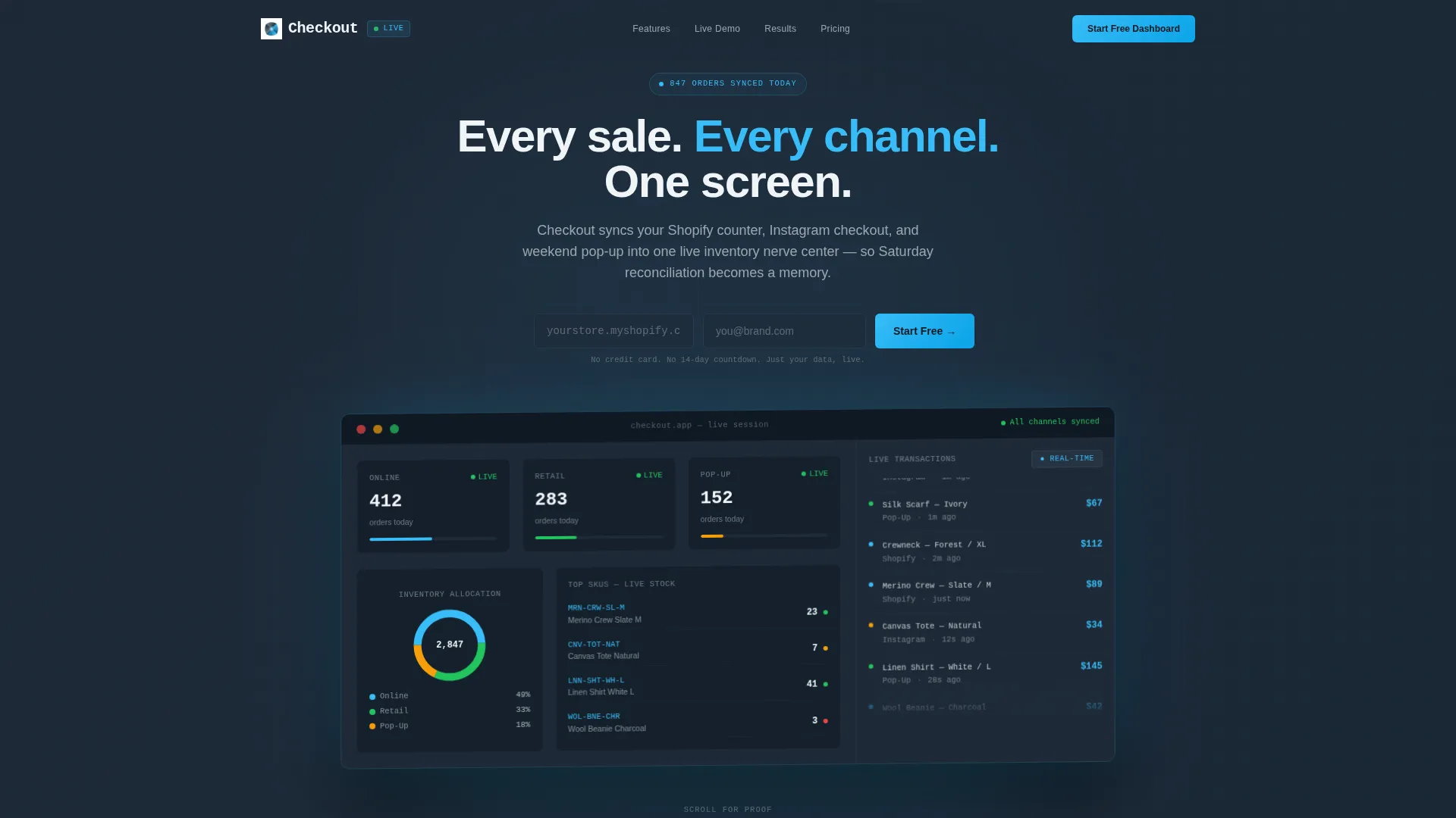
- A full-width product screenshot header showing a live dashboard mid-session with channel columns and sync-status indicators
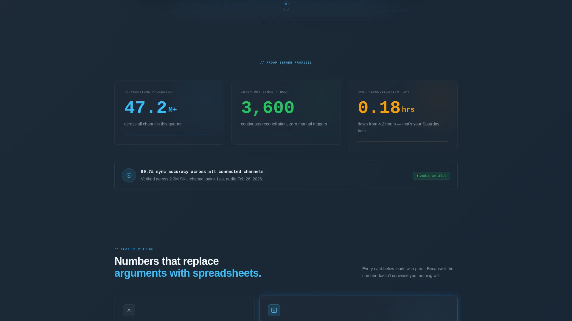
- Three animated metric counters below the hero that tick upward to build immediate credibility
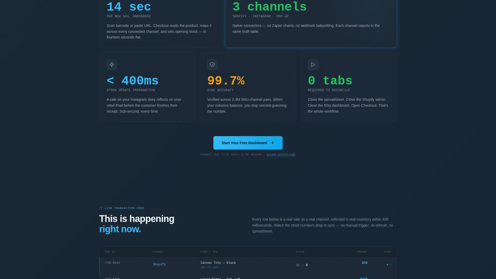
- A repeating data-card grid layout where each card leads with a bold metric before a single explanatory sentence
- Two strategically placed "Start Your Free Dashboard" call-to-action (call to action) placements with an inline two-field form
- A secondary conversion path labeled "Connect Your First Store in 90 Seconds" linking to a guided integration walkthrough
Feature list
This template bundles several purposeful design and layout features. Each one is drawn directly from the brief and serves a specific conversion or communication goal.
Animated Metric Counters
Three counters sit immediately below the hero section. They tick upward on scroll, displaying transactions processed, inventory syncs per hour, and reconciliation time. The motion draws the eye and makes the proof feel live rather than static.
Product Screenshot Hero
The header features a pixel-rendered dashboard image, slightly rotated on a Z-axis and floating over a graphite background. A soft sky-blue glow beneath the screen creates the impression that the interface itself is the light source, making the product feel premium and real.
Data-Card Grid Layout
Each feature section uses a card-per-feature grid. Every card opens with a bold metric ("99.7% sync accuracy," "14-second onboarding per new SKU") followed by one sentence of context. The number-then-narrative rhythm repeats across multiple rows, building layered trust.
Pinned Dual call to action System
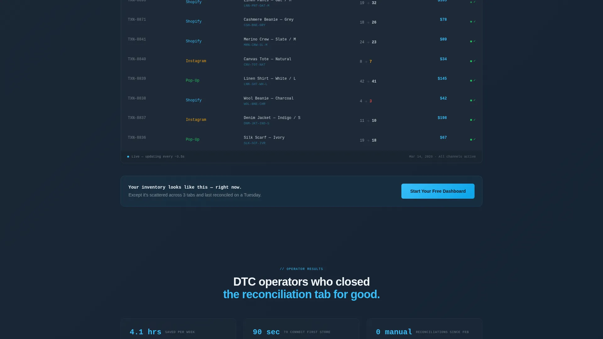
The primary call to action, "Start Your Free Dashboard," appears twice: once anchored to the header and again after the third data-card row. The inline form asks for only a store URL and an email address, removing every possible barrier to signup.
Secondary Guided Conversion Path
Below the fold, a secondary call to action offers "Connect Your First Store in 90 Seconds." This path targets visitors who want to see the integration experience before committing, giving cautious buyers a lower-stakes entry point.
Three-Channel Dashboard Visual
The hero screenshot displays three labeled channel columns (Online, Retail, Pop-Up), each with green sync-status dots, a donut chart for inventory allocation, and a real-time transaction feed in the sidebar. This one image communicates the entire product value before a visitor reads a single word.
Page sections overview
| Section | Purpose |
|---|---|
| Header hero | Showcases live dashboard screenshot with headline and pinned call to action |
| Animated counters | Delivers immediate proof via three upward-ticking performance metrics |
| First card row | Introduces sync accuracy and onboarding speed with metric-led cards |
| Second card row | Expands feature credibility with additional data-point-led feature cards |
| Third card row | Completes the data-card sequence before the second call to action placement |
| Mid-page call to action | Repeats the free-trial form after sufficient proof has been established |
| Secondary call to action | Offers a guided integration path for visitors not yet ready to sign up |
Design & branding system
The template uses a Slate and Sky color system built around four intentional tones. The palette is designed to feel technical and trustworthy, like a professional operations dashboard rather than a consumer marketing page.
- Deep graphite (#1E2A38) for panel and section backgrounds, giving data grids a focused, low-distraction canvas
- Cool slate (#475569) for secondary surfaces and supporting user interface elements
- Open-sky blue (#38BDF8) for live data points, active metrics, and interactive accents that pulse with energy
- Cloud white (#F0F4F8) for card faces and body typography, with subtle elevation shadows on hover states
Mobile & speed optimization
The template is structured with a layout that adapts naturally to smaller screens. Card grids reflow and the hero screenshot scales without losing its visual impact, keeping the proof-first experience intact on any device.
- Data cards stack vertically on mobile so metric-led content remains readable and scannable
- The inline call to action form collapses to a single-column layout, keeping the two-field signup frictionless on touch screens
- Graphite backgrounds and sky-blue accents maintain contrast and legibility across screen sizes
How this template helps you convert
The entire page is sequenced to reduce doubt before asking for commitment. Every layout decision moves the visitor one step closer to trusting the product.
- The hero screenshot and headline deliver product context instantly, so visitors understand what they are looking at within three seconds of landing on the page.
- Animated counters and metric-led data cards front-load performance proof so aggressively that by mid-scroll the visitor is calculating the cost of their current setup, not questioning whether the product works.
- The pinned two-field call to action and the secondary guided-walkthrough path give every visitor a clear next step, regardless of where they are in their decision.
Other information about this template
This template sits within the Technology category, under the E-Commerce Software and SaaS subcategory, and targets the e-commerce POS system niche specifically. It is designed as a Dashboard and Data Grid template following a Directory and Discovery theme. The freemium and free-trial landing page direction makes it well suited for POS software products that rely on low-friction onboarding to grow their user base.
- The template style is Dashboard and Data Grid, which mirrors the visual language of the product itself
- The Directory and Discovery theme keeps navigation and layout clear, helping first-time visitors orient quickly
- The Stats-First Impact creative direction is particularly effective for skeptical operations buyers who have already been burned by overpromised software
Theme
Directory & Discovery
Creative direction
Stats-First Impact
Color system
Slate & Sky
Style
Dashboard/Data Grid
Direction
Freemium/Trial
Page Sections
Animated Metric Counters Below Hero
Product Screenshot Hero Section
Metric-led Data Card Grid
Pinned Dual Call to Action with Inline Form
Secondary Guided Walkthrough Call to Action
Three-channel Dashboard Visual
Related questions
What kind of business is this template designed for?
Does the template include the animated counters and data-card layout?
How does the two-field signup form work in this template?
Can this template be adapted for a single-channel product?
What is the secondary call to action on this landing page?



