Complete Directory & Marketplace Platforms Professional Website Template
Roster is a bento grid landing page template built for child care provider directories. It showcases a searchable, filterable dashboard of licensed daycares, in-home providers, and after-school programs. Designed with a dark Data Command aesthetic, it uses interactive tab previews, a feature matrix layout, and a clear call-to-action flow to turn first-time visitors into confident users.
by Rocket studio
Quick summary
Roster is a single-page bento grid template for child care provider directories. It presents a filterable dashboard of local providers, inspection records, real parent reviews, and live availability in one focused layout. The Data Command visual theme keeps the interface dark, dense, and readable, built for tired parents who need answers fast.
Who this template is for
This template is designed for teams building tools that help families find trusted child care. It fits high-stakes, research-heavy searches where trust signals and data density matter most.
- Parents searching for licensed daycare or after-school programs near their zip code
- Human resources coordinators building backup care networks for employees
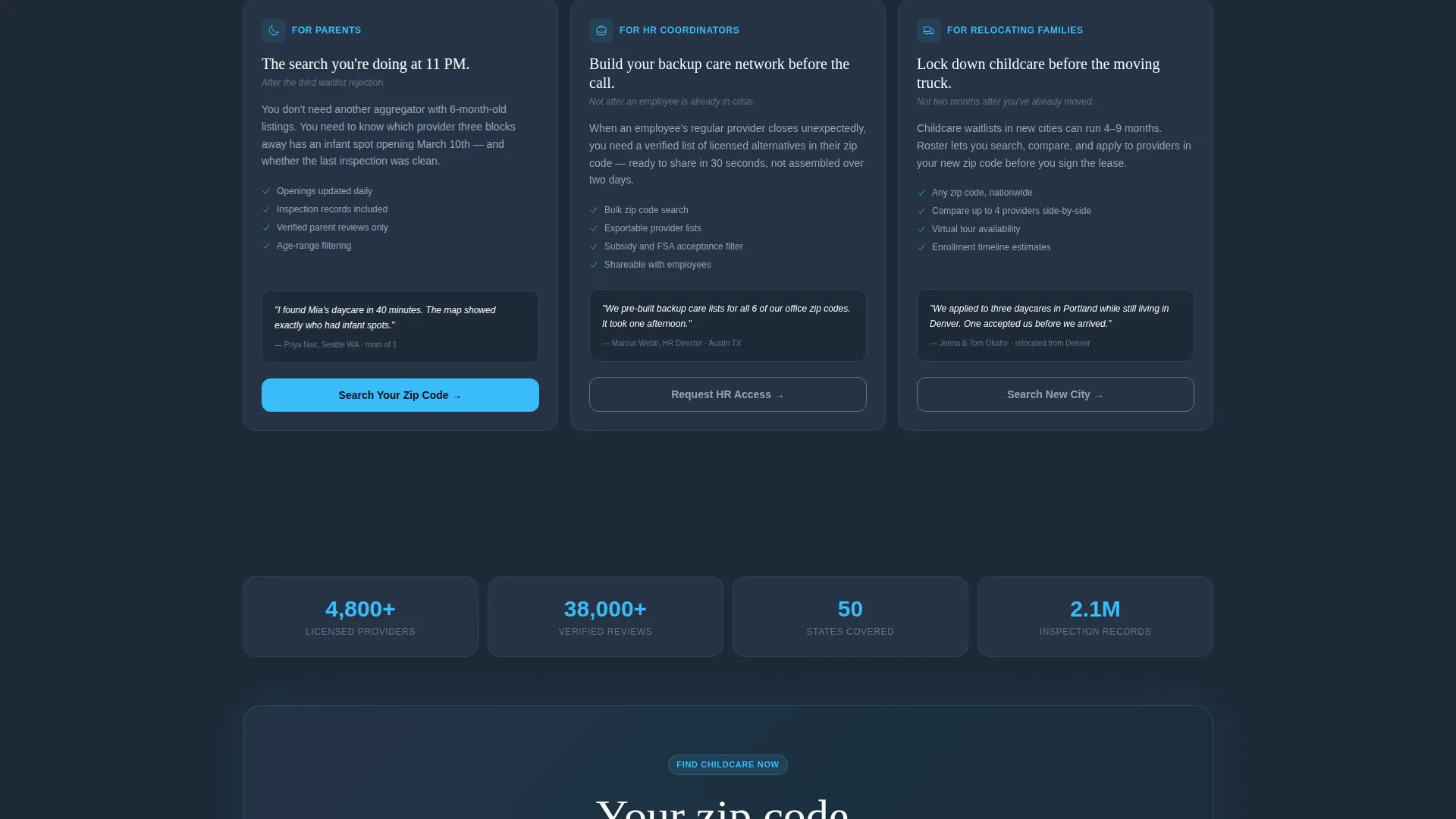
- Relocating families who need a verified provider locked in before they arrive
What problem this template solves
Most child care search experiences feel scattered. Ratings live on one site, inspection records on another, and availability nowhere at all. Parents end up texting friends at midnight or calling numbers that go to voicemail.
- No single place shows ratings, openings, and licensing data together
- Trust is hard to establish when reviews are thin or unverified
- Hesitant visitors abandon before entering their zip code because they do not yet trust the product
What you get with this template
You get a fully structured bento grid landing page that demonstrates the directory product before the visitor ever clicks a search button. Every section is designed to show capability, not describe it.
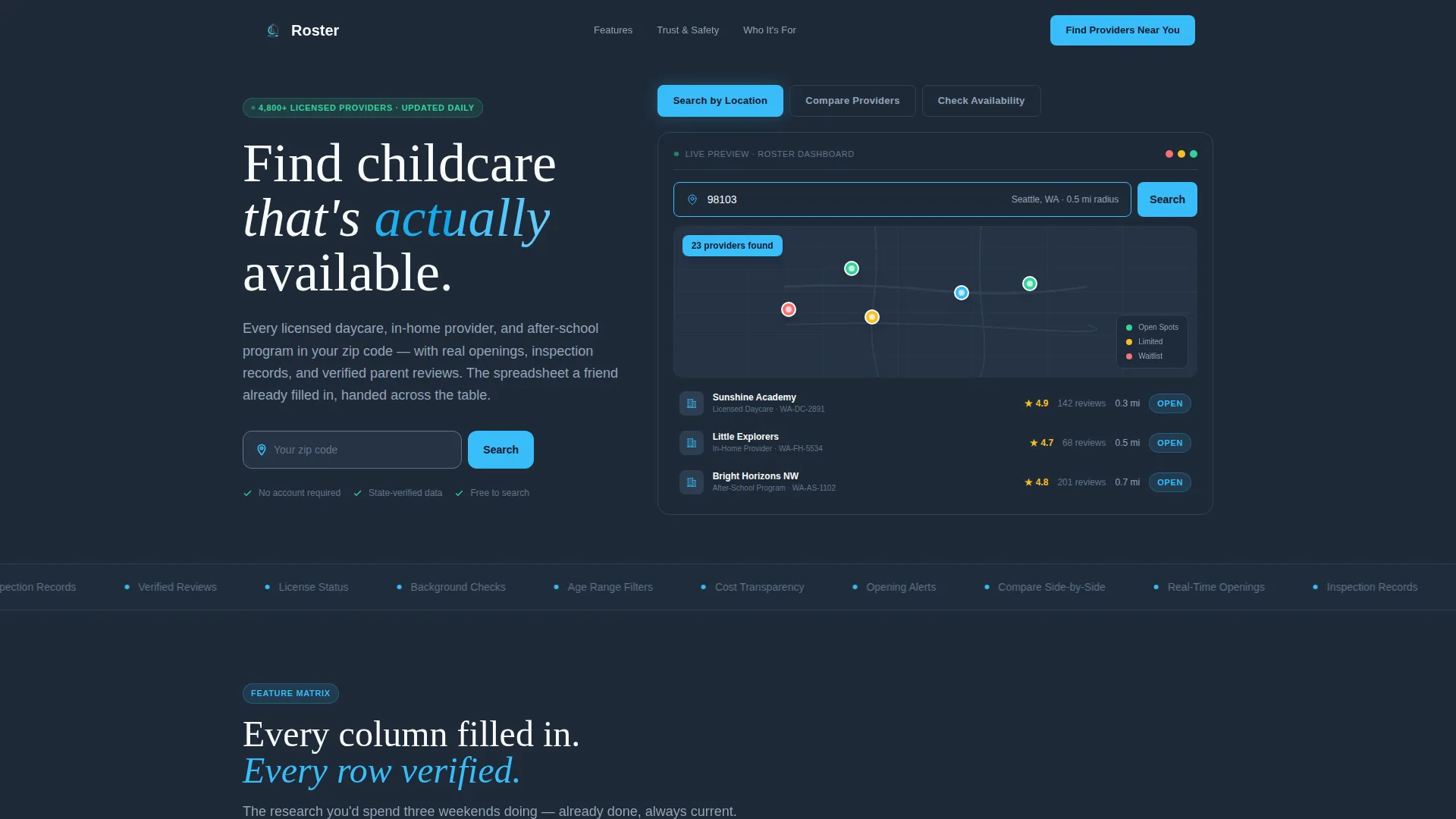
- A Feature Tab Switcher header with three live-preview states: map search, provider comparison, and availability calendar
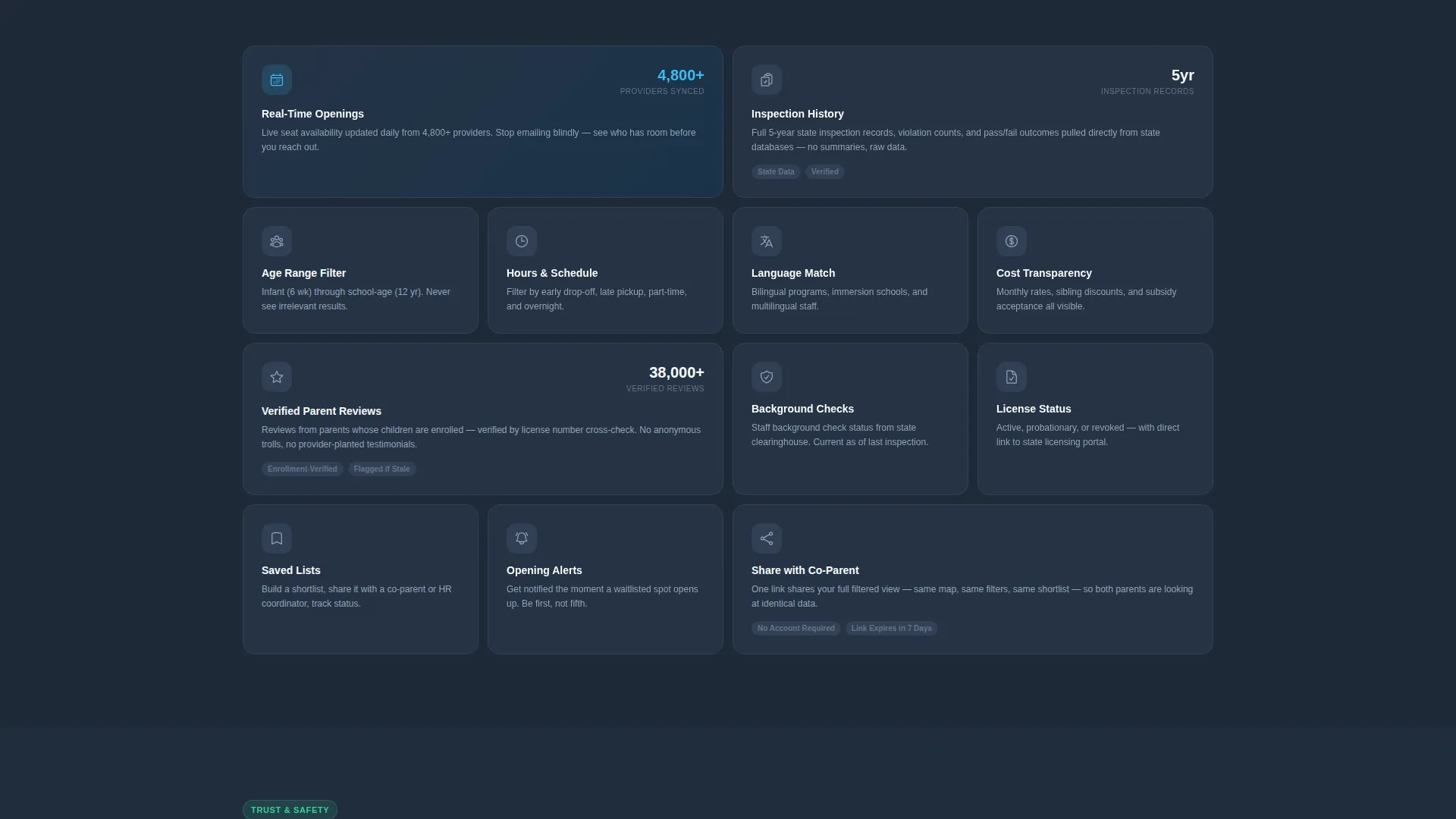
- A scrolling Feature Matrix of modular bento cells organized from search features through trust signals to convenience tools
- A conversion-focused call-to-action system with a primary button, a secondary demo path, and a fixed mobile bottom bar
Feature list
This template is built around one core idea: show the product working. Every feature below serves that goal directly.
Feature Tab Switcher Header
The header contains three clickable tabs labeled "Search by Location," "Compare Providers," and "Check Availability." Each tab swaps the content inside a live-preview bento block. The previews are rendered as functioning user interface snapshots filled with realistic provider names, star counts, and license numbers, not screenshots.
Provider Comparison View
The second tab state renders two provider cards side by side. Twelve criteria rows display green or red checkmarks across both cards simultaneously. This gives visitors a concrete sense of how the comparison tool works before they commit to a search.
Availability Calendar Preview
The third tab state shows a calendar grid with open time slots highlighted in sky blue. Visitors see exactly how availability is surfaced inside the product, reducing uncertainty about what "check availability" actually means.
Scrolling Feature Matrix
The bento grid below the header stacks capability cells in varying sizes. Double-width cells highlight hero features such as real-time openings and inspection history. Standard-width cells cover filters like age range, hours, language, and cost. The density of the grid communicates thoroughness without a single word of marketing language.
Trust Signal Section
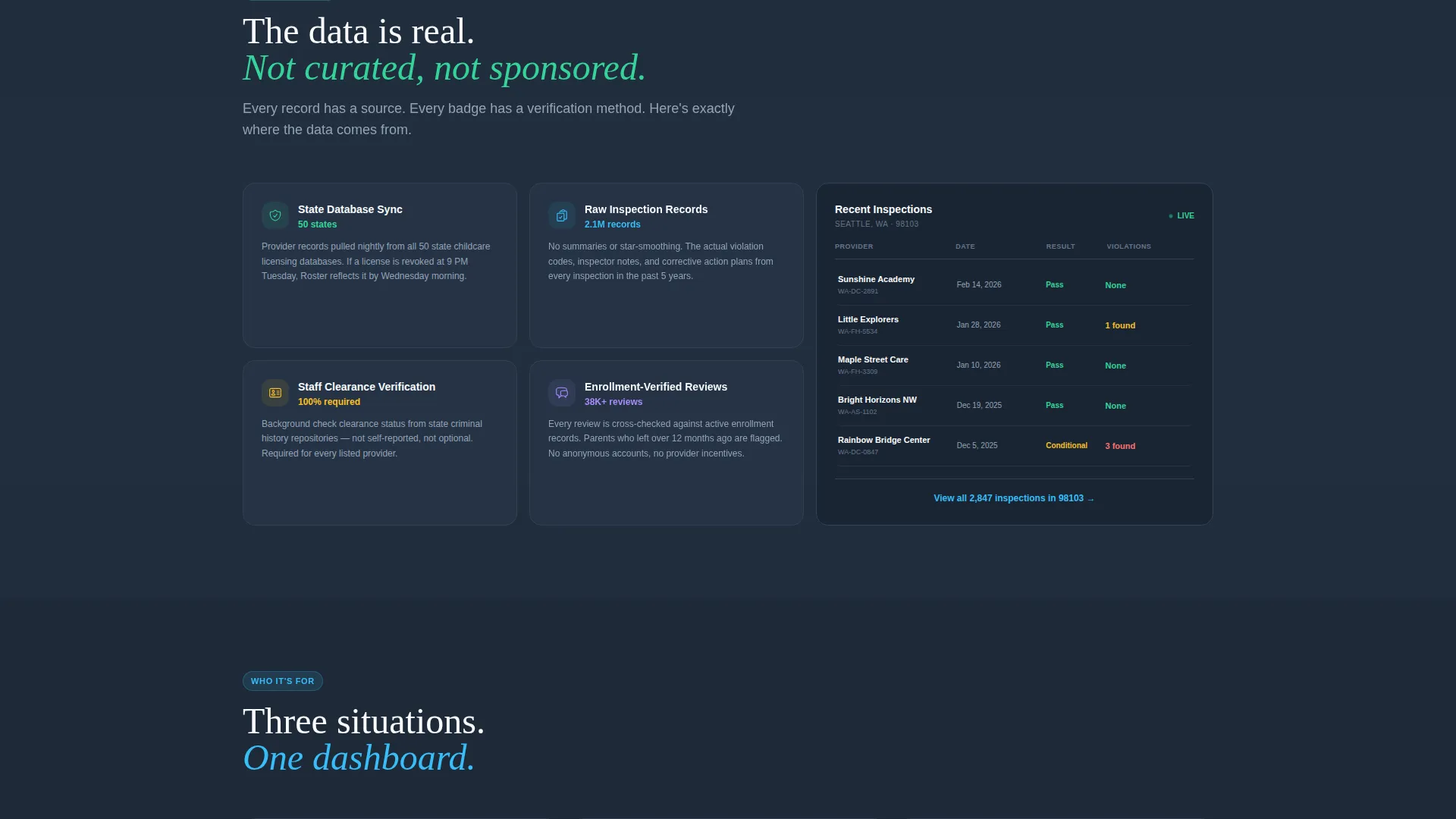
After the search feature cells, the grid shifts to trust-focused content. Verified review badges, background check indicators, and state licensing links each occupy their own cell. This sequence builds credibility in the exact moment a visitor begins to wonder whether the data is reliable.
Dual Call-to-Action Path
The primary call to action, "Find Providers Near You," appears in the header preview, at the midpoint of the page after the trust row, and as a fixed bar at the bottom of the mobile layout. A secondary option, "See a Sample Search," routes cautious visitors to a demo results page for a fictional zip code, removing the friction of entering personal data before trust is established.
Page sections overview
| Section | Purpose |
|---|---|
| Tab Switcher Header | Previews search, compare, and availability states interactively |
| Map Search Preview | Shows zip code field and pinned provider map view |
| Provider Comparison Preview | Displays side-by-side criteria checklist for two providers |
| Availability Calendar Preview | Highlights open slots on a live-style calendar grid |
| Search Features Row | Introduces filters for location, age, hours, language, and cost |
| Trust Features Row | Presents review verification, background badges, and licensing links |
| Convenience Features Row | Covers saved lists, alerts, and co-parent sharing tools |
| Mid-Page call to action Block | Reinforces primary action after trust signals are established |
| Fixed Mobile call to action Bar | Keeps the primary button accessible while scrolling on mobile |
Design & branding system
The Slate and Sky color system anchors the Data Command theme. Deep charcoal slate forms the primary background, giving the layout a focused, low-strain feel that works at any hour. Sky blue draws the eye to every interactive element without competing with the content.
- Deep charcoal slate (#1E2A38) as the primary background, mid-tone steel (#64748B) for secondary containers and borders
- Open-sky blue (#38BDF8) on buttons, toggles, and active tab states to signal interactivity
- Cloud white (#F8FAFC) for card surfaces and body text, so every provider card floats visually against the dark frame
Mobile & speed optimization
The template is structured so that key conversion points remain accessible on smaller screens. The fixed bottom bar ensures the primary call to action is never out of reach while a visitor scrolls through the feature grid.
- Fixed bottom call-to-action bar keeps "Find Providers Near You" visible on mobile throughout the entire page
- Bento grid cells reflow cleanly for narrow viewports, maintaining the modular layout without losing hierarchy
- Dense user interface preview blocks are built as rendered snapshots rather than embedded iframes, keeping the layout stable
How this template helps you convert
The page earns the click by making visitors feel like they are already using the product. By the time they reach the call-to-action button, the interface is familiar.
- The tab switcher header loads a dense, realistic preview immediately, so visitors see the actual product rather than a promise about it
- The Feature Matrix scrolls through search, trust, and convenience capabilities in sequence, answering objections row by row before they form
- The "See a Sample Search" secondary path removes the barrier of entering a real zip code, letting hesitant visitors explore the product without commitment
Other information about this template
This template belongs to the Child - Premium Care Landing Page Template family and is designed specifically for the child care provider directory niche within directory and marketplace platforms. It is built to serve technology-category products where data transparency and search clarity are the primary value proposition.
- Template style: Bento Grid, suited to data-rich directory products that need to show capability at a glance
- Theme: Data Command, optimized for interfaces where density signals expertise rather than clutter
- The "Roster" concept positions the directory as a pre-verified shortlist rather than an open search engine
- This template can support use cases ranging from municipal child care registries to private marketplace platforms
Theme
Data Command
Creative direction
Feature Matrix
Color system
Slate & Sky
Style
Bento Grid
Direction
Click-Through
Page Sections
Feature Tab Switcher Header
Provider Comparison Side by Side
Scrolling Bento Feature Matrix
Trust Signal Cell Row
Dual Call-to-action System
Fixed Mobile Bottom Bar
Related questions
Who is this landing page template designed for?
Does the tab switcher in the header actually function?
Can I use this template if my directory covers only one type of provider?
What makes the dual call-to-action path useful?
Is the Slate and Sky color system easy to customize?



