Multilingual Documentation Cost Calculator Website Template
A split-screen landing page template built for traditional Chinese documentation platforms. It leads with a live file-compatibility estimator, walks visitors through a side-by-side feature comparison, and closes with a single focused call to action. The Tech Glass visual identity and Carbon Fiber palette make complex multilingual rendering evidence feel sharp, credible, and immediately convincing.
by Rocket studio
Quick summary
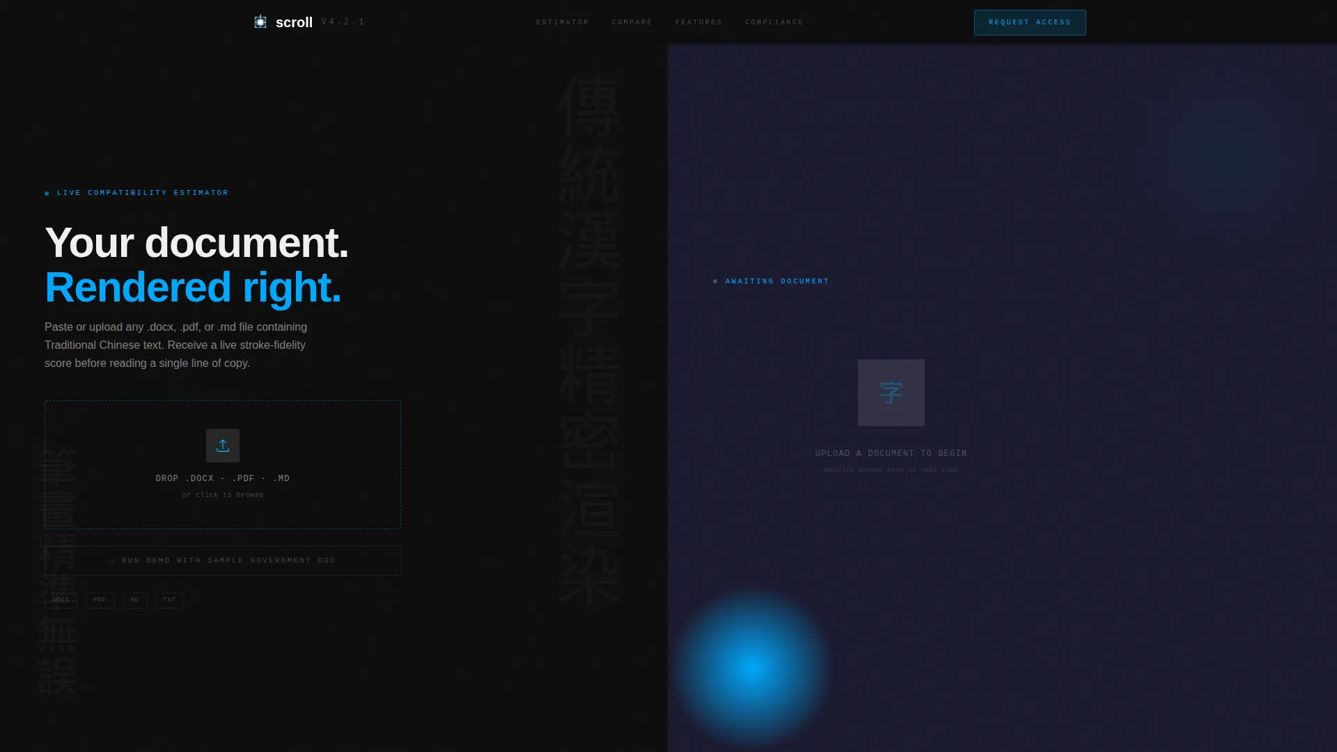
This is a high-converting split-screen landing page template designed for traditional Chinese documentation platforms. A live Calculator/Estimator header lets visitors paste or upload their own file and see real compatibility scores instantly. A scrolling Feature Matrix then builds the case row by row, letting the evidence speak before any headline does.
Who this template is for
This template is built for teams and organizations that handle traditional Chinese text at a professional level. If rendering accuracy, vertical layout support, or archival compliance is a daily concern, this page speaks your language.
- Localization engineers pushing CJK (Chinese, Japanese, and Korean) text through complex pipelines
- Taiwanese government agencies publishing bilingual regulatory documents
- Hong Kong publishing houses typesetting for both print and reflowable ePub formats
What problem this template solves
Traditional Chinese documentation tools regularly fail in ways that are invisible until they are catastrophic. Broken stroke rendering, collapsed Ruby annotations, and forced horizontal layouts in vertical-first prose are all common pain points that are hard to demonstrate to stakeholders without live evidence.
- Visitors cannot see rendering failures until their own document exposes them
- Feature comparison pages rarely show real broken output alongside working output
- Generic landing page templates do not accommodate the visual complexity of CJK typography
What you get with this template
You get a complete, structured single-page layout built around two core interaction models: a file-based estimator and a scrolling comparison matrix. Every design decision supports the goal of letting the visitor's own document make the argument.
- A live Calculator/Estimator header that scores any uploaded.docx,.pdf, or markdown file
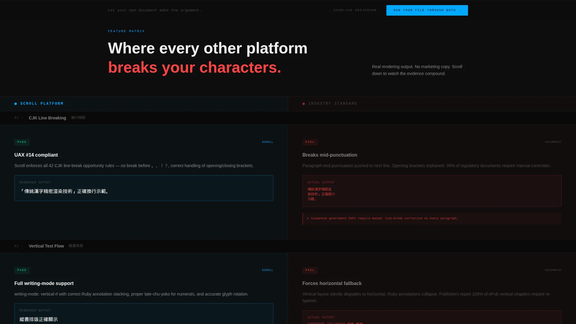
- A scrolling Feature Matrix with split-screen comparison rows showing real rendered output
- A pinned bottom-rail call-to-action and a secondary static PDF export path
Feature list
This template is built around prompt-defined components that work together to move a technical buyer from skepticism to confidence.
Live File Compatibility Estimator
The header occupies a full 50/50 split. The left panel accepts a file paste or upload in.docx,.pdf, or markdown format. The right panel returns real-time scores for stroke rendering accuracy, vertical layout support, Ruby annotation coverage, and Big5/Unicode conversion fidelity. Filament-blue progress rings populate as the scores arrive.
Scrolling Feature Matrix Layout
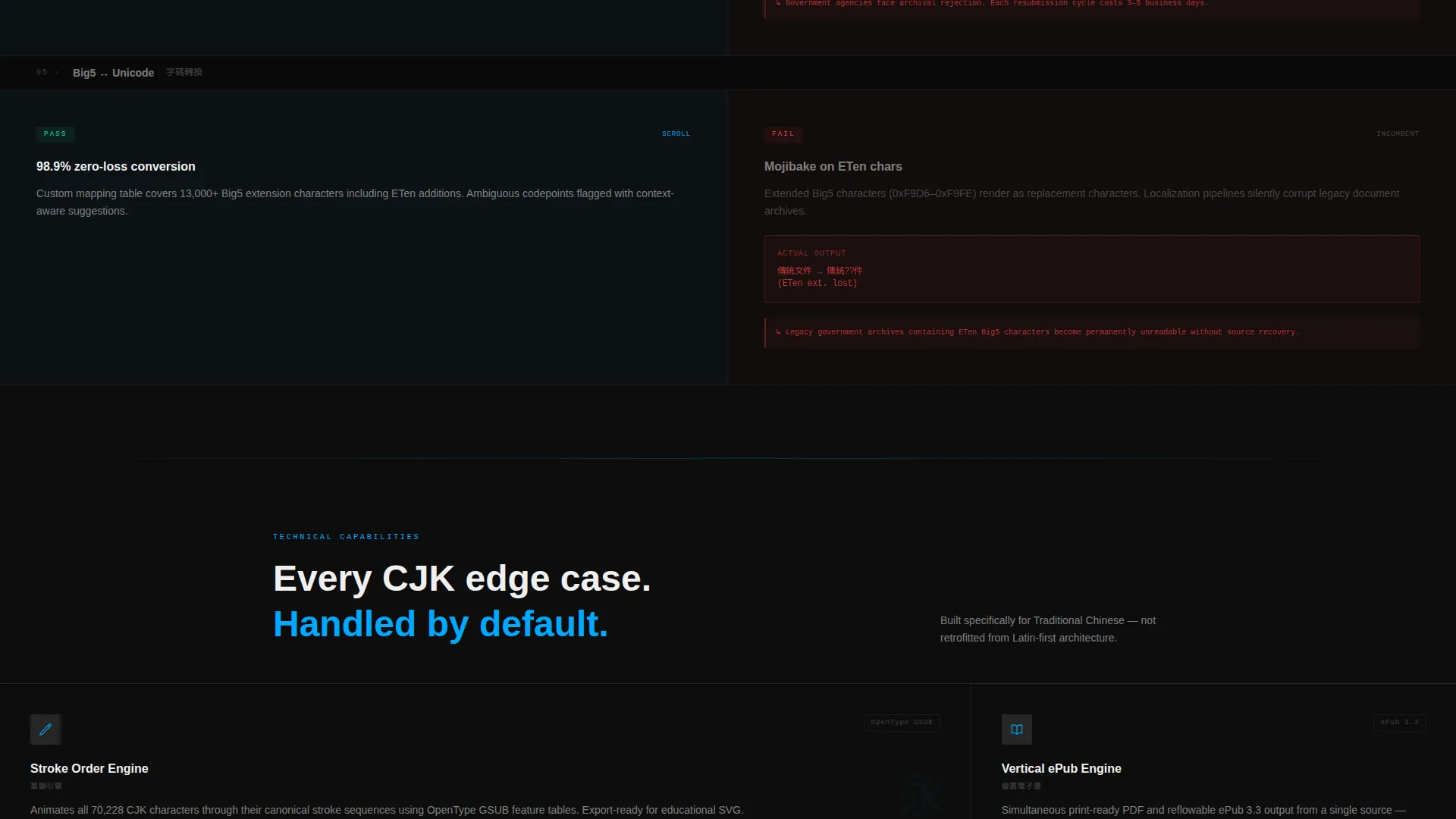
Every section below the fold follows the same split-screen logic. The left half displays this platform's output. The right half shows the incumbent alternative. Each row targets a specific pain point such as CJK line-breaking rules, mixed-direction text flow, PDF/A archival compliance, and OpenType feature support for stroke-order animation.
Escalating Consequence Rows
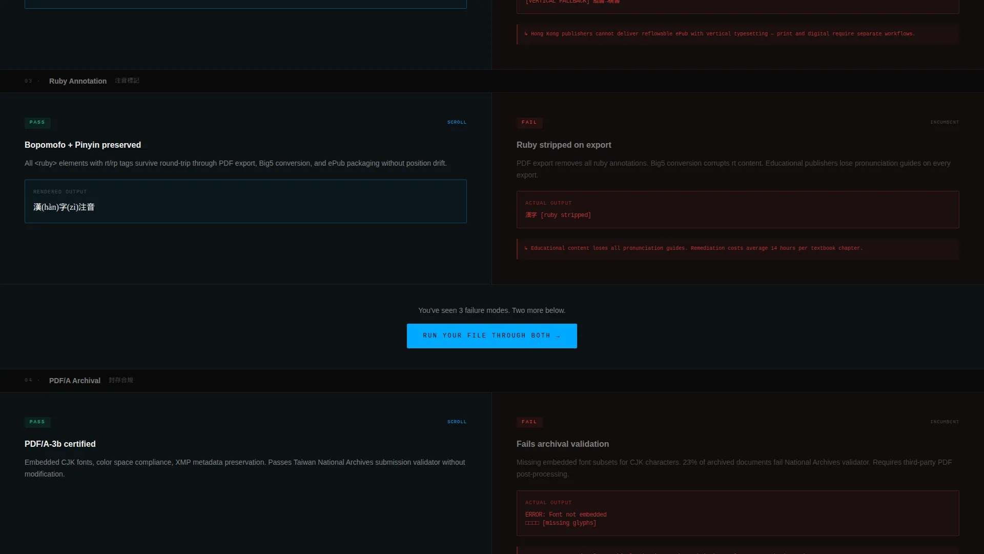
The comparison does not simply list features. It escalates consequences as the visitor scrolls. The competitor column includes inline rendered examples of garbled output, collapsed Ruby text, and horizontal-forced vertical prose. The evidence compounds row by row until switching feels like the only logical next step.
Pinned Primary Call to Action
After the third comparison row, a primary call to action labeled "Run Your File Through Both" appears. It stays pinned to the bottom navigation rail throughout the rest of the scroll. The form asks only for a file upload and an email address, keeping friction minimal.
Secondary PDF Export Path
A secondary conversion path offers a static PDF export of the full comparison matrix. The label "Download the Full Breakdown" gives technically minded visitors a low-commitment way to engage before committing to the primary action.
Tech Glass Visual Identity
The entire page uses a Tech Glass theme rendered through a Carbon Fiber palette. Deep carbon black, woven graphite, translucent panel gray at low opacity, and filament blue for interactive states create a surface where light appears only on interaction. Every accent is earned by a user action, never applied as decoration.
Page sections overview
| Section | Purpose |
|---|---|
| Estimator Header | Accepts file upload and returns live compatibility scores |
| Comparison Row One | Compares CJK line-breaking rules with inline rendered examples |
| Comparison Row Two | Covers mixed-direction text flow and vertical layout handling |
| Primary call to action Block | Introduces "Run Your File Through Both" after row three |
| Comparison Row Three | Addresses PDF/A archival compliance differences |
| Comparison Row Four | Covers OpenType stroke-order animation support |
| Secondary Export call to action | Offers static PDF download of the full comparison matrix |
| Pinned Bottom Rail | Keeps the primary call to action accessible throughout the scroll |
Design & branding system
The visual identity uses a Tech Glass theme executed through a Carbon Fiber palette. The result feels like a precision device that only activates when touched.
- Deep carbon black (#0D0D0D) and woven graphite (#1A1A2E) form the base layer, with translucent panel gray (#E0E0E0 at 12% opacity) for surface depth
- Filament blue (#00A8FF) is reserved strictly for interactive edges, toggle states, progress rings, and comparison highlights
- The aesthetic rule is that accent glow is earned by interaction, never used as background decoration
Mobile & speed optimization
The split-screen layout is designed to remain functional and legible across device sizes. The 50/50 structure reflows appropriately so that comparison rows stay readable on smaller screens.
- Filament-blue progress rings and real-time estimator outputs are designed to render cleanly within the layout constraints of mobile viewports
- The pinned bottom-rail call to action remains accessible regardless of scroll position or screen size
How this template helps you convert
This template converts by removing the need for persuasion. The visitor's own document does the convincing.
- The file estimator at the top of the page turns every visitor into an active participant before they read a single headline, making the compatibility gap personal and measurable.
- The Feature Matrix escalates from informational to consequential as the visitor scrolls, with each row adding rendered evidence of what breaks in the competitor column.
- The pinned call to action and minimal form (file plus email only) reduce the decision to a single frictionless step at exactly the moment trust is highest.
Other information about this template
This template sits within the Documentation and Support category, specifically targeting the multilingual documentation subcategory and the traditional Chinese documentation niche. It is built as a single-page layout with a section-led scroll flow.
- The template is suited for teams managing Big5 to Unicode conversion workflows or publishing content that must meet PDF/A archival standards
- The intersection of Tech Glass theme, Feature Matrix creative direction, and Comparison/Versus landing-page direction makes this a strong fit for technical buyers who need evidence before they trust a platform
- The Calculator/Estimator header concept is a core differentiator: it replaces abstract claims with the visitor's own data, which is particularly effective for localization engineers and government publishing teams who deal with real documents daily
Theme
Tech Glass
Creative direction
Feature Matrix
Color system
Carbon Fiber
Style
Split Screen (50/50)
Direction
Comparison/Versus
Page Sections
Live File Compatibility Estimator
Split-screen Feature Matrix
Escalating Consequence Rows
Pinned Bottom-rail Call to Action
Secondary PDF Export Path
Tech Glass Carbon Fiber Visual Theme
Related questions
What file types does the estimator header accept?
Does a visitor need to read any copy before seeing value?
How does the Feature Matrix show competitor failures?
How many form fields does the primary call to action use?
Can a visitor engage without uploading a file?



