Modern Simplified Landing Page Template
A card grid landing page template built for Simplified Chinese documentation localization services. It features a live translation preview tool, a logo bar header, and a freemium conversion flow. The glassmorphic Data Command visual system uses deep blacks, frosted panels, and electric cyan highlights to create a credible, tool-first experience that moves technical buyers toward a free trial.
by Rocket studio
Quick summary
This is a single-page, card grid landing page template for a Simplified Chinese documentation translation service. It opens with a logo bar, moves immediately into a live translation preview tool, then spreads capability cards across a modular grid. The visual identity uses a glassmorphic Data Command palette. The entire layout is designed to convert SaaS and open-source teams on a freemium trial offer.
Who this template is for
This template is built for teams who publish technical documentation in English and need it rendered in accurate, publication-ready Simplified Chinese. It speaks directly to the people responsible for that work.
- SaaS product managers localizing developer docs for the mainland Chinese market
- Open-source project maintainers whose Chinese contributor base is outgrowing their English documentation
- Developer relations leads who understand that a mistranslated error message damages user trust
What problem this template solves
English-first developer teams often delay Chinese localization because they cannot quickly demonstrate quality to stakeholders or prospects. Generic translation tools produce output that breaks code fences, mangles technical terms, and ignores format structure. This template solves that hesitation by putting a live proof tool front and center.
- Visitors see their own documentation transformed before they read a single capability claim
- Technical buyers need to inspect quality before committing, and the preview tool delivers that inspection instantly
- Teams lose time convincing internal stakeholders; a downloadable sample output gives those stakeholders something tangible
What you get with this template
You get a fully structured landing page layout with every section, component, and conversion path included. Nothing needs to be built from scratch.
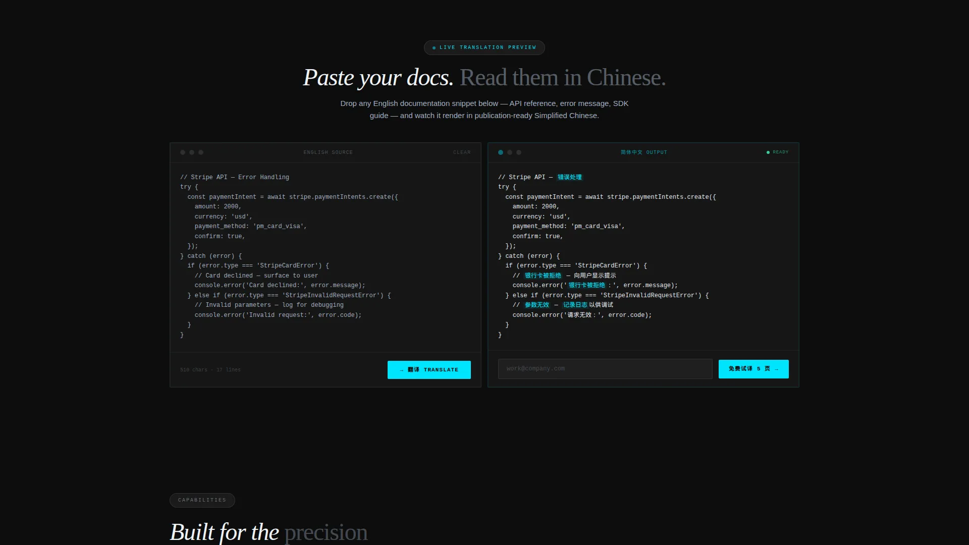
- A live translation preview tool pre-loaded with a sample API error handling block
- A modular card grid of capability cards with scroll-activated micro-animations
- Two conversion paths: a primary free trial form and a secondary gated sample download
Feature list
This template packages several purpose-built components. Each one is grounded in what technical documentation buyers need to see before they commit.
Live Translation Preview Tool
Visitors paste any English documentation snippet directly into the tool. It renders the Simplified Chinese output character by character in real time. Technical terms are highlighted, and glossary tooltips appear on hover, so buyers inspect translation quality without leaving the page.
Modular Capability Card Grid
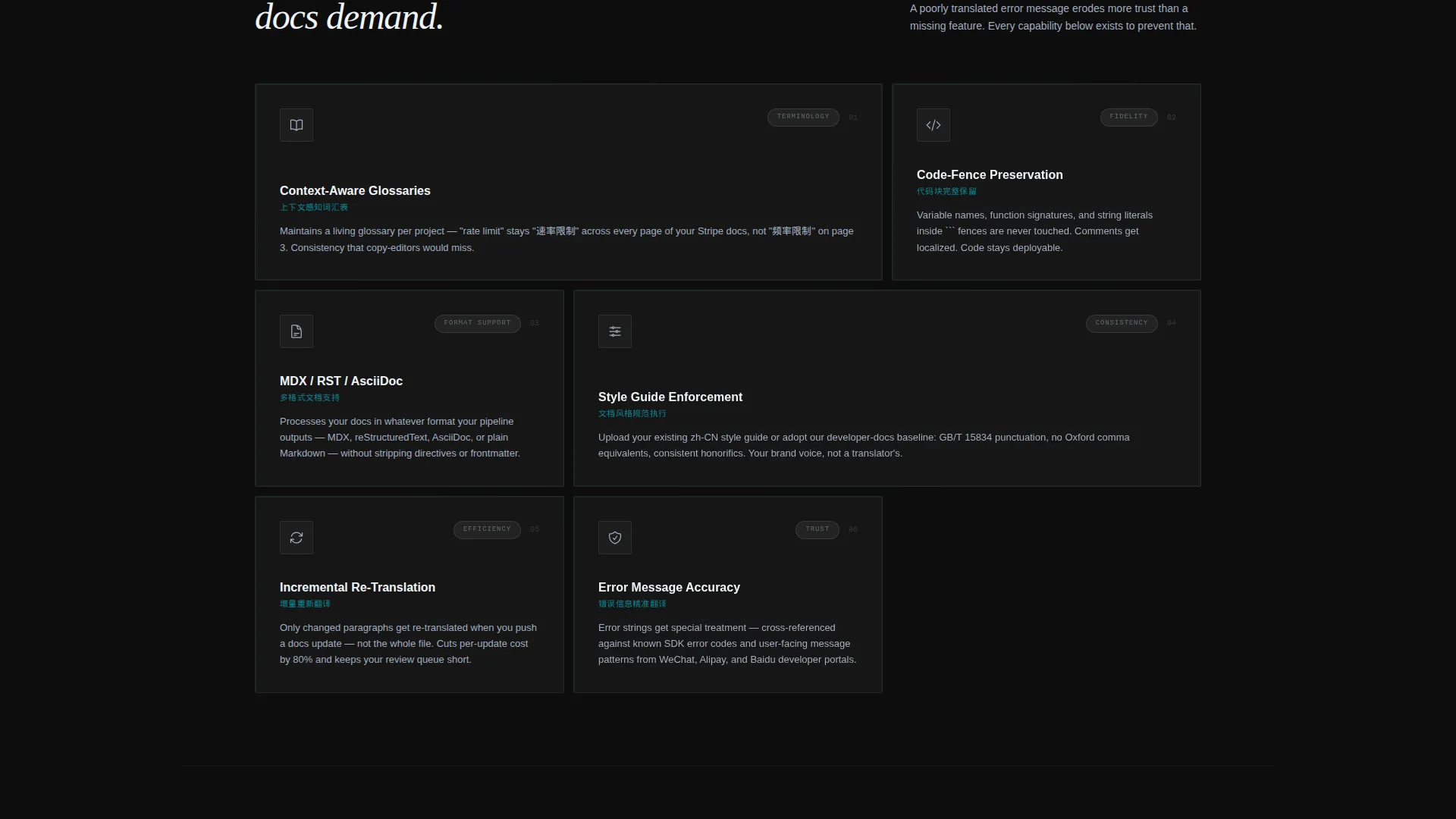
Each card is a frosted glass panel presenting a distinct capability: context-aware glossaries, code-fence preservation, MDX and RST format support, and style guide enforcement. Cards activate with micro-animations on scroll, giving the grid a sense of layered depth rather than a static list.
Logo Bar Header
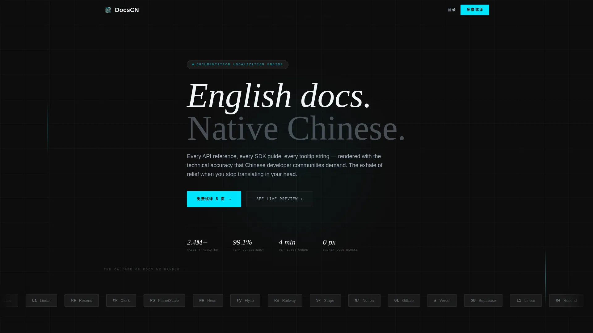
A horizontal scroll of recognizable SaaS and open-source brand silhouettes sits above the headline "Paste your docs. Read them in Chinese." The logos render in monochrome on frosted glass chips, establishing credibility before any copy is read.
Dual Conversion Flow
The primary call to action, labeled "免费试译 5 页" (Translate 5 Pages Free), appears inside the live tool and as a sticky bottom bar on mobile. A secondary path offers a gated sample output PDF requiring only an email address, catching visitors who want to review quality before connecting a repository.
Minimal Signup Form
The trial form asks only for a work email address and a documentation URL. No credit card, no team size field, no phone number. Reducing friction at the signup step keeps the conversion path clean and fast.
Glassmorphic Data Command Visual System
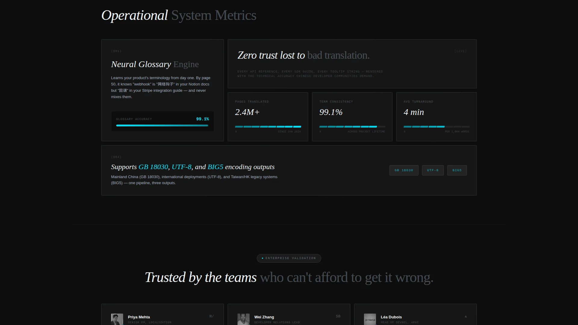
The design uses deep command-line black, frosted glass panels at 12% opacity, electric terminal cyan for interactive highlights, and muted steel for body text. Backdrop blur layers depth behind each card, and cyan pulses on hover states to signal interactivity.
Page sections overview
| Section | Purpose |
|---|---|
| Logo Bar Header | Establishes credibility through recognizable brand silhouettes above the headline |
| Live Preview Tool | Lets visitors paste docs and watch real-time Simplified Chinese rendering |
| Capability Card Grid | Presents each localization feature as a frosted modular panel |
| Primary call to action Block | Drives free trial signups with a minimal two-field form |
| Sample Download Gate | Captures early-stage leads with a PDF quality sample behind an email wall |
| Sticky Mobile Bar | Keeps the free trial call to action visible as users scroll on smaller screens |
Design & branding system
The visual identity is built on a Data Command theme expressed through a glassmorphic color system. Every element is calibrated to feel like a floating heads-up display projected onto dark glass.
- Color palette: deep command-line black (#0D0D0D) base, frosted white panels at 12% opacity (#FFFFFF1F), electric terminal cyan (#00E5FF) for interactive highlights, and muted steel (#A0AEC0) for body text
- Surface treatment: backdrop-blur layers create depth behind each card, with luminous soft edges that catch light and cyan hover pulses that signal active states
- Typography and spacing: the layout is monochromatic and precise, reinforcing the technical accuracy positioning of the service itself
Mobile & speed optimization
The template is structured to work on small screens without sacrificing the conversion mechanics. The most critical interactive elements adapt to mobile context.
- The sticky bottom bar keeps "免费试译 5 页" (Translate 5 Pages Free) reachable at all times on mobile without interrupting the reading flow
- The card grid reflows into a single-column stack on smaller viewports, keeping each frosted panel readable and tap-friendly
- The live preview tool and the signup form remain the focal points on every screen size, preserving the tool-first creative direction
How this template helps you convert
The layout is sequenced so that trust is built before any ask is made. Every section earns the next click rather than demanding it.
- The logo bar delivers immediate credibility at first glance, before a visitor reads a word of copy, establishing the caliber of documentation this service handles.
- The live translation preview tool turns curiosity into conviction. Once a visitor pastes their own text and sees it rendered accurately in Simplified Chinese, the decision to try the service becomes a natural next step rather than a leap of faith.
- The dual conversion path means no visitor leaves empty-handed. Those ready to connect a repository take the free trial. Those who need more time download a quality sample and stay in the funnel.
Other information about this template
This template is categorized under Documentation and Support, within the Multilingual Documentation subcategory, with a specific focus on the Chinese (Simplified) Docs niche. It is designed as a card grid (modular) layout with a Calculator/Tool First creative direction and a Freemium/Trial conversion model.
- The template style is Card Grid (Modular), meaning each capability can be added, removed, or reordered without rebuilding the layout
- The header concept is a Logo Bar, making it well suited for services that want to lead with social proof from recognizable technology brands
- The intersection match score for this template's category, subcategory, and niche combination is 13, indicating a tightly focused use case with strong alignment between design system and audience intent
Theme
Data Command
Creative direction
Calculator/Tool First
Color system
Glassmorphic
Style
Card Grid (Modular)
Direction
Freemium/Trial
Page Sections
Live Translation Preview Tool
Modular Capability Card Grid
Logo Bar Credibility Header
Dual Conversion Path Layout
Glassmorphic Data Command Design System
Related questions
Who is this landing page template designed for?
Does the live translation preview tool require a backend setup?
What does the minimal signup form include?
Can I customize the capability cards in the grid?
What is the secondary conversion path in this template?



