History Study Guide Landing Page Template
Chronicle is a history study guide landing page template built for students and adult learners who need structured, exam-ready content fast. A multi-step placement form opens the experience, a comparison table anchors the mid-page, and portrait-style educator cards build trust through faces and credentials. The result is a focused lead generation page that guides every visitor from first click to a custom study roadmap.
by Rocket studio
Quick summary
Chronicle is a single-page history study guide template designed for lead generation. It opens with a three-step placement form, moves into a comparison table that contrasts free scattered notes against structured guides, and weaves in educator portrait cards throughout. The Institutional Authority visual theme makes the page feel credible and calm, like a well-organized university reading room.
Who this template is for
This template is built for history education platforms, independent educators, and study guide publishers who serve students preparing for high-stakes exams. It speaks directly to learners who feel overwhelmed and need a clear, structured path forward.
- Advanced Placement (AP) History students preparing for Document-Based Question (DBQ) essays and timed exams
- College freshmen navigating survey courses like Western Civilization with heavy reading loads
- Adult learners returning to education after a long gap who need to rebuild academic writing confidence
What problem this template solves
Students often land on history study sites and find a wall of unstructured notes with no clear starting point. They leave without converting because nothing on the page speaks to their specific exam format or era. Chronicle solves that by asking the right questions first, then delivering a personalized roadmap that feels earned, not generic.
- No clear entry point for visitors with different exam types or study goals
- Generic free notes that lack source citation depth, timeline integration, or exam-specific formatting
- Low trust because there is no visible expertise or human voice behind the content
What you get with this template
You get a complete, ready-to-customize lead generation landing page built around a structured three-step form, a content-rich comparison table, and a people-forward educator section. Every layout decision supports one goal: turning a curious student into a committed subscriber.
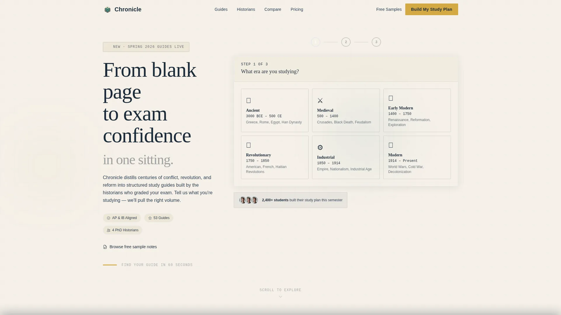
- A multi-step header form that captures era, exam type, and email in sequence
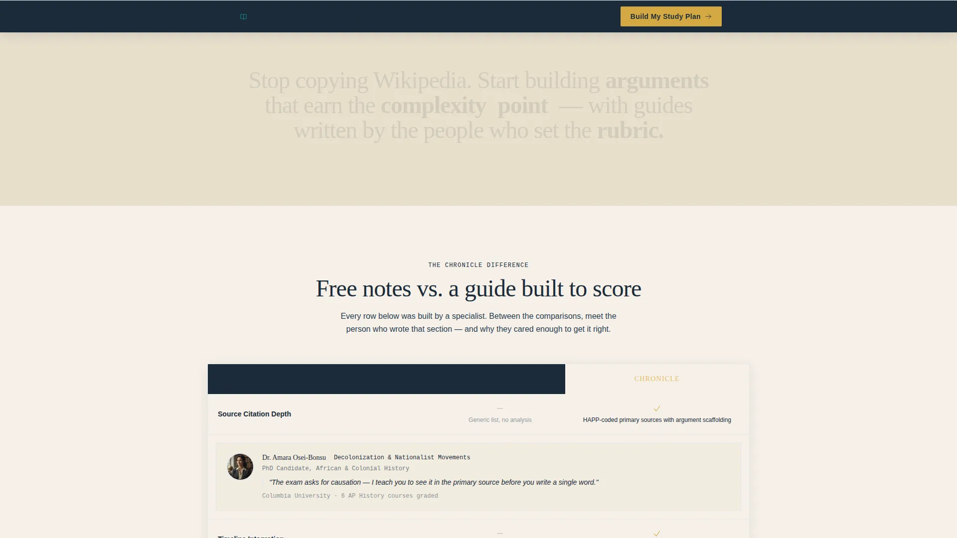
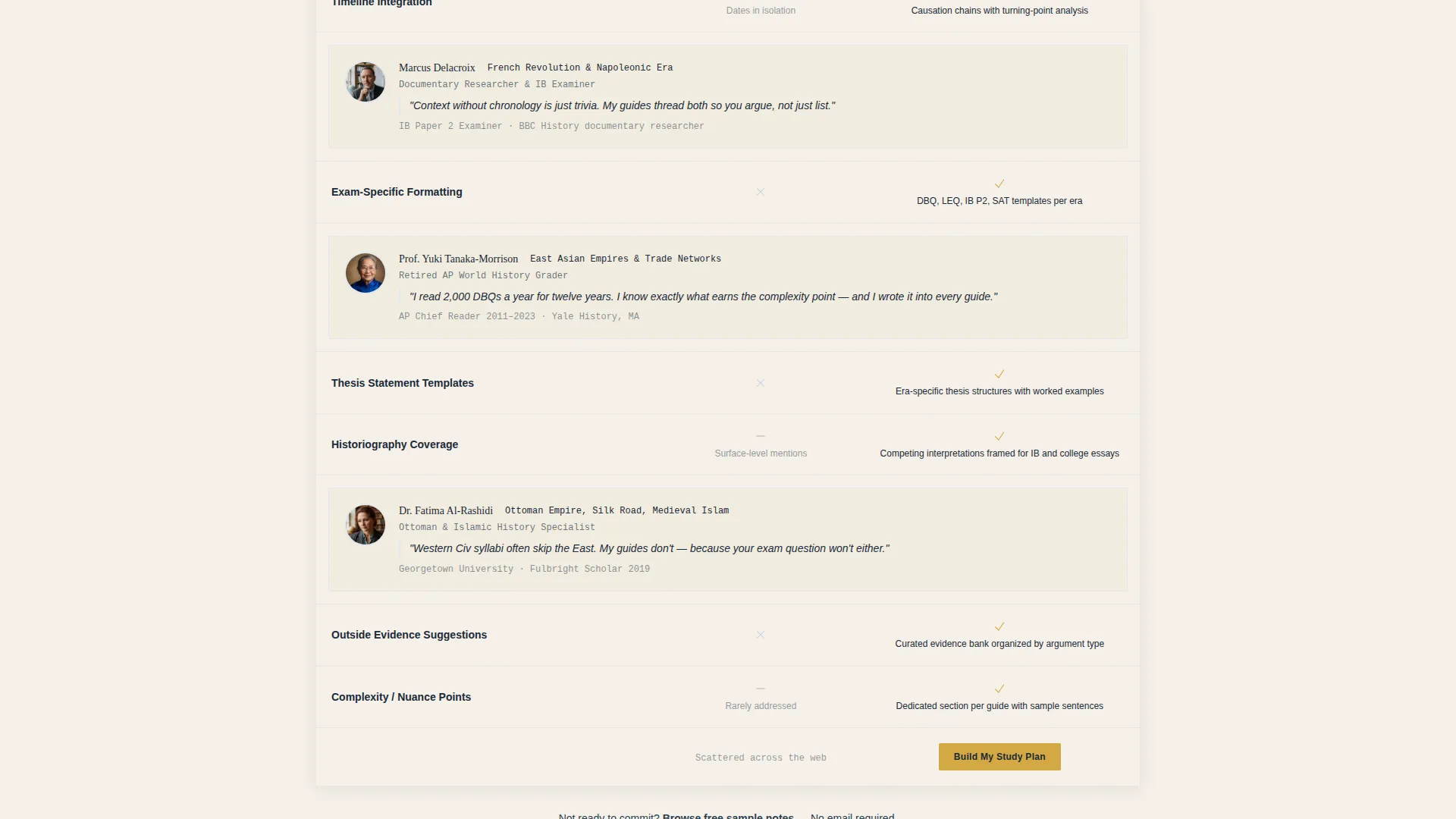
- A mid-page comparison table with embedded educator portrait cards between rows
- A sticky bottom bar call to action (call to action) that activates after fifty percent scroll depth
- A secondary path labeled "Browse Free Sample Notes" for visitors not yet ready to commit
Feature list
This section details the core built-in components that make Chronicle work as a lead generation landing page for history study content.
Multi-Step Placement Form
The header opens with an illustrated era selector showing century markers from Ancient to Modern. Step two asks for exam format, including AP DBQ, essay-based, multiple choice, and IB Paper 2. Step three requests an email to unlock a custom study roadmap. The sequence feels like a guided consultation, not a data form.
Comparison Table with Educator Cards
A structured table sits at the center of the page, comparing free scattered notes against Chronicle's curated guides across dimensions like source citation depth, timeline integration, and exam-specific formatting. Between each table row, a portrait card introduces the specialist behind that section, complete with credentials and a one-sentence teaching philosophy.
Sticky Bottom call to action Bar
After a visitor scrolls past fifty percent of the page, a persistent bottom bar appears with the primary call to action: "Build My Study Plan." This ensures the conversion prompt is always within reach without interrupting the reading experience above it.
Secondary Engagement Path
Visitors who are not yet ready to sign up can choose "Browse Free Sample Notes" instead. This secondary path keeps them engaged with the content and creates a retargeting opportunity through content depth without requiring any immediate commitment.
Educator Portrait Section
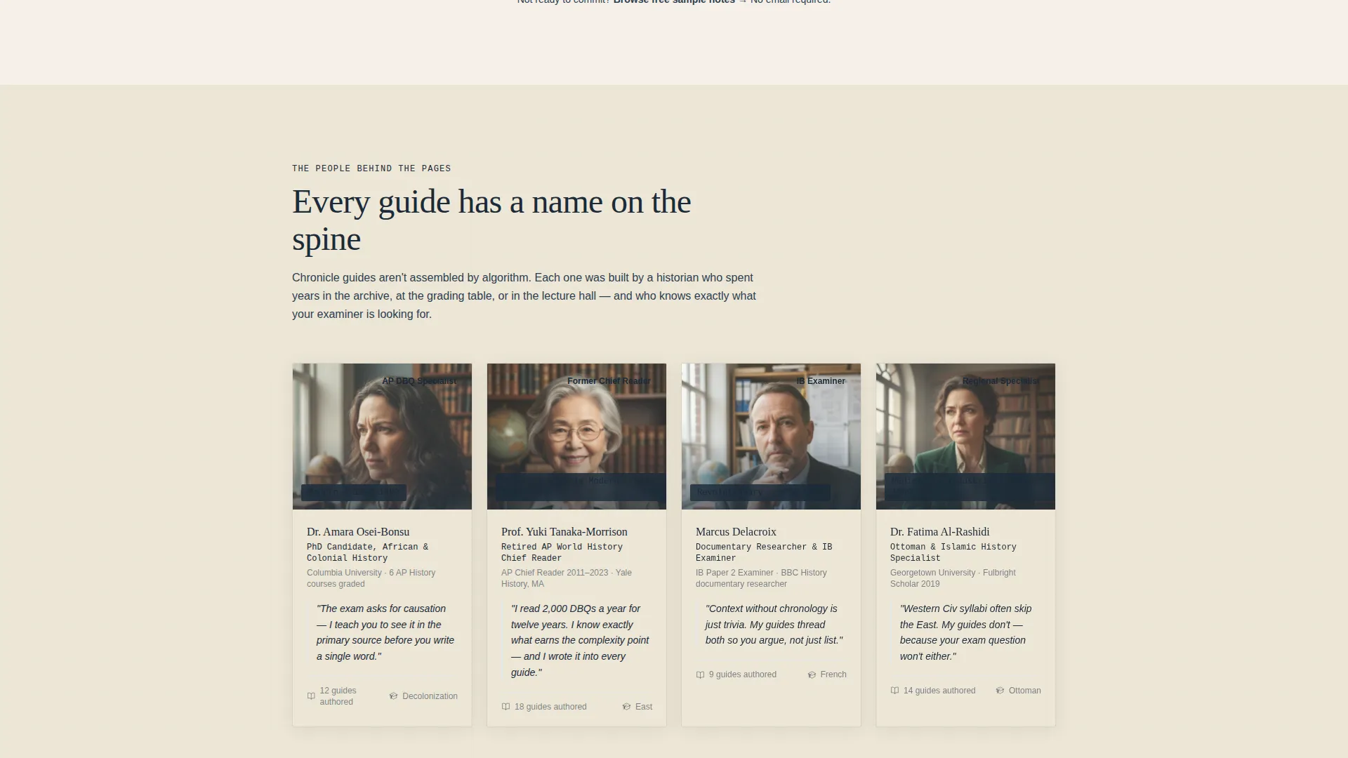
Following the header form, the page reveals the historians and educators behind each guide. Each card includes a photo, credentials such as PhD candidate or retired AP grader, and a short personal statement. The section builds trust through real faces rather than abstract feature lists.
Institutional Authority Visual Theme
The page uses a tightly controlled color palette and typographic hierarchy to project academic credibility. The layout mimics the calm clarity of a university library reading room, using warm accents only where they guide action and keeping the overall tone serious and focused.
Page sections overview
| Section | Purpose |
|---|---|
| Multi-Step Header Form | Capture era, exam type, and email in three guided steps |
| Educator Reveal Section | Introduce the historians and specialists behind each guide |
| Comparison Table | Contrast free notes against structured guides across key dimensions |
| Educator Portrait Cards | Build trust between table rows with credentials and personal philosophy |
| Sticky call to action Bar | Keep the primary conversion action visible after deep scroll |
| Free Sample Path | Offer a low-commitment entry point for undecided visitors |
Design & branding system
The Teal Catalyst color system gives Chronicle the look of a serious academic resource without feeling cold or institutional in a negative sense. Every color has a defined role, and the palette works together like a brass desk lamp switching on inside a wood-paneled study.
- Deep academic teal (#0D7377) anchors the primary brand identity across headers and section backgrounds
- Blackboard slate (#1B2A38) handles body text and darker section fills, reinforcing the scholarly tone
- Archival parchment (#F5F0E8) surfaces content areas with a warm, paper-like quality
- Catalyst gold (#D4A843) is reserved strictly for calls to action, highlights, and interactive hover states to draw the eye where action is needed
Mobile & speed optimization
The template is structured with a single-page, section-led layout that keeps the visitor experience focused and uncluttered on any screen size. The form, table, and portrait cards are all designed to stack cleanly on smaller viewports.
- The multi-step form breaks into clear, one-question-per-screen steps that work naturally on mobile devices
- The comparison table is built to remain readable when columns stack or condense on narrower screens
- The sticky call to action bar sits at the bottom of the viewport on mobile, mimicking a native app interaction pattern
How this template helps you convert
Chronicle is built around a lead generation funnel that earns trust before asking for anything personal. Every section is ordered to reduce friction and increase commitment gradually.
- The multi-step form leads with value by asking about the visitor's era and exam format before requesting an email, making the data exchange feel fair and purposeful.
- The comparison table and educator cards work together to demonstrate why Chronicle's structured guides are worth choosing over free, unorganized alternatives, removing the main objection before it forms.
- The sticky call to action bar and the "Browse Free Sample Notes" secondary path together cover both high-intent and low-intent visitors, maximizing the chance that every scroll depth results in some form of engagement.
Other information about this template
Chronicle is categorized under Education and Training, specifically within the History Education and History Study Guide niche. It is a strong fit for platforms targeting students in Advanced Placement programs or university-level survey courses.
- The template style is a Comparison Table landing page, making it particularly effective for audiences already evaluating multiple study options
- The creative direction follows a Team and People approach, which aligns with research showing that visible expert credentials increase conversion rates in education products
- The header concept is a Multi-Step Form, a proven pattern for lead generation in content-subscription and study-platform contexts
- The Institutional Authority theme makes this template adaptable to a wide range of history education brands, from solo tutors to structured online course providers
Theme
Institutional Authority
Creative direction
Team & People
Color system
Teal Catalyst
Style
Comparison Table
Direction
Lead Generation
Page Sections
Multi-step Placement Form
Comparison Table with Educator Cards
Sticky Call to Action Bottom Bar
Secondary Free Sample Path
Educator Portrait Section
Institutional Authority Visual Theme
Related questions
Who is the ideal user for this template?
Can I customize the era options and exam formats in the multi-step form?
How do the comparison table and educator cards work together?
What is the purpose of the Browse Free Sample Notes path?
Is this template suitable for adult learners, not just high school students?



