Classic Fashion Blog Website Template
Chronicle is a dark immersive lifestyle landing page template built for editorial creators who blend long-form writing with curated product recommendations. Its modular card grid layout organizes content verticals across Cook, Wander, Make, Wear, and Read. With a Merlot and Smoke color system, cinematic macro photography header, and a saved-items drawer, it turns taste-led storytelling into real conversions.
by Rocket studio
Quick summary
Chronicle is a single-page lifestyle landing page template designed for editorial creators who write and curate. It combines a modular card grid with a dark immersive visual identity, guiding visitors from a cinematic hero through editorial essays and into curated product picks. The result is a seamless experience where great writing and trusted taste work together.
Who this template is for
Chronicle is built for a specific kind of creator: someone whose voice is the product. If you write with care, curate with intention, and want a page that reflects both, this template fits your world.
- Lifestyle writers and essayists who publish long-form content across food, travel, craft, and daily ritual
- Independent creators building a loyal readership alongside a curated product recommendation stream
- Design-conscious professionals who need a landing page that looks as considered as their work
What problem this template solves
Most blog and creator templates force a choice between editorial depth and marketplace functionality. Chronicle removes that tension entirely. It lets the writing earn the trust before any product is introduced.
- Editorial content and product picks often feel mismatched in tone, breaking the reader's immersion
- Generic newsletter sign-up prompts feel transactional and out of place on a taste-led platform
- Standard light themes and busy layouts undercut the slow, deliberate mood that attracts high-trust audiences
What you get with this template
Chronicle delivers a fully structured single-page layout with every section already designed and sequenced. You get a cohesive visual system, interactive components, and a conversion flow that never feels like a sales funnel.
- A complete dark immersive landing page with seven distinct sections, from cinematic hero to Arc Browser Split footer
- A modular card grid covering five content verticals with editorial and product card variants that visually distinguish content from commerce
- Interactive components including a saved-items drawer, rotating quote carousel, scroll reveal animations, and a sticky "Join the Letter" footer bar
Feature list
Chronicle includes a focused set of built-in components that serve both editorial atmosphere and conversion function.
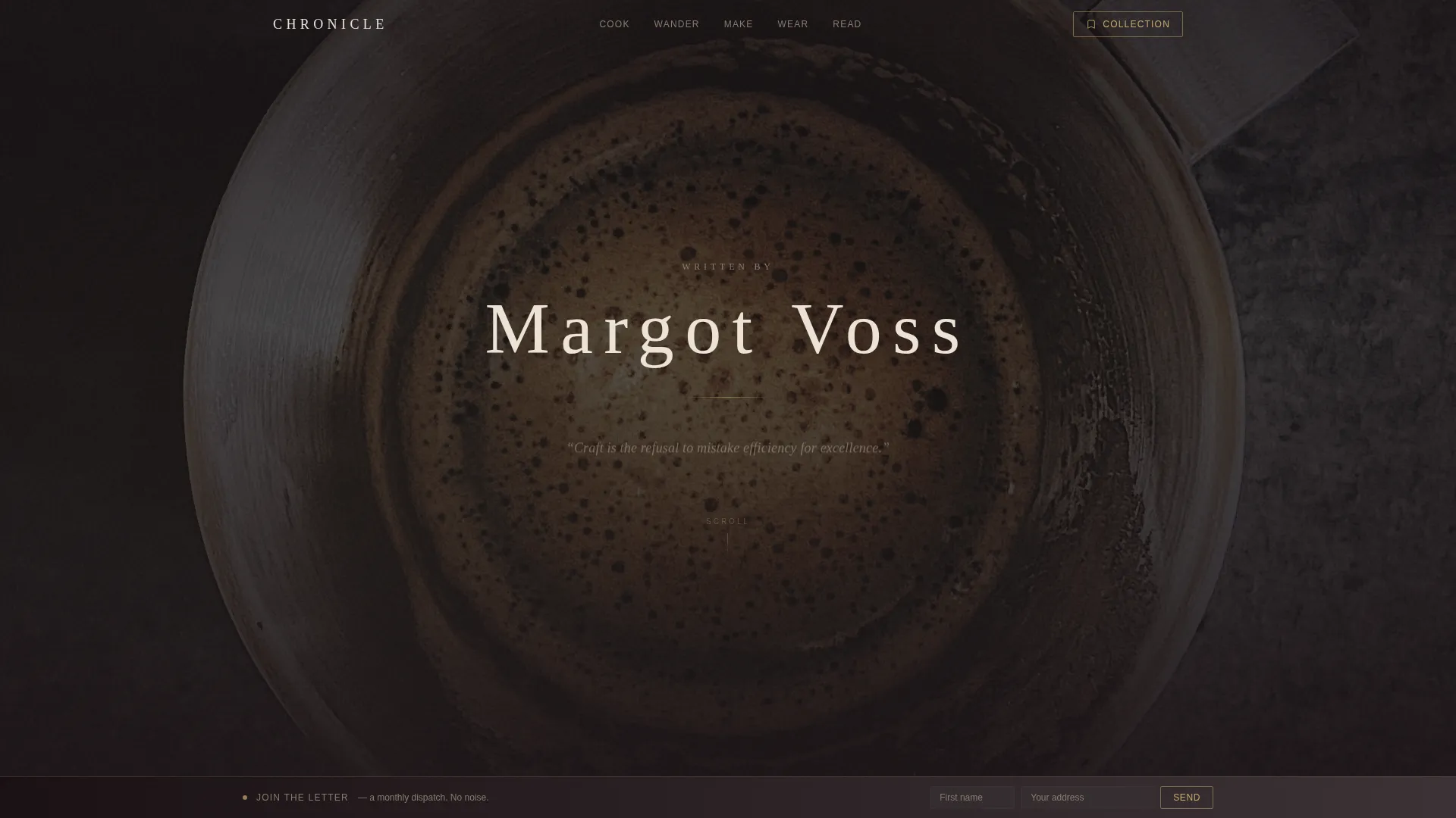
Macro Close-Up Hero Section
The full-viewport header uses a richly textured cinematic photograph shot at near-microscopic scale. The creator's name appears in thin, wide-tracked serif type over the image. After a brief beat, a rotating quote from the latest essay fades in beneath in italic parchment cream.
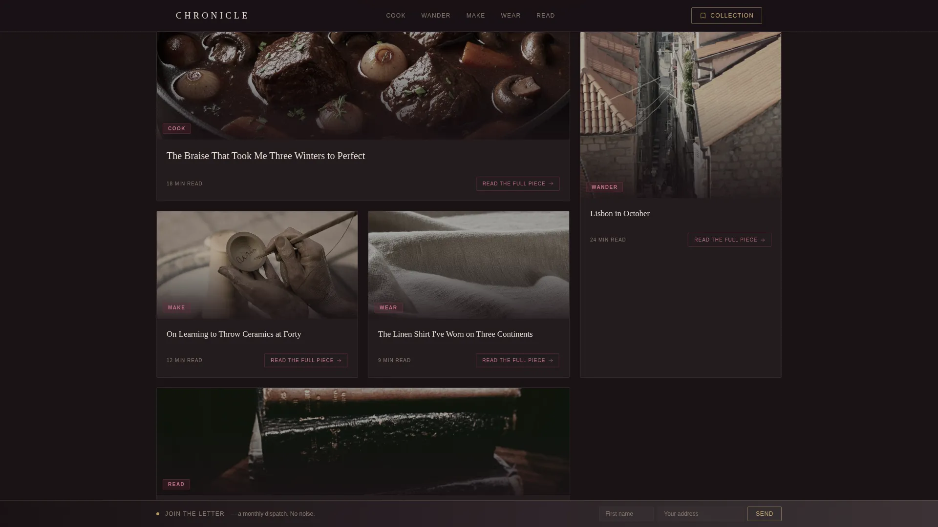
Modular Editorial Card Grid
Five content verticals, Cook, Wander, Make, Wear, and Read, are laid out in an asymmetric bento-style grid. Each card features a moody editorial image, a two-line excerpt, and a merlot category tag. The grid shifts naturally from editorial to product cards as the visitor scrolls deeper.
Saved-Items Drawer
Product cards include an "Add to Collection" call to action that feeds into a slide-out drawer from the right edge of the screen. This keeps product discovery feeling personal and intentional rather than transactional.
Rotating Quote Carousel
A quote carousel cycles through lines pulled from recent essays. It reinforces the creator's voice and keeps the hero section feeling alive without requiring a video or autoplay media.
"Join the Letter" Persistent Footer Bar
A sticky footer bar sits at the bottom of the page throughout the scroll. It invites visitors to join with only a first name and email address, framed as a monthly dispatch rather than a newsletter, keeping the tone consistent with the editorial voice.
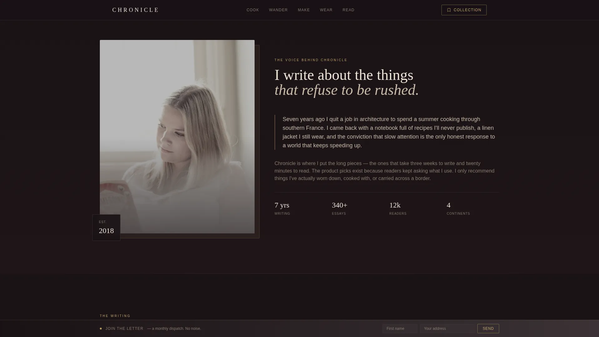
Creator Spotlight Section
Directly below the hero, a first-person introductory paragraph sits alongside a candid portrait photograph. This section establishes the voice and personality behind the curation before any content or products appear.
Page sections overview
| Section | Purpose |
|---|---|
| Macro Close-Up Hero | Draws visitors in with texture and creator presence |
| Creator Spotlight | Introduces the voice and person behind the content |
| Editorial Card Grid | Organizes five content verticals in a modular layout |
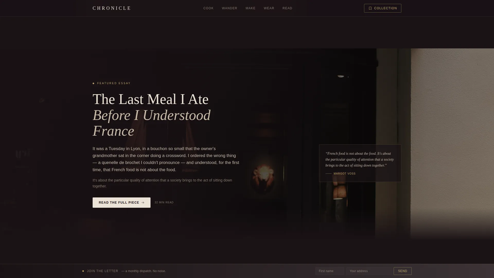
| Featured Essay Pullout | Highlights the hero piece with a full-bleed cinematic excerpt |
| Curated Picks Grid | Transitions editorial tone into trusted product recommendations |
| Reader Voices | Builds social proof with subscriber quotes and credentials |
| Arc Browser Split Footer | Anchors the page with navigation and the letter sign-up bar |
Design & branding system
The visual identity is built around depth rather than brightness. Every color and typographic choice reinforces the feeling of a candlelit room where someone has placed something worth reading in front of you.
- Color system: charcoal background (#1A1215), muted merlot (#6B2D3E) for category tags, warm smoke (#3D3438) for card borders, parchment cream (#EDE3D7) for text and card surfaces, and aged brass (#C9A96E) reserved for hover states and product card accents
- Typography: Fraunces as the display serif for headlines and creator name, paired with Manrope as the body sans-serif for excerpts and interface copy
- Cards float against the charred background with subtle borders; merlot glows on editorial cards while brass replaces it on product cards, creating a natural visual signal without interrupting the mood
Mobile & speed optimization
Chronicle is designed desktop-first, built for Sunday morning laptop browsing. The template also responds cleanly to smaller screens so the experience holds across devices.
- Images use lazy loading so the page loads progressively as the visitor scrolls
- Smooth CSS scroll behavior is built in, keeping the slow-reveal pacing intact on all devices
- The modular card grid reflows for mobile viewports without losing the editorial hierarchy
How this template helps you convert
Chronicle earns conversions by letting the voice and visual taste do the work first. By the time a visitor reaches the product grid, they have already decided they trust this person's eye.
- The editorial card grid builds contextual trust across five content verticals before any product is introduced, so the "Add to Collection" action feels like a natural recommendation rather than a prompt.
- The persistent "Join the Letter" footer bar keeps the email sign-up visible throughout the entire scroll without interrupting the reading experience, lowering friction for the most valuable conversion on the page.
Other information about this template
Chronicle is a strong fit for any creator working at the intersection of editorial publishing and curated commerce. It is equally suited to independent writers launching their first dedicated platform and established voices consolidating their audience and product picks in one place.
- Template style: Card Grid (Modular), with an asymmetric bento layout supporting both editorial and product card formats
- Theme: Dark Immersive, using the Merlot and Smoke color system throughout
- Creative direction: Creator Spotlight, with the scroll structured as a slow reveal of the person behind the taste
- Localization: English language, USD pricing format, and US date format are built into the design intent
- Social proof components include a Reader Voices testimonial section and visible subscriber and years-of-writing credentials in the Creator Spotlight
Theme
Dark Immersive
Creative direction
Creator Spotlight
Color system
Merlot & Smoke
Style
Card Grid (Modular)
Direction
Marketplace/Multi
Page Sections
Macro Close-up Cinematic Hero
Modular Editorial Card Grid
Saved-items Slide-out Drawer
Rotating Quote Carousel
Persistent Join the Letter Bar
Creator Spotlight with Candid Portrait
Related questions
Can I use this template if I only have editorial content and no products yet?
How does the template visually separate editorial content from product recommendations?
What kind of photography works best with this template?
Is this template designed for desktop or mobile audiences?
Can the Join the Letter footer bar copy be customized?



