Advanced Internal Knowledge Base Professional Website Template
Logbook is a scroll-reveal landing page template built for developer tooling teams that need to capture architectural decisions clearly and permanently. The dark terminal aesthetic, typewriter hero animation, and Problem-to-Solution narrative arc make it compelling from the first scroll. Engineers, platform leads, and CTOs will recognize the pain immediately and trust the solution on sight.
by Rocket studio
Quick summary
Logbook is a single-page, scroll-reveal landing page template designed for ADR (Architectural Decision Record) and decision-log tools targeting engineering teams. It opens with a live typewriter terminal, walks visitors through visceral pain, delivers a clean solution comparison, and closes with a full-width conversion block. Every section is a working artifact, not a placeholder.
Who this template is for
This template is purpose-built for developer tooling products, internal knowledge base platforms, and B2B engineering productivity tools. If your product helps teams capture, search, or share institutional memory, this layout speaks directly to that audience.
- Senior engineers writing ADRs late at night after design reviews
- Platform leads who onboard new hires without rehashing old debates
- CTOs inheriting codebases with no documentation trail
What problem this template solves
Engineering teams lose critical context every week. Decisions get buried in Slack threads, tribal knowledge walks out the door with departing engineers, and new hires repeat arguments that were settled two quarters ago. A well-structured landing page template cannot fix the underlying process, but it can communicate the solution with enough clarity and emotional resonance to earn the click.
- No template exists for this exact niche: decision-log tools aimed at senior engineers
- Generic SaaS templates fail to reflect the terminal-native, documentation-first mindset of the audience
- Most landing page templates rely on stock imagery and abstract shapes instead of real, working artifacts
What you get with this template
This template includes a complete, production-ready set of sections organized into a Problem-to-Solution Arc narrative. Each section progressively reveals a deeper capability as the visitor scrolls, building momentum and trust before the final conversion block.
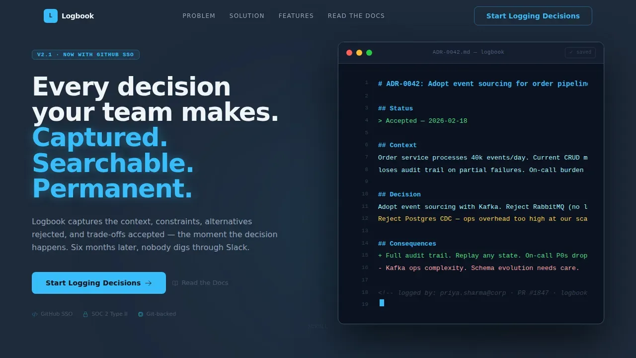
- Hero terminal with typewriter ADR animation and ghost call-to-action button
- Simulated Slack chaos section, solution comparison panel, capabilities bento grid, and full-width conversion block
- Scroll-reveal animations powered by Intersection Observer, staggered message cascades, and a blinking cursor motif
Feature list
This template delivers a focused set of interaction patterns and visual components that match how engineers actually evaluate tools.
Terminal Typewriter Hero
The hero renders a realistic, syntax-highlighted ADR inside a mock terminal window. Lines appear one by one with a typewriter animation, simulating live writing. The headline fades in above the terminal on load. This is the artifact itself, doing its job in real time, not a screenshot of it.
Scroll-Reveal Progressive Sections
Each section below the fold slides into view only when the visitor reaches it, using Intersection Observer. The reveal order follows a deliberate arc: pain first, solution second, capability detail third. Momentum builds naturally as the visitor scrolls, mirroring the experience of shipping features one after another.
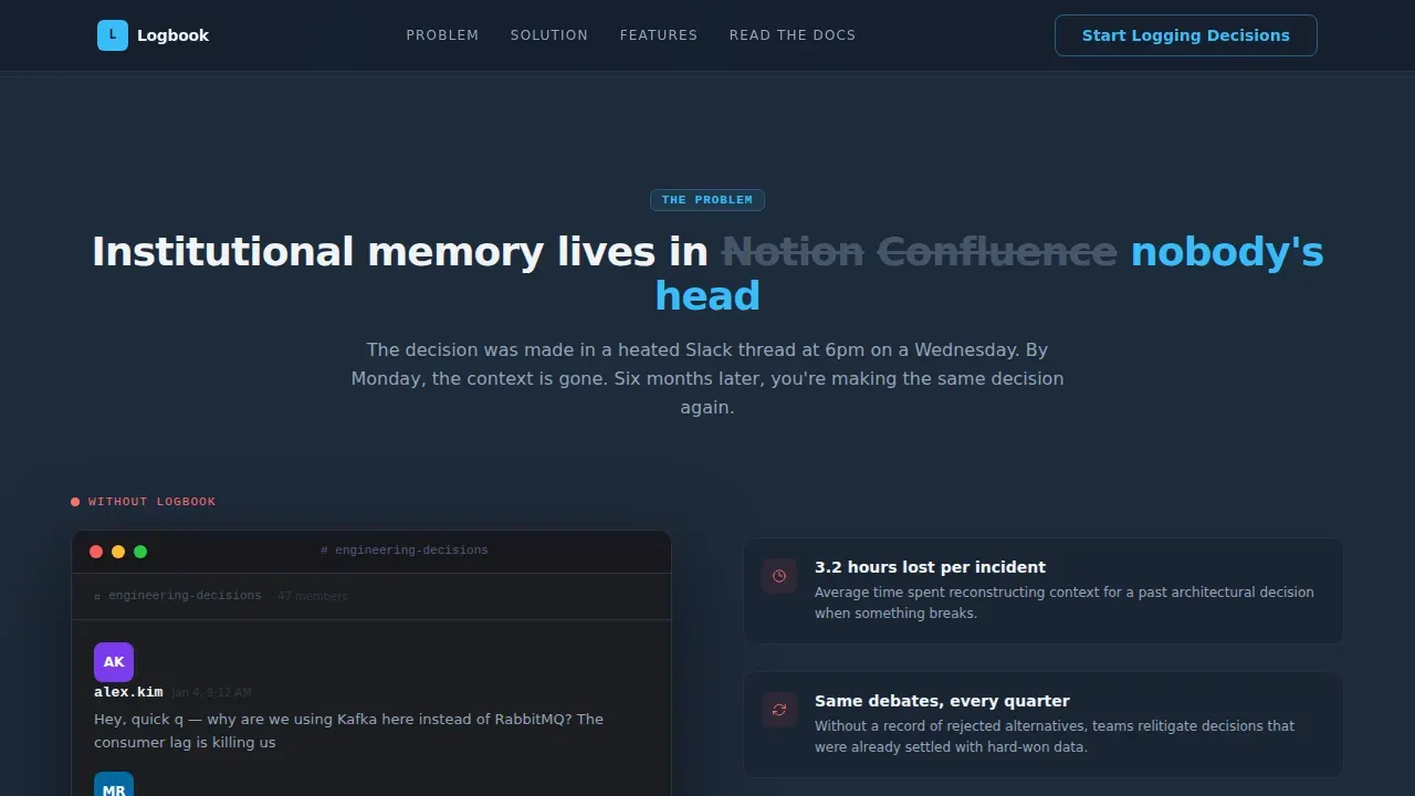
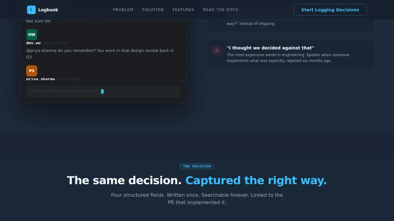
Simulated Slack Pain Panel
A staggered cascade of simulated Slack messages shows three engineers arguing about a past decision that nobody documented. Timestamps span weeks. The final message reads: "does anyone remember why we chose this?" This emotional hit is the setup for the solution reveal that follows immediately.
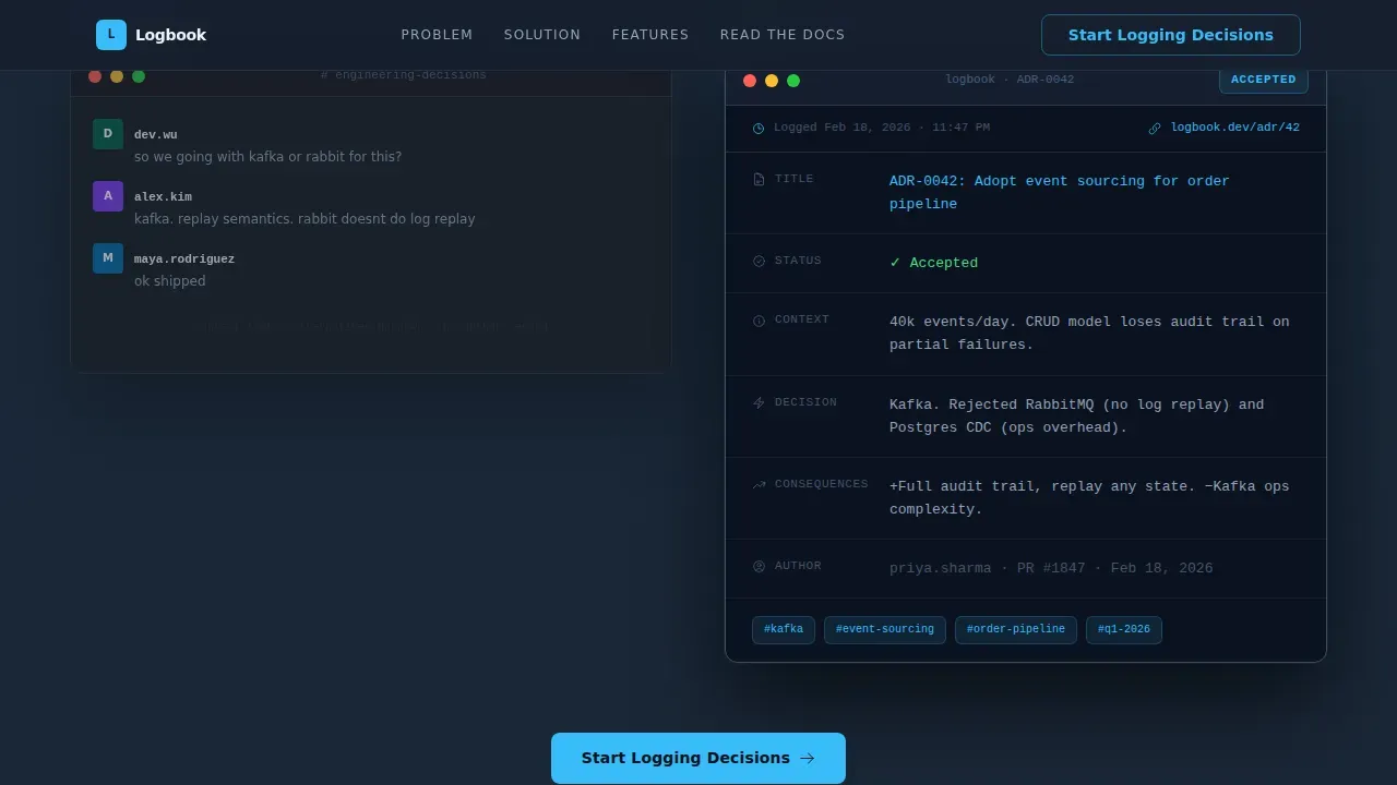
Side-by-Side Comparison Block
The solution comparison places Slack chaos directly beside a clean Logbook capture. Four structured fields, a timestamp, a tag, and a pull request link. The contrast is immediate and the idea lands without a word of explanation needed.
Capabilities Bento Grid
A bento-style grid progressively reveals four capability panels: template libraries, Git-backed versioning, team-wide search, and onboarding timelines. Each panel slides in on scroll. The layout communicates depth without overwhelming the visitor with text.
Triple Call-to-Action Placement
The primary call-to-action, "Start Logging Decisions," appears three times: as a ghost button in the hero, mid-page after the comparison lands, and as a full-width sky-blue block at the bottom. A secondary text link, "Read the Docs," sits beneath each primary button for engineers who need to inspect before they commit.
Page sections overview
| Section | Purpose |
|---|---|
| Terminal Hero | Opens with live typewriter ADR and ghost call-to-action |
| Slack Pain Panel | Recreates undocumented-decision frustration emotionally |
| Solution Comparison | Contrasts Slack chaos with clean Logbook capture |
| Capabilities Bento | Reveals template libraries, versioning, search, onboarding |
| Social Proof Strip | Displays inline metrics and engineer testimonial quotes |
| Full-Width call to action | Sky-blue conversion block driving GitHub SSO signup |
| GitHub Dev Footer | Minimal footer with nav links and documentation reference |
Design & branding system
The visual identity follows the Startup Velocity theme with a Slate and Sky color system. The palette feels like a code editor at dusk: dark enough to focus, punctuated by electric blue wherever action is needed.
- Deep charcoal slate (#1E2A3A) for all primary backgrounds and structural elements; mid-tone graphite (#3B4D61) for card surfaces and secondary panels
- Bright sky blue (#38BDF8) for every interactive element: buttons, links, status badges, and the blinking cursor motif that threads through every section
- Plus Jakarta Sans for interface typography; JetBrains Mono for all code, terminal, and ADR content
Mobile & speed optimization
This template is designed desktop-first, reflecting its primary audience: senior engineers at workstations late at night. Responsive breakpoints are included for tablet and mobile, so the layout holds at every screen width without breaking the terminal or comparison components.
- Server components handle all static sections; client components are scoped only to animated elements like the typewriter and scroll reveals
- Staggered Slack message animations and Intersection Observer scroll triggers are implemented as isolated client components to keep static rendering fast
- The blinking cursor, typewriter sequence, and frequently asked question accordion are all contained in lightweight client-side components that do not block the initial render
How this template helps you convert
The conversion architecture is deliberate. Every design decision pushes the visitor toward one action: clicking "Start Logging Decisions" and entering the GitHub SSO signup flow.
- The hero earns attention immediately with a working ADR artifact, not a tagline, setting credibility before the visitor reads a single marketing sentence.
- The pain section creates emotional recognition in engineers who have lived through undocumented decisions, making the solution feel urgent rather than optional.
- The triple call-to-action placement and the absence of a form on the page reduce friction: no fields to fill, no commitment beyond a single click.
Other information about this template
This template sits at the intersection of the Decision Log and ADR niche within the broader Internal Knowledge Base category under Documentation and Support. It is the only template in this collection designed specifically for the formulate precision contract supplement manufacturing landing page template niche equivalent in engineering tooling: a highly specific audience with exacting expectations.
- The frequently asked question accordion is an interactive client component that supports common buyer questions without requiring a separate documentation page
- The social proof strip includes inline metrics, such as decisions logged and teams active, alongside engineer testimonial quotes focused on reliability, quality, and partnership
- The footer follows a GitHub Developer Minimal pattern with essential links, contact references, and documentation pointers, keeping visitors focused on the conversion goal rather than navigating away
- The template is localized for English, USD pricing references, and US date format, matching the primary market for B2B developer tooling in North America
- Brands launching a new developer tool can customize the color tokens, swap the ADR example content, and define their own capability labels without restructuring the layout
- The template supports a one stop shop presentation style: a single scrolling page that covers pain, solution, capabilities, social proof, and conversion without routing visitors to secondary pages
Theme
Startup Velocity
Creative direction
Problem→Solution Arc
Color system
Slate & Sky
Direction
Click-Through
Page Sections
Terminal Typewriter Hero Section
Scroll-reveal Progressive Layout
Simulated Slack Chaos Panel
Side-by-side Solution Comparison
Capabilities Bento Grid
Triple Call to Action Conversion Architecture
Related questions
Can I change the ADR content shown in the terminal hero?
Does the page include a contact form?
Is the scroll-reveal animation compatible with all modern browsers?
Can I add more sections without breaking the layout?
Who receives the source code after purchase?



