Boutique Resort Blog & Content Publisher Website Template
Chronicle is a dashboard-style resort blog landing page built for boutique hospitality publishers. It combines a glassmorphic visual system, animated feature cards, and a side-by-side property comparison tool to serve travel-obsessed readers. The layout accelerates with scroll depth, guiding visitors from discovery to an email signup without friction.
by Rocket studio
Quick summary
Chronicle is a single-page resort blog landing page designed around a data-rich, dashboard aesthetic. It serves curated travel intelligence, property comparisons, seasonal guides, loyalty breakdowns, and photo essays, to readers who need fast, organized answers. The glassmorphic design feels like a smartphone screen reflected in a midnight infinity pool: luminous, layered, and immediately scannable.
Who this template is for
Chronicle is built for hospitality content publishers who want their blog to feel as premium as the properties they cover. If your audience browses competing resorts on multiple tabs and needs a reason to commit, this template was designed for them.
- Travel bloggers and editorial teams covering boutique hotels and resorts
- Hospitality brands using content to attract high-intent guests and wedding planners
- Independent publishers building comparison-led travel media products
What problem this template solves
Most resort blogs look like generic travel sites. They bury the most useful content, amenity breakdowns, honest comparisons, insider itineraries, under slow-loading imagery and vague calls to action. Chronicle fixes that by leading with organized, data-forward design that respects a busy reader's attention.
- Readers toggling between six competing resort tabs never find a clear reason to stay on one page
- Loyalty program chasers and wedding venue scouts need side-by-side details, not prose paragraphs
- Generic blog layouts fail to communicate the editorial authority that boutique hospitality content requires
What you get with this template
You get a fully structured, scroll-driven landing page that launches with a product screenshot hero and accelerates through animated content cards, a live trending destinations ticker, and a dual-path conversion section. Every element is designed to keep a reader moving forward.
- A sticky frosted-glass navigation bar with a persistent "Compare Properties Now" call to action
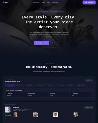
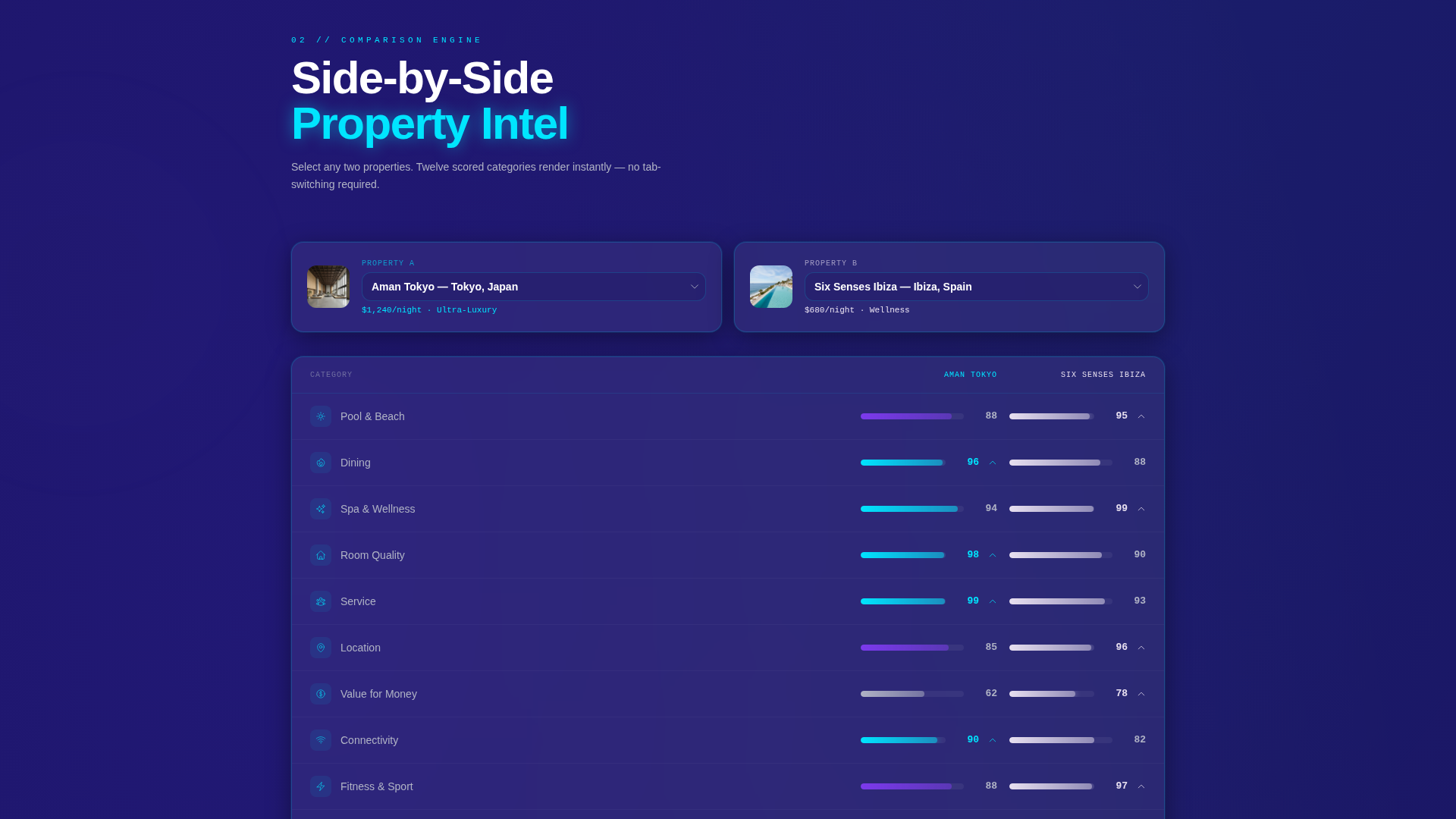
- An interactive property comparison tool showing two resorts across twelve scored categories
- A "Get the Weekly Brief" email capture section with content-preference toggle switches for luxury, budget, adventure, and wellness
Feature list
Chronicle is built around a set of purposeful, content-first features that serve both readers and publishers. Each component earns its place by solving a specific friction point in the resort discovery process.
Glassmorphic Dashboard Header
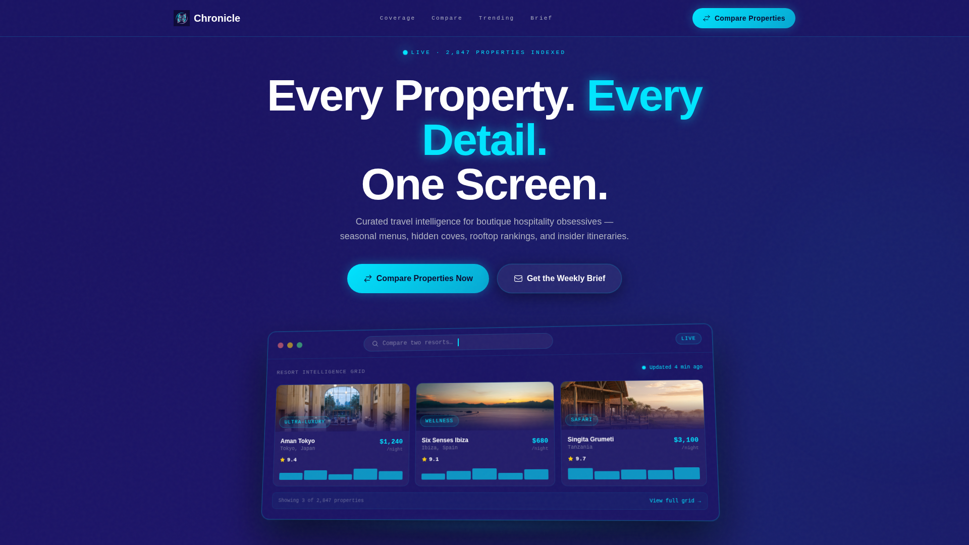
The header centers a stylized browser frame showing the blog's own dashboard interface. Resort comparison cards, star ratings, price-per-night sparklines, and thumbnail hero images render at a slight isometric tilt with a soft drop shadow. A blinking cursor sits in the search bar reading "Compare two resorts..." and the headline fades in above it.
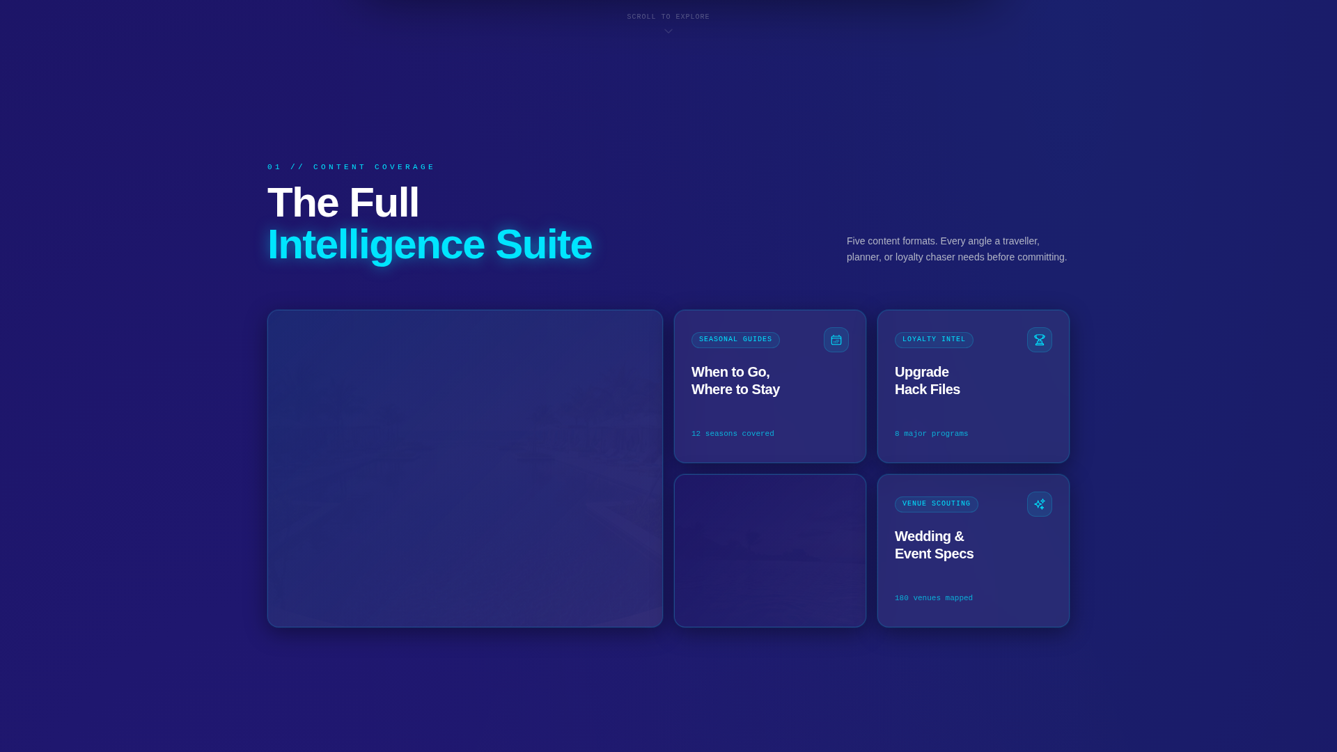
Staggered Animated Feature Cards
The first scroll section explodes outward from the hero screenshot into individual feature cards on a staggered grid. Each card represents a blog content type: versus reviews, seasonal guides, loyalty breakdowns, and photo essays. Cards animate in sequentially so the page feels alive rather than static.
Interactive Property Comparison Tool
Visitors select two resorts from dropdown menus and instantly see a side-by-side specification sheet. The comparison covers twelve scored amenity categories with animated progress bars. This tool is the core conversion engine, once a reader sees their shortlisted hotels broken down in detail, the email signup feels like a natural next step.
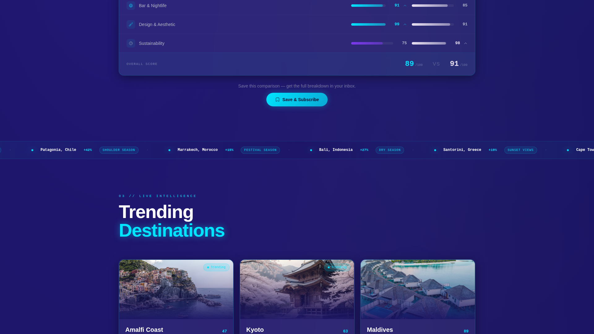
Trending Destinations Ticker Ribbon
A live-style ticker ribbon cuts across the page at roughly the two-thirds scroll mark. It surfaces trending destinations and keeps the energy building as the reader approaches the conversion sections. The ribbon reinforces the editorial authority of the publication.
Dual-Path Conversion Section
The page offers two distinct conversion paths simultaneously. The primary path anchors "Compare Properties Now" in the sticky navigation. The secondary path presents a single email field with toggle switches for content preferences, letting readers self-segment before subscribing.
Scroll-Accelerating Layout Momentum
Scroll depth drives increasing content density. Cards get denser, comparison tables slide in, and data points multiply as the reader moves down the page. The layout is engineered so the energy never plateaus, it builds continuously toward the final decision point.
Page sections overview
| Section | Purpose |
|---|---|
| Sticky Nav Bar | Anchors primary call to action persistently across scroll |
| Hero Screenshot Header | Establishes product credibility with dashboard visual |
| Animated Feature Cards | Introduces blog content types with scroll-triggered motion |
| Comparison Tool Section | Delivers side-by-side resort data across twelve categories |
| Trending Destinations Ticker | Injects editorial energy at the two-thirds scroll point |
| Email Capture Section | Converts readers with preference-based newsletter signup |
Design & branding system
Chronicle uses a glassmorphic color system built on deep space indigo as the base, with frosted translucent white panels floating above it. Electric cyan accents pulse on hover states and live data points. The overall feel channels the atmosphere of a glass-walled departure lounge at dawn, organized, luminous, and layered.
- Core palette: deep space indigo (#1B1464) base, frosted white (#FFFFFFB3) glass panels, electric cyan (#00E5FF) accents, soft lavender mist (#E8E0F0) for secondary cards, and muted silver (#B0B3C5) for secondary text
- Glass-blur containers hold each content card, with 1-pixel cyan border glows and crisp white primary text
- The visual theme follows a Startup Velocity direction, sharp, data-forward, and premium without being decorative for decoration's sake
Mobile & speed optimization
The landing page layout is designed for readers who are already on their phones, toggling between resort tabs while planning a trip. The dashboard grid and comparison tool scale cleanly for smaller viewports without sacrificing the visual impact of the glassmorphic system.
- Frosted-glass cards and isometric hero frames are designed to render cleanly across screen sizes
- Sticky navigation keeps the primary call to action accessible at every scroll depth on mobile
- The ticker ribbon and animated card grid maintain their scroll-energy effect on touch devices
How this template helps you convert
Chronicle is built specifically around a comparison-driven conversion model. Every design and layout decision points toward one of two actions: starting a property comparison or subscribing to the weekly brief.
- The sticky "Compare Properties Now" call to action stays visible throughout the entire scroll journey, reducing the distance between interest and action at any point on the page.
- The interactive comparison tool does the persuasion work passively, once a visitor sees their two shortlisted resorts scored across twelve categories, the email capture feels like saving progress rather than giving away personal information.
- The preference toggle switches on the email form let readers choose between luxury, budget, adventure, and wellness content, making the subscription feel personalized and low-commitment.
Other information about this template
Chronicle belongs to the Hotel and Resort Website Templates subcategory within the broader Technology category on the marketplace. It is purpose-built for the hotel and resort blog page niche, where editorial quality and data density must coexist.
- The template style is classified as Dashboard and Data Grid, making it distinct from standard editorial blog layouts
- The creative direction follows a Launch Energy approach, meaning scroll momentum is a deliberate design feature rather than a decorative choice
- The header concept uses a Product Screenshot framing, which gives the landing page an app-launch feel appropriate for a data-driven travel publication
- The Comparison and Versus landing page direction means the layout is engineered to reduce decision fatigue for readers comparing multiple properties
Theme
Startup Velocity
Creative direction
Launch Energy
Color system
Glassmorphic
Style
Dashboard/Data Grid
Direction
Comparison/Versus
Page Sections
Glassmorphic Dashboard Hero
Staggered Animated Card Grid
Interactive Resort Comparison Tool
Trending Destinations Ticker
Dual-path Conversion Layout
Scroll-driven Density Escalation
Related questions
What type of content works best with this template?
Can the comparison tool be customized for different resort categories?
Who is the target reader this template is designed for?
Does the email capture section support content preference segmentation?
Is Chronicle suitable as a standalone blog or part of a larger site?