Lightning-Fast Database Landing Page Template
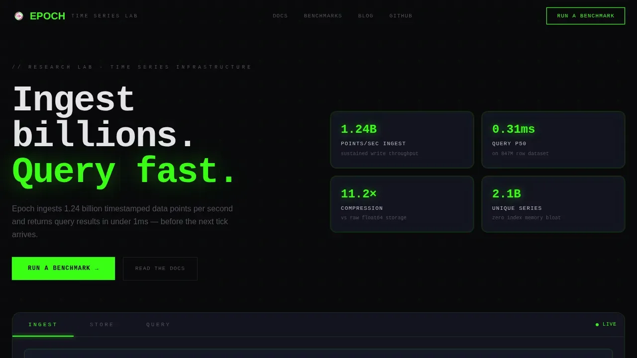
Epoch is a dashboard-style landing page template built for time series database research labs. It uses a Feature Tab Switcher hero, an animated Problem-to-Solution arc, and a benchmark comparison table to show visitors real performance before asking for anything. The design runs on a Tech Glass aesthetic with phosphor green data visuals, void black surfaces, and signal magenta interactive states.
by Rocket studio
Quick summary
Epoch is a single-page landing page template designed for teams building high-performance time series database infrastructure. It leads with an interactive three-tab hero panel, walks visitors through an animated failure-to-resolution arc, and closes with a latency benchmark table. Every section earns the primary call to action by demonstrating performance first.
Who this template is for
This template is built for technically minded teams who need to communicate database performance to an equally technical audience. If your product ingests, stores, or queries time series data at scale, this template speaks your visitors' language without requiring a single word of explanation.
The ideal user is someone running a time series database research lab, a developer infrastructure startup, or an internal platform team that needs to convince engineers to run a benchmark rather than fill out a form.
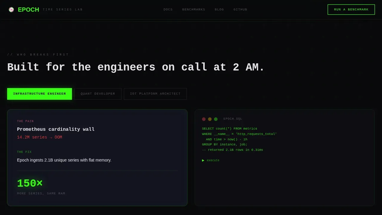
- Infrastructure engineers who face Prometheus cardinality explosions and need a page that acknowledges their specific pain
- Quantitative development teams whose backtests choke on years of financial tick data and need to see latency histograms before they trust anything
- IoT platform architects watching their existing database system buckle under continuous sensor data floods
What problem this template solves
Most database landing pages lead with marketing copy. Engineers skip it. They scroll for numbers, look for a benchmark, and leave when they find nothing concrete. The result is a high bounce rate from exactly the audience you need.
This template flips that experience. It opens with live-styled data panels and lets visitors interact with ingestion counters and latency histograms before any prose appears. The scroll journey transforms visible failure into visible resolution, which builds trust faster than any testimonial block.
- Generic SaaS templates cannot represent the complexity of time series data workloads, cardinality management, or sub-millisecond query performance in a believable way
- Standard hero-and-features layouts do not show real performance metrics or let visitors experience the product interaction before committing
- Form-first approaches create friction for engineers who want to analyze data before talking to anyone
What you get with this template
You get a fully structured, single-page dashboard landing page built around five tightly sequenced sections. Every section is purposeful. There is no decorative padding. The layout is designed to guide infrastructure engineers, quant developers, and IoT architects from skepticism to benchmark click in a single scroll.
- A three-tab interactive hero panel with animated ingestion counters, a compression ratio visualizer, and a sub-millisecond latency histogram, each tab revealing a live-styled monitoring dashboard view
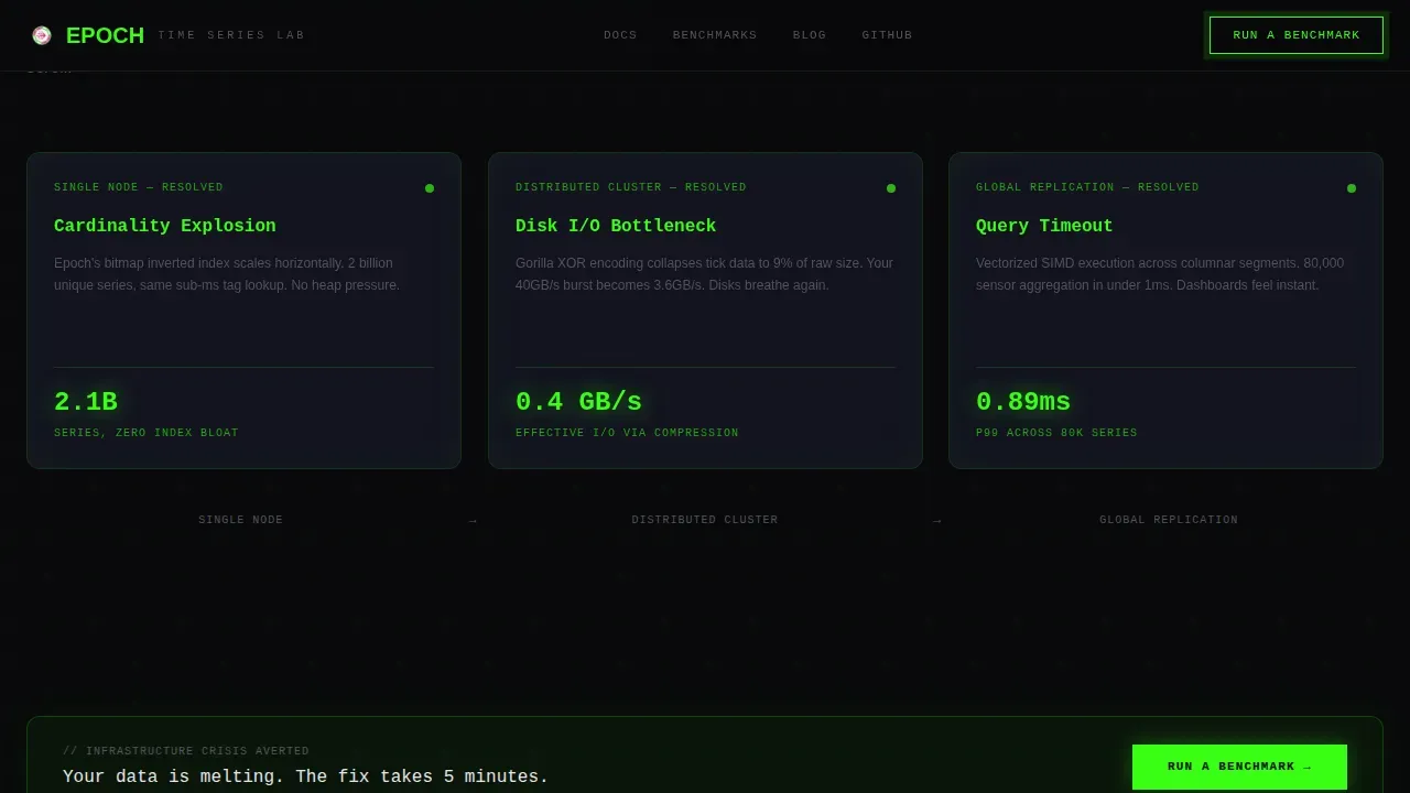
- A Problem-to-Solution arc with animated metric cards that rewrite themselves from red failure states to green resolution states as the visitor scrolls, escalating from single-node to distributed to global replication
- A benchmark comparison table and a final anchor call-to-action section that routes visitors to a hosted playground with no form required
Feature list
Three-Tab Feature Switcher Hero
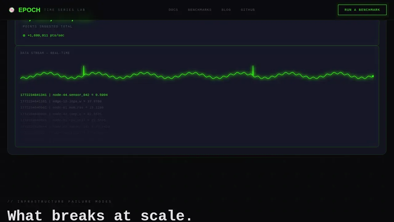
The header is built around a Feature Tab Switcher with three tabs labeled INGEST, STORE, and QUERY. Each tab reveals a distinct live-styled dashboard panel beneath it. The default INGEST tab shows a phosphor green ingestion rate counter ticking upward alongside a cardiogram-style data stream. STORE reveals a compression ratio visualizer showing raw bytes collapsing into a fraction of their original size. QUERY displays a latency histogram where every bar sits under the one-millisecond line. Switching tabs animates the grid, so visitors interact with the page before they realize they are evaluating a product.
Animated Problem-to-Solution Arc
Below the hero, the page opens a section titled "What Breaks at Scale" using monospace typography. Three data grid cards present real failure modes: cardinality explosion, disk input-output bottleneck, and query timeout. Each card shows a blinking red metric. As the visitor scrolls, each failure card transitions into a solution card. The red metric rewrites itself in phosphor green, the architecture diagram restructures, and the benchmark numbers improve. The arc escalates from single-node to distributed cluster to global replication. By the end of the scroll, the visitor has watched an entire infrastructure crisis resolve in slow motion.
Floating and Anchored Call-to-Action Placement
The primary call to action reads "Run a Benchmark" and appears three times across the page. It floats once after the header tabs, appears once mid-page after the solution arc pivot, and anchors the final section beside the latency comparison table. No form is required at any point. Each click routes to a hosted playground where visitors can paste a query and see results against a preloaded sample data set. The placement strategy ensures the call to action appears exactly when visitor confidence is highest.
Benchmark Comparison Table
The final section before the footer includes a latency comparison table that positions Epoch against three commonly evaluated time series database examples in the market. The table is designed to show concrete query performance numbers at a glance, giving engineers the comparative evidence they need to justify moving forward. This section is built to handle the moment when a visitor has absorbed the full scroll arc and is ready to make a decision.
Tech Glass Visual System with Acid Digital Color
The entire template runs on a Tech Glass aesthetic using the Acid Digital color system. Void black pools behind cards and grids. Phosphor green dominates data visualizations, live metrics, and ingestion counters. Signal magenta fires only when something demands attention, such as a clicked tab, a benchmark spike, or a call-to-action pulse. The palette is disciplined and intentional. Nothing is decorative. Every color has a functional role in directing attention.
Scroll-Triggered Animation Engine
The template is built with high animation fidelity throughout. The cardiogram data stream in the hero uses canvas rendering for smooth real-time data visualization. Animated counters tick upward as data points appear. Tab panel transitions animate the grid on switch. Scroll-triggered metric rewrites fire using IntersectionObserver so performance stays consistent as the visitor moves through the arc. The animation engine is designed to feel like a real monitoring console, not a marketing slideshow.
Page sections overview
| Section | Purpose |
|---|---|
| Tab Switcher Hero | Introduce INGEST, STORE, and QUERY panels with live-styled animated metrics |
| Floating call to action Block | Place the first "Run a Benchmark" prompt immediately after the hero tabs |
| What Breaks at Scale | Present three animated failure-mode cards with blinking red metrics |
| Problem to Solution | Scroll-triggered card transitions rewriting red metrics into green resolutions |
| Mid-Page call to action | Reinforce the benchmark call to action after the solution arc pivot |
| Benchmark Comparison | Latency table comparing query performance across four database options |
| Final Anchor call to action | Close the page with a latency histogram and the third benchmark prompt |
| Single-Row Footer | Minimal linear footer completing the layout |
Design & branding system
The design language is built on a Tech Glass theme with the Acid Digital color system. The palette is strict: four colors, each with a defined role, nothing ambient. Typography splits between JetBrains Mono for all data, numbers, and code-adjacent labels, and DM Sans for prose and explanatory copy. The result feels like a terminal window at 2 AM, functional, focused, and earned.
- Void black (#09090B) for all card backgrounds and grid surfaces; terminal gray (#1A1A2E) for secondary surface layers; phosphor green (#39FF14) for all live data, metrics, and counters; signal magenta (#FF2E97) reserved for interactive hover states, alert indicators, and call-to-action pulses
- JetBrains Mono handles all time stamped data labels, benchmark figures, and monospace section titles; DM Sans handles paragraph prose and navigation labels, keeping the reading experience clear without losing the terminal aesthetic
Mobile & speed optimization
The template is built desktop-first, reflecting the reality that infrastructure engineers, quant developers, and IoT architects primarily work at terminals with large displays. The layout is optimized for widescreen grid density. Mobile responsiveness is included to ensure the page remains accessible and readable on smaller screens for technical users who encounter it on multiple devices.
- Canvas animations use requestAnimationFrame for consistent rendering without dropping frames or creating performance bottlenecks during the data stream and counter sequences
- IntersectionObserver handles all scroll-triggered metric rewrites and card flip transitions, so animations fire at the right moment without impacting page load or causing performance degradation on lower-powered devices
How this template helps you convert
This template is built around a single conversion objective: earn the benchmark click without a form. Every design and content decision serves that goal. The page demonstrates performance before asking for trust, which is the only approach that works with a technically skeptical audience.
- The interactive tab switcher lets visitors experience simulated real time data panels in the first seconds, building credibility before a single claim is read, because engineers trust what they can see and interact with more than any headline
- The Problem-to-Solution arc mirrors the visitor's actual frustration, from query timeout and cardinality explosion to resolved green metrics and distributed architecture, creating an emotional and logical momentum that makes clicking "Run a Benchmark" feel like the obvious next step
Other information about this template
This template is categorized under the Technology niche, specifically Time Series Database Technology. It is designed to work for any team that needs to communicate the performance advantages of a purpose-built time series database to a technically demanding audience.
A time series database (TSDB) is specifically designed to store, manage, and analyze data points indexed by time. Unlike traditional relational databases or general-purpose systems, a time series database handles high write throughput, time-based queries, and efficient storage compression as core design priorities. Traditional databases were built for transactional workloads, not for the append-only, high-cardinality, time stamped data patterns that infrastructure teams deal with daily. When query performance degrades under data volume pressure, the gap between a purpose-built time series database and a general-purpose database system becomes impossible to ignore.
Time series data is characterized by measurements or observations captured at fixed intervals or on event triggers, each carrying a timestamp and one or more measured values. This structure enables time-based queries across long time ranges, efficient aggregation, and the ability to detect anomalies against historical patterns. Use cases span a wide range of data types and industries.
- IoT sensor telemetry and industrial equipment monitoring, where sensor readings arrive continuously and data volume grows without pause
- Financial markets applications, including financial tick data ingestion, candlestick chart generation, and long term trend analysis for backtesting
- Application performance monitoring, including server error logs, system metrics, and user analytics that require real time analytics dashboards
- Product analytics and tracking user behavior through event data, where teams need to aggregate data across sessions and analyze data for user behavior patterns
Time series databases apply compression techniques including delta encoding and columnar storage to reduce storage requirements significantly compared to traditional databases. Columnar storage groups data by column rather than row, which improves query performance on time-based aggregations and reduces data storage overhead. Vectorized query execution allows the database to process data in batches across columns, delivering faster results on complex queries. Parallel processing distributes query execution across cores or nodes, which improves query performance further under large data volumes.
Data retention policies are essential for managing the natural lifecycle of time series data. Common retention strategies combine data expiration, storage tiering, and data rollup. Storage tiering moves older data to object storage layers, keeping recent data at full granularity while aggregating older data into pre aggregated data summaries. This approach maintains cost efficiency and storage efficiency without losing historical data entirely. Data retention policies can also enforce data expiration to manage storage costs automatically.
Real time data pipelines require efficient storage and high write throughput to prevent the performance bottlenecks that appear when data arrives faster than the database system can commit it. Real time processing demands that the database handle new data without causing performance degradation on concurrent read queries. Strong consistency guarantees become important when operational data must be accurate at the moment it is read, not eventually consistent.
When choosing a time series database, workload characteristics matter most. The right database depends on data volume, query patterns, temporal data access frequency, and data integration requirements. Some teams prioritize sql support for compatibility with existing tooling. Others need a specialized query language built for grouping data by time windows and filtering across high-cardinality tags. Data diversity, data types, and the balance between recent data access and historical data retrieval all influence which database fits best.
The Epoch landing page template referenced here is the epoch high performance time series database landing page template, a purpose-built layout for communicating these exact capabilities to a technical audience. Comparative time series database examples such as InfluxDB, TimescaleDB, and ClickHouse are represented in the benchmark table section of this template. InfluxDB uses a custom query language and is known for ease of deployment. TimescaleDB extends PostgreSQL with time series optimizations while maintaining relational data compatibility and sql support. ClickHouse is a columnar OLAP database adopted for time series use cases because of its columnar storage design, high compression, and fast analytical queries on large data volumes. The benchmark table lets visitors compare query performance, sample data throughput, and latency figures side by side, giving them only the data they need to make an informed decision without needing to navigate multiple tables of documentation.
Teams that need to analyze data across massive volumes of time stamped data, detect anomalies in real time data streams, or surface pre aggregated data for dashboards will find this template structured around exactly those needs. It is also suitable for teams building aggregate data pipelines, managing unstructured data alongside structured sensor data, or working with event data from distributed systems. The template supports the full narrative from raw data ingestion through efficient storage to real time analytics output.
Theme
Tech Glass
Creative direction
Problem→Solution Arc
Color system
Acid Digital
Style
Dashboard/Data Grid
Direction
Click-Through
Page Sections
Three-tab Interactive Hero Panel
Scroll-triggered Problem-to-solution Arc
Triple-placement Benchmark Call to Action
Latency Benchmark Comparison Table
Tech Glass Acid Digital Visual System
Canvas Animation and Scroll Trigger Engine
Related questions
What kind of team is this template built for?
Does the page require visitors to fill out a form?
How does the Problem-to-Solution arc work in practice?
Can this template support a team that competes with other time series database products?
Is the animation performance optimized for fast page loads?



