Churn - High-Voltage Retention Landing Page Template
Churn is a Bold Brutalist e-commerce CRM landing page template built for retention-focused operators. It combines a hub and spoke anchor navigation layout with head-to-head competitor comparison sections, live-metric glass panel headers, and a benchmark report conversion flow. The design runs on Monochrome Steel with a single high-voltage accent green, built to signal precision and urgency from the first scroll.
by Rocket studio
Quick summary
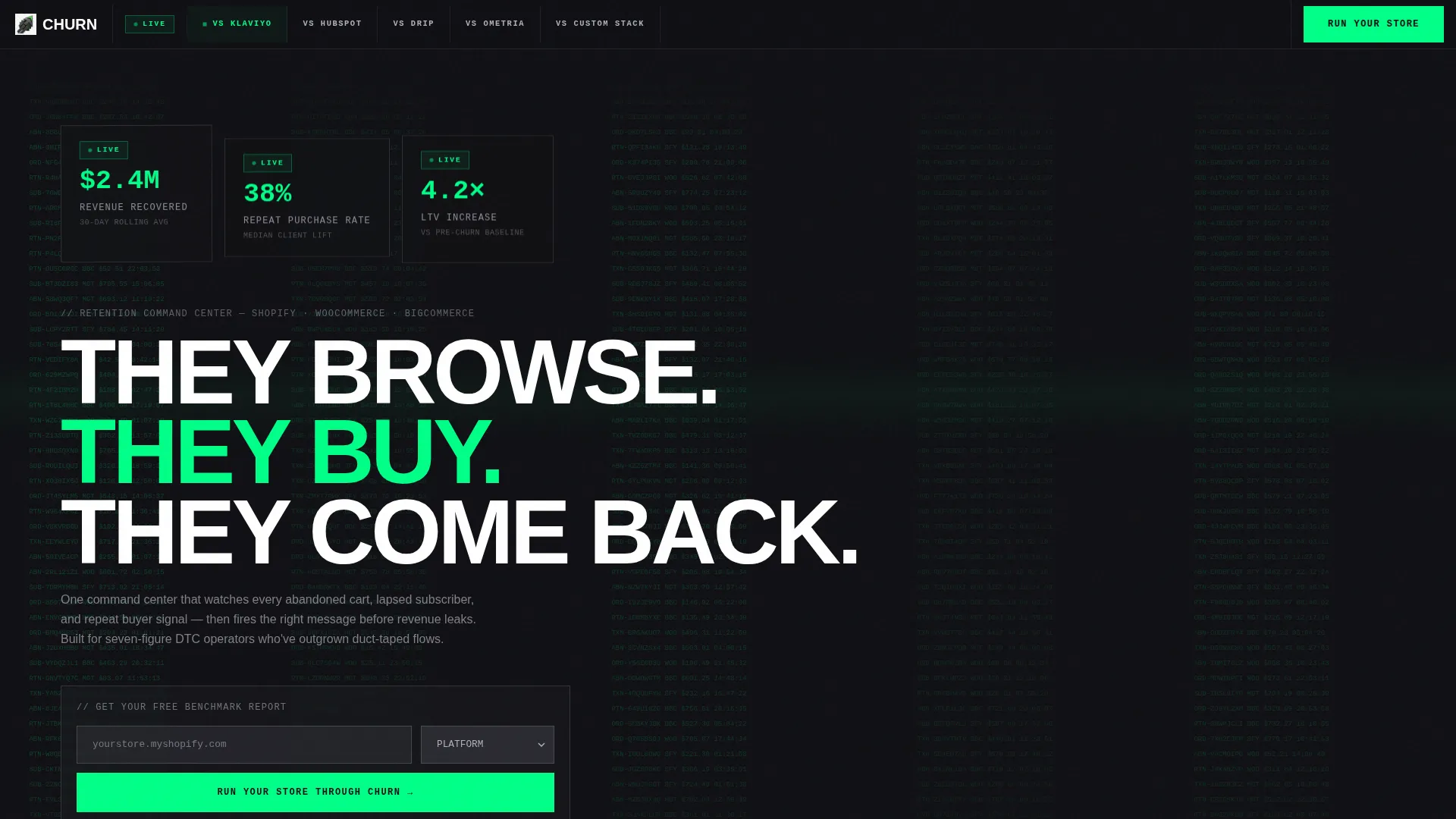
Churn is a single-page hub and spoke landing page template for an e-commerce CRM platform. It opens with three Dark Glass Panels displaying real-time retention stats, then moves through five competitor comparison spokes anchored at the top. Every section leads with a hard number before any explanation. The template is designed to win visitors through evidence, not narrative.
Who this template is for
This template is built for e-commerce software teams and retention-focused operators who need to prove platform superiority fast. It speaks directly to buyers who are already using a competing tool and are ready to evaluate a switch.
- Direct-to-consumer brand operators running seven-figure stores who have outgrown basic segmentation flows
- E-commerce directors at mid-market retailers managing retention across multiple data sources
- Agency founders overseeing retention strategy across a portfolio of client stores
What problem this template solves
Retention platforms often lose the sale because their landing pages rely on feature lists and testimonials. This template flips that. It puts the visitor inside a live command center and shows them the cost of staying on their current tool before they ever scroll to a form.
- Visitors comparing multiple CRM tools leave pages that do not give them side-by-side data quickly
- Conversion drops when the primary call to action only appears at the top or bottom of a long page
- Generic SaaS landing pages fail to communicate urgency or the real revenue gap retention tools close
What you get with this template
You get a fully structured hub and spoke landing page that anchors five comparison spokes in a pinned navigation row. Each section is self-contained and conversion-ready, so visitors can act at any point without scrolling back.
- A sticky anchor navigation bar linking to five competitor comparison sections
- A header block with three Dark Glass Panels showing oversized monospaced live-metric stats
- An in-page benchmark conversion form with a store URL input and platform dropdown
Feature list
This template includes purpose-built components designed specifically for the e-commerce CRM comparison use case.
Dark Glass Panel Header
Three translucent frosted-glass stat cards float over a pure black viewport. Each card displays a single real-time metric in oversized monospaced type. A scrolling waterfall of order data is visible behind the glass, creating the impression of a live data feed. Subtle parallax drift on mouse movement adds physical depth to the header.
Hub and Spoke Anchor Navigation
A pinned navigation row sits at the top of the page throughout scrolling. Five spoke labels link directly to their respective comparison sections. Visitors can jump to any competitor comparison instantly without losing context.
Animated Horizontal Bar Charts
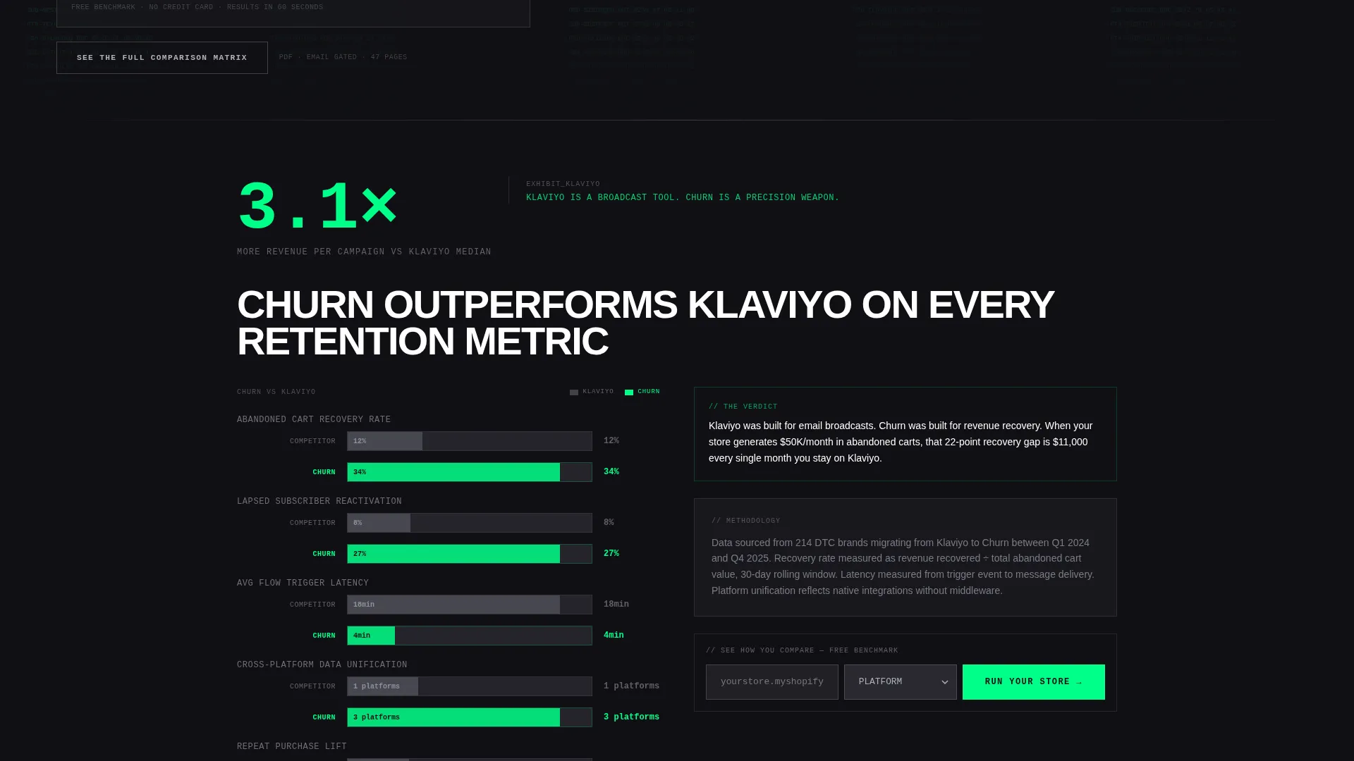
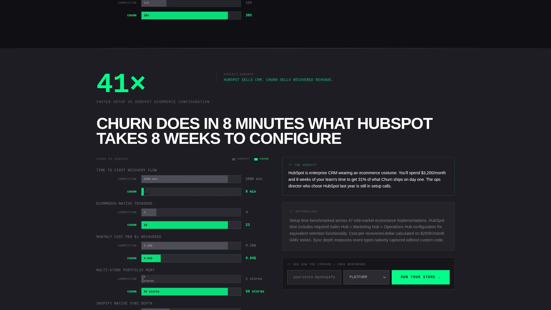
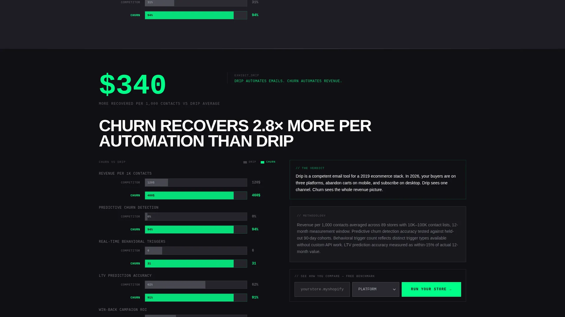
Each spoke section opens with a head-to-head metric comparison rendered as a horizontal bar chart. The competitor bar renders first, then the platform bar stretches further, filling in accent green like a loading bar. The half-second delay makes the win feel earned and visible.
In-Page Benchmark Conversion Form
The primary call to action sits inside every spoke section directly below the comparison chart. A single input field collects the visitor's store URL. A platform dropdown covers Shopify, WooCommerce, BigCommerce, Magento, and Other. Submitting generates a free benchmark report against median client performance data.
Gated PDF Secondary Conversion Path
A secondary call to action labeled "See the Full Comparison Matrix" gates a downloadable PDF behind email capture. This gives visitors who are not ready to submit their store URL a lower-friction next step while still entering the conversion funnel.
Stats-First Section Flow
Every scroll transition opens with a number before any explanatory copy. A single paragraph below each chart explains the methodology. The page builds its case like stacked evidence, each section delivering a harder data point than the last.
Page sections overview
| Section | Purpose |
|---|---|
| Dark Glass Header | Display three live-metric stat panels with parallax drift and scrolling order data |
| Anchor Nav Bar | Pin five competitor spoke links to the top of the page throughout scroll |
| versus Competitor Spoke | Lead each section with an animated bar chart comparison and in-section call to action form |
| Benchmark Report Form | Collect store URL and platform selection to generate a free retention benchmark |
| Gated PDF Capture | Gate the full comparison matrix PDF behind an email capture secondary call to action |
Design & branding system
The visual identity runs on a Monochrome Steel palette under a Bold Brutalist theme. Every design decision is functional and load-bearing. Nothing is decorative.
- Color system: forge black (#101014) and rolled steel (#3A3A42) alternate as section backgrounds, machined aluminum (#B0B0BC) defines borders and secondary text, and high-voltage accent green (#00FF88) is reserved exclusively for live metrics, active states, and primary call-to-action elements
- Typography is oversized and condensed uppercase for headlines, monospaced for all data and metrics, and grotesque sans-serif for body copy
- No rounded corners, no gradients, and borders are set at 1px solid aluminum throughout the layout
Mobile & speed optimization
The template is structured for fast rendering and clean layout shifts across screen sizes. Brutalist grids translate well to narrow viewports without requiring complex breakpoint logic.
- The anchor navigation collapses cleanly on smaller screens so spoke links remain accessible without consuming header space
- Monospaced metric panels and horizontal bar charts are sized proportionally, keeping data legible on mobile without requiring horizontal scrolling
How this template helps you convert
The entire page architecture is designed around one goal: getting the visitor to submit their store URL before they leave.
- Every spoke section embeds the primary call-to-action form directly below the comparison chart, so the visitor can act at the moment of maximum conviction without scrolling back to the top
- The benchmark report offer reframes the form submission as a value exchange, giving visitors a concrete deliverable in return for their store URL and platform details
- The secondary PDF gate captures visitors who are not yet ready to commit, turning passive browsers into leads through email capture
Other information about this template
This template is built on the intersection of Bold Brutalist design and the Stats-First Impact creative direction. It is suited to any e-commerce CRM or retention software product that competes directly against established tools in the market.
- The template style is Hub and Spoke with Anchor Navigation, making it straightforward to adapt spoke sections for different competitor matchups
- The Monochrome Steel color system with a single accent green keeps the visual focus on data and metrics rather than brand decoration
- The Dark Glass Panels header concept is a signature component of this template and can be repurposed with different live-metric stats to match the specific platform being marketed
- This template is compatible with the comparison and versus landing page conversion direction, making it well suited to products launching against Klaviyo, HubSpot, Drip, Ometria, or a custom retention stack
Theme
Bold Brutalist
Creative direction
Stats-First Impact
Color system
Monochrome Steel
Style
Hub & Spoke (Anchor Nav)
Direction
Comparison/Versus
Page Sections
Dark Glass Panel Header with Parallax
Pinned Hub and Spoke Anchor Nav
Animated Competitor Bar Charts
In-section Benchmark Report Call to Action
Gated PDF Comparison Matrix
Stats-first Scroll Architecture
Related questions
Can I change the competitor names in the spoke sections?
Does the benchmark form connect to a live data source out of the box?
Can the Dark Glass Panels display different metrics?
How many spoke sections does the template include?
Is this template suitable for a single-platform e-commerce CRM?



