Software & SaaS Professional Website Template
ChurnCommand is a scroll-reveal landing page template built for customer success platforms. It uses a dark glassmorphic design to guide visitors from the cost of churn to a live product demonstration. The layout drives freemium and trial sign-ups through progressive disclosure, animated data panels, and a two-step signup flow that mirrors the page's own reveal mechanic.
by Rocket studio
Quick summary
ChurnCommand is a single-page, scroll-reveal landing page template for customer success platforms. It opens with three frosted glass panels showing live-style metrics, then guides visitors through a problem-to-solution arc before surfacing a freemium call to action. The dark glassmorphic aesthetic makes the product itself the visual, with no hero images or stock photography required.
Who this template is for
This template is designed for teams and founders who need to communicate the value of a predictive customer success platform quickly and credibly. It speaks directly to decision-makers who manage large account portfolios and feel the financial weight of preventable churn.
- VP of Customer Success at B2B software-as-a-service companies managing 200 or more accounts
- Customer success operations managers replacing spreadsheet-based dashboards with a live command view
- Chief Revenue Officers who understand that retaining one enterprise contract can justify an entire platform investment
What problem this template solves
Customer success teams often struggle to communicate what their platform actually does before a prospect clicks away. Generic SaaS landing pages rely on hero images, vague benefit statements, and single-step signup forms that ask for too much too soon. This template solves that trust gap.
- Visitors leave before understanding the product because there is nothing concrete to experience above the fold
- A single-step signup form creates friction before the visitor has seen the platform in action
- Churn and revenue risk messaging often feels abstract without real signal data to anchor it
What you get with this template
You get a fully structured, scroll-reveal landing page that uses the product interface itself as the visual story. Every section is sequenced to build understanding and desire before asking for anything.
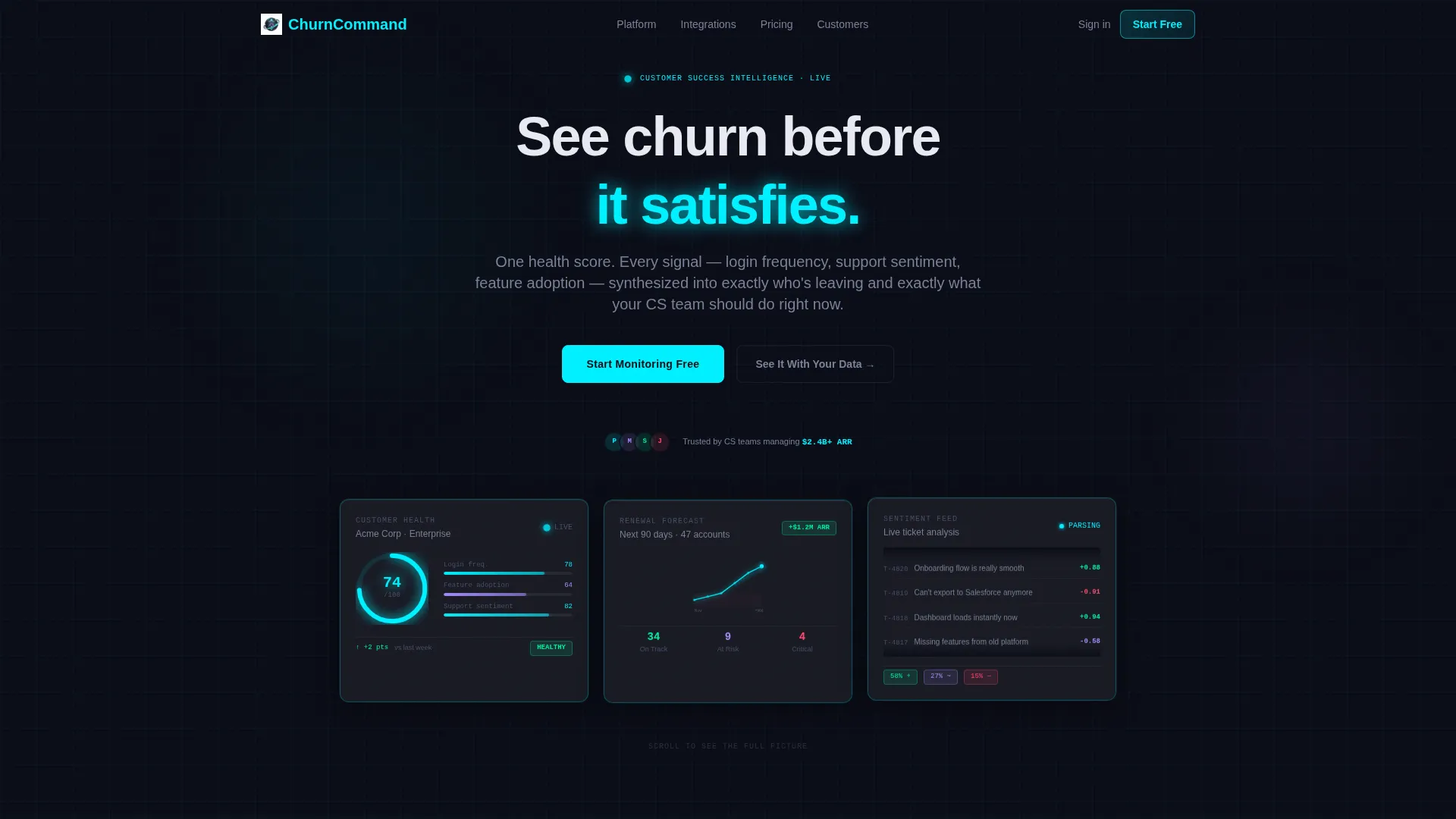
- Three animated frosted glass panels in the header showing a customer health score, a renewal probability arc, and a live support ticket sentiment feed
- A two-act problem-to-solution scroll arc separated by a pulsing electric teal threshold line
- A two-step progressive signup flow asking only for a work email first, then company name and account count on the second step
Feature list
This template delivers a focused set of design and structural capabilities drawn directly from the brief.
Live-Style Data Panel Header
Three translucent, frosted rectangles float against a near-black background in the header. Each panel displays a different real-time metric style: a health score ticking between 72 and 74, a renewal probability arc, and a sentiment analysis feed. Soft luminous borders in electric teal cast faint reflections beneath the panels, making the product the visual from the first second.
Problem-to-Solution Scroll Arc
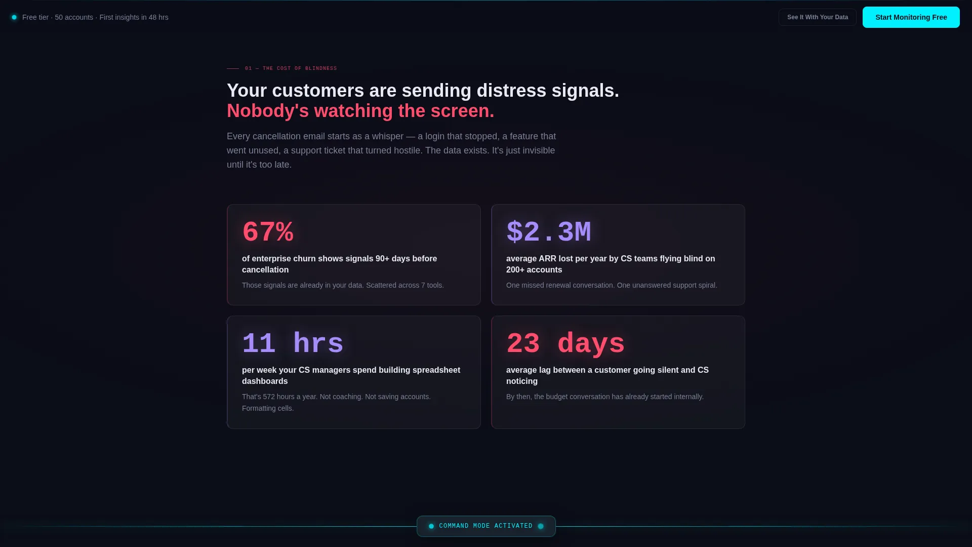
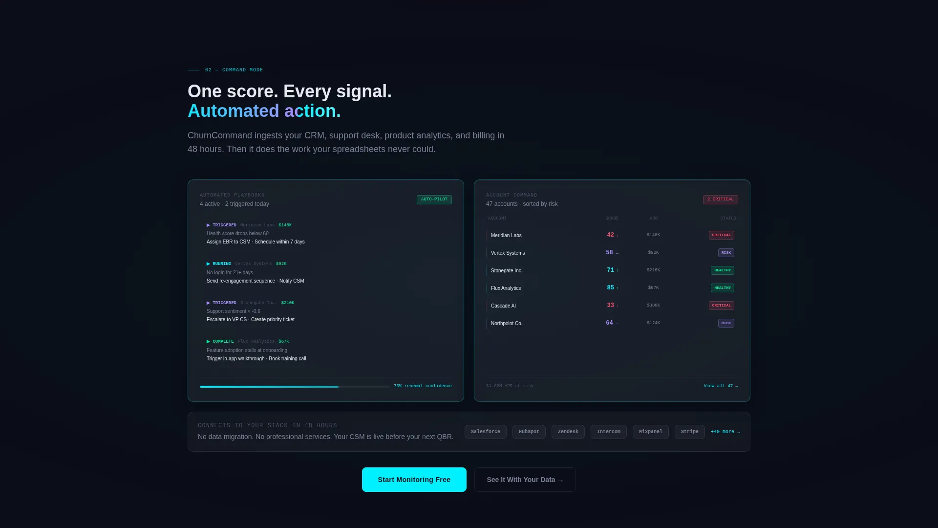
The page is structured in two distinct acts. The first act reveals churn statistics through frosted cards that materialize from blur into focus as the visitor scrolls, building tension around missed signals and silent cancellations. A pulsing horizontal teal threshold line marks the transition into the second act, where the same panel style now shows the platform working.
Progressive Disclosure Signup Flow
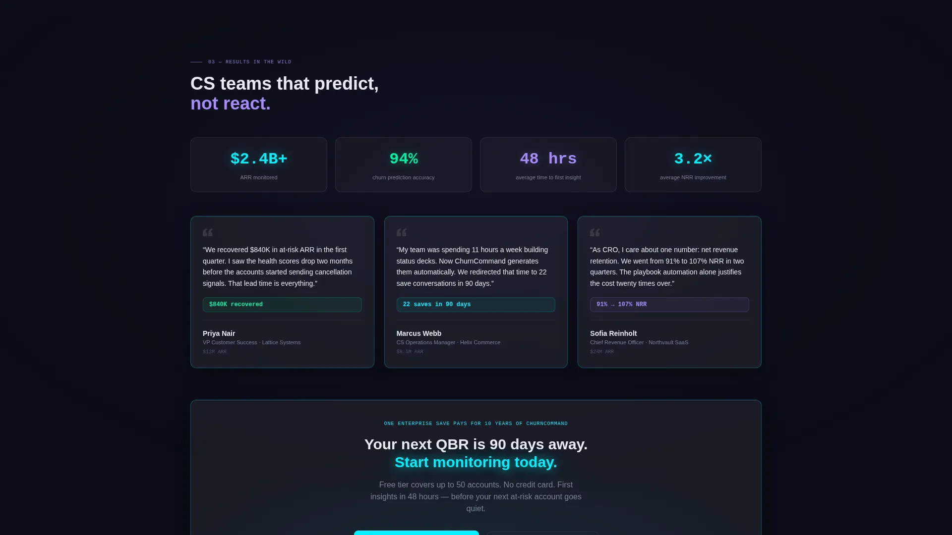
The primary call to action, labeled "Start Monitoring Free," appears first after the threshold moment. It uses a two-step form: step one asks only for a work email, and step two asks for company name and approximate account count. This mirrors the page's own reveal mechanic, reducing friction at the point of highest intent.
Persistent Bottom Bar call to action
After the visitor scrolls past the halfway point, a persistent bottom bar carrying the primary call to action stays in view. This keeps the conversion path accessible without interrupting the scroll experience. A secondary path labeled "See It With Your Data" is also present for enterprise prospects who want a personalized demo.
Full Dashboard Panorama Section
The final scroll section reveals a full dashboard panorama that feels earned rather than overwhelming. Panel complexity and interconnection increase progressively as the visitor scrolls deeper, so the complete product view arrives only after the visitor has already engaged with the interface through earlier glass panel sections.
Glassmorphic Visual Identity System
The entire template is built around a Data Command color system. Deep void black (#0B0D17) forms the base, frosted glass panels use white at 8% opacity with backdrop blur, electric teal (#00F0FF) marks live data and health indicators, and muted lavender (#A78BFA) signals at-risk states. Every glow is intentional and tied to a data meaning.
Page sections overview
| Section | Purpose |
|---|---|
| Header Glass Panels | Display live-style health score, renewal arc, and sentiment feed above the fold |
| Problem Act One | Reveal churn statistics through blur-to-focus card animations as the visitor scrolls |
| Teal Threshold Line | Mark the visual and narrative transition from problem to solution with a single pulse |
| Solution Act Two | Show the platform in action with health scores, playbooks, and renewal forecasts turning green |
| Progressive Signup Form | Capture work email on step one, then company name and account count on step two |
| Enterprise Demo Path | Offer a "See It With Your Data" secondary call to action for personalized demo requests |
| Full Dashboard Panorama | Close the page with a complete, interconnected dashboard view that feels earned |
| Persistent Bottom Bar | Keep the primary call to action visible after the visitor passes the halfway scroll point |
Design & branding system
The visual identity follows a Data Command theme built entirely around glassmorphism. The palette is designed to feel like looking through smoked glass at a submarine's sonar array: dark, translucent, layered, and precise.
- Base background in deep void black (#0B0D17), frosted glass panels in white at 8% opacity with backdrop blur, electric teal (#00F0FF) for all live data accents and health indicators
- Muted lavender (#A78BFA) used specifically as a secondary signal color to represent at-risk customer states
- No hero images and no stock photography; the product interface panels carry all visual weight throughout the page
Mobile & speed optimization
The scroll-reveal structure and glassmorphic layers are designed to translate cleanly across screen sizes. The progressive disclosure flow functions on smaller screens without losing the sequenced narrative impact.
- Panel-based layout adapts to narrower viewports while preserving the frosted glass depth and teal accent hierarchy
- Two-step signup form is touch-friendly and keeps each step minimal to reduce drop-off on mobile devices
- Persistent bottom bar call to action stays fixed and accessible on mobile, so the conversion path is never buried below the fold
How this template helps you convert
The page is structured to earn the click before asking for it. Every layout decision is sequenced to reduce objections and build intent progressively.
- The header panels let visitors experience the interface immediately, so the product feels real before any copy explains it.
- The problem arc builds emotional tension around missed signals and revenue loss, making the solution feel necessary rather than optional.
- The two-step signup form and persistent bottom bar keep conversion friction low at exactly the moment when visitor intent is highest.
Other information about this template
This template is categorized under Technology, within the Software and SaaS subcategory, and is specifically designed for the customer success platform niche. It is built as a scroll-reveal, single-page layout matched to a freemium and trial conversion goal. The intersection match score between the template style and niche context is 13, indicating a high-confidence fit between the design direction and the target use case. The template can support use cases involving churn reduction messaging, customer health score presentation, and renewal forecasting narratives. It is a strong fit for teams evaluating how to position a predictive customer success tool to both practitioner and executive buyers on a single page.
- Template style: Scroll Reveal (Progressive), single landing page structure
- Theme: Data Command with Glassmorphic color system
- Conversion direction: Freemium and trial sign-up with an enterprise demo secondary path
- Niche: Customer success platform targeting B2B software-as-a-service teams
Theme
Data Command
Creative direction
Problem→Solution Arc
Color system
Glassmorphic
Style
Scroll Reveal (Progressive)
Direction
Freemium/Trial
Page Sections
Live-style Data Panel Header
Two-act Problem-to-solution Arc
Progressive Disclosure Signup Flow
Persistent Bottom Bar Conversion Path
Full Dashboard Panorama Finale
Glassmorphic Data Command Identity
Related questions
Who is this landing page template designed for?
Does this template require custom illustrations or photography?
How does the two-step signup form work?
Can enterprise prospects request a demo through this template?
What makes this template different from a standard SaaS landing page?



