Beer Certification Landing Page Template
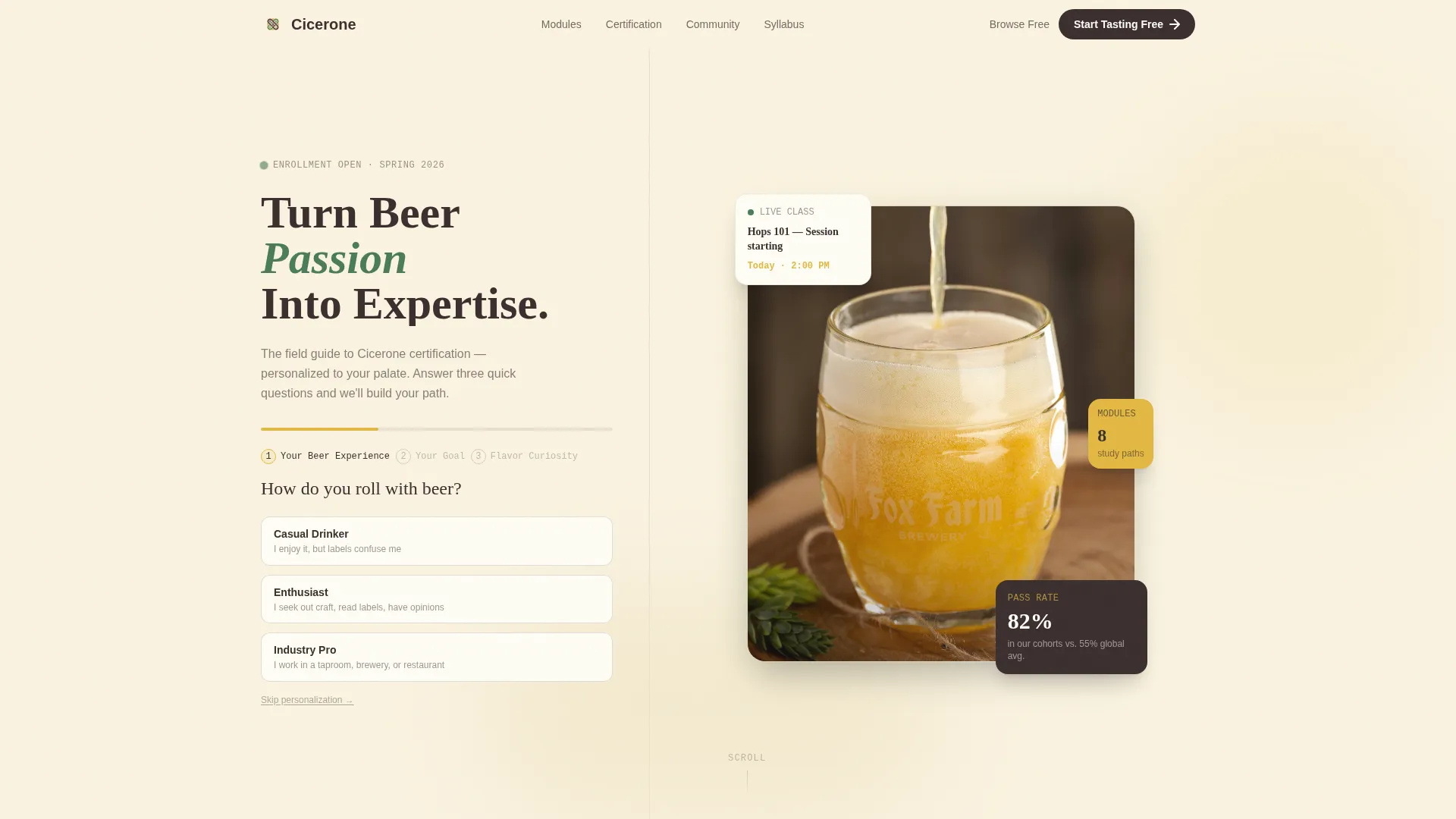
Cicerone is a playful geometric landing page template built for beer certification programs. A modular card grid arranges study modules, tasting resources, and certification tracks along a Problem-to-Solution scroll arc. An illustrated multi-step form personalizes the page in real time, and every card invites visitors to start tasting for free before committing to a full program.
by Rocket studio
Quick summary
Cicerone is a single-page landing page template designed for beer certification and flavor education programs. It combines a botanical color palette, illustrated card modules, and an adaptive multi-step form to guide casual drinkers, taproom staff, and hospitality professionals toward enrollment. The page earns trust by delivering real knowledge before asking for a sign-up.
Who this template is for
This template is built for educators and program operators who need to communicate structured beer knowledge in an engaging, credible way. It suits anyone selling or promoting a beer certification program to a mixed audience of beginners and professionals.
- Craft brewery taproom staff and managers seeking credentials to better serve customers
- Homebrewers who want to formalize their expertise with a recognized certification track
- Restaurant and hospitality managers building a smarter, more profitable beer program
What problem this template solves
Most education landing pages either overwhelm visitors with dense course catalogs or say too little to earn trust. Beer certification programs face an extra challenge: the subject feels niche, so the page must quickly prove that structured learning has real, practical value.
- Visitors arrive skeptical and leave before understanding what the program actually teaches
- Generic course pages fail to match the right resources to the right experience level
- There is no clear entry point for casual learners who are not yet ready to commit to a full exam track
What you get with this template
You get a fully designed, modular card-grid landing page that guides visitors from curiosity to enrollment through a structured scroll experience. Every section is purposeful, and the layout does the heavy lifting of explaining and selling the program.
- A multi-step header form that personalizes the card grid in real time based on experience level, goal, and flavor curiosity
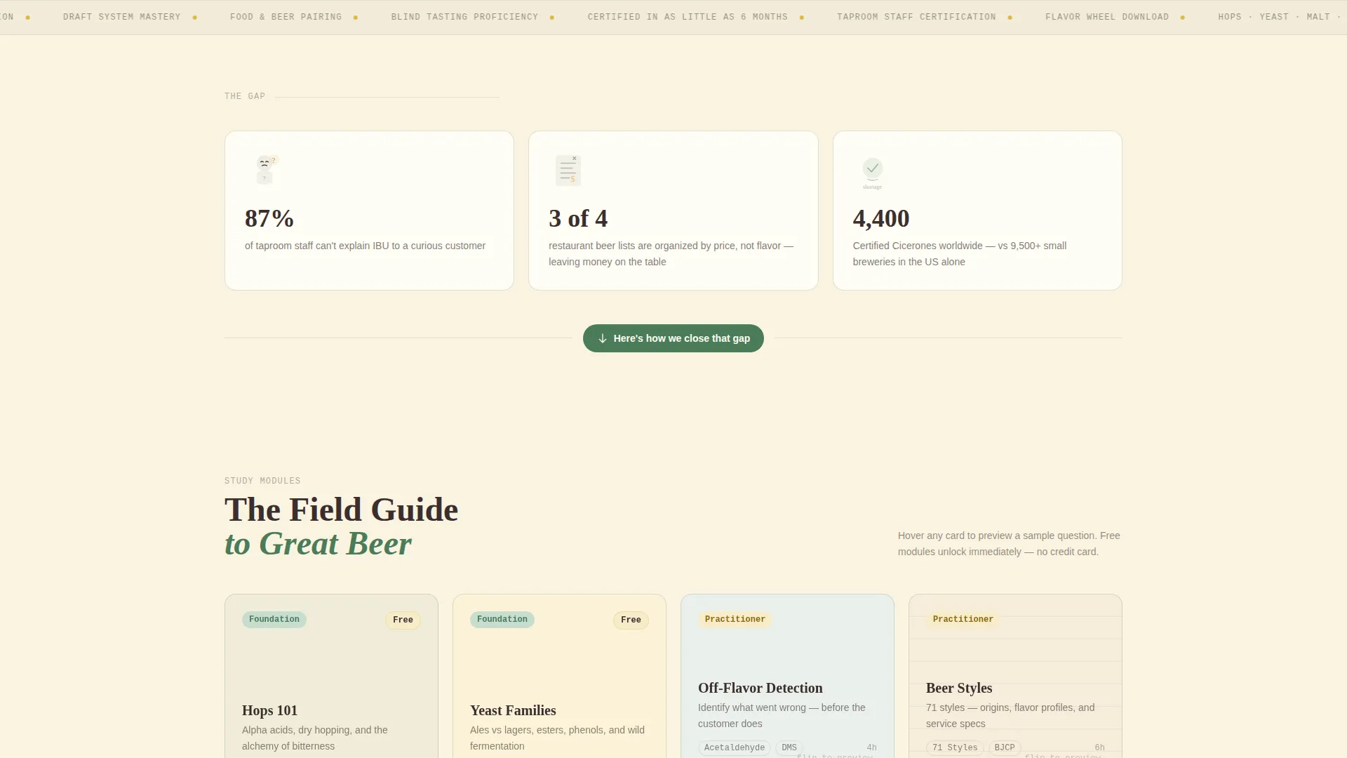
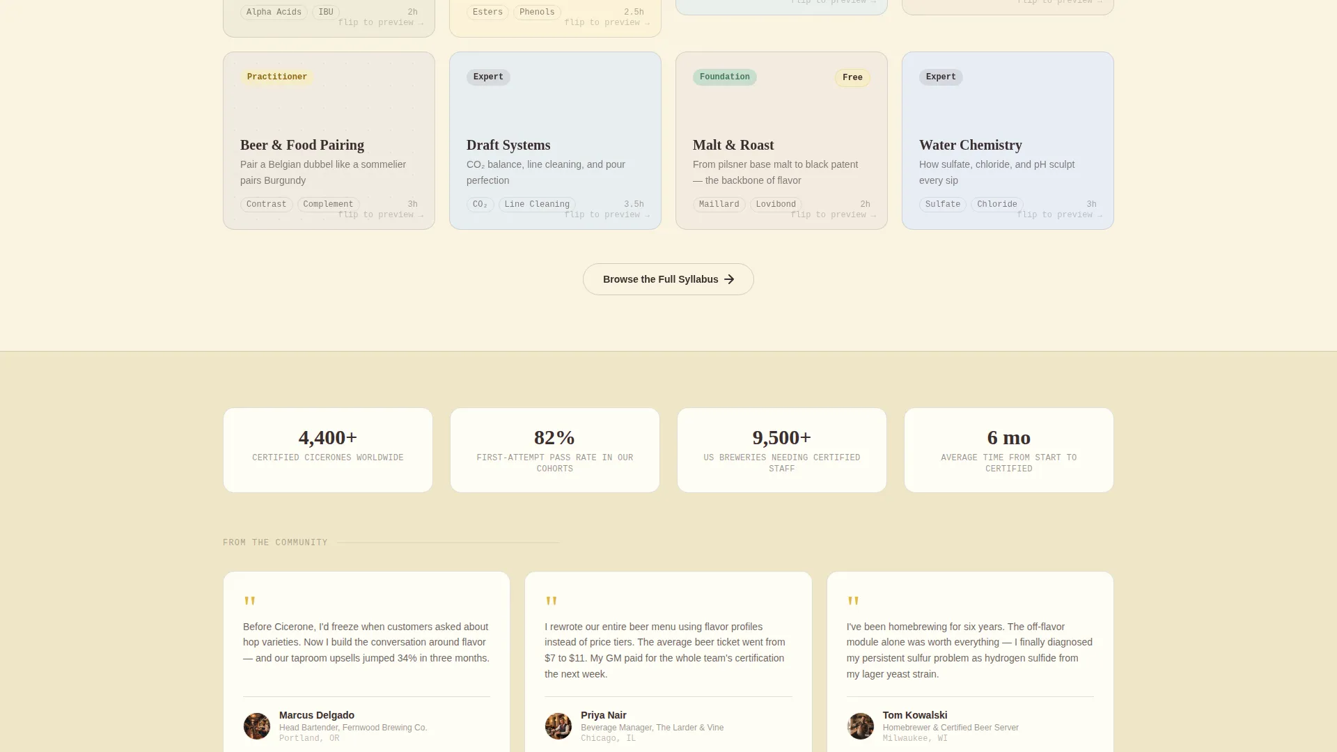
- Illustrated botanical study cards covering modules such as Hops 101, Yeast Families, and Off-Flavor Detection, each with difficulty rosettes, estimated hours, and a hover-reveal sample question
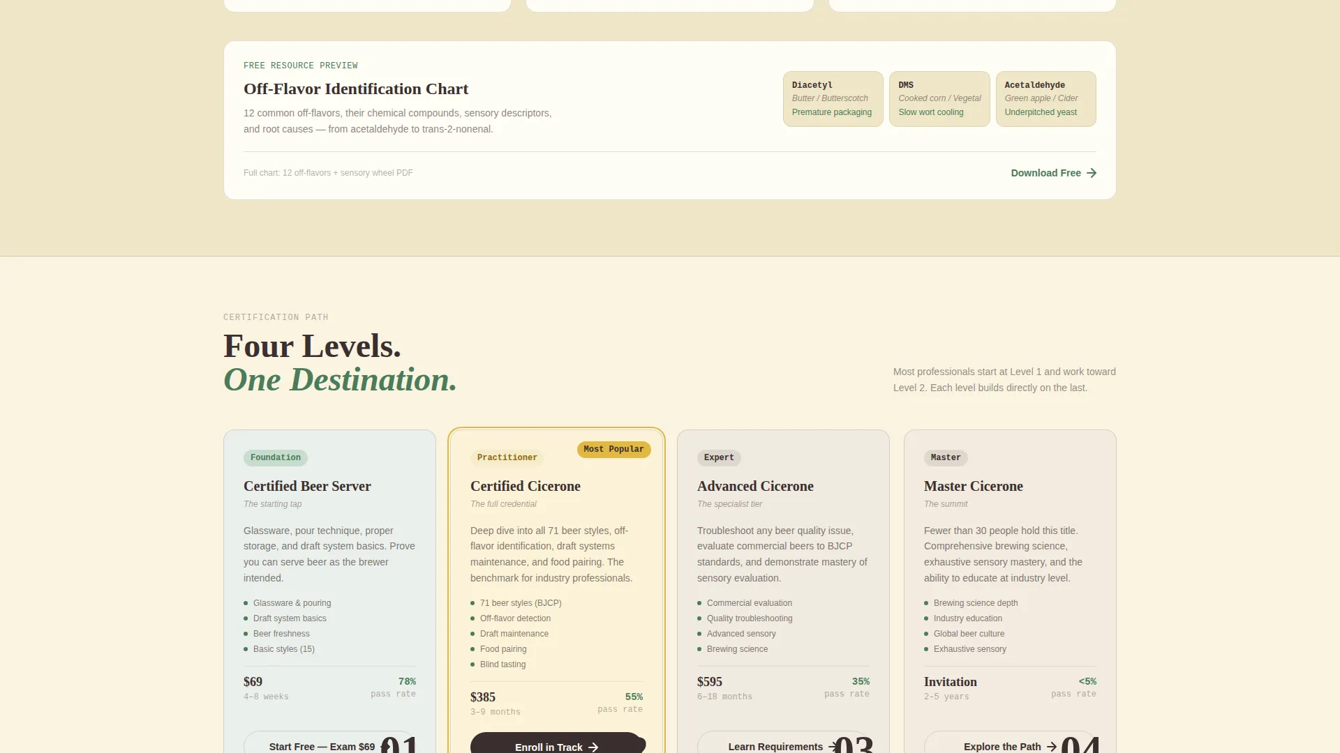
- A tiered content path that moves from free tasting worksheets through exam prep decks to full certification tracks, with a primary call to action on every card
Feature list
This template ships with a set of purpose-built components drawn directly from the brief. Each one works together to create a cohesive, conversion-friendly experience.
Adaptive Multi-Step Header Form
Three illustrated steps ask visitors about their beer experience, their learning goal, and their flavor curiosity. Selections animate the background card grid below, rearranging recommended resources in real time so the page feels personally curated before the visitor scrolls further.
Illustrated Botanical Study Cards
Each study module appears as a hand-illustrated card with a difficulty rosette, an estimated hour count, and a sample question that flips into view on hover. The card design uses the botanical color palette to signal depth and progress as visitors scroll down the page.
Problem-to-Solution Scroll Arc
The first card row surfaces the pain using geometric icons and sharp statistics. Cards then grow larger and richer as the grid shifts into solution territory, creating a visual and emotional escalation that mirrors the visitor's growing confidence.
Tiered Free-to-Paid Content Path
The primary call to action on every card reads "Start Tasting Free," unlocking a downloadable flavor wheel and a three-lesson starter module. A secondary "Browse the Full Syllabus" path lets visitors explore without gating, building trust before the ask.
Auto-Fill Email Capture
If a visitor completes the header form, their experience level pre-populates the email capture field on every card. This removes friction from the sign-up moment and makes the transition from browsing to enrolling feel seamless.
Visible Social Proof and Pass-Rate Preview
Cards surface real knowledge on their faces: sample tasting notes, a visible off-flavor identification chart, and a peek at exam pass rates. Visitors receive tangible value before they download anything, which makes the free resource feel like more of what they already trust.
Page sections overview
| Section | Purpose |
|---|---|
| Multi-Step Header Form | Captures experience level, goal, and flavor curiosity to personalize the card grid |
| Problem Card Row | Presents pain points using geometric icons and industry statistics |
| Solution Card Grid | Displays illustrated study modules with difficulty levels and hour estimates |
| Free Starter Module | Offers a flavor wheel download and three-lesson intro in exchange for an email |
| Full Syllabus Browse | Provides ungated access to the complete course catalog for trust-building |
| Off-Flavor Chart | Shows a visible identification reference to demonstrate real curriculum depth |
| Exam Prep Decks | Highlights advanced certification tracks with pass-rate previews |
| Progress Indicators | Uses gold hover states and difficulty rosettes to signal learning milestones |
Design & branding system
The visual identity follows a Playful Geometric theme rooted in a Botanical color system. The palette feels like a hand-drawn label on a farmhouse saison: earthy, warm, and alive with Saturday-afternoon energy.
- Core colors are deep loam brown (#3B2F2F), living hops green (#4A7C59), wildflower gold (#E2B842), and cream parchment (#FAF3E0) applied across card backgrounds, body text, badges, and hover states
- Cards sit on parchment backgrounds with thin loam border lines; green rosette badges mark difficulty levels; gold activates hover states and progress indicators like sunlight catching a glass rim
- Illustrated icons include a tap handle, hop cone, yeast cell, malt kernel, and water droplet, giving the layout a hand-crafted field-guide quality throughout
Mobile & speed optimization
The modular card grid is structured to reflow cleanly across screen sizes. Illustrated cards and geometric icons are built for clarity at smaller viewports without losing the botanical visual character.
- Cards stack vertically on mobile, preserving the Problem-to-Solution scroll arc and keeping difficulty rosettes and call-to-action buttons readable at thumb scale
- The multi-step header form collapses into a clean step-by-step sequence on smaller screens, so the personalization experience works as intended on any device
How this template helps you convert
Every design and copy decision in this template is aimed at reducing hesitation and moving visitors toward their first free lesson. The page earns the click rather than demanding it.
- The multi-step form creates a sense of personal relevance immediately, so visitors feel the curriculum was built for them before they read a single module description.
- Free knowledge on every card, including tasting notes, the off-flavor chart, and pass-rate data, proves the program's value upfront and makes the "Start Tasting Free" call to action feel like a natural next step rather than a cold ask.
Other information about this template
This template is designed specifically for the beer certification niche and the broader craft beverage education market. It is built as a single-page, section-led landing page with a card-grid layout, making it straightforward to adapt for related programs.
- The template supports use cases across craft brewery staff training, homebrewer credentialing, and restaurant team education
- The tiered content arc, from free tasting worksheets up to full certification tracks, mirrors the structure of programs like the Cicerone Certification Program, making the template a natural fit for that ecosystem
- The auto-fill form behavior and card rearrangement logic are designed as front-end interactions within the template's layout structure
- Color tokens and illustrated icon assets follow the botanical system and can be updated to match a specific program's branding without breaking the layout
Theme
Playful Geometric
Creative direction
Problem→Solution Arc
Color system
Botanical
Style
Card Grid (Modular)
Direction
Content/Resource
Page Sections
Adaptive Multi-step Header Form
Illustrated Botanical Study Cards
Problem-to-solution Scroll Arc
Tiered Free-to-paid Content Path
Auto-fill Email Capture
On-card Knowledge Previews
Related questions
Who is this landing page template designed for?
Can visitors explore the curriculum without signing up?
How does the multi-step form personalization work?
What free content does the template's starter offer showcase?
Can this template be adapted for other beverage or food certification programs?



