Civic - Powerful Government Landing Page Template
Civic is a government AI voice assistant landing page template built on a dark, data-rich dashboard aesthetic. It presents a single-page experience designed to showcase voice-driven access to public services, permit renewals, benefit checks, and municipal complaints, through animated feature panels, live-demo interactions, and a clear app download call to action.
by Rocket studio
Quick summary
Civic is a single-page landing page template for a government AI voice assistant. It combines a Dark Glass Panel header with a scrolling Feature Matrix and a live demo bar, guiding visitors from curiosity to app download. The design runs on a Midnight Blue color system with signal cyan accents, projecting calm authority throughout.
Who this template is for
This template suits teams and individuals building a public-facing product page for a government-focused AI voice tool. It works equally well for a product launch or a city technology pitch.
- City IT directors modernizing legacy government portals and constituent-facing services
- Product teams launching a voice assistant app for residents navigating public services
- Civic technology vendors pitching AI tools to municipal departments or government agencies
What problem this template solves
Government websites are fragmented, slow, and difficult for residents to use. Residents toggle between many browser tabs just to renew a permit or check a benefit status. This template gives that problem a compelling visual solution.
- It presents a complex AI product clearly, without overwhelming the visitor with jargon
- It moves the visitor from awareness to app download in a single scroll-driven flow
- It demonstrates the product's value before asking for any commitment from the user
What you get with this template
You get a complete, single-page landing page layout with every section pre-built and ready to customize. The structure flows logically from proof of capability to a final download action.
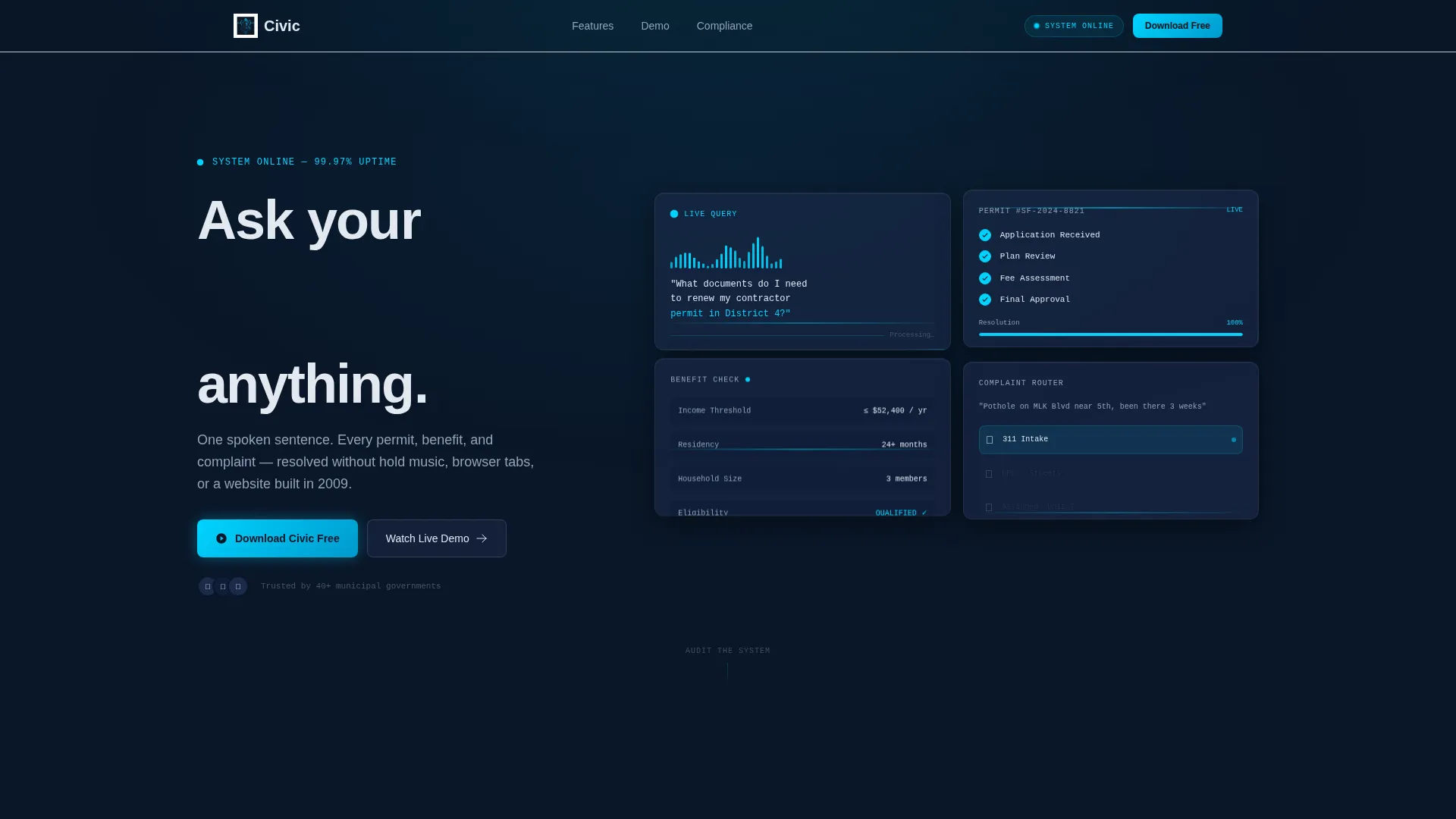
- A four-panel Dark Glass header displaying live interaction previews and a typed headline animation
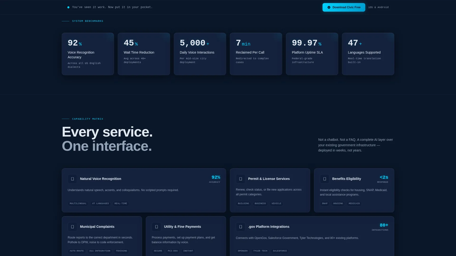
- A scrolling Feature Matrix with animated data counters, service category tiles, and compliance badge displays
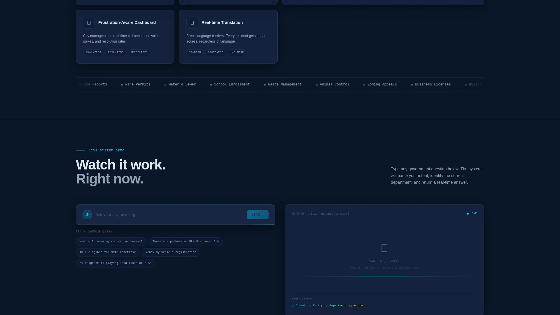
- A live demo bar where visitors type a government question and watch a simulated AI response populate in real time
- Triple-placed app download calls to action with frosted-glass App Store and Google Play badge styling
- A sticky bottom bar that activates once the visitor scrolls past the demo section
Feature list
This template is built around a tightly defined set of functional sections and visual behaviors. Each one is grounded in the brief and delivers a specific role in the user journey.
Animated Dark Glass Header
Four translucent panel cards float against the deep navy background. Each card shows a different live interaction state, a voice waveform, a permit status resolving, a benefit result populating, and a complaint being routed. A headline types itself out letter by letter: "Ask your city anything."
Scrolling Feature Matrix
The feature area is structured as a grid that powers up as the visitor scrolls. Each row unlocks a new capability, voice recognition metrics, service categories, platform compatibility, and compliance indicators. Data points animate in like live counters, keeping the experience dynamic without being distracting.
Live Demo Input Bar
A styled text input field lets visitors type a sample government question directly on the page. The template returns a simulated AI-parsed answer, giving visitors a hands-on preview of how the assistant handles real queries before they ever tap a download button.
Triple-Placed App Download calls to action
The primary call to action, "Download Civic Free," appears three times across the page. Paired App Store and Google Play badges are rendered in the frosted glass visual style and placed after the header, after the Feature Matrix, and inside a sticky bottom bar.
Sticky Bottom Download Bar
A persistent bottom bar activates once the visitor scrolls past the live demo section. It keeps the download action visible throughout the rest of the page without interrupting the content experience above it.
Compliance and Integration Display
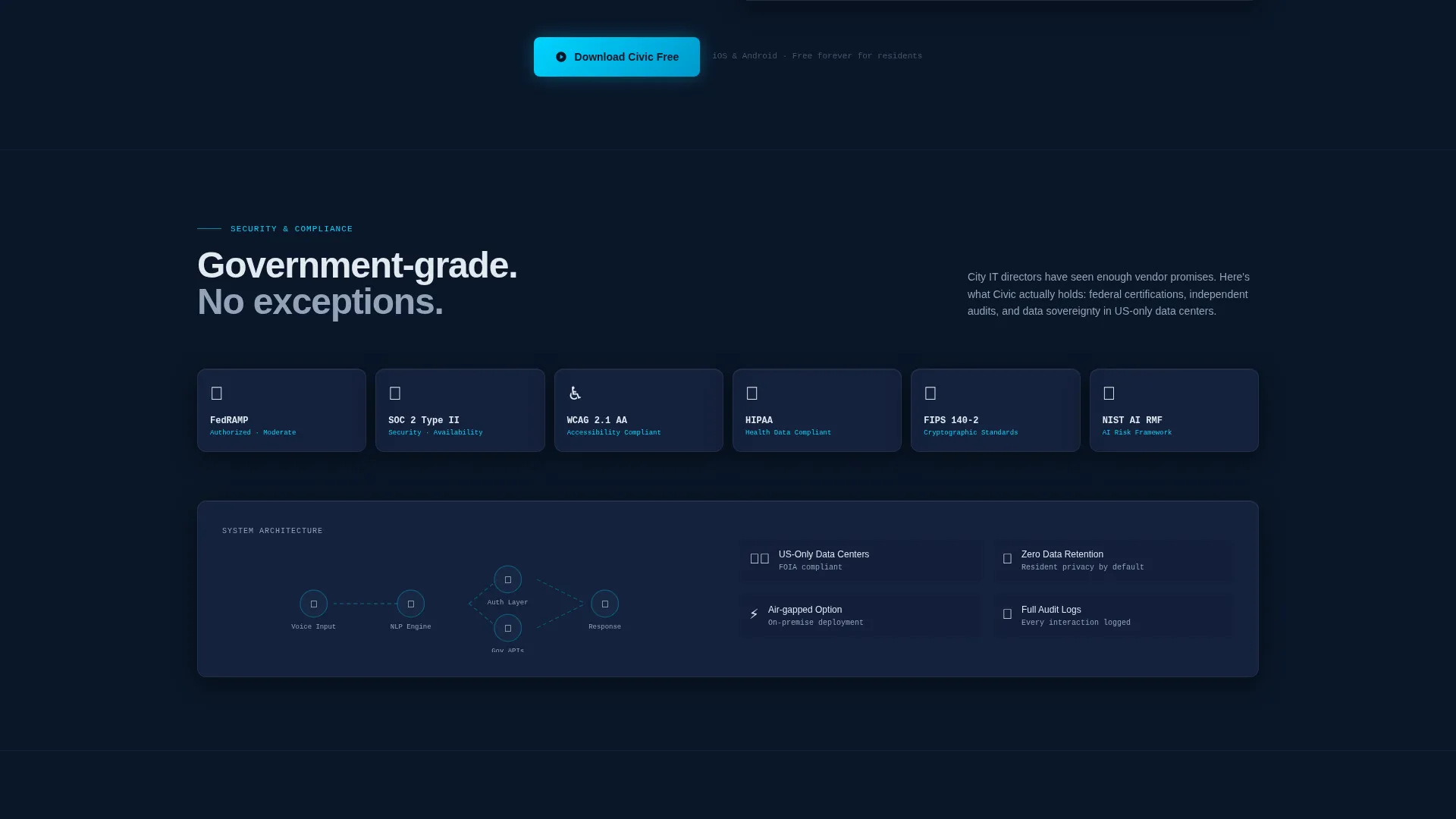
The Feature Matrix includes dedicated sections for security compliance badges, covering FedRAMP, SOC 2 Type II, and WCAG 2.1 AA accessibility standards, and a compatibility panel for existing dot-gov platform integrations.
Page sections overview
| Section | Purpose |
|---|---|
| Dark Glass Header | Showcases four live interaction panels and the typed headline |
| Voice Waveform Panel | Visualizes an active voice query mid-recognition |
| Permit Status Panel | Shows a permit resolution populating in real time |
| Benefit Eligibility Panel | Displays a benefit result filling field by field |
| Complaint Routing Panel | Demonstrates a complaint routing to the correct department |
| Feature Matrix Grid | Scrollable grid that animates capability data into view |
| Service Category Tiles | Interactive tiles displaying supported government service types |
| Compliance Badge Row | Displays FedRAMP, SOC 2, and WCAG 2.1 AA credential badges |
| Live Demo Bar | Text input field that simulates an AI-parsed government query |
| Primary Download call to action | First app download placement after the header section |
| Mid-Page Download call to action | Second app download placement after the Feature Matrix |
| Sticky Bottom Bar | Persistent download bar activated on scroll past the demo |
Design & branding system
The visual language is built on the Tech Glass theme using a Midnight Blue color system. Every surface is intentional, dark, precise, and functional.
- Background layers use deep terminal navy (#0A1628) with subtle frosted-glass blur effects between depth levels
- Card surfaces use translucent panel blue (#1B2A4A) with faint luminous borders, making panels appear to float above the background
- Typography is set in cold interface white (#E2E8F0) for high contrast readability against the dark surfaces
- Signal cyan (#00D4FF) appears selectively on active states, voice waveforms, animated counters, and interactive pulse indicators
Mobile & speed optimization
The template is structured with a responsive layout that adapts the multi-panel grid to narrower viewports without losing the dashboard-style visual hierarchy.
- The Dark Glass Panel header collapses gracefully so each interaction preview card remains readable on smaller screens
- The Feature Matrix grid reflows into a single-column stack on mobile, keeping animated data counters and service tiles accessible
- The sticky bottom download bar is designed to remain usable on mobile without obscuring key content
How this template helps you convert
Every structural decision in this template moves the visitor toward the app download while building confidence in the product.
- The live demo bar lets visitors interact with the assistant concept before committing, which reduces hesitation at the final call to action
- The compliance badge section directly addresses trust concerns that are common for any government-facing technology product
- Placing the app download call to action three times, including in a sticky bar, keeps the conversion path visible at every point of readiness
Other information about this template
This template is well-suited for government technology vendors, civic innovation teams, and public sector digital agencies. It can also support internal pitch decks adapted for city council or procurement presentations.
- The template style is classified as Dashboard and Data Grid, making it a strong fit for any product that needs to communicate data fluency and system reliability
- The lp direction is App Download, so all structural decisions prioritize moving visitors toward installing the mobile application
- The header concept follows the Dark Glass Panels approach, a visual treatment that positions the product as infrastructure-grade and always on
- The Tech Glass theme and Midnight Blue color system work together to reinforce a sense of precision and federal-grade trustworthiness without heavy imagery
Theme
Tech Glass
Creative direction
Feature Matrix
Color system
Midnight Blue
Style
Dashboard/Data Grid
Direction
App Download
Page Sections
Animated Dark Glass Panel Header
Scrolling Feature Matrix with Live Counters
Live Demo Input Bar
Triple-placed App Download Ctas
Compliance and Integration Badge Panel
Sticky Bottom Conversion Bar
Related questions
Who is this template designed for?
Does this template include a working AI voice assistant?
Can I change the color scheme or branding?
How many times does the app download call to action appear?
Is this template suitable for a government agency promoting a digital service?



