CivicPro — Smart Government Ops Landing Page Template
Dispatch is a bold brutalist government AI customer service landing page built to convert skeptical public-sector buyers. It showcases an AI platform that resolves citizen requests in under 90 seconds across permits, benefits, and billing. Scroll-reveal statistics, terminal-style demos, and a persistent call-to-action drive visitors toward a personalized agency demo.
by Rocket studio
Quick summary
Dispatch is a single-page scroll-reveal landing page for a government AI customer service platform. It uses a bold brutalist visual system to present hard numbers first, then context. Three interactive tab demos show the AI resolving real citizen requests. Every section builds toward one goal: getting public-sector decision-makers to book a personalized demo.
Who this template is for
This template is built for teams selling AI-powered citizen service platforms to government buyers. It speaks directly to the people holding the budget and the frustration.
- State Chief Information Officers managing high call center attrition and legacy infrastructure
- County administrators facing public pressure over long citizen wait times
- Federal program managers looking to modernize outdated interactive voice response systems
What problem this template solves
Government technology buyers are skeptical by nature. They need evidence before they engage, and they rarely trust polished marketing copy alone. This template solves the credibility gap by leading with real outcomes and letting the product demonstrate itself.
- Generic software landing pages fail to address the specific pain points of public-sector procurement teams
- Visitors leave before reaching the value proposition when pages bury stats under lengthy introductions
- Decision-makers need a clear, low-friction path to a next step without filling out a long form on the first visit
What you get with this template
You get a fully designed, scroll-reveal landing page that puts performance data front and center and guides government buyers from skepticism to a scheduled demo. Every visual and structural choice reinforces institutional credibility meeting modern speed.
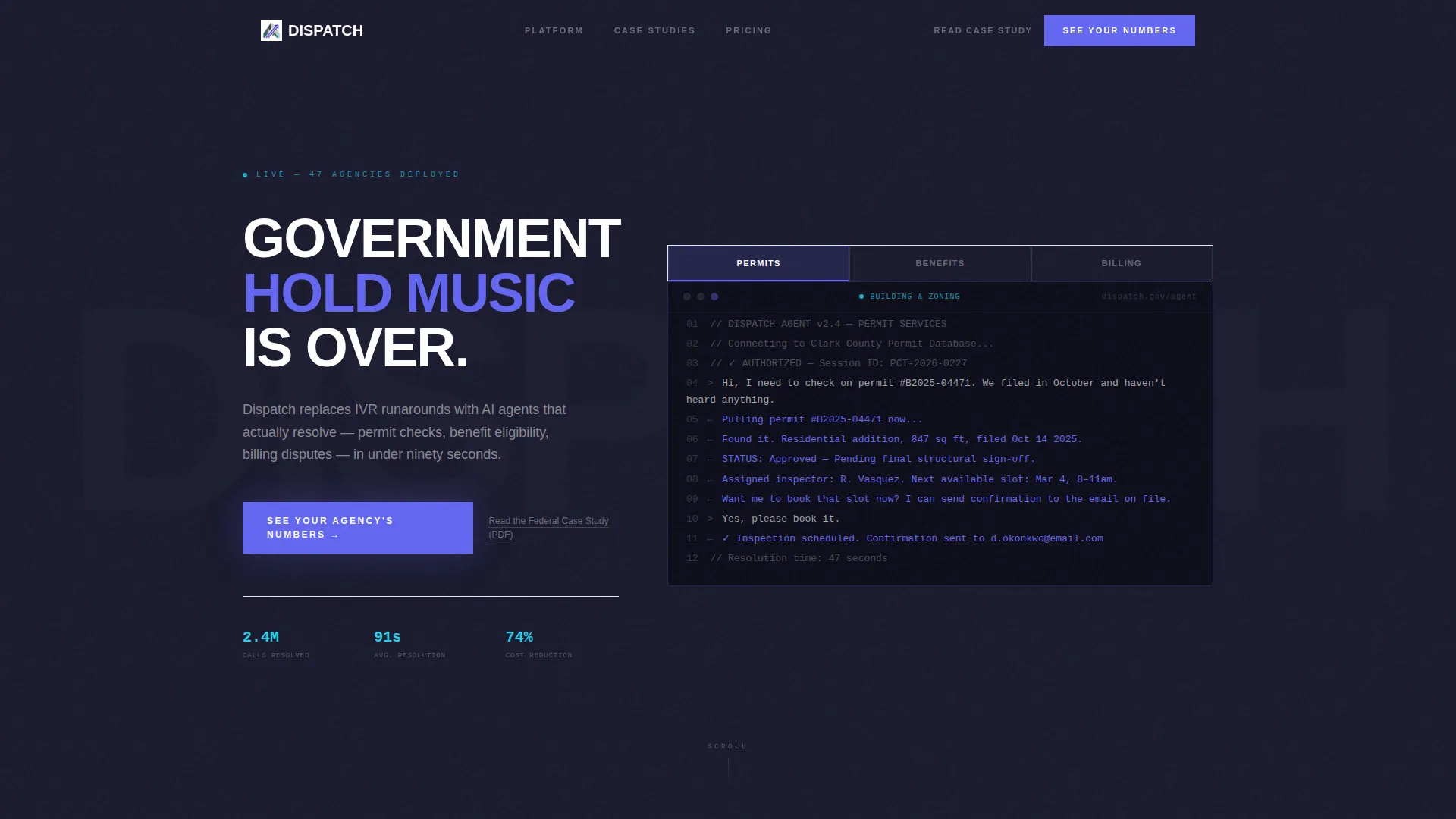
- A feature tab switcher header with three live-style AI conversation demos for permits, benefits, and billing
- Five progressive stat reveal sections that animate headline numbers before supporting context appears
- A persistent bottom call-to-action bar, a primary demo button, and a secondary gated PDF case study link
Feature list
This template includes a tightly scoped set of components designed specifically for high-stakes government technology sales.
Feature Tab Switcher Header
Three brutalist tabs labeled "PERMITS," "BENEFITS," and "BILLING" span the top of the viewport. Each tab click reveals a different terminal-style AI conversation in progress, showing the platform resolving a real citizen request in real time. No stock photography is used; the product interaction is the visual.
Scroll-Reveal Stat Detonations
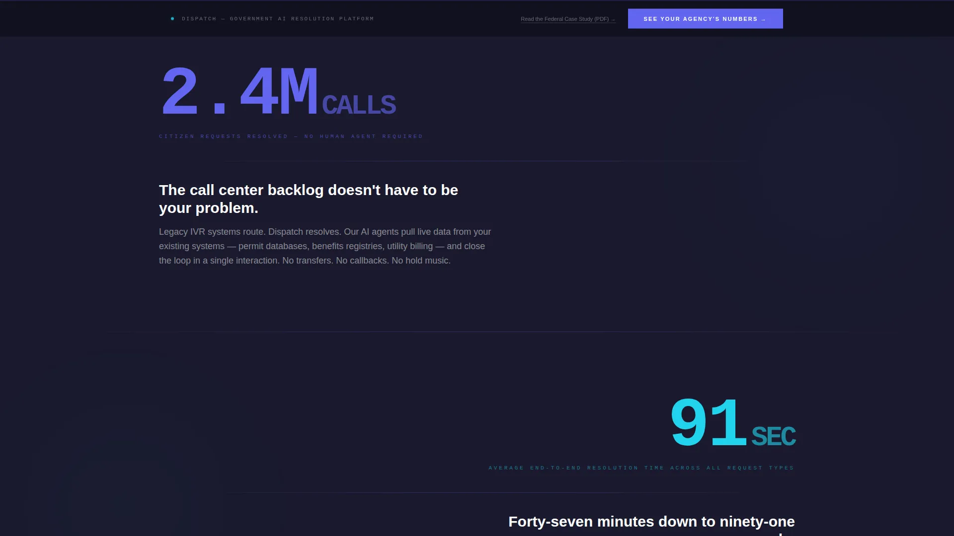
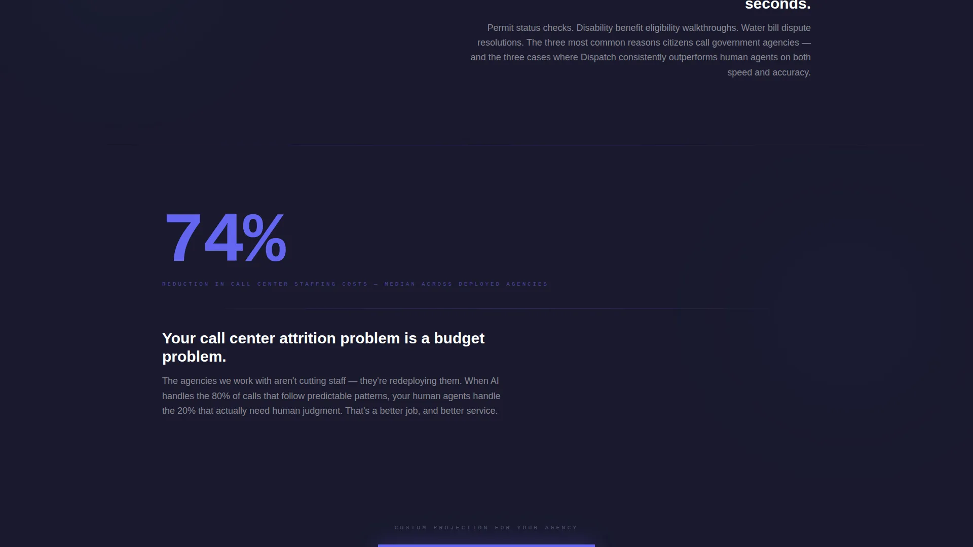
As visitors scroll, each new section opens with a single oversized statistic in 120-pixel monospaced type. The number lands and holds before supporting context fades in below it. This sequencing creates an evidentiary rhythm that is hard to dismiss.
Progressive Case Study Blocks
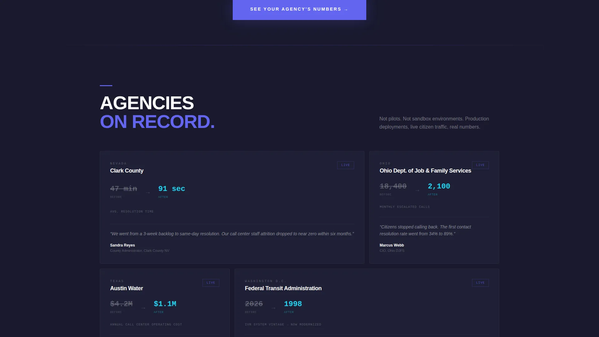
Between the stat reveals, short case study blocks appear one element at a time. Each block surfaces a county name, a before-and-after metric pair, and a single quote from a county administrator. The progressive reveal builds trust incrementally without overwhelming the reader.
Persistent Bottom Call-to-Action Bar
A sticky bar activates once the visitor scrolls past the third stat section. It carries the primary call-to-action label "See Your Agency's Numbers" and stays visible for the rest of the scroll journey. This keeps the conversion path accessible at every point on the page.
Dual Conversion Path Design
The page offers two routes forward. The primary path is a click-through to a personalized demo scheduling page with a custom projection of automation potential and budget recovery. The secondary path is a text link to a gated federal case study PDF that captures an email on the document gate.
Bold Brutalist Visual System
The entire layout uses deep charcoal slabs, electric indigo interactive states, raw off-white body text, and high-voltage cyan reserved for live metric counters. Typography is oversized grotesque sans-serif for headings and monospaced for all statistics. Generous negative space gives every number room to read like a monument.
Page sections overview
| Section | Purpose |
|---|---|
| Tab Switcher Header | Demonstrates AI resolving permit, benefit, and billing requests via terminal-style conversations |
| First Stat Reveal | Detonates "2.4 million calls resolved" in oversized type before context appears |
| Second Stat Reveal | Presents "91-second average resolution" with the same scroll-triggered sequence |
| Third Stat Reveal | Delivers "74% reduction in call center staffing costs" as a standalone impact statement |
| Case Study Blocks | Progressively reveals county-level before-and-after metrics and administrator quotes |
| Primary call to action Section | Introduces "See Your Agency's Numbers" button after the third stat reveal |
| Persistent Bottom Bar | Sticky call-to-action bar that activates on scroll and remains visible page-wide |
| Secondary Conversion Link | Text link to a gated federal case study PDF for procurement-minded visitors |
Design & branding system
The visual identity is built around a bold brutalist aesthetic: institutional weight combined with a sharp digital energy. Every color and type choice reinforces the feeling of a government structure brought to life from the inside.
- Color palette: deep slab charcoal (#1A1A2E) as the primary background, electric indigo (#6366F1) for highlights and interactive states, raw concrete off-white (#E5E5E5) for body text and card surfaces, and high-voltage cyan (#22D3EE) reserved exclusively for live metric counters
- Typography: oversized grotesque sans-serif for all body and heading copy, monospaced typefaces for every statistic, with generous negative space to let numbers breathe at monument scale
- No illustrations or stock photography anywhere on the page; all visual content is the product interface rendered as stark terminal-style interactions
Mobile & speed optimization
The scroll-reveal sequencing and large-format typography are structured to maintain visual impact at smaller viewport sizes. The layout is designed so each stat section still reads as a standalone moment even on a phone screen.
- Oversized monospaced statistics reflow cleanly so the number remains the dominant visual element on any screen width
- The persistent bottom call-to-action bar is sized for thumb-friendly interaction on mobile devices
- Progressive reveal sections are structured so content loads in a logical top-down order without depending on complex simultaneous animations
How this template helps you convert
The entire page is engineered as a click-through funnel. There is no form to fill out here; the only asks are a demo booking click and an optional email for the case study PDF.
- The stats-first scroll structure builds a compounding evidence wall that makes it progressively harder for a skeptical buyer to disengage before reaching the call-to-action
- The "See Your Agency's Numbers" framing personalizes the demo promise, making the click feel like the start of a custom analysis rather than a generic sales call
- The gated PDF case study gives procurement and legal stakeholders a lower-commitment first step while still capturing contact information for follow-up
Other information about this template
This template is designed for the government AI customer service niche and can support sales motions where longer procurement cycles require multiple stakeholder touchpoints.
- The dual conversion path (live demo plus gated PDF) accommodates both executive sponsors and procurement reviewers in the same visit
- The brutalist visual language deliberately avoids the polished, corporate look common in commercial software marketing, which can feel misaligned to public-sector audiences
- The template is built as a scroll-reveal progressive layout, meaning each section is designed to appear in a deliberate sequence as the visitor moves down the page
- Teams building pages with AI for government platforms will find the tab switcher header particularly useful for showing product range without requiring a full product tour page
- The click-through landing page structure means no backend form handling is needed on this page itself; the demo scheduling and email capture happen on destination pages
Theme
Bold Brutalist
Creative direction
Stats-First Impact
Color system
Electric Indigo
Style
Scroll Reveal (Progressive)
Direction
Click-Through
Page Sections
Feature Tab Switcher Header
Scroll-reveal Stat Detonations
Progressive Case Study Blocks
Persistent Bottom Call-to-action Bar
Dual Conversion Path Design
Bold Brutalist Visual System
Related questions
Who is the primary audience for this landing page template?
Does this template include a contact form?
Can I adapt the three tab categories to different service areas?
What makes the brutalist design style effective for a government audience?
Is this template suitable for federal agency sales as well as state and county?



