CivicX — Pro Government Platform Landing Page Template
Civic is a modular card-grid landing page template built for government website builders. It combines a dark, full-bleed header with an embedded compliance scanner, a browsable capability catalog, and clear calls to action. Municipal clerks, county IT directors, and state agency webmasters can present a professional government portal without writing a single line of code.
by Rocket studio
Quick summary
Civic is a single-page template designed for government website builder platforms. It opens with a dramatic dark header, loads an instant compliance scanner before the visitor scrolls, then reveals a modular card grid of government portal capabilities. The layout guides public-sector buyers from problem awareness to a guided demo request in one focused, skimmable flow.
Who this template is for
This template is built for the people who carry public-sector digital responsibility without large teams or big budgets. It speaks directly to the frustration of maintaining aging government sites and the urgency of accessibility deadlines.
- Municipal clerks and lone digital coordinators managing township websites on outdated tools
- County IT directors consolidating multiple department microsites into a single coherent portal
- State agency program managers facing mobile-accessibility compliance deadlines on grant portals
What problem this template solves
Many government websites are trapped in an older era of web publishing. Residents struggle to find permits, meeting minutes, or emergency alerts. Staff struggle to update pages without developer help. This template addresses that gap head-on.
- Visitors arrive without a clear sense of whether their current site is failing residents
- Procurement processes slow down even the simplest website improvements
- Accessibility requirements such as ADA compliance and WCAG certification feel overwhelming without a clear starting point
What you get with this template
The template delivers a complete, conversion-focused landing page layout that puts the compliance problem front and center. Every section is designed to build trust before asking for a commitment.
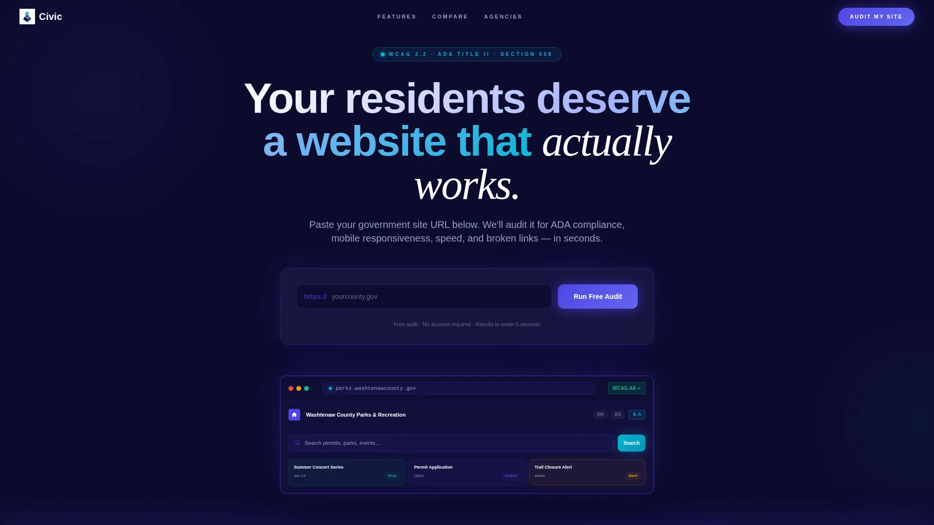
- A dark full-bleed header section with a glowing government site preview and a headline that speaks directly to resident needs
- An embedded compliance scanner that returns a live scorecard covering ADA grade, mobile responsiveness, page load speed, and broken-link count
- A modular capability card grid, a side-by-side comparison row, a testimonial grid, and layered calls to action including a sticky bottom bar
Feature list
This template includes purposefully structured components that guide a public-sector buyer from curiosity to action.
Embedded Compliance Scanner Tool
A live audit tool sits directly beneath the headline. Visitors paste their current government URL and receive a scorecard with four graded metrics. Each result card flips from gray to indigo or red, making the problem immediately visible and personal.
Modular Capability Card Grid
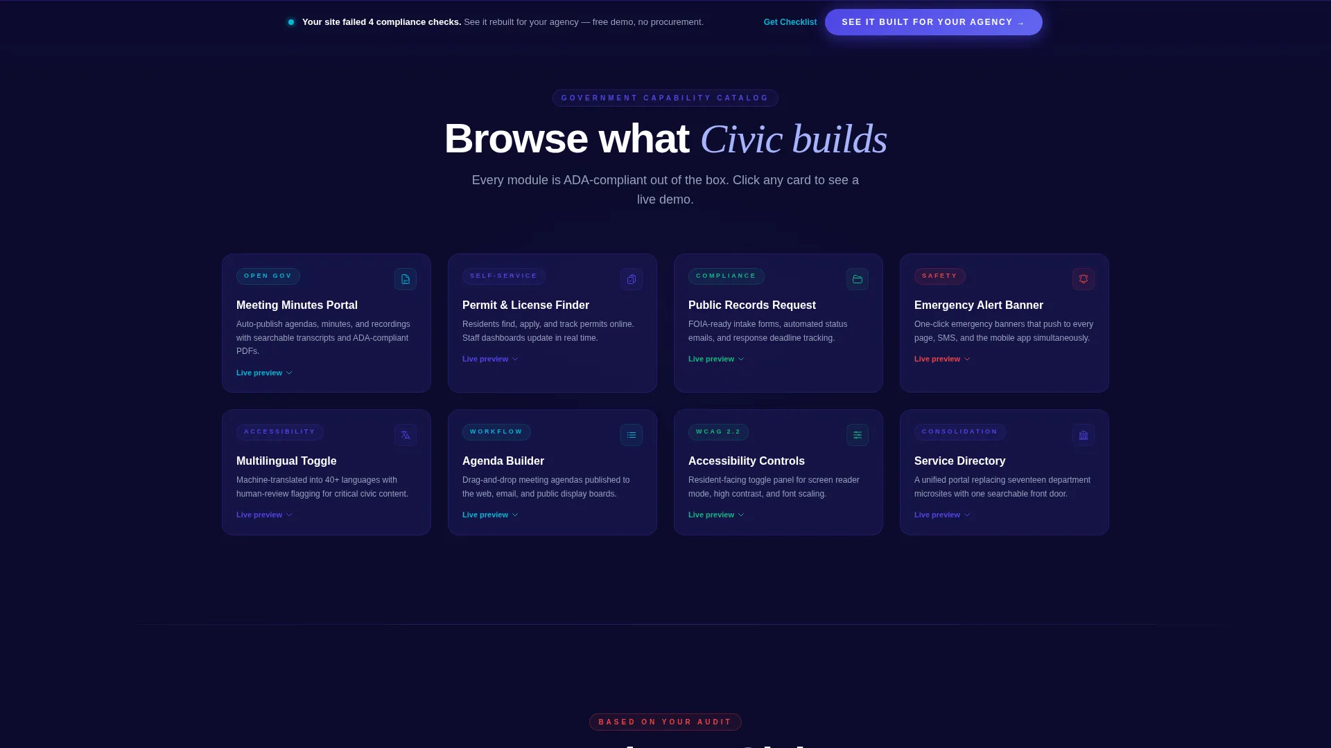
A browsable grid presents government portal features as individual cards. Each card represents a distinct capability such as a Meeting Minutes Portal, Permit and License Finder, Public Records Request form, Emergency Alert Banner, or Multilingual Toggle. Cards lift on hover with a teal border glow and open into a live micro-demo on click.
Audit-Driven Comparison Row
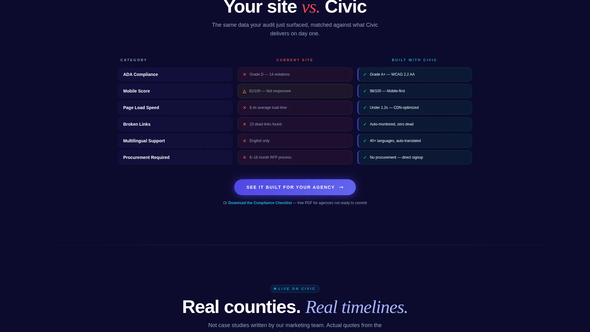
Midway through the page, a split comparison row places the visitor's own audit data beside a version built with the platform. The contrast is generated from their real results, making the upgrade case concrete rather than hypothetical.
Testimonial Grid with Real Agency Data
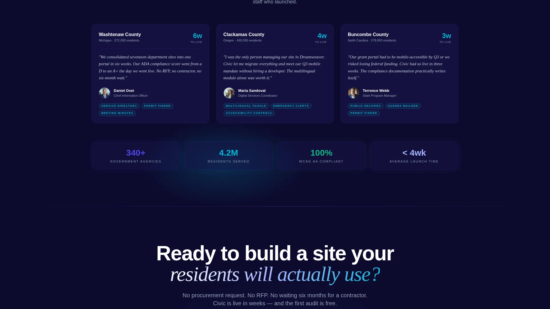
A grid of social-proof blocks features county names, resident population figures, and actual launch timelines. This format builds credibility without vague claims, giving hesitant buyers the specificity they need.
Layered Call-to-Action System
The primary call to action, "See It Built for Your Agency," first appears inside the audit results card once the scan completes. It then repeats as a sticky bottom bar that activates after 40 percent scroll depth. A secondary path, "Download the Compliance Checklist," captures email from visitors who are not yet ready to commit.
Sticky Bottom Bar with Scroll Trigger
A persistent call-to-action bar appears after the visitor has scrolled 40 percent of the page. It keeps the primary conversion option visible without interrupting the browsing experience during early sections.
Page sections overview
| Section | Purpose |
|---|---|
| Dark Header Scene | Establishes authority with a glowing government site preview and the main headline |
| Compliance Scanner Tool | Delivers an instant audit scorecard before the visitor scrolls further |
| Audit Results Cards | Displays ADA grade, mobile rating, load speed, and broken-link count as flipping cards |
| Capability Card Grid | Lets visitors browse portal features like a catalog with hover effects and live demos |
| Comparison Row | Contrasts the visitor's current site against a platform-built version using their own data |
| Testimonial Grid | Shows real county names, population figures, and launch timelines for credibility |
| Primary call to action Section | Prompts visitors to see a demo pre-loaded for their specific agency type |
| Email Capture Path | Offers a compliance checklist download for visitors not ready to request a demo |
| Sticky Bottom Bar | Keeps the primary call to action accessible after 40 percent scroll depth |
Design & branding system
The visual identity follows a Directory and Discovery theme built on an Electric Indigo color system. The palette is designed to feel authoritative and public-sector appropriate without being cold or corporate.
- Deep civic navy (#0D0B2E) as the primary background, electric indigo (#4F46E5) as the main interactive accent, and soft permit-gray (#E5E7EB) for card surfaces and secondary containers
- Sharp civic teal (#06B6D4) reserved specifically for live-state indicators, success confirmations, and progress bars within the compliance scanner
- A dark full-bleed header with subtle box-shadow halos around the government site preview, creating a glow effect that makes interactive elements feel alive on a dark canvas
Mobile & speed optimization
The template is structured for a responsive layout that serves government staff on any device, from a desktop workstation to a phone in the field.
- The card grid uses a modular layout that reflows cleanly from wide desktop columns to single-column mobile stacks
- The compliance scanner and result cards are designed to remain fully usable at mobile viewport widths, keeping the core hook intact on smaller screens
How this template helps you convert
The conversion strategy is built on proving the problem with the visitor's own data before presenting any solution.
- The compliance scanner creates a personal, data-driven moment of urgency before any product claim is made, making the primary call to action feel earned rather than interrupting.
- The sticky bottom bar and the audit-results card placement ensure the "See It Built for Your Agency" button is available at the exact moment a visitor reaches their highest intent, without requiring them to scroll back to the top.
Other information about this template
This template is part of a broader set of government software and SaaS landing page resources. A few additional details are worth noting for teams evaluating this layout.
- The template style is Card Grid (Modular), making it straightforward to add, remove, or reorder capability cards as a product's feature set evolves
- The creative direction is Calculator and Tool First, meaning the interactive compliance scanner is the central hook, not a secondary feature
- The header concept is Dark Full-Bleed with Glow, a deliberate departure from the stock-photography style common in civic technology marketing
- The landing page direction is Click-Through, guiding visitors toward a pre-loaded guided demo environment matched to their specific agency type
- No photography of generic citizens is included; the visual focus stays on the interface itself, which suits a professional government software audience
Theme
Directory & Discovery
Creative direction
Calculator/Tool First
Color system
Electric Indigo
Style
Card Grid (Modular)
Direction
Click-Through
Page Sections
Embedded Compliance Scanner
Modular Capability Card Grid
Audit-driven Comparison Row
Layered Call-to-action System
Testimonial Grid with Agency Data
Dark Full-bleed Glow Header
Related questions
Who is this template designed for?
What does the compliance scanner section do?
Can the capability cards be customized for different portal features?
How does the secondary email-capture path work?
Is this a single-page layout or a multi-page template?



