Consulting Firm Software Reviews & Social Proof Website Template
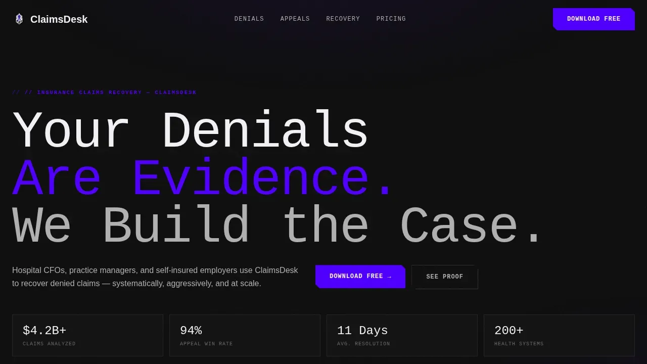
The Claims Brutalist Insurance Recovery Landing Page is a bold, data-forward one page website built for healthcare revenue cycle consultancies. It pairs a Feature Tab Switcher hero with a Problem-to-Solution bento grid, driving visitors toward an app download or enterprise portfolio review. The design uses void black, electric indigo, and clinical white to make denied-claim data impossible to ignore.
by Rocket studio
Quick summary
This insurance recovery landing page template is purpose-built for claims management consulting firms. It opens with a three-tab hero showing live denial data, then drives scroll through a problem-and-solution bento grid. The landing page closes on a sticky app download call to action and an enterprise contact path. Every design choice signals urgency, evidence, and expertise.
Who this template is for
This landing page is built for revenue cycle professionals who need their website to do serious work. It speaks directly to decision-makers who live inside payer rejection queues every day.
- Hospital CFOs and revenue cycle directors managing aging receivables
- Practice managers overwhelmed by payer rejections and denial backlogs
- Self-insured employers whose stop-loss disputes have stalled for months
What problem this template solves
Most insurance recovery landing pages look like they were built for general audiences. They bury the data, soften the urgency, and fail to convert high-stakes buyers. This template fixes that directly.
- Visitors leave before seeing proof that denied claims can be recovered
- Complex coverage disputes are hard to explain without a clear visual structure
- Enterprise prospects need a contact path that feels credible, not generic
What you get with this template
You get a complete, deployment-ready one page website with every section pre-structured for an insurance recovery landing use case. No placeholder filler, no guesswork about layout.
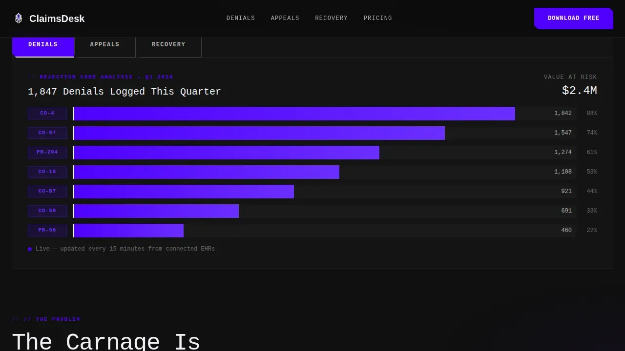
- A Feature Tab Switcher hero with three data panels: DENIALS, APPEALS, and RECOVERY
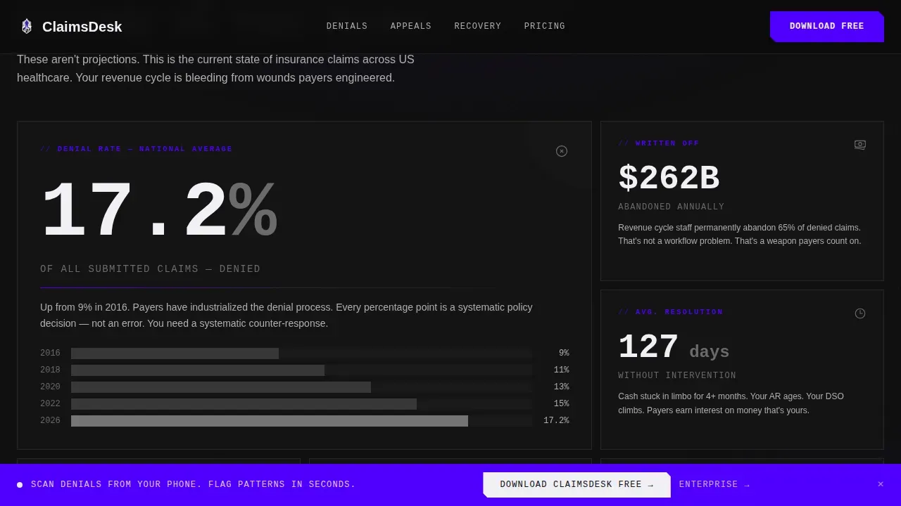
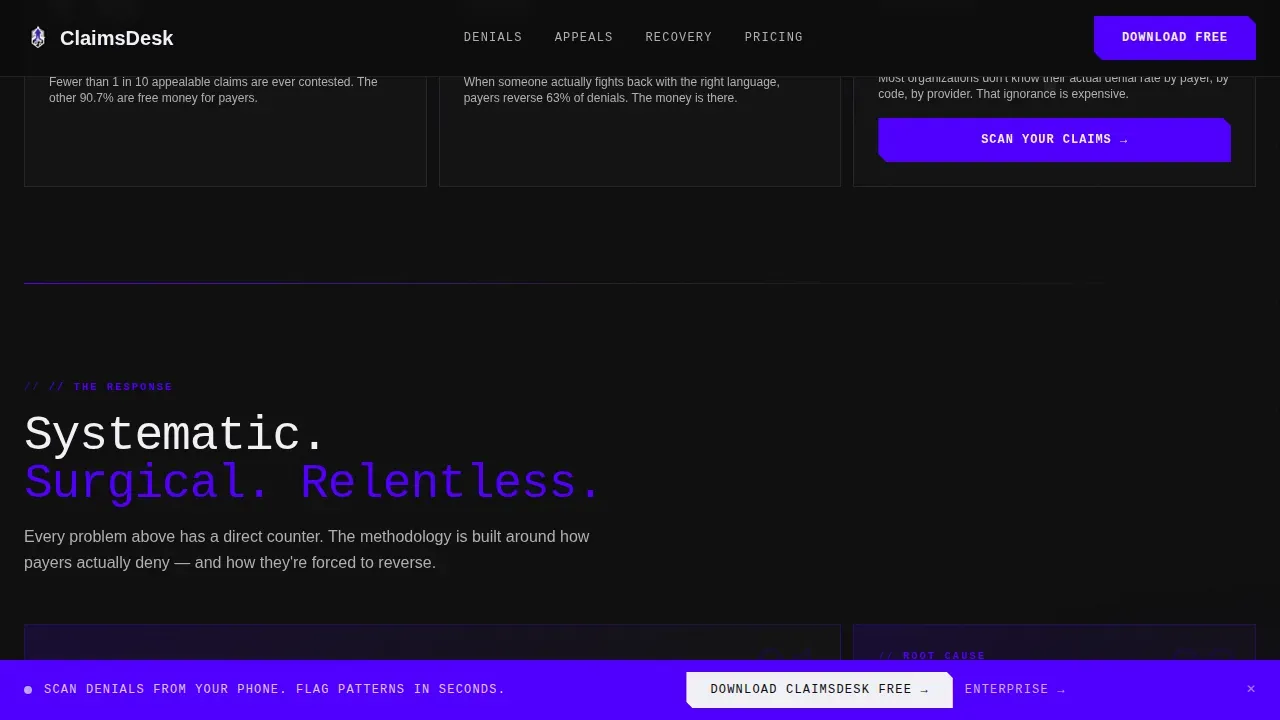
- A bento grid problem arc followed by indigo-led solution cards that mirror each problem
- A sticky app download bar plus a secondary enterprise portfolio review request path
Feature list
This landing page template ships with six distinct functional features drawn directly from the project brief.
Three-Tab Hero with Live Data Panels
The hero uses a Feature Tab Switcher with tabs labeled DENIALS, APPEALS, and RECOVERY. Each tab reveals a different data visualization: a waterfall chart of rejection codes, a claim appeal timeline, and a ticking recovery counter. Users see proof before they read a single line of copy.
Problem-to-Solution Bento Grid
The scroll begins with stark monochrome cards showing industry denial rates, unrecovered dollar values, and average resolution time without intervention. As users scroll, indigo bleeds into the design and solution cards appear, each one directly mirroring a problem card above. The visual call-and-response makes the firm's methodology feel inevitable.
Sticky App Download Bar
After the second scroll section, a sticky indigo bar locks to the viewport. It holds a single email input field, two app store badges, and a micro-copy line that reads "Scan denials from your phone. Flag patterns in seconds." The interface stays visible throughout the rest of the landing page.
Proof Section with Case Study Tiles
Before-and-after recovery rate tiles, grayscale client logos, and a single oversized testimonial quote from a revenue cycle director give the landing page its social proof layer. The testimonial uses brutalist slab typography and occupies its own full-width bento tile for maximum impact.
Enterprise Contact Path
A secondary call to action labeled "Request a Portfolio Review" sits alongside the primary download prompt. This gives enterprise prospects a clear contact route without competing with the app download flow. Both paths share the same indigo design language for visual consistency.
Dual-Font Data Typography
Manrope handles headlines and body copy. JetBrains Mono renders all data values, counter figures, and code-style labels. The combination gives the website a clinical, evidence-forward feeling that distinguishes it from standard insurance website templates.
Page sections overview
| Section | Purpose |
|---|---|
| Tab Switcher Hero | Show denial, appeal, and recovery data interactively |
| Problem Bento Grid | Present industry-scale denial stats in monochrome cards |
| Solution Method Grid | Mirror problem cards with firm methodology in indigo |
| Proof and Testimonials | Before/after tiles, logos, and director quote |
| App Download call to action | Drive app installs via sticky bar and email input |
| Enterprise Contact Block | Capture portfolio review requests from large prospects |
| Single-Row Footer | Linear footer with links and minimal branding |
Design & branding system
The design follows a Bold Brutalist theme rooted in industrial confidence. It rejects decorative polish in favor of raw clarity, making every element feel like evidence in a case file.
- Void Black (#0D0D0D) dominates the background; Clinical White (#F0F0F5) punches through for typography and card surfaces
- Electric Indigo (#4F00FF) commands every button, progress bar, notification badge, and interactive state across the landing page
- Concrete Gray (#B0B0B0) holds secondary text, dividers, and structural grid lines throughout the website
Mobile & speed optimization
The template is desktop-first by design, reflecting the CFO workstation use case. The landing page also delivers a responsive experience for mobile users arriving at the app download call to action.
- Sticky call to action bar and email input are fully responsive for smaller viewports
- Bento grid cards reflow cleanly into single-column layouts on mobile screens
How this template helps you convert
This landing page is engineered to build conviction before asking for any commitment. By the time users reach the call to action, they have already seen the scale of the problem.
- The tab-switching hero forces engagement immediately: users interact with denial data before reading any marketing copy, building credibility in the first ten seconds on the landing page.
- The problem-to-solution scroll arc shows the dollar cost of inaction, then positions the firm's services as the direct answer, making the app download feel like a practical decision rather than a sales ask.
Other information about this template
This template is a responsive vector product and includes assets useful for further custom design work. Below are practical details for buyers who want to check what they receive on purchase.
- The zip file delivered on purchase contains EPS and JPG files alongside the primary build assets, making adjustments and design iterations straightforward
- The insurance recovery landing page template includes a cartoon character illustration element in its asset set, which users can incorporate or swap during custom design adjustments
- This claims brutalist insurance recovery landing page template draws inspiration from mid-20th-century architectural brutalism, where raw concrete and simple forms replaced decorative facades
- Contrasting colors are central to the design system: indigo against void black creates the high-contrast interface that makes data stand out
- The design prioritizes simplicity and directness, using an exposed grid structure and bold typography so users are never confused about where to look or what to do next
- The web design approach here follows brutalist principles: visible grids, oversized type, thick borders, and a single-purpose focus that reduces cognitive load for busy professionals
- Users interested in making quick site-wide branding adjustments will find the vector source files in the zip file easy to work with, since every color and type choice maps to a clear design token
- Do not hesitate to check the full asset list before purchase; if you are interested in the enterprise contact path, the template supports that flow without additional configuration
- The product is well suited as a portfolio piece for agencies making a case for bold web design to healthcare clients
Theme
Bold Brutalist
Creative direction
Problem→Solution Arc
Color system
Electric Indigo
Style
Bento Grid
Direction
App Download
Page Sections
Feature Tab Switcher Hero
Problem-to-solution Bento Grid
Sticky App Download Bar
Proof Section with Case Study Tiles
Enterprise Portfolio Review Path
Dual-font Data Typography System
Related questions
What file formats are included in the download?
Does the template include both the app download and enterprise contact flows?
Is this template usable for a general insurance website or only claims consulting?
How does the brutalist design style affect the user experience?
Can I customize the color system and typography?



