Specialist Veterinary Software Comparison Website Template
The Claims Precision Veterinary landing page template is built for veterinary software platforms that automate insurance claim submission. It combines a scroll-reveal layout, dark cockpit visual identity, and a comparison-driven conversion flow. The result is a single-page experience that turns complex claim-processing capabilities into a confident, data-forward pitch your buyers will actually read.
by Rocket studio
Quick summary
This template is a scroll-reveal landing page designed for a veterinary claims management platform. It parses SOAP notes, matches procedure codes, and submits clean claims to 40-plus pet insurance carriers. The layout powers up section by section as the visitor scrolls, building trust through live-looking data displays, a sticky comparison table, and a savings estimator that makes the cost of inaction visible.
Who this template is for
This template is built for veterinary technology companies and software teams who need to communicate a complex, high-stakes product with clarity and authority. It speaks directly to the buyers making the platform decision, not just browsing for general software.
- Practice managers at multi-doctor clinics who deal with high denied-claim volumes daily
- Veterinary chief financial officers reconciling write-offs across hospital groups
- Solo practitioners currently submitting pet insurance claims through outdated manual processes
What problem this template solves
Manual claim submission in veterinary practices is slow, error-prone, and expensive. The gap between the exam room and reimbursement creates denied claims, lost revenue, and administrative overload. This template gives a veterinary claims platform a conversion page that matches the seriousness of that problem.
- No clear visual proof of capability leaves buyers unconvinced about switching away from manual workflows
- Comparison pages for complex software often overwhelm visitors with too much at once, losing them before the call to action
- Generic healthcare software templates fail to speak to the specific language and pain points of veterinary billing teams
What you get with this template
You get a fully structured, single-page conversion layout built around the veterinary claims management use case. Every section is purpose-built to move a skeptical buyer through awareness, proof, and decision.
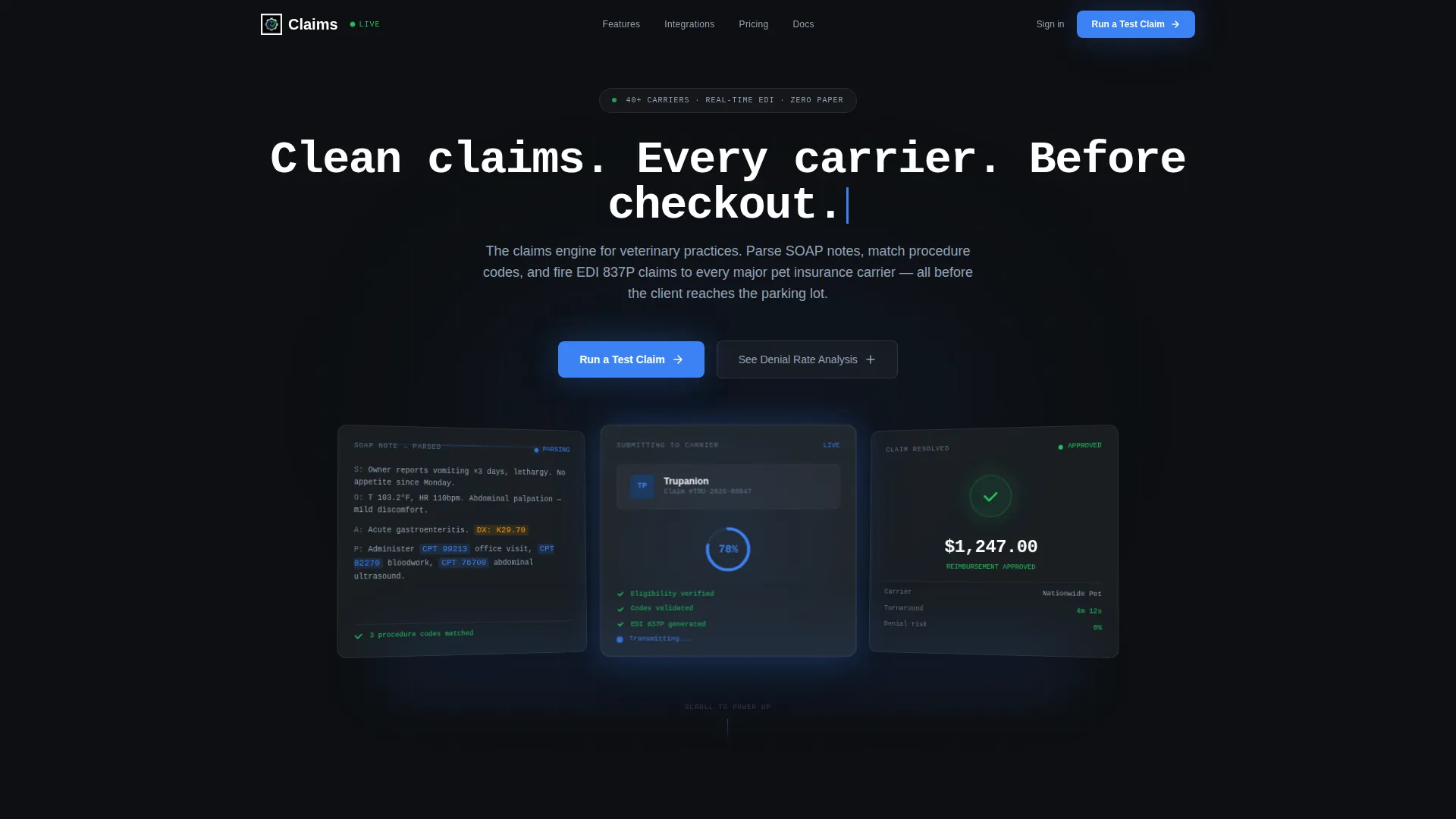
- A Dark Glass Panels header with three frosted-glass cards showing live-state claim examples at parsed, in-progress, and resolved stages
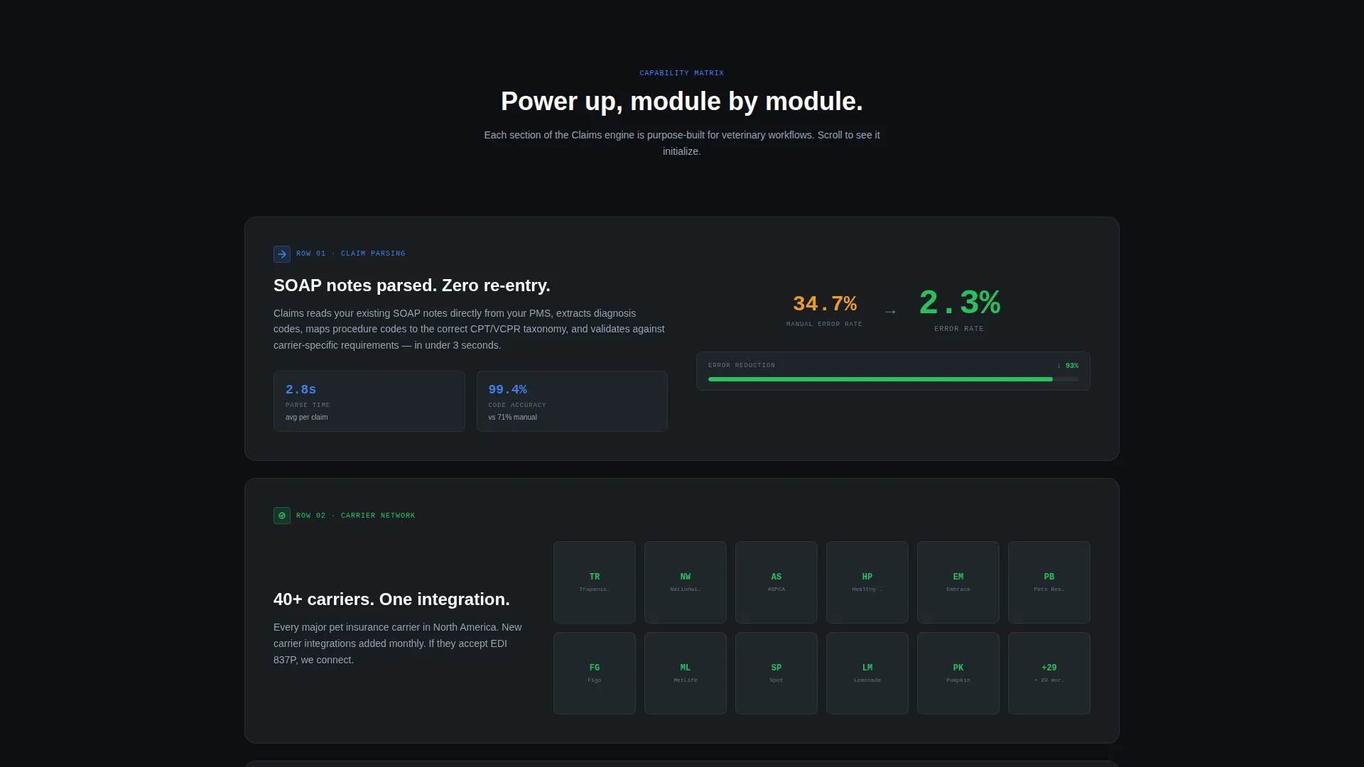
- A scroll-reveal Feature Matrix that introduces capability rows one at a time, each sliding in from a dark background as the visitor scrolls
- A sticky comparison table, a live savings estimator, a lead capture form, and a secondary gated content path all included in the layout
Feature list
This template includes a focused set of high-impact components drawn directly from the platform brief.
Dark Glass Panel Header
Three perspective-angled frosted-glass cards sit against a pure black background. Each panel displays a claim in a different state: one with a parsed SOAP note and highlighted procedure codes, one mid-submission with a carrier logo and a spinning progress ring, and one resolved with a green checkmark and a reimbursement amount of $1,247.00. The headline types in like a terminal output.
Scroll-Reveal Feature Matrix
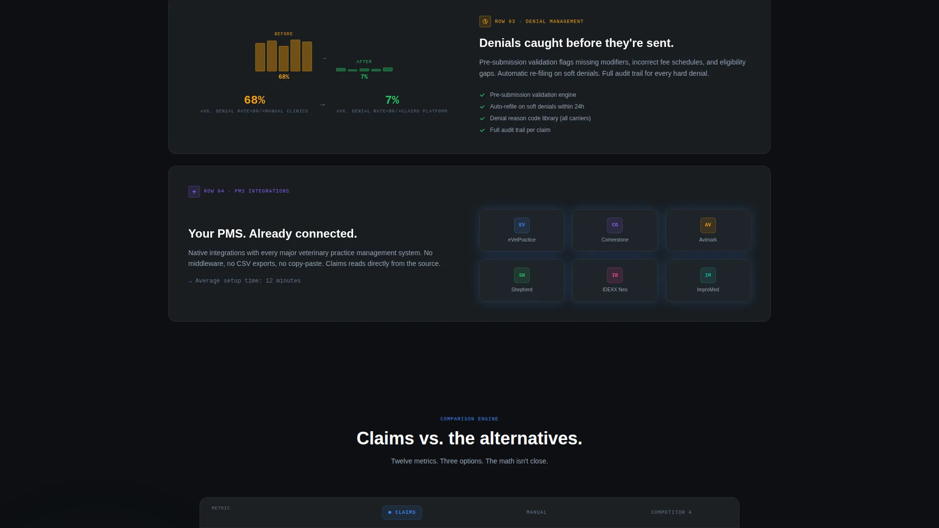
The Feature Matrix does not load all at once. Each capability row slides in from darkness as the visitor scrolls, covering claim parsing accuracy versus manual entry, a carrier coverage grid with logos that illuminate on scroll, a denial management before-and-after chart, and a practice management system integration row with named system logos lighting up on arrival.
Sticky Comparison Table
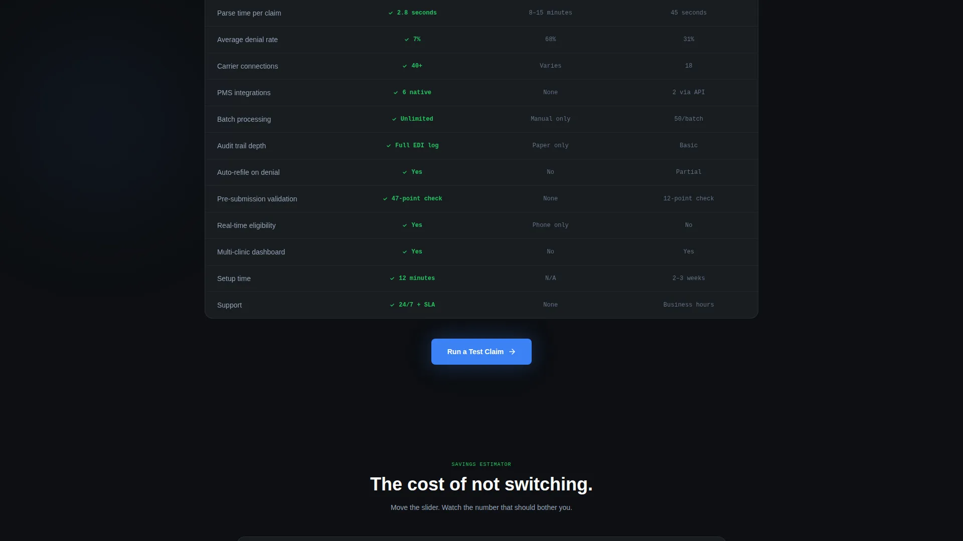
A "versus." table locks to the viewport mid-scroll and compares the platform against manual submission and one named competitor. The table covers twelve rows including parse time, denial rate, carrier count, practice management system integrations, batch processing, and audit trail depth. It stays visible while the visitor reads surrounding proof content.
Primary and Secondary call to action Paths
The primary call to action is "Run a Test Claim," positioned after the comparison table and repeated in a floating bottom bar. The lead form collects clinic name, practice management system selection from a dropdown, and average monthly claim volume via a slider from 50 to 2,000 plus. A secondary path offers a free denial rate analysis gated behind an email address only.
Live Savings Estimator
A savings estimator sits above the final call to action and calculates dollars recovered per month based on the volume slider input. It makes the financial cost of staying with the current workflow visible and personal to the visitor's own clinic size.
Page sections overview
| Section | Purpose |
|---|---|
| Dark Glass Header | Displays three live-state claim panels with a terminal-style headline |
| Feature Matrix Rows | Reveals platform capabilities one scroll-triggered row at a time |
| Carrier Coverage Grid | Illuminates insurance carrier logos as the visitor scrolls past |
| Denial Management Chart | Shows before-and-after rejection rate data in a visual comparison |
| PMS Integration Row | Lights up compatible practice management system logos on scroll |
| Sticky Versus Table | Compares platform to manual submission and a competitor across 12 rows |
| Primary call to action Block | Houses the "Run a Test Claim" form with clinic and volume inputs |
| Secondary Lead Gate | Offers a denial rate analysis download in exchange for an email |
| Savings Estimator | Calculates monthly recovered revenue from the visitor's volume input |
| Floating Bottom Bar | Keeps the primary call to action visible throughout the scroll journey |
Design & branding system
The visual identity follows a Dashboard Pro theme built on a Carbon Fiber color system. The palette is inspired by high-end audio equipment in a dark room: every element is backlit just enough to be readable, and nothing is decorative without purpose.
- Background layers stay within deep cockpit black (#0D0F12) to brushed graphite (#1E2328), with cards floating on subtle one-pixel borders of translucent white
- Instrument-cluster blue (#3B82F6) and status-green (#22C55E) appear only where data moves or decisions are made, keeping their signal value intact
- Cool matte silver (#94A3B8) is used for secondary text, and the ambient glow beneath the header panels makes the data itself feel like the light source
Mobile & speed optimization
The scroll-reveal layout is structured for progressively loaded sections, which keeps the initial viewport light and the experience focused. Each module activates only when the visitor reaches it.
- Section-by-section reveal means each panel loads contextually rather than all at once, supporting a smooth experience on smaller screens
- The floating bottom bar and sticky comparison table are designed to remain functional and readable on mobile viewports without obscuring primary content
- Form inputs including the volume slider and practice management system dropdown are sized and spaced for touch interaction
How this template helps you convert
This template is built as a Comparison/Versus conversion engine, meaning every design and layout decision is oriented toward helping a skeptical buyer reach a clear yes.
- The scroll-reveal structure creates a pacing effect that mirrors a product demo, letting the visitor absorb one layer of proof before the next arrives, which reduces overwhelm and increases retention
- The sticky comparison table and savings estimator together make the financial argument concrete and personal, so the visitor can calculate their own switching justification before they ever fill out a form
- Two distinct conversion paths, one form-heavy for high-intent buyers and one email-only for earlier-stage visitors, mean more of the page's traffic is captured at the right depth
Other information about this template
This template is part of a broader library of veterinary software and technology landing page templates built around niche-specific conversion patterns. It is designed for teams who need a polished, production-ready starting point rather than a blank canvas.
- The template is categorized under Technology and Veterinary Software, making it relevant for platforms addressing veterinary practice management, insurance claim workflows, and billing automation
- The Carbon Fiber color system and Dashboard Pro theme are reusable design primitives that can be adapted for related products in the veterinary technology space
- The layout is compatible with modern no-code and low-code build environments, and the component structure is modular enough to support iterative testing of individual sections
Theme
Dashboard Pro
Creative direction
Feature Matrix
Color system
Carbon Fiber
Style
Scroll Reveal (Progressive)
Direction
Comparison/Versus
Page Sections
Dark Glass Panel Header
Scroll-reveal Feature Matrix
Sticky Comparison Table
Dual Conversion Path Design
Live Savings Estimator
Related questions
Who is this landing page template designed for?
What makes this template different from a generic SaaS landing page?
Can I customize the comparison table rows and carrier logos?
What conversion paths does this template include?
Do I need to use every section in this template?



