AI for Nonprofit Specialist Directory Website Template
Clarity is a nonprofit AI analytics dashboard landing page template built around a dark Dashboard Pro theme. It features a three-tab Feature Tab Switcher, a side-by-side comparison table, a scrolling metrics ticker, and a sticky lead-generation form. Development directors, program managers, and executive directors can showcase live donor intelligence, grant tracking, and impact reporting in one focused view.
by Rocket studio
Quick summary
Clarity is a single-page landing page template designed for nonprofit AI analytics platforms. It opens with an interactive Feature Tab Switcher, builds conviction through a column-by-column comparison table, and closes with a sticky lead-generation bar. The electric indigo and deep console black palette gives the page a focused, mission-control feel that matches the product it promotes.
Who this template is for
This template is built for technology teams and product marketers promoting AI-powered analytics tools aimed at the nonprofit sector. It suits anyone who needs to convert skeptical, data-heavy audiences into demo requests or email leads.
- Development directors and program managers who need to see donor intelligence and grant tracking in one place
- Executive directors who want one clear screen instead of dozens of spreadsheet tabs
- SaaS teams marketing nonprofit analytics dashboards to organizations managing complex reporting cycles
What problem this template solves
Nonprofit professionals often juggle disconnected spreadsheets, manual data exports, and retroactive reports. A landing page that mirrors their pain and then immediately demonstrates a better way is far more persuasive than a generic feature list.
- Visitors leave before converting because the page fails to prove speed or relevance quickly enough
- Traditional layouts bury the comparison between old workflows and new tools, slowing decision-making
- Lead forms feel abrupt without the right persuasion sequence building up to them
What you get with this template
You get a fully structured, section-led landing page that guides each visitor from curiosity to conversion without a single unnecessary click. Every section has a defined job, and the layout executes that job in order.
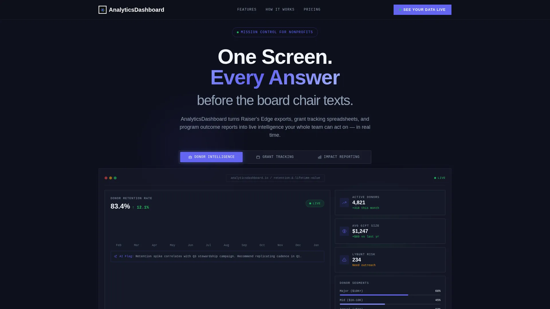
- A three-tab Feature Tab Switcher showing donor intelligence, grant tracking, and impact reporting views
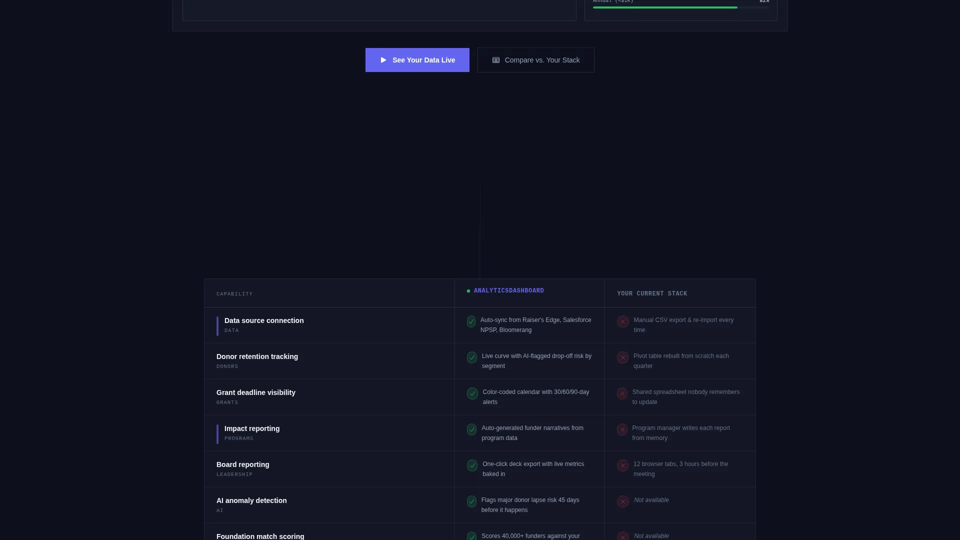
- A side-by-side comparison table with micro-animations and an indigo checkmark system
- A sticky lead-generation bar with a three-field primary form and a secondary gated PDF path
Feature list
This template ships with purpose-built sections that work together as a persuasion sequence. Each component below is drawn directly from the design brief.
Three-Tab Feature Switcher Header
Three clickable tabs labeled "Donor Intelligence," "Grant Tracking," and "Impact Reporting" each reveal a different live dashboard view. The active tab glows electric indigo, and transitions between views are instant and smooth. This section proves product speed before a visitor reads a single line of copy.
Side-by-Side Comparison Table
The comparison table pits the dashboard against "Your Current Stack" column by column. Rows cover manual data merging versus automated sync, static PDF reports versus real-time dashboards, and retroactive analysis versus predictive AI flags. Each row lands with a micro-animation, stacking indigo checkmarks that build momentum as the visitor scrolls.
Scrolling Metrics Ticker
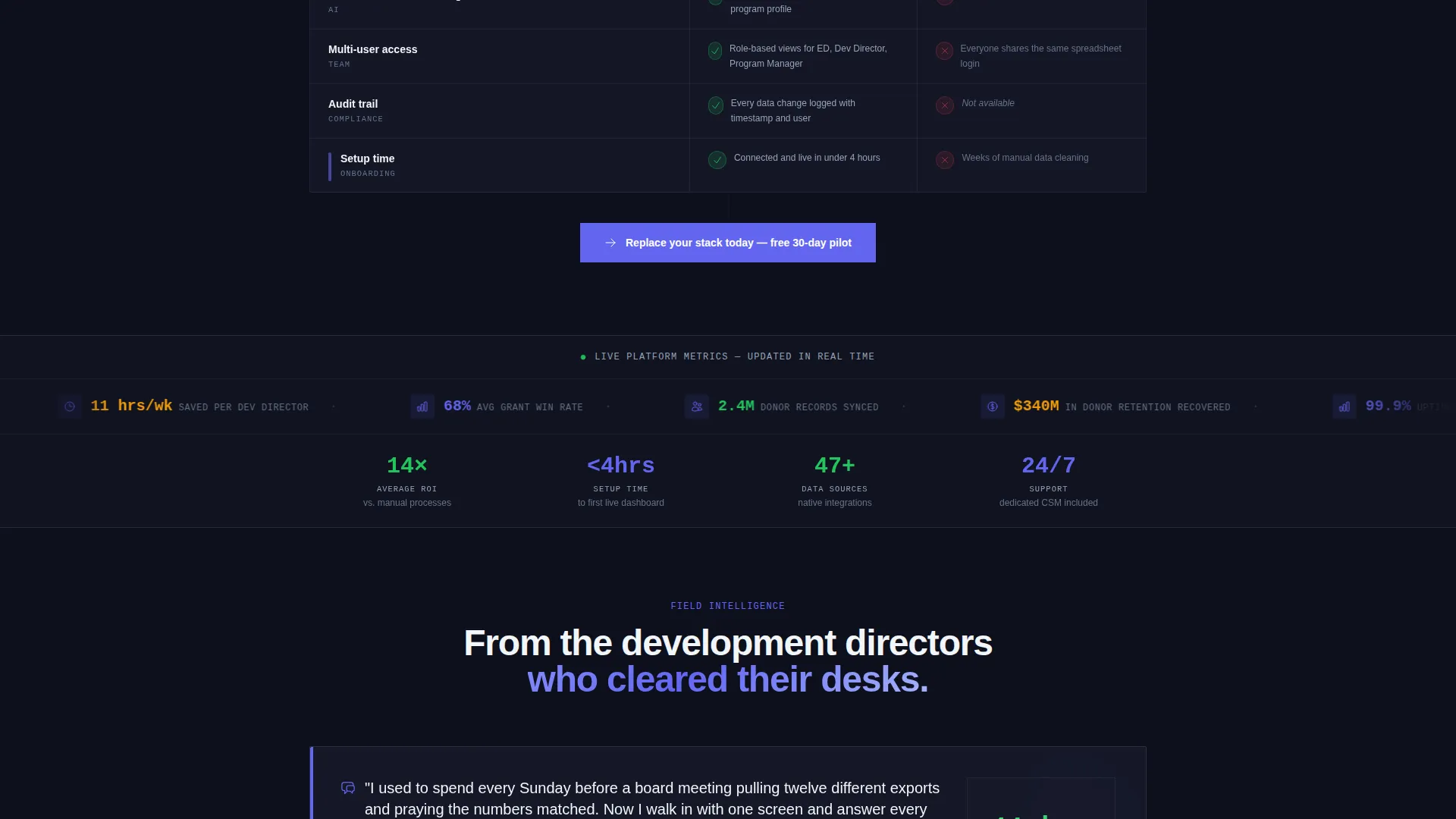
A horizontal ticker below the comparison table displays aggregate social-proof numbers such as grant totals tracked and nonprofits onboarded. The scroll is continuous and quiet, adding authority without interrupting the reading flow.
Sticky Lead-Generation Bar
After the comparison table, a sticky bar pins the primary call to action to the viewport. The three-field form collects organization name first, then annual operating budget range via dropdown, then work email. This deliberate order reduces friction while qualifying each lead.
Gated Secondary Conversion Path
Visitors not ready to book a demo can download a gated "Impact Reporting Playbook" PDF. A single email field captures this second-tier audience, keeping no interested visitor behind without an option.
Dark Dashboard Visual System
Every dashboard view inside the tab switcher is rendered against a deep console black background. The electric indigo active states, cool slate secondary text, and signal green positive metrics create a visual language that signals live data and operational focus throughout the page.
Page sections overview
| Section | Purpose |
|---|---|
| Feature Tab Switcher | Demonstrates the three core dashboard views interactively |
| Comparison Table | Contrasts old manual workflows with the AI-powered alternative |
| Metrics Ticker | Provides scrolling social proof with aggregate platform numbers |
| Sticky call to action Bar | Pins the primary lead-generation form after the comparison table |
| Gated PDF Offer | Captures emails from visitors not yet ready to request a demo |
Design & branding system
The visual identity follows a Dashboard Pro theme centered on an Electric Indigo color system. Every color choice carries a specific meaning, so the palette feels intentional rather than decorative.
- Deep console black (#0D0F1C) as the base background, cool slate (#94A3B8) for secondary text and divider lines, and signal green (#22C55E) for positive metrics and confirmation states
- Electric indigo (#6366F1) drives active tab states, checkmarks, and primary call-to-action elements throughout the page
- The overall aesthetic mirrors a mission-control environment: dark, focused, and precise, where every bright element earns its place by communicating something real
Mobile & speed optimization
The template is structured so that the most persuasive elements translate cleanly to smaller screens without losing their visual hierarchy. The sticky bar and tab switcher are designed to remain functional and legible at mobile widths.
- The comparison table layout is built to reflow gracefully so column contrasts stay readable on narrower viewports
- The scrolling metrics ticker maintains its continuous motion on touch devices, preserving the social-proof effect without layout disruption
How this template helps you convert
The page is built as a deliberate persuasion sequence, not a static brochure. Each section hands off to the next with increasing commitment from the visitor.
- The Feature Tab Switcher opens with a live product demonstration, establishing credibility before any written claim is made, so the visitor arrives at the comparison table already engaged.
- The comparison table does the persuasive heavy lifting row by row, and the sticky call to action bar appears only after that case is made, so the call to action feels like a natural next step rather than an interruption.
Other information about this template
This template sits within the Technology category under the AI for Nonprofit subcategory, targeting teams building or marketing nonprofit AI analytics dashboard products. It is designed to support a lead-generation goal, making it suitable for demo-request funnels and gated content campaigns.
- The template style is Comparison Table, paired with a Launch Energy creative direction that sequences demonstration, proof, and social validation in strict order
- The header concept is a Feature Tab Switcher, a pattern well suited to platforms with multiple distinct capability areas such as donor intelligence and grant tracking
- Teams using donor management platforms or grant administration tools as part of their existing stack will find the comparison table rows directly relevant to their audience's daily workflow

Theme
Dashboard Pro
Creative direction
Launch Energy
Color system
Electric Indigo
Style
Comparison Table
Direction
Lead Generation
Page Sections
Three-tab Feature Switcher
Side-by-side Comparison Table
Scrolling Metrics Ticker
Sticky Lead-generation Bar
Gated Secondary Conversion Path
Dark Dashboard Visual System
Related questions
Who is this landing page template designed for?
Can I change the tab labels and dashboard content inside the Feature Tab Switcher?
How does the comparison table work in this template?
What lead capture options are included?
Is this template designed as a single page or part of a multi-page site?



