Specialized Vision Correction Landing Page Template
Optic is a hub-and-spoke landing page template built for an optometry mobile app. It maps nearby eye care providers, lets patients compare wait times, insurance acceptance, and review scores, then books an appointment in seconds. With a Stats-First layout, animated versus table, and sticky anchor navigation, Optic turns raw data into confident decisions before a visitor ever dials a number.
by Rocket studio
Quick summary
Optic is a single-page, anchor-navigated landing page template designed for an optometry mobile app. It leads with bold, real-world statistics, walks visitors through a Find-Compare-Book flow, and closes with a zip-code-powered call to action. The dark, focused visual identity mirrors the precision of an eye exam, keeping every feature crisply legible from the first scroll.
Who this template is for
This template is built for product teams and founders launching or promoting an optometry directory mobile app. If your app helps patients find and book eye care providers, Optic gives you a conversion-ready landing page that proves value immediately.
- Mobile app developers and product owners in the eye care space
- Digital health startups building patient-facing provider directories
- Optometry practices or networks wanting a modern, app-first patient acquisition page
What problem this template solves
Finding the right eye care provider is surprisingly frustrating. Patients juggle insurance portals, outdated directories, and phone hold music just to check availability. Optic solves that with a landing page that communicates your app's data advantage before a visitor decides to engage.
- No clear way for patients to compare providers on wait time, insurance, and ratings at once
- Generic app landing pages that list features without demonstrating real, measurable value
- Visitors leaving without acting because the proof of value arrives too late in the scroll
What you get with this template
You get a complete, single-page hub-and-spoke layout with four anchor-navigated spokes and a sticky top navigation bar. Every section is structured to lead with a statistic and then unpack the feature behind it.
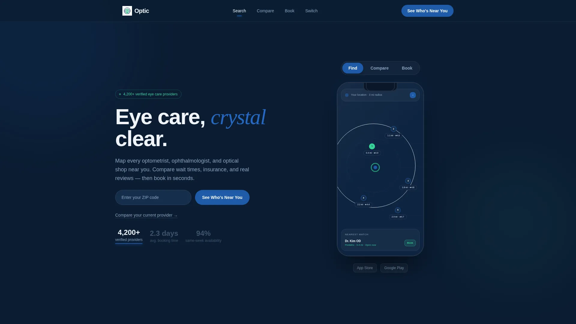
- A Feature Tab Switcher header with three animated app screen previews: Find, Compare, and Book
- An animated comparison table pitting your app against legacy directories across seven dimensions
- A testimonial carousel and a zip-code-first call-to-action form built into the sticky navigation
Feature list
This section describes the core functional components baked into the Optic template.
Feature Tab Switcher Header
The header contains three togglable tabs: Find, Compare, and Book. Each tab animates a phone mockup to show the corresponding app screen. The active tab underline pulses in iris blue, and the transition between screens is smooth and immediate. Headline stats like "4,200+ verified providers" and "avg. 2.3-day booking time" appear large enough to read before a visitor consciously engages.
Sticky Anchor Navigation Bar
A navigation bar pins to the top of the page as visitors scroll. It contains four anchor links: Search, Compare, Book, and Switch. The primary call-to-action button, "See Who's Near You," lives inside this bar so it is always visible and always one click away.
Stats-First Spoke Sections
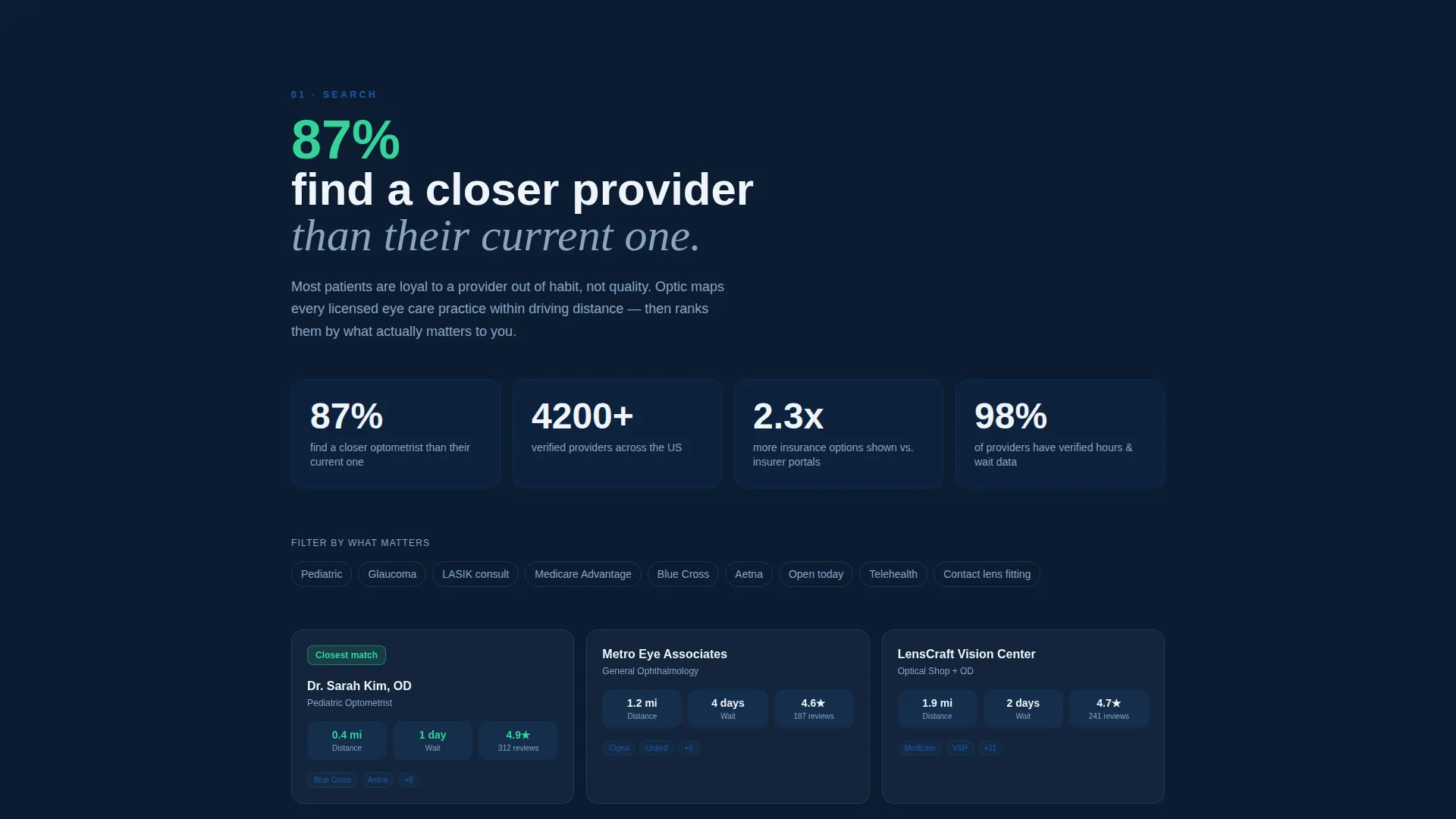
Each of the four spoke sections opens with a bold, large-format statistic before expanding into feature copy. For example, the Search spoke leads with a figure like "87% of users find a closer optometrist than their current one." This structure builds credibility through data before making any narrative claim.
Animated Versus Comparison Table
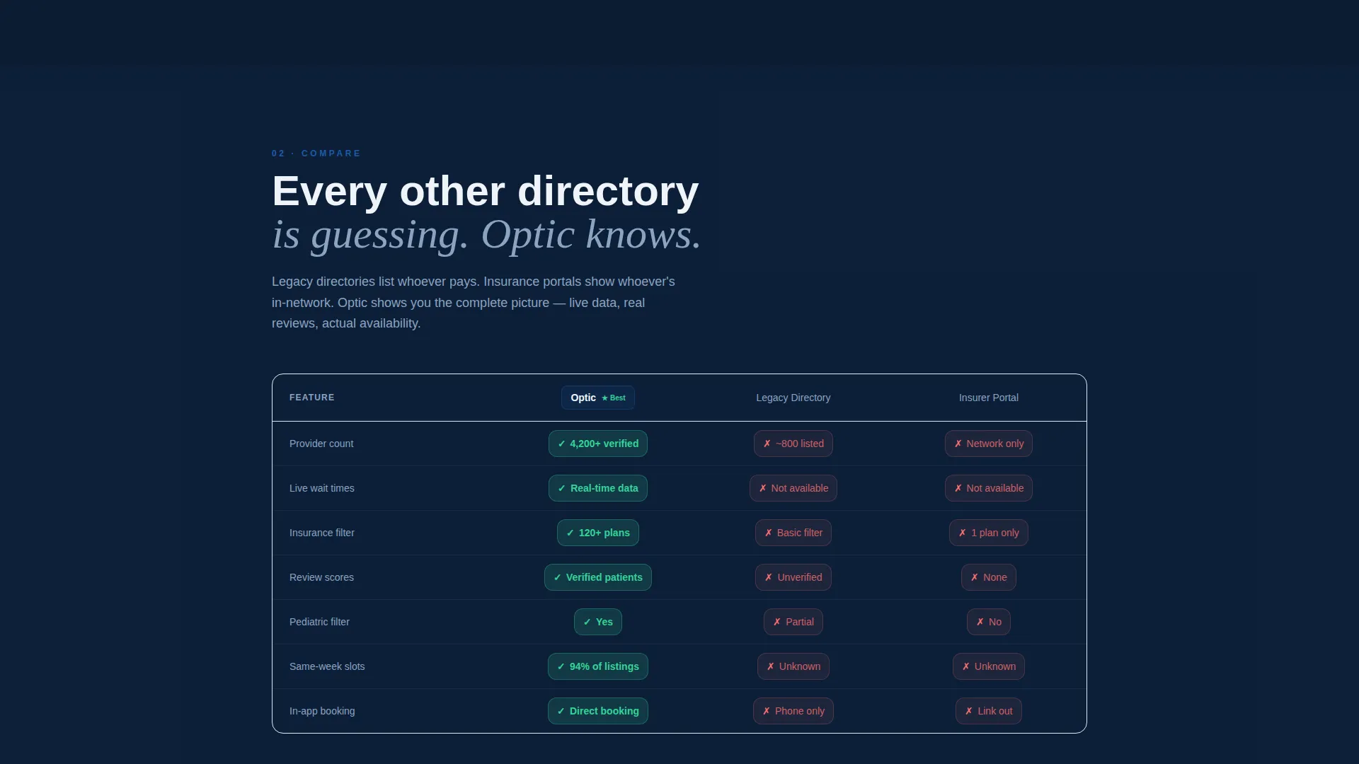
The Compare spoke features a side-by-side table measuring your app against legacy directories and insurance portals across seven dimensions. Table cells light up green or red as they scroll into the viewport, creating a visual proof moment that drives the conversion decision.
Secondary Provider Lookup Path
Alongside the primary zip-code form, a secondary input lets visitors type the name of their current optometrist to see how that provider ranks in the app. This creates a personalized discovery moment and an immediate reason to explore alternatives.
Patient Testimonial Carousel
The final spoke closes with a rotating carousel of real patient stories. Each testimonial names a specific condition caught during an exam, connecting data-driven features to genuine health outcomes and building emotional trust before the final call to action.
Page sections overview
| Section | Purpose |
|---|---|
| Feature Tab Switcher | Showcase Find, Compare, Book app screens with animated phone mockups and headline stats |
| Sticky Anchor Nav | Keep primary call to action and section links visible throughout the full-page scroll |
| Search Spoke | Lead with proximity stat, introduce map-based provider search feature |
| Compare Spoke | Animated versus table comparing app to legacy directories on seven dimensions |
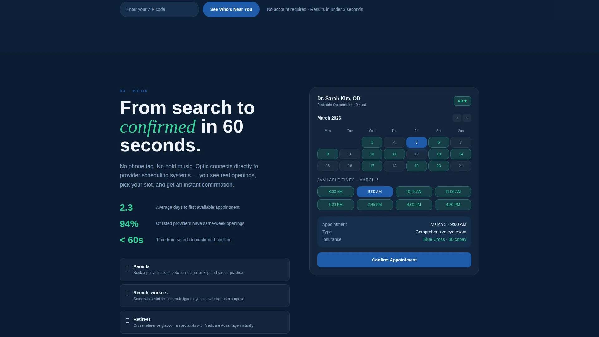
| Book Spoke | Highlight calendar with open slot visibility and average booking time stat |
| Switch Spoke | Address provider loyalty friction with secondary lookup and social proof |
| Testimonial Carousel | Rotate real patient stories tied to specific exam outcomes |
| Zip Code call to action | Capture first interaction with a single zip-code field, no account required |
Design & branding system
The visual identity follows a Directory and Discovery theme built around a Midnight Blue color system. The palette is designed to feel like the focused intimacy of an exam room when the slit lamp clicks on: dark and precise, with sharp points of illuminating color.
- Deep diagnostic navy (#0B1D33) for primary backgrounds, clinical iris blue (#1E5AA8) for interactive elements and active states, and lens-flare white (#F0F4FA) for card surfaces
- Acuity green (#34D399) used exclusively on comparison winner badges and positive differentials, giving it clear visual meaning
- The overall aesthetic is dark, focused, and high-contrast, matching the precision and trust required in a medical-adjacent product
Mobile & speed optimization
The template is designed with a mobile-first mindset, which is appropriate given that the product it promotes is itself a mobile app. Every layout decision prioritizes the smaller screen without sacrificing the detail that desktop visitors expect.
- Phone mockup animations in the header are built for smooth performance on mobile viewports
- The sticky navigation and zip-code form are thumb-friendly and remain accessible throughout the scroll on any screen size
- Card surfaces and stat blocks scale cleanly across breakpoints, keeping large numbers readable at every size
How this template helps you convert
Optic earns its conversions through a deliberate sequence: prove value with data, create a personal discovery moment, then make the first action effortless.
- The Stats-First layout presents hard numbers immediately, so visitors trust the product before they read a single marketing claim. Large stats like provider counts and average booking times are visible before the visitor decides to scroll.
- The animated versus table makes the competitive advantage visual and immediate. Cells lighting green as they enter the viewport give visitors a felt sense of superiority without requiring them to process a written argument.
- The zip-code call to action removes all friction from the first step. Visitors do not need an account or a decision. They type five digits and see results, which converts curiosity into engagement instantly.
Other information about this template
This template is built specifically for the optometry mobile app niche, where patient trust and data credibility are the primary conversion drivers. A few additional details are worth noting for anyone evaluating this template.
- The template style is Hub and Spoke with Anchor Navigation, meaning all sections live on one page and are linked from the persistent top bar for fast, frictionless scanning
- The creative direction is Stats-First Impact, a deliberate choice for a product category where numbers outperform narrative in building trust with skeptical, time-pressed patients
- The landing page direction is Comparison and Versus, making it especially effective for markets where patients are already using a competing tool or a manual process and need a reason to switch
- This template is categorized under Technology, specifically within the Optometry Digital Presence subcategory, and is well suited for founders or teams seeking to position their app as the most data-complete option in their market
Theme
Directory & Discovery
Creative direction
Stats-First Impact
Color system
Midnight Blue
Style
Hub & Spoke (Anchor Nav)
Direction
Comparison/Versus
Page Sections
Feature Tab Switcher Header
Sticky Anchor Navigation
Stats-first Spoke Layout
Animated Versus Comparison Table
Dual Conversion Entry Points
Patient Testimonial Carousel
Related questions
Who is this landing page template designed for?
Can I update the statistics and provider numbers in the template?
What makes the comparison table more effective than a standard feature list?
Are there multiple conversion paths built into this template?
Does this template suit a single app or a multi-location provider network?



