Premium Optometry Software Cost Estimator Website Template
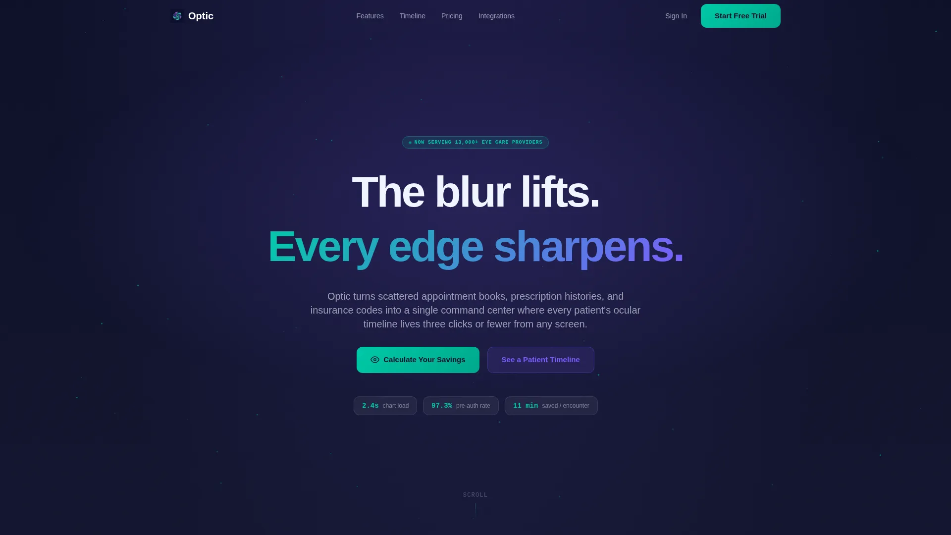
Optic is a bento grid landing page template built for optometry patient management platforms. It features a live Revenue and Efficiency Estimator header, stats-first bento tiles, a simulated patient timeline panel, and a freemium trial conversion flow. The design uses a glassmorphic Data Command palette to make a complex clinical product feel immediate, credible, and easy to explore.
by Rocket studio
Quick summary
Optic is a single-page bento grid landing page template for an optometry patient management platform. It leads with an interactive estimator that calculates real value before the visitor scrolls. Every section is built around dominant numbers and translucent data tiles. The result feels like a clinical dashboard, not a brochure.
Who this template is for
This template is built for software teams and founders who sell patient management tools to eye-care practices. It speaks directly to the daily workflow challenges those practices face, and it earns trust through specificity rather than generic claims.
- Independent optometrists running small practices who lose time to manual chart pulls
- Multi-location optometry groups whose front-desk staff juggle several disconnected systems
- Ophthalmology referral coordinators who need instant access to refraction histories from other providers
What problem this template solves
Eye-care practices carry a specific operational burden: appointment books, prescription histories, and insurance codes each live in a different place. A generic SaaS landing page cannot communicate that burden or the relief of solving it. Optic closes that gap with a design that feels operational from the first scroll.
- Visitors cannot quickly see the time and revenue they are losing without a concrete, personalized calculation
- Most SaaS pages present features before proving value, which increases skepticism and drop-off
- Prospects need to feel the product working before they commit to a trial or a demo
What you get with this template
You get a fully structured bento grid landing page with every section pre-designed to match the optometry patient management use case. The layout, copy scaffolding, interactive elements, and conversion paths are all included and ready to customize.
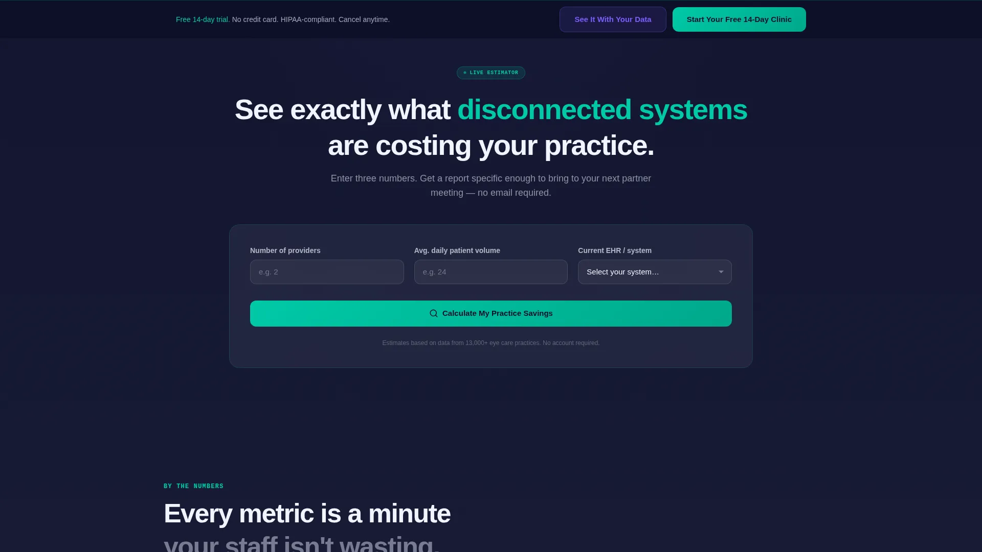
- A live estimator header with animated frosted-glass result tiles showing hours saved, revenue recovered, and no-show reduction
- A stats-first bento grid body with varied tile sizes, dominant metric typography, and a simulated horizontal patient timeline panel
- A freemium trial conversion flow with a low-friction signup form, a sticky bottom call-to-action bar, and a secondary guided import path
Feature list
This template is built around purposeful components that work together to move a skeptical clinical buyer from curiosity to trial signup.
Revenue and Efficiency Estimator Header
Visitors enter their number of providers, average daily patient volume, and their current system from a dropdown of fifteen common options plus a paper and spreadsheet choice. On submit, three frosted-glass bento tiles animate into view with a spring-ease counting effect. Each tile shows a specific projected output: hours saved per week, revenue recovered from missed recall appointments, and a no-show reduction percentage.
Stats-First Bento Grid Layout
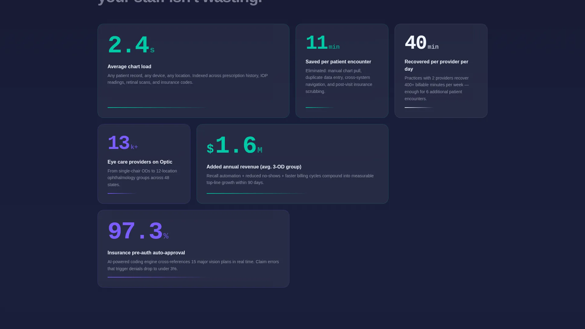
Every bento cell leads with a large, typographically dominant number before any explanatory text appears. Key metrics like "2.4 seconds" for average chart load, "97.3%" for insurance pre-authorization auto-approval rate, and "11 minutes" saved per patient encounter anchor the grid. Double-width tiles hold the headline metrics while smaller cards carry supporting detail, creating a dashboard rhythm that reads operational rather than promotional.
Simulated Patient Timeline Panel
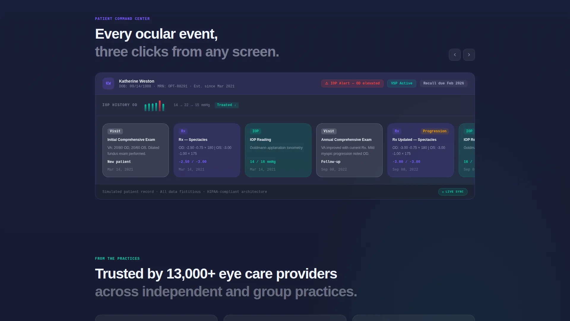
A translucent mid-page panel expands to reveal a simulated patient record. It shows prescription changes, intraocular pressure readings, and retinal scan entries scrolling horizontally inside its tile. This component makes the product tangible before the visitor ever touches a signup form.
Freemium Trial Conversion Flow
The primary call-to-action, "Start Your Free 14-Day Clinic," appears first inside the estimator results and again as a sticky bottom bar that activates after forty percent scroll. The signup form asks only for clinic name, provider count, and work email. No credit card is required.
Guided Data Import Path
A secondary conversion path labeled "See It With Your Data" allows prospects to upload a de-identified comma-separated values file of patient records. The platform then populates with familiar data shapes, reducing the psychological distance between landing page and live product.
Glassmorphic Data Command Design System
The visual identity uses translucent card surfaces at sixty percent opacity layered over a deep clinical indigo base. Aqueous teal fires across progress bars and live metric badges. A soft iris violet activates on hover states and selected navigation items. Every layer of depth is created by light passing through light, echoing the precision of a slit-lamp view.
Page sections overview
| Section | Purpose |
|---|---|
| Estimator header | Personalized value calculation with animated result tiles |
| Estimator result tiles | Show projected hours saved, revenue recovered, and no-show reduction |
| Stats bento grid | Lead with dominant metric numbers before any explanation |
| Key metric tiles | Double-width tiles for headline figures, smaller cards for context |
| Patient timeline panel | Horizontal simulated record scrolling inside a translucent tile |
| Primary call to action block | "Start Your Free 14-Day Clinic" with low-friction signup form |
| Sticky call to action bar | Reappears after forty percent scroll to recapture scrollers |
| Guided import path | Secondary "See It With Your Data" upload and preview flow |
Design & branding system
The design language is called Data Command and uses a glassmorphic color system that creates visible depth without heavy gradients. Every surface feels like a frosted instrument panel floating above a clinical dark background, which signals precision and trust to an eye-care audience.
- Deep clinical indigo (#1B1F3B) as the base layer, translucent card white at sixty percent opacity (#FFFFFFCC) for tile surfaces, aqueous teal (#00C9A7) for progress bars and live badges, and soft iris violet (#7C5CFC) for hover and selected states
- Typography is scaled to make numbers the visual hero in every bento tile, with supporting text nested at a smaller weight to preserve hierarchy
- Spring-ease animations on the estimator result tiles and a horizontal scroll interaction inside the patient timeline panel add motion that feels purposeful rather than decorative
Mobile & speed optimization
The bento grid layout is structured to restack cleanly at smaller viewports so the dashboard rhythm reads on a phone or tablet without losing the visual hierarchy. The sticky call-to-action bar is especially effective on mobile, where it persists within thumb reach throughout the scroll.
- Bento tiles restack in a logical single-column order that preserves the stats-first reading flow on narrow screens
- The estimator form is input-minimal by design, reducing friction on touch keyboards with only three required fields
- The horizontal patient timeline panel adapts to touch-swipe interaction inside its tile container
How this template helps you convert
The conversion architecture is built so that value is proven before the call-to-action is ever pressed. Every layout decision reduces friction and increases the visitor's confidence that the product will work for their specific practice.
- The estimator header personalizes the value proposition before the visitor reaches a single feature description, making the numbers feel earned rather than claimed.
- The stats-first bento grid sustains credibility through the scroll by anchoring every section in a specific, concrete metric rather than a generic benefit statement.
- The two-path conversion model lets high-intent visitors go straight to the free trial while more cautious buyers follow the guided import path, so neither audience hits a dead end.
Other information about this template
Optic is built as a single landing page using the Bento Grid template style. It is categorized under Technology, specifically within the Optometry Software subcategory targeting the Optometry Patient Management niche. The template ships with a complete design system that can be recolored to match a different brand palette while keeping the glassmorphic depth logic intact.
- The estimator dropdown includes fifteen common electronic health record systems plus a paper and spreadsheet option, covering a wide range of current practice setups
- The template is designed to support a freemium or free-trial go-to-market model and is not structured for a high-touch enterprise sales funnel
- The simulated patient timeline panel uses placeholder data and is intended to be replaced with realistic representative records during customization
Theme
Data Command
Creative direction
Stats-First Impact
Color system
Glassmorphic
Style
Bento Grid
Direction
Freemium/Trial
Page Sections
Live Revenue and Efficiency Estimator
Stats-first Bento Grid Body
Simulated Patient Timeline Panel
Low-friction Freemium Trial Flow
Guided Data Import Path
Glassmorphic Data Command Visual System
Related questions
Who is the ideal buyer for this template?
Does the estimator calculate live data automatically?
Can I update the color palette to match my brand?
What conversion model does this template support?
Can I replace the simulated patient timeline with real data?



