Preschool Terms of Service Landing Page Template
Clarity is a split-screen preschool terms of service landing page built for early-opening childcare centers that serve busy, schedule-driven families. Its Feature Matrix layout presents enrollment, tuition, pickup, illness, and withdrawal policies side by side in plain language. The dark Midnight Blue palette with electric teal accents makes legal content feel trustworthy, not intimidating, and a sticky lead-generation form converts confident readers into tour bookings.
by Rocket studio
Quick summary
Clarity is a single-page, split-screen terms of service template designed for preschools and daycare centers. It organizes policy content into a scannable Feature Matrix, pairs plain-language summaries with expandable full legal text, and drives tour reservations through a sticky teal call-to-action button. The design feels authoritative yet approachable for time-pressed parents.
Who this template is for
This template is built for childcare operators who need their policies to do real work. It suits centers that open early, serve working families, and want their terms page to build confidence rather than confusion.
- Early-opening preschools and daycare centers serving dual-income or shift-working parents
- Childcare directors who want policy pages that convert browsers into enrolled families
- Centers relocating families or filling waitlists who need instant policy clarity
What problem this template solves
Most childcare terms pages are dense legal documents that parents skip or skim with dread. Clarity replaces that experience with a structured, readable layout that resolves parental anxiety section by section.
- Parents cannot quickly find answers about tuition, illness rules, or pickup authorization
- Centers lose trust when policies feel buried, vague, or legalese-heavy
- Busy parents browsing from a hospital break room or a commute need one-tap access to key information
What you get with this template
You get a fully designed single landing page that presents your preschool's terms of service as a confidence-building experience. Every section is laid out to move a parent from uncertainty to enrollment readiness.
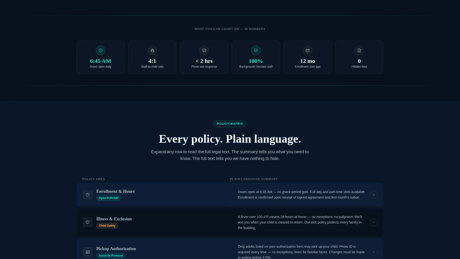
- A 50/50 split-screen Feature Matrix with policy categories on the left and plain-language summaries on the right
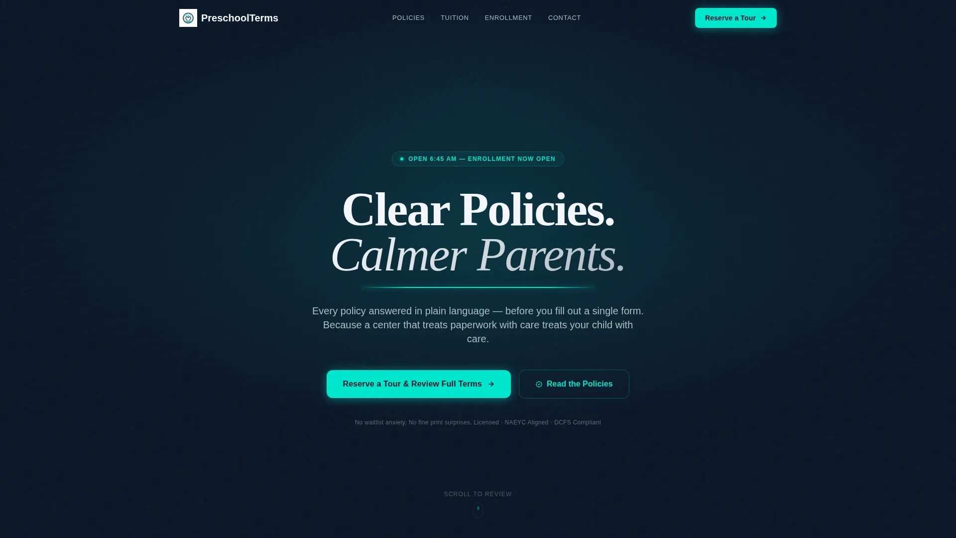
- A dark full-bleed header with a radial glow effect and animated teal underline beneath the headline
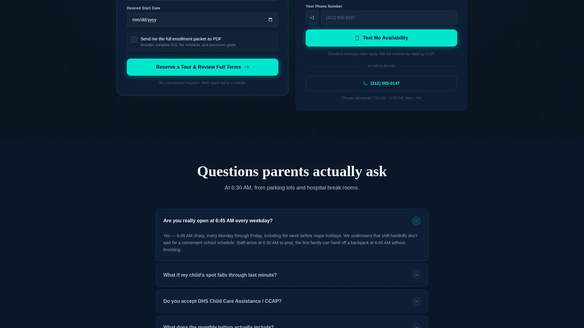
- A sticky lead-generation form capturing parent name, child age, desired start date, and a PDF enrollment packet checkbox
Feature list
This template comes with a focused set of design and layout components drawn directly from the source brief.
Split-Screen Policy Matrix
The page uses a strict 50/50 split layout. The left column names each policy area such as enrollment, illness, pickup authorization, tuition, and withdrawal. The right column delivers the plain-language summary with expandable full legal text. Rows alternate between navy and near-black backgrounds for visual rhythm.
Teal Hover Accent Borders
Each policy row lights up with a glowing electric teal border on hover. This interaction signals interactivity and guides the parent's eye through the matrix in a structured, reassuring sequence.
Dark Full-Bleed Glow Header
The header uses a deep navy background with a soft radial teal-to-navy gradient halo behind the headline. A single teal line animates beneath the headline text like a settling heartbeat, setting a tone of calm authority.
Sticky Lead-Generation Form
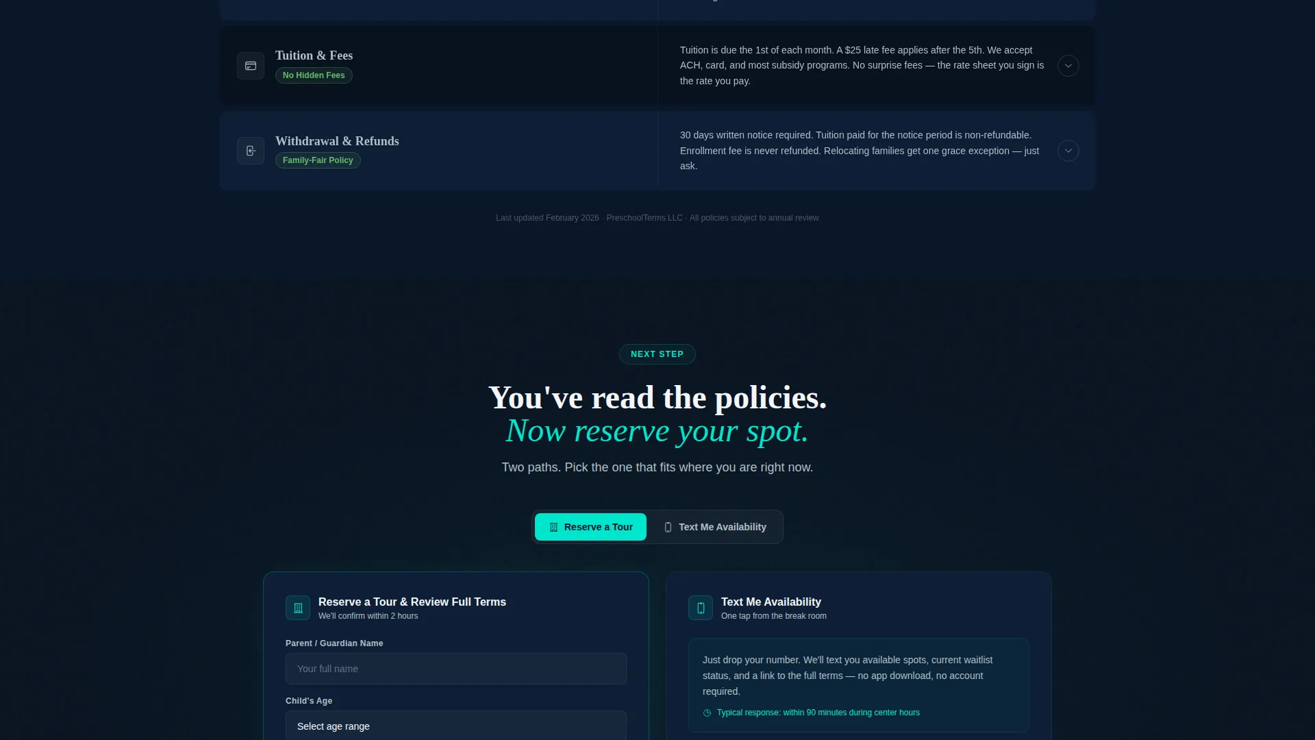
A primary call-to-action button labeled "Reserve a Tour and Review Full Terms" stays pinned after the visitor passes the third policy section. The form captures four fields and includes a checkbox to receive the full enrollment packet as a PDF download.
One-Tap Text Availability Path
A secondary conversion path offers a "Text Me Availability" option with a single phone number field. This lightweight path is designed for parents browsing quickly from a mobile device during a short break.
Expandable Full Legal Text
Each policy summary row supports expandable full legal text. Parents can read the plain-language version first, then expand to review the complete policy language, building trust through transparency at every step.
Page sections overview
| Section | Purpose |
|---|---|
| Dark Glow Header | Sets tone with headline and animated teal underline |
| Enrollment Policy Row | Explains enrollment process in plain language |
| Illness Policy Row | Clarifies attendance and illness rules clearly |
| Pickup Authorization Row | Defines authorized pickup and safety procedures |
| Tuition Policy Row | Breaks down payment terms and fee structure |
| Withdrawal Policy Row | Outlines notice periods and withdrawal conditions |
| Sticky call to action Button | Pins tour reservation button after third policy row |
| Lead Generation Form | Captures parent details and PDF packet request |
| Text Me Path | Offers one-tap phone-number contact option |
Design & branding system
The visual identity follows a Startup Velocity theme grounded in a Midnight Blue color system. The palette is designed to feel serious enough to hold legal weight while remaining warm enough for a parent's first visit.
- Core colors: deep command-center navy (#0A1628), soft lunar gray (#B0BEC5), trust-white (#F4F6FA), and glowing electric teal (#00E5CC) reserved for calls to action, hover states, and key policy highlights
- Typography is clean white on dark backgrounds, with no stock photography; authority is established through layout, type, and spatial design
- The overall aesthetic reads like a parenting app built by engineers: structured, precise, and reassuring without being cold
Mobile & speed optimization
This template is designed with mobile-browsing parents firmly in mind. The one-tap "Text Me Availability" path and the sticky button layout reflect the reality that many parents will visit from a phone during a short window of time.
- The split-screen matrix is structured to reflow cleanly for narrower viewports, keeping policy rows readable on small screens
- The secondary conversion path reduces friction to a single phone number field, removing barriers for parents on a hospital break or a commute
How this template helps you convert
The template earns the enrollment inquiry by proving transparency before asking for anything. Every design and layout decision is built around reducing parental hesitation.
- The policy matrix resolves specific anxieties in a logical order, moving from logistics to safety to financials, so parents feel fully informed before they reach the form
- The sticky "Reserve a Tour and Review Full Terms" button appears after the parent has already read three policy sections, making the click feel like a natural next step rather than a premature ask
- The dual conversion paths serve two distinct parent behaviors: the full form for parents ready to commit, and the single-field text option for parents who need a faster, lower-effort first contact
Other information about this template
This template is part of a daycare and preschool website template category within a broader technology-focused template marketplace. It is particularly well-suited for centers that differentiate themselves on operational transparency and early opening hours.
- The template style is a Split Screen (50/50) layout, making it distinct from full-width or card-based policy page designs
- The creative direction is a Feature Matrix, which structures policy content as a scannable comparison grid rather than a linear document
- The header concept is a Dark Full-Bleed with Glow, giving the page an immediately distinctive visual presence in the daycare and preschool niche
- The landing page direction is Lead Generation, meaning every design element is oriented toward capturing a qualified inquiry from a parent who has read and trusted the terms
- This template fits naturally within a broader multi-page preschool website as a dedicated terms of service page, or it can stand alone as a linked policy destination
Theme
Startup Velocity
Creative direction
Feature Matrix
Color system
Midnight Blue
Style
Split Screen (50/50)
Direction
Lead Generation
Page Sections
Split-screen Policy Matrix Layout
Expandable Full Legal Text Rows
Animated Dark Full-bleed Header
Sticky Tour Reservation Button
Dual Conversion Paths
Teal Hover Accent Borders
Related questions
Can I customize the policy categories shown in the matrix?
Does the sticky call-to-action button work on mobile screens?
What information does the lead-generation form collect?
Can this template work as a standalone page or does it need a full website?
Can the expandable rows hold complete policy documents?



