Cleaning Service Comparison Table Landing Page
Cleanmenu is a bold brutalist comparison table landing page built for cleaning service businesses. It lets visitors explore service tiers, toggle through room-by-room tasks, and mentally build their own package before tapping a single button. The design pushes them straight toward an app download with minimal friction and maximum clarity.
by Rocket studio
Quick summary
Cleanmenu is a single-page comparison table landing page for a cleaning service digital menu. It uses a bold brutalist visual system to present four cleaning tiers side by side. Visitors explore tasks, time estimates, and add-on prices through an interactive table, then convert via a smart app download link.
Who this template is for
This template is built for cleaning service businesses that want to replace a phone-call booking flow with a self-serve digital experience. It targets operators who serve high-turnover clients and need a page that qualifies the visitor before the app does.
- Property managers handling frequent unit turnovers who need a fast, no-call booking path
- Dual-income households who prefer tapping a screen over scheduling a service call
- Airbnb and short-term rental hosts booking cleans in tight checkout-to-check-in windows
What problem this template solves
Most cleaning service pages force potential clients to call, fill out a long form, or wait for a quote. That friction loses the visitor before the conversation even starts. Cleanmenu replaces all of that with a live comparison table the visitor can explore on their own terms.
- Eliminates the guesswork of "what does this tier actually include?" by showing tasks row by row
- Removes the phone-call barrier for clients who want to book fast and move on
- Bridges the gap between browsing and downloading by making the page itself feel like the app
What you get with this template
This template delivers a fully structured, single-page layout built around an interactive comparison table and a clear app download funnel. Every section is designed to reduce hesitation and push the visitor toward one action.
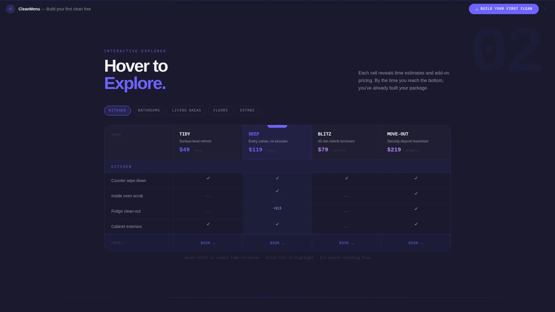
- A brutalist comparison table with four cleaning tiers and per-task row detail
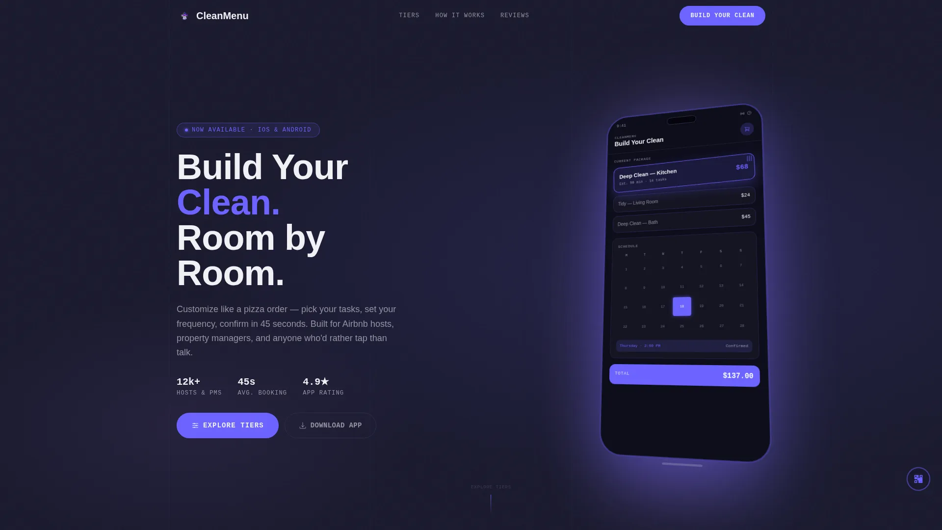
- A dashboard preview header showing the service builder in active use
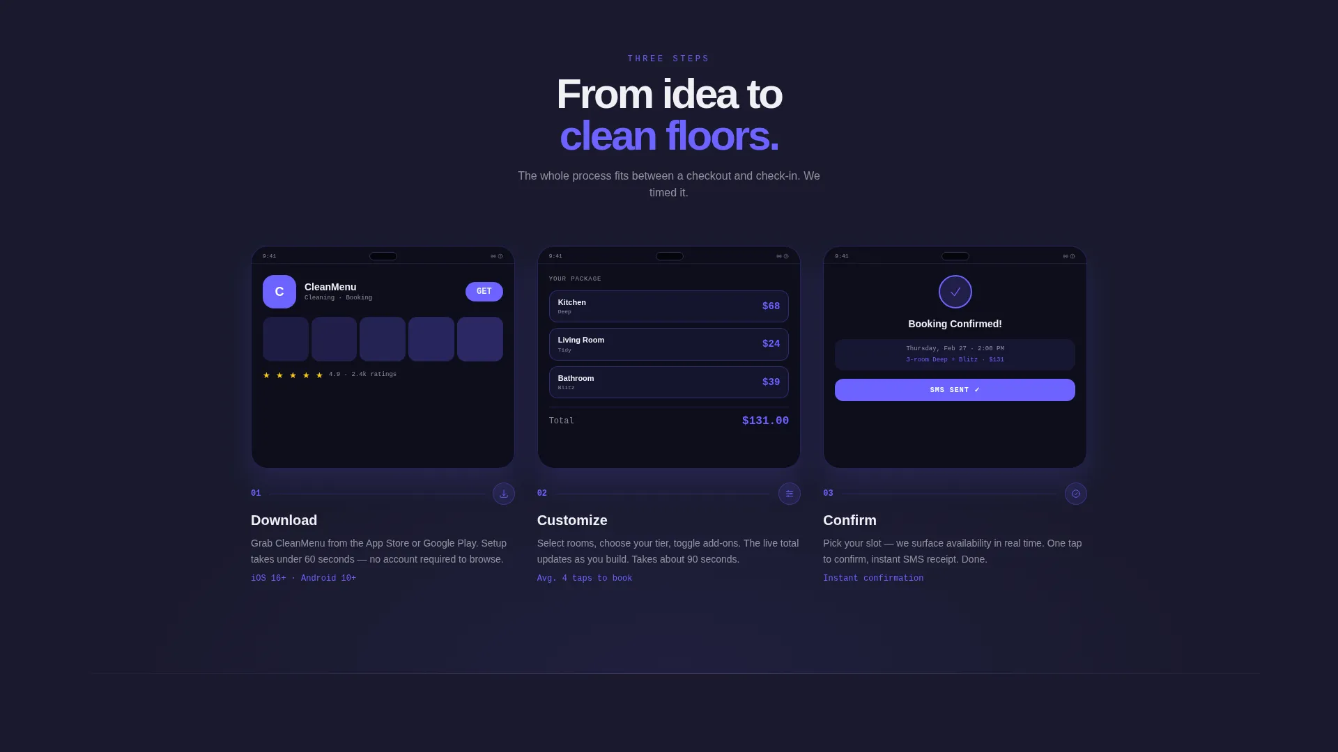
- A three-step download strip and a desktop QR code for instant mobile handoff
Feature list
This template packages several distinct layout components, each doing a specific conversion job. Together they form a frictionless path from first scroll to app download.
Interactive Comparison Table
The core of the page is a four-column brutalist table covering tiers named Tidy, Deep, Blitz, and Move-Out. Each row represents a specific task such as baseboard cleaning, inside-oven scrubbing, window track detail, or grout scrubbing. Cells light up in electric indigo on hover, revealing time estimates and add-on pricing inline.
Dashboard Preview Header
The header displays a pixel-accurate mockup of the app's service builder screen. The device is shown at a three-quarter axis rotation with a "Deep Clean Kitchen" card mid-drag into a cart. A calendar widget highlights Thursday at 2 PM in indigo, and the phone casts a soft violet shadow against the charcoal background.
App Download Call-to-Action Strip
A fat brutalist button labeled "Build Your First Clean" is anchored to the bottom of the viewport. It connects to both the App Store and Google Play using a device-detected smart link. This keeps the primary action visible at every scroll depth without interrupting the exploration experience.
Three-Step Onboarding Strip
Below the comparison table, a horizontal strip walks visitors through three steps: Download, Customize, and Confirm. Each step shows an actual app screenshot, reducing uncertainty about what happens after the tap. This section directly addresses the hesitation that comes before a first download.
Desktop QR Code Module
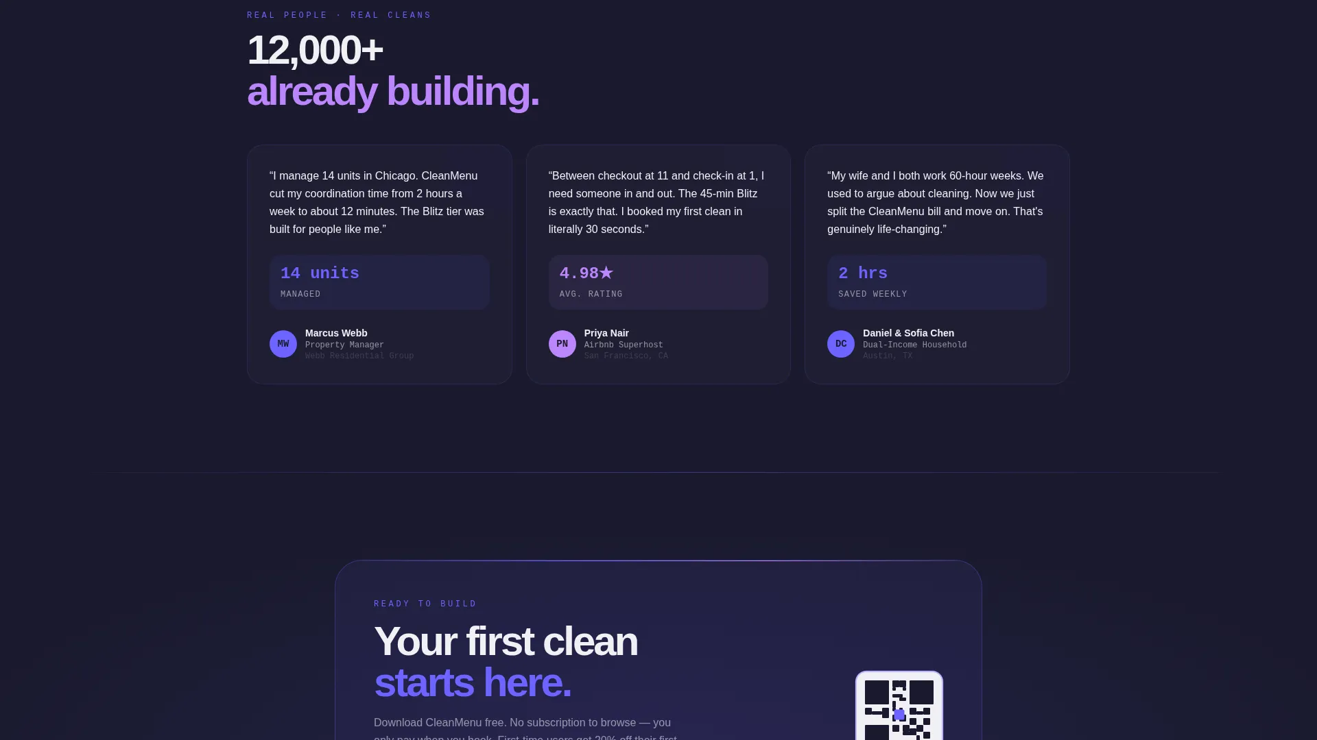
A secondary QR code floats in the lower-right corner on desktop viewports. Laptop users can point their phone camera and go directly to the app without switching devices or retyping a link. It removes the last physical barrier between desktop discovery and mobile action.
Bold Brutalist Visual System
The entire layout uses raw column borders, oversized monospace typography, and an electric indigo color system. Hover states pulse with hot accent violet. The aesthetic is deliberately industrial, making the page feel sharp and credible rather than decorative.
Page sections overview
| Section | Purpose |
|---|---|
| Dashboard Preview Header | Shows the app mid-use to establish product credibility immediately |
| Comparison Table | Lets visitors explore tiers, tasks, time estimates, and add-on prices |
| Three-Step Strip | Reduces download hesitation by showing what happens after the tap |
| Primary call to action Button | Anchors the app download action to the bottom of the viewport |
| Desktop QR Module | Gives laptop users a direct mobile handoff without retyping a link |
Design & branding system
The visual identity is built on a Bold Brutalist framework using an Electric Indigo color system. The palette is deliberately industrial: deep charcoal backgrounds, electric indigo interactive states, clinical white type, and a hot violet accent for selected and hovered elements.
- Background uses deep slab charcoal (#1A1A2E), buttons and active cells use electric indigo (#6C63FF), and text sits on clinical white (#F0F0F5)
- Hot accent violet (#BB86FC) appears exclusively on hover states and selected package highlights
- Typography leans on oversized monospace styling to reinforce the brutalist structure and make tier labels instantly scannable
Mobile & speed optimization
The entire layout is designed around a mobile-first interaction model. The comparison table and call to action button are optimized for thumb-reach use, and the smart download link routes each visitor to the correct app store without extra steps.
- The primary call to action uses a device-detected smart link that sends iOS users to the App Store and Android users to Google Play automatically
- The QR code module is visible only on desktop viewports, keeping the mobile layout clean and focused
- The dashboard preview header is sized and rotated to remain legible and sharp on small screens without cropping key interface details
How this template helps you convert
The page is structured so that exploration and conversion happen simultaneously. By the time a visitor reaches the bottom, they have already made most of their buying decision inside the table itself.
- The interactive comparison table lets visitors mentally build their service package before the app exists on their phone, making the download feel like the natural next step rather than a leap of faith.
- The three-step onboarding strip removes post-download uncertainty by showing real app screenshots at each stage, so visitors know exactly what they are committing to.
- The anchored call to action button and desktop QR code ensure the download action is always one tap or one camera-point away, regardless of where the visitor stops scrolling.
Other information about this template
This template is categorized under Technology with a subcategory focus on cleaning service digital presence. It is purpose-built for the cleaning service digital menu niche, where the goal is to replace traditional quote-request flows with a self-serve comparison experience. The Intersection Match Score for this template is 13, reflecting a strong alignment between the brutalist design system, interactive explorer creative direction, and the app download conversion goal. The template style is Comparison Table, the theme is Bold Brutalist, and the header concept is Dashboard Preview, all working together inside a single-page layout.
- Template style: Comparison Table with a Bold Brutalist theme and Electric Indigo color system
- Creative direction: Interactive Explorer, where scrolling the page functions as active product discovery
- Header concept: Dashboard Preview showing the app's service builder in a real usage state
- Landing page direction: App Download, with smart links, a QR code module, and a viewport-anchored call to action
Theme
Bold Brutalist
Creative direction
Interactive Explorer
Color system
Electric Indigo
Style
Comparison Table
Direction
App Download
Page Sections
Interactive Brutalist Comparison Table
Dashboard Preview Header
Anchored App Download Call to Action
Three-step Onboarding Strip
Desktop QR Code Module
Related questions
Who is this landing page template designed for?
Can I adjust the cleaning tiers shown in the comparison table?
Does the template work on mobile devices?
What does the device-detected smart link do?
Do I need a live app before using this template?



