Cybersecurity Job Board Landing Page Template
Clearance is a hub-and-spoke landing page template built for a cleared cybersecurity job board. It leads with a live salary calculator, then walks visitors through animated head-to-head comparisons that prove the platform's edge. The Carbon Fiber color system, phosphor green motion accents, and a three-field résumé upload form create a high-trust, conversion-focused experience for SOC analysts, CISOs, and cleared professionals.
by Rocket studio
Quick summary
Clearance is a single-page, anchor-nav landing page template designed for a cybersecurity job board that serves cleared professionals. It opens with an interactive salary calculator pre-populated with real clearance-level data, then flows into animated comparison spokes that benchmark the platform against competing job boards. Every section ends with the same primary call to action, keeping the conversion path tight and intentional.
Who this template is for
This template was built for a specific kind of operator: someone running a job board or talent platform that serves the cleared cybersecurity community. The visitor base is equally specialized, ranging from analysts to hiring leads inside defense organizations.
- Security Operations Center analysts and cleared cybersecurity professionals looking for roles that match their clearance level and specialization
- Chief Information Security Officers and defense contractor hiring managers who need verified, cleared talent on a defined timeline
- Facility Security Officers and recruiters managing active Top Secret/Sensitive Compartmented Information clearance verification across multiple open requisitions
What problem this template solves
Cleared cybersecurity professionals face a noisy, mismatch-heavy job market. Generic job boards do not filter by polygraph requirements, active clearance status, or work model constraints tied to Sensitive Compartmented Information Facilities. This template makes the case that the platform is different, immediately and without asking for trust upfront.
- Professionals waste time on roles that list clearances as preferred rather than required, and the template's comparison data surfaces that gap directly
- Hiring managers have no fast way to assess time-to-hire or verified employer rates across competing platforms, so the animated stat counters solve that at a glance
- Visitors arrive skeptical, so the salary calculator delivers personal, data-backed value before a single form field appears
What you get with this template
The template delivers a fully structured, single-page layout with every section, interaction pattern, and design token defined. There is no guesswork about how sections connect or where motion lives.
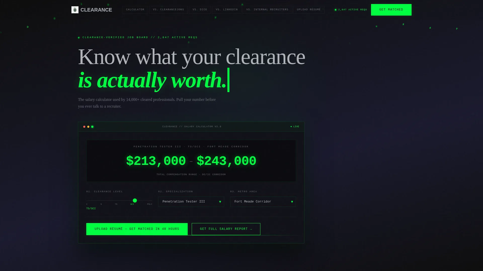
- A functional salary calculator module at the top of the page, pre-filled with penetration tester and clearance-level data and ready to use before any job listing appears
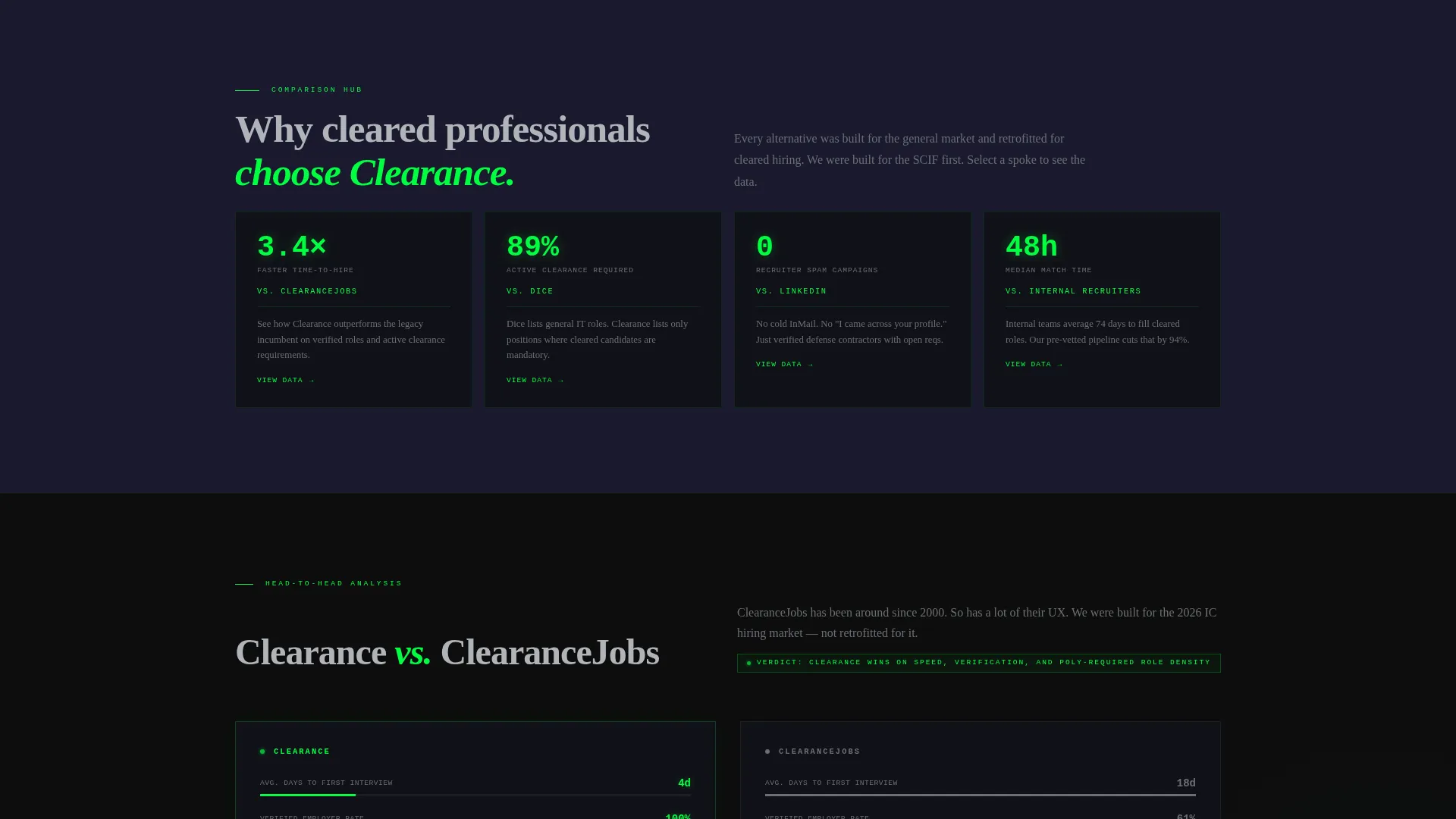
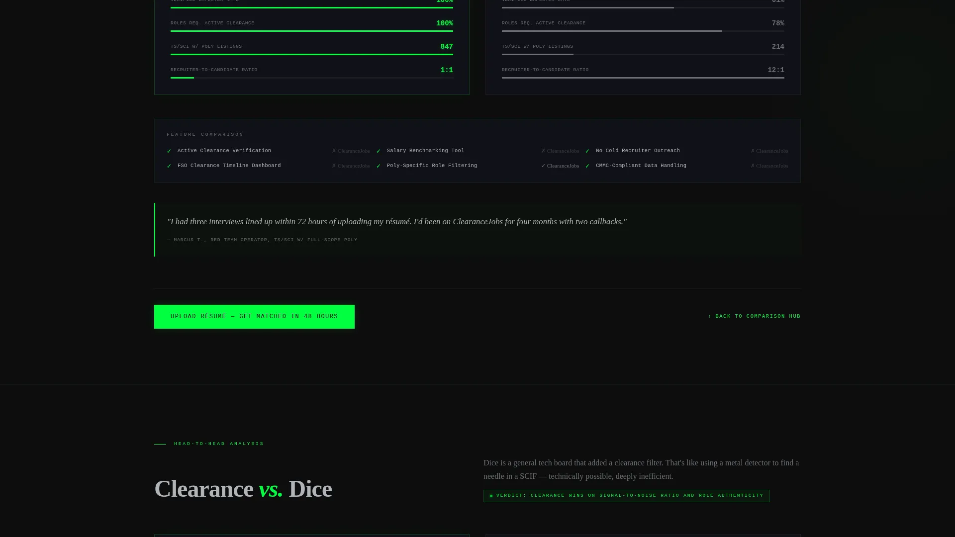
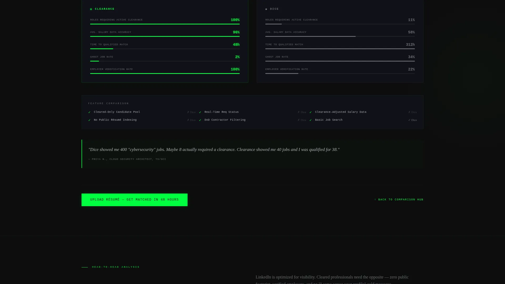
- Four animated comparison spokes with stat counters, progress bars, and slide-in columns covering time-to-hire, clearance-required role percentages, recruiter-to-candidate ratios, and verified employer rates
- A three-field résumé upload form with drag-and-drop interaction, clearance level dropdown, and work model selector, plus a secondary email-gated salary report path
Feature list
This section covers the core functional and design components built into the template.
Live Salary Calculator Module
The header section features a full-width product screenshot of the salary calculator pre-populated with real figures: "Penetration Tester III / TS/SCI with Full-Scope Poly / Fort Meade corridor / $187,000 to $214,000." Sliders for clearance level, specialization, and metro area are built in, and the salary range animates upward as the clearance toggle shifts from Secret to Top Secret/SCI, making the tool feel active rather than static.
Hub-and-Spoke Anchor Navigation
The page uses a central hub connected to four spoke sections, each accessible via anchor navigation. Visitors can jump directly to any comparison spoke from the hub without scrolling linearly, and every spoke ends with a phosphor green anchor that returns them to the center. This structure keeps the page organized even as content volume grows across multiple comparison breakdowns.
Animated Stat Counter Comparisons
Each comparison spoke uses animated counters and progress bars to display platform metrics side by side. Columns slide in from opposing edges as visitors scroll into view, and counters race to their final values, creating a data-driven case without requiring the visitor to read dense paragraphs.
Phosphor Green Motion System
The dynamic motion theme is applied through a consistent set of interactive states: phosphor green pulses on hover, traces along scroll-triggered progress bars, and blinks beside live job counts. Motion is deliberate and contained, reinforcing data activity without becoming distracting on a page already dense with information.
Three-Field Résumé Upload Form
The primary conversion form is intentionally minimal: a drag-and-drop résumé upload field with a scanning animation, a clearance level dropdown covering Confidential through Top Secret/SCI with Poly, and a preferred work model selector covering on-site Sensitive Compartmented Information Facility, hybrid, and remote-eligible. Low friction is the design goal.
Gated Salary Report Path
Visitors who engage with the calculator but are not ready to apply have a second conversion option: submitting an email address to receive a full salary report. This secondary path captures leads who found value in the tool before they are ready to commit to a résumé upload.
Page sections overview
| Section | Purpose |
|---|---|
| Header / Calculator | Anchors visitors with a live salary tool and immediate market-rate data |
| Hub Anchor Nav | Connects the central hub to four comparison spokes for quick navigation |
| Comparison Spoke: versus. Job Board A | Shows head-to-head metrics on time-to-hire and clearance-required role percentage |
| Comparison Spoke: versus. Job Board B | Benchmarks recruiter-to-candidate ratio and verified employer rates |
| Comparison Spoke: versus. Job Board C | Highlights differences in role visibility and active clearance filtering |
| Comparison Spoke: versus. Internal Recruiters | Compares speed, coverage, and verified employer access against in-house hiring |
| Primary call to action Hub | Centers the résumé upload form with clearance dropdown and work model selector |
| Secondary call to action Block | Presents the email-gated full salary report as an alternate conversion path |
| Repeated Spoke calls to action | Ends every spoke with the same primary call-to-action anchor |
Design & branding system
The Carbon Fiber color system is the foundation of every design decision in this template. The palette is built for low-light focus and high-contrast data display, reflecting the environment its audience actually works in.
- Core palette: deep carbon black (#0D0D0D) for backgrounds, woven graphite (#1A1A2E) for card and section surfaces, phosphor green (#00FF41) for all interactive and live-data accents, and cool titanium gray (#B0B3B8) for body text
- No white appears anywhere in the layout; form fields use dark fills with green caret lines, and all gradients run from absolute black to graphite
- Phosphor green is the only color with active motion states: it pulses on hover, traces scroll-triggered progress bars, and blinks beside live counters, creating a terminal-style visual rhythm throughout the page
Mobile & speed optimization
The dynamic motion theme is designed to remain legible and functional on smaller screens. Animation behavior and layout reflow are accounted for across breakpoints.
- The hub-and-spoke anchor navigation collapses cleanly on mobile so visitors can still jump between comparison spokes without linear scrolling
- Animated stat counters and progress bar fills are scoped to scroll-triggered events, meaning motion activates only when a section enters the viewport rather than running continuously in the background
- The three-field form maintains its drag-and-drop résumé upload and clearance dropdown in a single-column stack on narrow screens, keeping the conversion path intact
How this template helps you convert
Every structural decision in this template is oriented toward earning the click rather than demanding it. Visitors receive tangible value before they encounter any form field.
- The salary calculator at the top of the page gives cleared professionals a personalized market-rate number immediately, creating a reason to stay and a reference point that makes the platform feel credible before any comparison data appears.
- The animated comparison spokes replace vague platform claims with visible, side-by-side metrics, so by the time a visitor reaches the résumé upload form they have already processed the data that justifies the decision.
- The secondary salary report path captures email addresses from visitors who engaged with the calculator but are not ready to apply, ensuring that a single page layout serves two distinct conversion intents without cluttering the primary form.
Other information about this template
This template is purpose-built for the cleared cybersecurity hiring market and carries design and content decisions that reflect that specificity. A few additional details are worth noting for teams evaluating it for their platform.
- The comparison spoke structure is designed to address the most common alternatives a cleared professional or defense hiring manager would consider when evaluating a specialized job board against broader platforms
- The Dynamic Motion theme is intentionally disciplined: motion is used as a signal of live data and interactivity, not as decoration, keeping the page readable for users who rely on fast information scanning
- The template is built as a standalone landing page and does not require a multi-page site architecture to function as a complete conversion surface
- Color and motion tokens are defined at the system level, making it straightforward to apply the Carbon Fiber palette consistently across any custom additions to the layout
Theme
Dynamic Motion
Creative direction
Calculator/Tool First
Color system
Carbon Fiber
Style
Hub & Spoke (Anchor Nav)
Direction
Comparison/Versus
Page Sections
Live Salary Calculator with Clearance Sliders
Hub-and-spoke Anchor Navigation
Animated Stat Counter Comparisons
Phosphor Green Motion System
Three-field Résumé Upload Form
Gated Salary Report Conversion Path
Related questions
Who is the target visitor for this landing page template?
Can the salary calculator be customized with different clearance levels or job titles?
What does the résumé upload form collect from visitors?
How does the hub-and-spoke layout work for visitors arriving from different sources?
Is this template suitable for platforms serving both cleared candidates and cleared employers?



